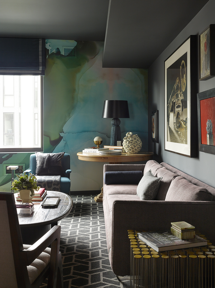
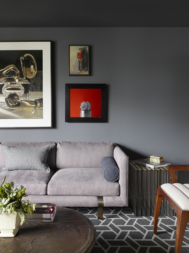
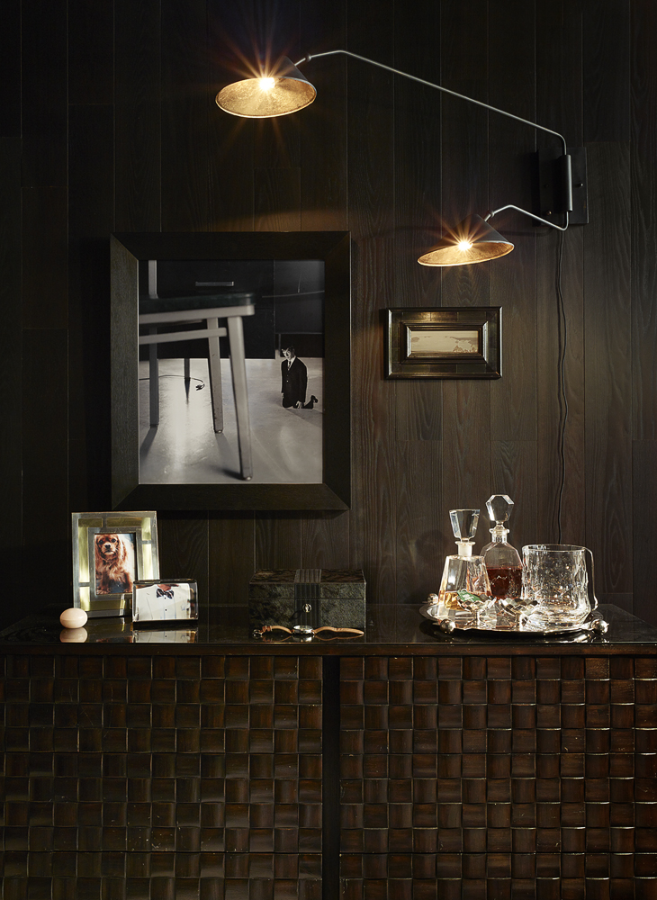
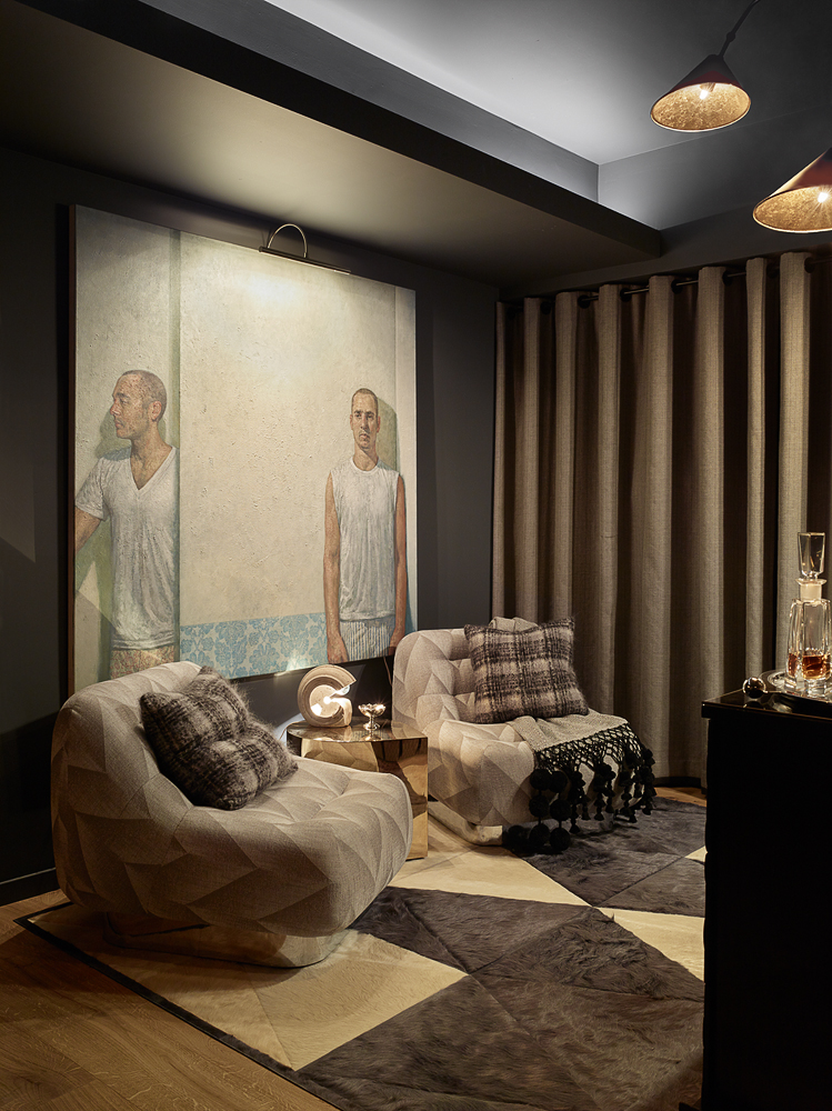
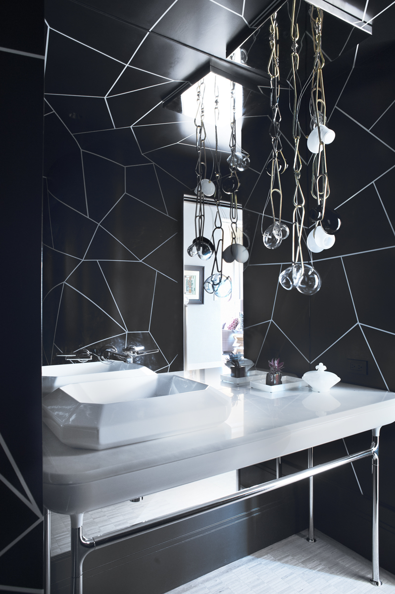
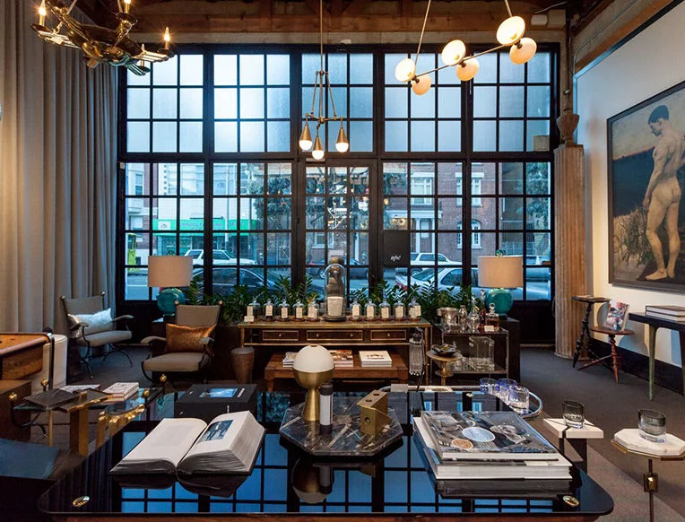
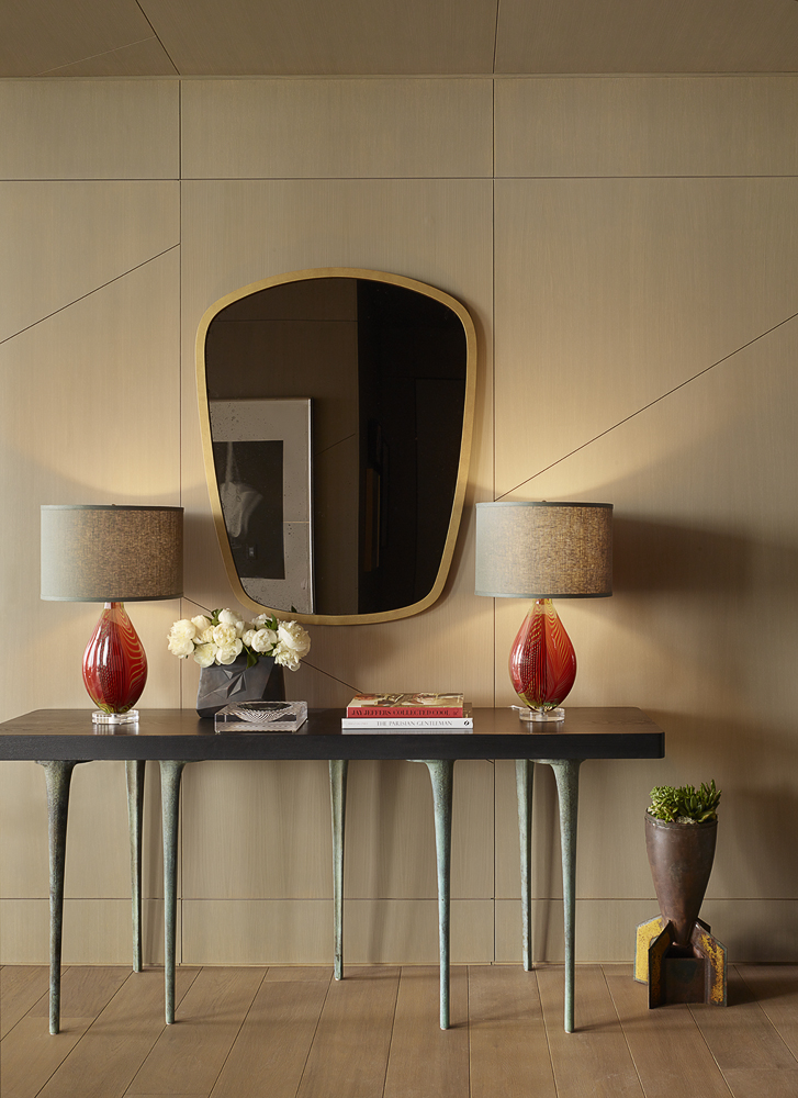
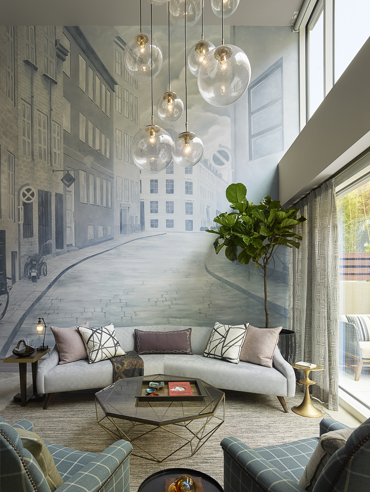
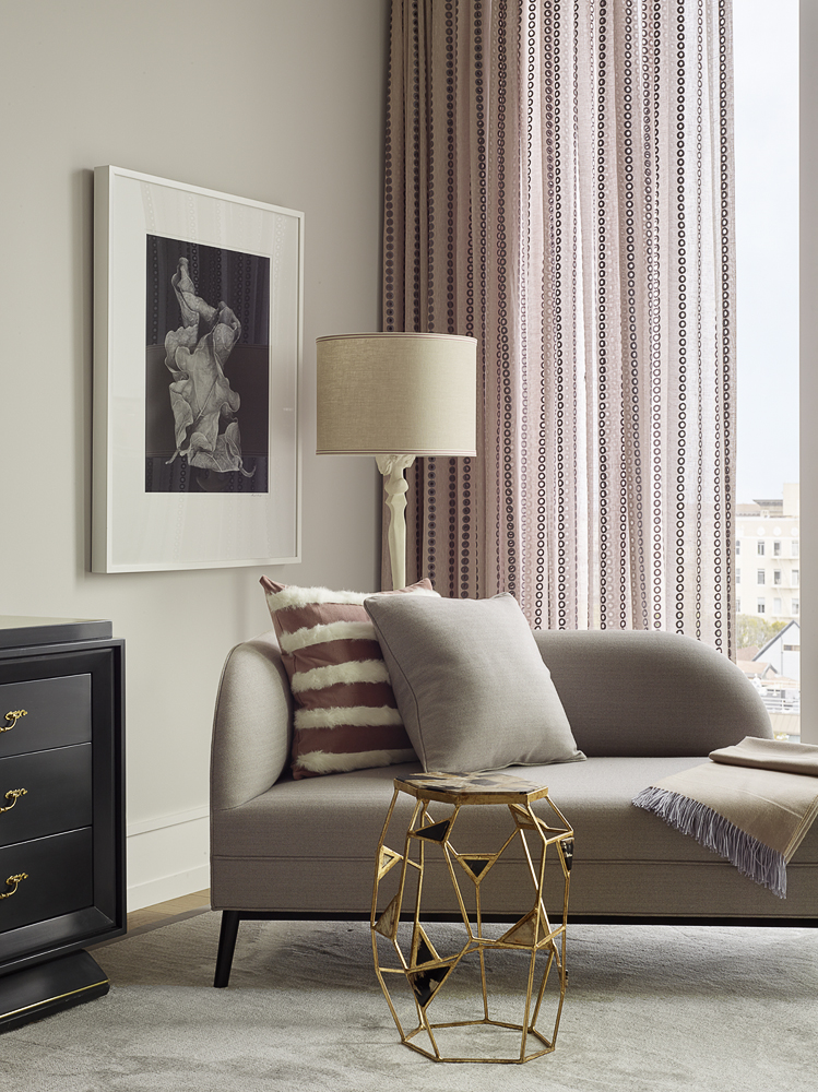
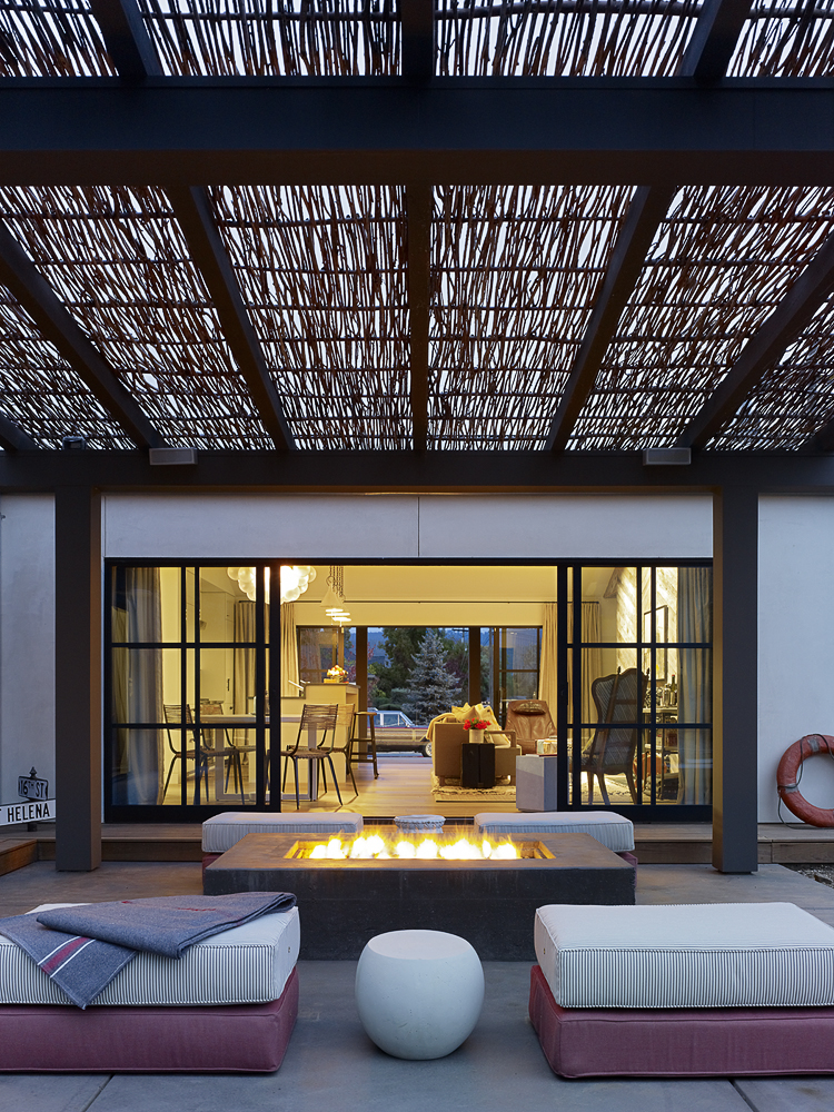
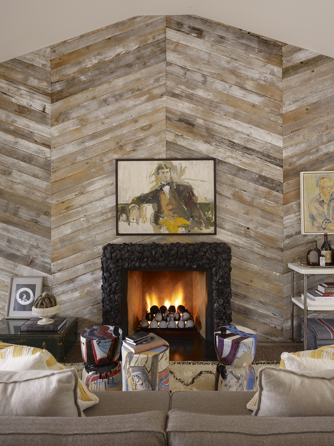
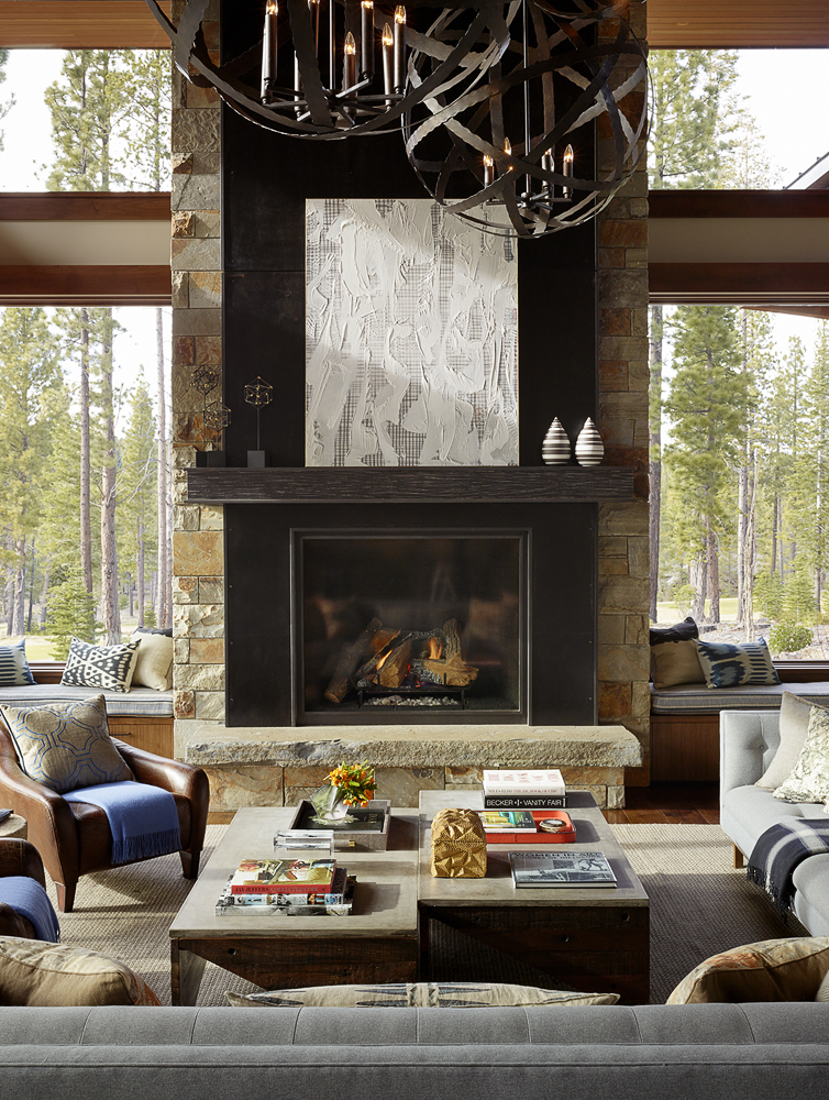
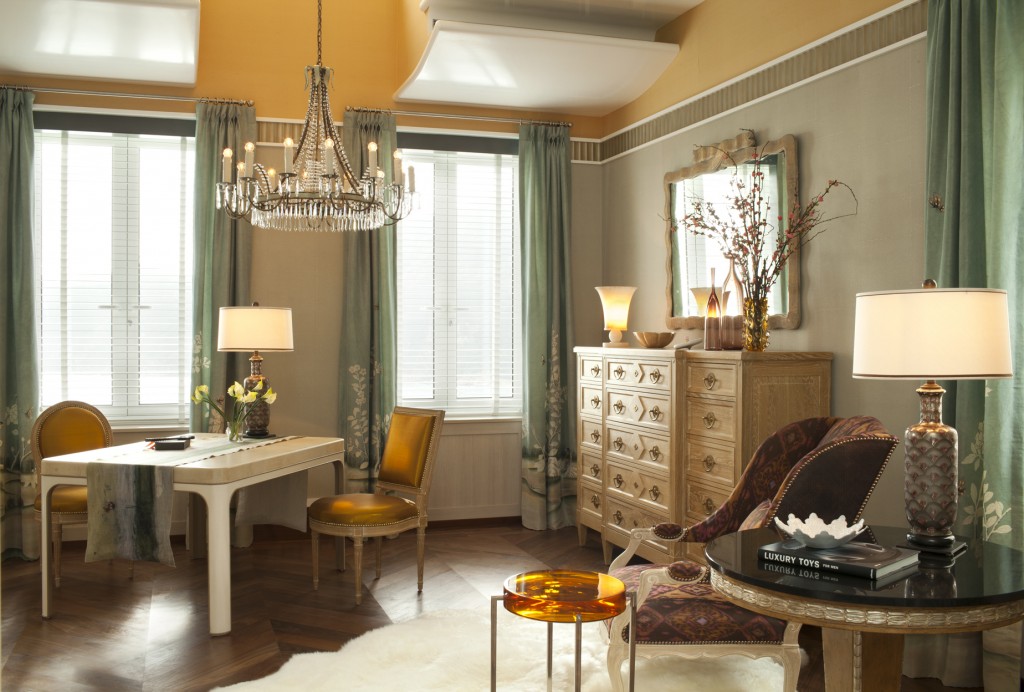
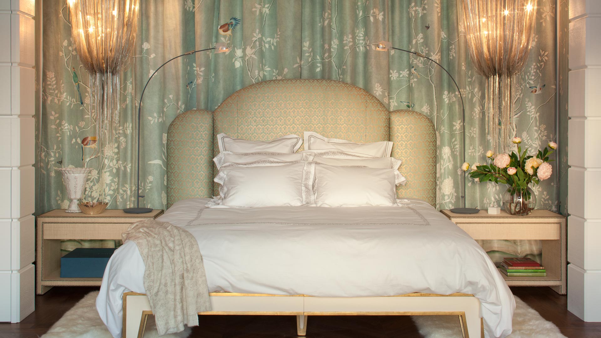
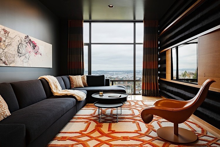
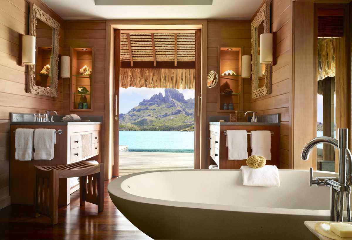
Jay Jeffers - Jay Jeffers Studio

The Refined Sophisticate

BY JOSEPH LUCIER

Several years back, I heard Jay Jeffers announce to a designer panel his passionate and constant search for the next beautiful chair.  I was stuck by this singular vision and lifelong pursuit of something as charming and utilitarian as a chair.  It’s this wanderlust for a perfect object being supplanted by another that continues to drive and develop the refined interiors of Jay Jeffers.  In a recent evening at the sumptuous Linden Room in Hayes Valley, Jay romanticized his inspiration for experiencing new cultures through travel, the genesis of his epynomous retail store, and where he escapes to from his tireless schedule of brining his clientele’s dreams to life.

Jay Jeffers

Jay Jeffers

Joseph Lucier: How did you decide upon the profession of becoming an interior design?

Jay Jeffers: I have a  business degree and moved to San Francisco to become the next Hal Riney in advertising.  I landed at Gap Inc. in their advertising department and while I learned a great deal, I soon realized that marketing was not going to be my vibe. I took a night class through Berkeley Extension in interior design and it was the first time I could see myself making a living doing something I love.  That was 20 years ago. 

JL: Of the many past design and style icons, who inspires the work you do today?

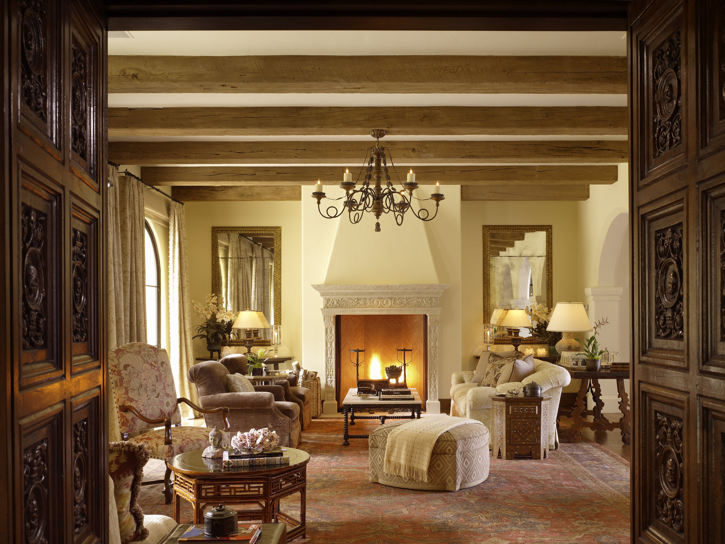
JJ: I'm inspired by so many – David Hicks, Dorothy Draper, and Albert Hadley (Mrs. Astor's library!), Jean Michel Frank, Gary Hutton, Jamie Drake, Kelly Hoppen, Kelly Wearstler – the list goes on and on.  But a quote from  Billy Baldwin that I read in design school is a mantra that has stuck with me throughout my career.  He said, "If one walks into a room and says, 'Billy Baldwin designed this space' then I didn't do my job correctly." Meaning that a home should reflect the architecture, it's surroundings and most importantly, it's inhabitants and not their designer.

JL: Brass is back and it seems like the Seventies style has returned to vogue.  Any thoughts?

JJ: There is a glamorous reaction to the Belgian gray that has been in vogue for years and brass is certainly a part of that.  I love the warmth it brings to a room.  But like anything else, use it lightly.  I strive to create rooms as timeless as possible.  I don't want someone to walk into a space 10 years from now and thing it is "so 2016."

"A home should reflect the architecture, it's surroundings and most importantly, it's inhabitants, not their designer.

JL; What is your relationship to using color in your design work?

JJ: I like it. Color evokes a mood in a space.  The mood can be dramatic, sexy, quiet, and everything in between.  The key for me, as with anything, is using it sparingly.  I'm not one to paint every room a different color. 

JL: What is your philosophy on incorporating art and accessories into a home?

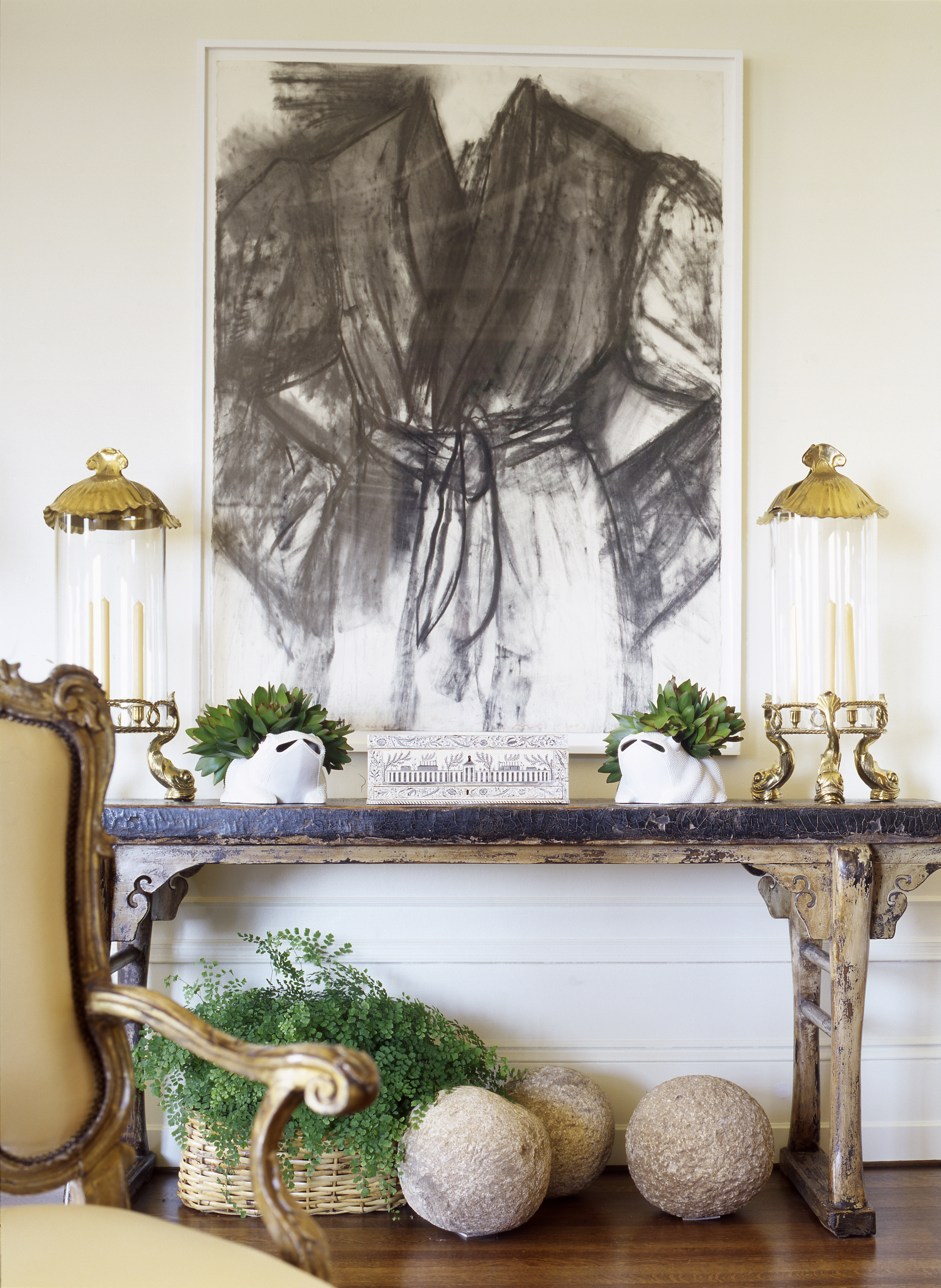
JJ: To me art and accessories are the soul of the home.  A home that just has a bunch of furniture but nothing on the walls and no accessories is just a house.  When you have paintings, sculpture, photography, and objet hanging on walls and sitting on tables, suddenly the space reflects who you are.  

JL: You have a retail component to your business at JAY JEFFERS - THE STORE.  What drove you towards opening an atelier and designing products for retail?

JJ: I opened the store for a few reasons.  The main reason is that I love to shop! But in the last downturn San Francisco lost so many great shops that I would have to find interesting things for my clients.  It has been a great adventure finding wonderful one of kind items as well as new furniture and lighting lines to represent.  Funny enough, our biggest customers are other designers, which makes me think we must be doing something right!

JL: How do you see the Tenderloin neighborhood around your store maturing? Where do you see the neighborhood in five years?

JJ: I bought the building we are in 9 years ago and the neighborhood has changed so much.  We've seen the addition of Jane Bakery, Mr. Holmes Bakehouse, Emily Holt's Hero Shop and fantastic restaurants like Huxley and The Saratoga.  The Tenderloin has a rich history and has evolved into many things over the years.  I'm excited to see what comes next. 

Jay Jeffers - The Store @ 1035 Post Street, San Francisco

Jay Jeffers - The Store @ 1035 Post Street, San Francisco

"To me art and accessories are the soul of the home."

JL: How do you like to travel and what inspiration do you find from experiencing other cultures?

JJ: I love all types of travel – experiencing a new culture opens your eyes and expands your mind.  I'm heading to Cuba in a few days on an architectural tour and so excited to experience the history and the people of that country.  I am also very much a fan of sitting on a beach chair with a good book and a glass of rose and doing absolutely nothing! 

JL: What did you get personally from the process of publishing your monograph 'Collected Cool: The Art of Bold, Stylish Interiors' in 2014?

JJ: Publishing my book was a lovely stroll down memory lane! To put the 18 projects together in the book and see their common threads as well as their differences was amazing.  It's hard to explain the feeling when that first copy arrives in mail and you open it and see what you have accomplished over the last 10 years.  

JL: What was your experience like working with Trumark Urban to create model residences on their current Pacific Heights development, The Pacific?

JJ: Working with Trumark Urban was a fantastic experience! They really allowed us to create beautiful and unique apartments that felt like homes. 

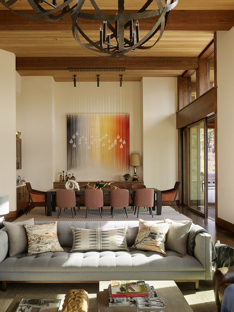
Jeffers Interiors at The Pacific

JL: Favorite restaurants?

JJ: I live in Hayes Valley, so my favorites are walking distance – Petite Cren, Cala, Monsieur Benjamin.  And my latest, The Saratoga is just down the street from my office. If someone asked me if I had to choose my last meal, it would be a caesar and roast chicken from Zuni. 

JL: When you want to get away from it all, where do you escape?

JJ: We have a place in St. Helena that is our refuge.  It is cozy and warm in the winter and beautiful and sunny in the summer.  It is definitely my happy place. 

JL: What is your travel bucket list?

JJ: Japan – It's been on the top of my list for years and I still haven't made it there.  

JL: What are you reading?

JJ: The New York Times on Sunday.  I currently don't have a book.  Every time I try to start one I fall asleep after the first paragraph. :-)

Visit Jay @ JayJeffers.com

Thanks to Jay Jeffers and Kat Daly for working on this piece with me. - Joe

Stephen Sutro - Sutro Architects

A Native Approach

BY JOSEPH LUCIER

Year after year the ubiquitous orange and white signs of Sutro Architects dot San Francisco’s highly sought residences.  As a native son, Stephen Sutro embodies the elegance, longevity, and quiet pride that San Francisco is known for the world over.  Sutro’s constant stream of well-heeled clients enjoy his soft business touch, creative design solutions, and his all-important understanding of the dance between San Francisco building codes and the perfect home.  A look inside Sutro Architects downtown offices reveal a passionate man who looks after the heart of the city with his careful stewardship of our picturesque residential neighborhoods.

Stephen Sutro

Stephen Sutro

Joseph Lucier: Being a native San Franciscan, how does your connection to the City inspire the work you do in town every day?

Stephen Sutro: Its great to see some neighborhoods that are changing dramatically and others that change subtly with small improvements.

JL: Before starting your own firm, you worked with local classical architecture firm.  Do you still incorporate the principles of classical proportion and scale in your current designs?

SS: Of course. Understanding fundamentals of proportion is important, no matter what the style.

JL: You have just acquired a building downtown next door to Jay Jeffers atelier on Post Street.  What are your plans for the look and feel of Sutro Architects offices?

SS: We are transforming an auto body repair shop into a light-filled open architecture work space. We’re lucky to have lots of light and southern exposure. We are maintaining the beaux arts facade and use the large, previously auto-entrance as a large steel and glass pedestrian entrance. Its exciting!

Millennium Tower Penthouse

Millennium Tower Penthouse

"I’m currently interested in exterior materials with aesthetic and functional durability - natural materials that can be used with contemporary or traditional detailing."

JL: Many of the homes my residential real estate colleagues and I sell go through complete gut renovations.  With these types of blank canvases, how do you guide homeowners through the process of creating a new home?

SS: We help clients define their goals, understand the opportunity and challenges each property presents and create an action plan to bring it to fruition.

JL: Do you have a particular look or do you try to stay away from a formulaic approach?

SS: I think the context of the project and goals of the clients are the most important. A condo in a contemporary high rise or a new home in the city is a perfect context for a contemporary design. Working in the context of a early 20th century house with similar structures adjacent, would suggest an approach of keeping the details in tact while creating a more fresh plan and juxtaposing more contemporary materials and details.

JL: What is it about your profession that you love?

SS: The creativity!

JL: Are you working on any “ground up” projects?

SS: Quite a few… some in town and some in the country.

Cole Valley Cool

Cole Valley Cool

"Its always fun to learn about a particular function or interest in a project, or work with different climates and environments."

JL: What materials are you most enjoying integrating in your current interior/exterior designs?

SS: I’m currently interested in exterior materials with aesthetic and functional durability. For me, this means brick, stone, metal - natural materials that can be used with contemporary or traditional detailing.

JL: Do you have a dream project that you would like to have someday?

SS: Its always fun to learn about a particular function or interest in a project, or work with different climates and environments. We’ve completed a fly fishing guest ranch in Montana, which was awesome. We also have worked on some hospitality projects, which are super interesting and new. It would be fun to work on a horse ranch, beach house in Hawaii or mountain house or lodge.

JL: Favorite travel destinations (past and future)?

SS: Argentina has been a highlight — both for fishing and architecture. I’m looking forward to going to Japan.

JL: What are you reading?

SS: Mostly historical fiction.

sutro 2.jpg

Suzanne Tucker - Tucker & Marks

The Timeless Elegance of Suzanne Tucker

BY JOSEPH LUCIER

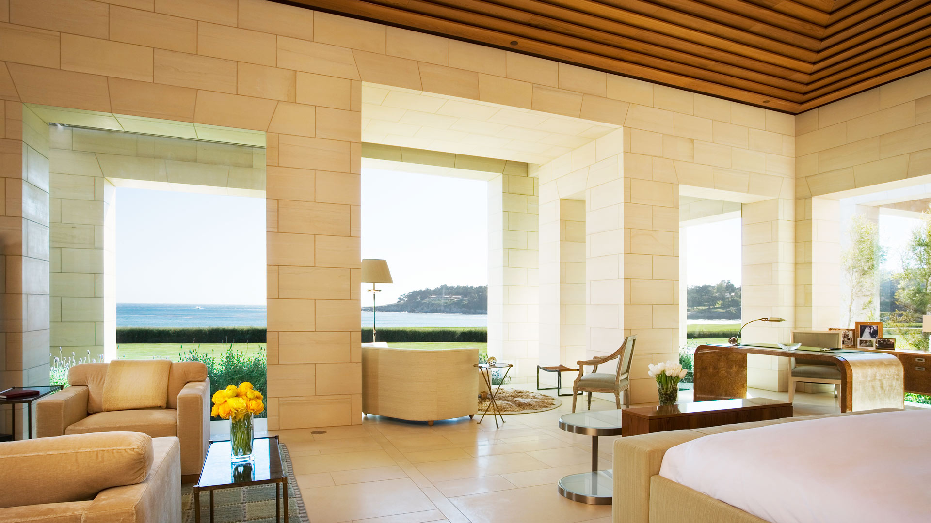
As a little girl, Suzanne Tucker grew up in the idyllic southern California enclave of Montecito, rearranging all the ornaments on the family Christmas tree. It was no surprise that she would eventually begin a career as an aspiring young designer with the legendary Michael Taylor, setting the stage to become the last word in interior design for San Francisco’s beau monde and beyond.  Having enjoyed a friendship with Suzanne for over a decade, I have had the pleasure of intimately witnessing the weave she creates from intermingling a passion for design with her zeal for living. Suzanne's attention to every detail and a genuine caring personality, topped with an unerring sensibility for scale and proportion, give her interiors a sense of refined comfort and livability that speak to the very essence of her well heeled clientele. Her ability to frame classical principles with a modern sensibility allows homeowners the comfort of Tucker's guided collaboration.  I spoke with Suzanne between projects in Pebble Beach, Aspen, and the Yellowstone Club to learn a little more about what makes the “Queen of Custom” tick.

Suzanne_TuckerLR.jpg

Joseph Lucier: Was there something inside of you as a child giving you a notion that someday you would enter the world of interior design?

Suzanne Tucker: My mother will tell you she saw the decorating inclination in me when I was a very little girl, apparently spending hours rearranging all the ornaments on the Christmas tree.  But growing up in Montecito, the world was my architectural and horticultural oyster. My sister and I would spend days on end building forts and creating fantasies, roaming through next door properties with romantic names like Lotusland, Val Verde, and El Mirador. I loved tagging along with my parents to their friends' parties so I could see their houses and explore their gardens.  Art classes outside of my school curriculum were a must and it seemed a given that I would gravitate towards the arts, art history, architecture and design when I was in college. I studied interior architecture and design at university and was happiest when totally immersed in the art department. For a moment I had seriously considered architecture school but all that tedious math and years of more schooling seemed so boring - I wanted to get out into the “real world”!  It may sound a bit odd but I didn't set out with the intention of having a career. I followed what I loved, traveled to Europe, lived in London, worked for some inspiring people, had some incredible mentors, and it all fell into place. Interior design is a fantastic profession - constantly evolving, always challenging, very hard work, and immensely rewarding.

JL: Having grown up in Santa Barbara, are there any stylistic elements of the Tucker & Marks look that owe themselves to this part of California's architectural, interior, and landscape design heritage?

ST: Absolutely, although I was also strongly influenced by living in London for several years – another architectural feast and a great decorating influence. But Santa Barbara is in my soul and has had a powerful effect on me, given the importance and beauty of the local architecture, the inherently gracious houses, historic precedents of style, enchanted gardens, the unique quality of the light, and the colors of the mountains and beaches.  All of this lives deep in my visual and sensual memories, grounding how I create layered and elegant environments for others. I would say London gave me my extended education in decorating and architecture with courses at the V&A that were invaluable and the deeper understanding of a “proper house”: how rooms should flow, how a house should function, the graciousness of space, putting a house together and the ease of living comfortably, whether casual or formal.

JL: How did you come to work for Michael Taylor and, more interestingly, how did you manage to stay in a position that tested so many before you?

ST: There are several very funny stories in answer to that question, but that’s for a tell-all book.  I consider myself very fortunate to have landed that job – even though to get my foot in the door, I had to swallow my pride and start as Michael’s secretary – albeit one with rather pathetic secretarial skills who could barely type.  But that lasted all of three months when he figured out I actually knew something about decorating and began taking me to client meetings and involving me in the projects. Michael was notorious for hiring and firing and was an incorrigible bully to his staff.  I suppose I stayed because I wasn't afraid to speak my mind – chalk it up to chutzpah or naiveté, or a mix of both – and he respected that… and was amused by it. Michael, lovable tyrant that he was, took me under his wing as “teacher’s pet”, spoiled and indulged me, and thus became my greatest mentor.   After his death, Tim and I bought his interiors business and the furniture line Michael Taylor Designs was sold to Paul Weaver who built it into the line it is today.

JL: What element of Taylor’s style, both in business and design, did you take into the formative years of Tucker & Marks?

ST: I couldn’t help but be greatly influenced by Michael's mastery of scale and proportion, his use of color and light, and his knowledge of furniture and antiques. And those are all aspects that I utilize in some form or fashion every single day in my work. I’ve definitely done my own thing, but every once in awhile, I find that I pause and ask myself “What would Michael do with this space?”   And as to the business, Tim (Marks) and I have modeled ours along the same high-end service and custom design work that Michael did.  But the best part is that he showed us how not to run a business and how not to treat employees. He was abysmal at both.

"Michael, lovable tyrant that he was, took me under his wing as 'teacher’s pet', spoiled and indulged me, and thus became my greatest mentor." 

JL: How has your design style developed over the years?

ST: Stylistically I’ve never been trendy.  Trends are great for fashion but the kiss of death in decorating.  Who wants to live in yesterday’s fad?  My own style has always aligned with what is current yet timeless, elegant yet approachable, more classic than cool. And my design philosophy has always been the same: scale and proportion are key; color is subjective; make it individual – make it timeless - make it beautiful. I always strive to create uniquely personalized residences that reflect my clients – who they are, how they want to live, and I hope, where they ultimately are most themselves - at home.

JL: You have done a number of units in 2006 Washington Street in Pacific Heights. How do you keep the ideas fresh as you go from apartment to apartment?

ST: That’s easy for me because I don’t have a cookie-cutter look.  For me, each project is about the client – who they are, how they live, their likes and dislikes, and my job is to create something that is personally reflective, so much them, that it’s beyond anything they could dream on their own.  A house should reflect those who live in it not the decorator, and should become a personal haven.  And 2006 is my most favorite San Francisco building – great architecture, full floor apartments, a classic circular flow, excellent proportions, light on all sides and fabulous views.

Apartment at 2006 Washington Street

Apartment at 2006 Washington Street

JL: As a founder of the Institute of Classical Architecture & Art’s Northern California Chapter and a current national board member, what importance do you place on the stewardship of these centuries old design and proportion principles?

ST: For me this stewardship, as you call it, is vital.  Classicism today is still about the essentials of scale and proportion and balance. Education is the key and the ICAA still teaches these fundamental courses that are no longer being taught in 99% of the architecture schools in the country.  My interiors work is not about being a slave to traditional formality or unimaginative constraints, but rather, it’s about a suitable approach in today’s world. I find that many clients and even some architects associate classic design simply with predictable forms—arches, columns, pediments, moldings, etc. But even the most modern structure needs to have its grounding in classical proportions. For my work it’s maintaining a creative focus that is both timely and timeless because it’s based in a classic approach. The human eye will pick up an imbalance and the psyche will know when rooms feel harmonious and others feel discordant – it’s not about the style or the colors, modern or traditional, it’s all about the proportions.

JL: What are your secrets to perfectly marrying art, antiques, and furnishings?

ST: The rigid rules are gone – thank goodness. There are some definite “Don’ts” – don’t buy a “suite” of furniture, don’t buy pairs of everything, don’t hang art too high, don’t have everything in a room brand new.  I love the mix so I would say never to be afraid of putting a piece of great value - art or antiques - next to a flea market find. Mix the high with the low – it will have more character.  I'm also not a purist and definitely believe in mixing contemporary pieces with antiques, modern elements with antiquities. But regardless of style or era, the balance of the furniture and elements in a room are always the most important. Does it fit? Does it look out of place? Look at the lines, study the bones... If it speaks to you, buy it! Live with it and love it, don't forget to feed it with a good wax and pass it onto the next lucky person.  And approach art the same way… love it? Buy it! Move it to different walls, live with it in different spaces.

JL: As this year’s chair of The San Francisco Fall Art and Antiques Show, how do you see this highly regarded event keeping up with the times as current tastes veer away from traditional antiques?

ST: Interestingly enough, we are finding there is still a very strong market for the high-end collectors – that has never changed.  And the pendulum has definitely swung back to mixing the old with the new, the antiques with the modern. In the design world we are always talking about the mix – it’s nothing new and the most chic interiors have always had those ingredients. I always encourage my clients to have at least one piece with some age in a room. It does not have to be over-the-top expensive, but antiques resonate with history's silent voices. The appeal resides in a patina only achievable with time: their very imperfections speak to me of soul and character and life lived.  Besides, a room filled with all new things is so boring… and remember, you don’t want to be the oldest thing in the room!

The San Francisco Art & Antiques Show in its 35th year is one of the oldest and most revered antiques shows in the country and was actually the first show to have international dealers exhibiting.  It’s a not-to-be-missed opening night in San Francisco and there are some exciting changes this year to keep things current and fresh.  The word "Art" is now added to the name of the show by popular demand from many dealers.  The art world goes hand in hand with the decorative arts and collecting plus it opens the show up to a broader range of art galleries exhibiting this year. We have also invited our dealers to think beyond antiques and bring pieces from antiquity to present day (no more 50-year cut-off date). With architect Andrew Skurman, we have reconfigured the entire layout of the show, making the booths much more interactive and compelling, displaying contemporary art with antiquities and 18th century with modern. Wandering through the show is always a visual feast but I think this year it will be particularly compelling especially with the Animalia theme.  

Joseph Lucier Suzanne Tucker

"A house should reflect those who live in it not the decorator, and should become a personal haven."

JL: With purchasing becoming more independent through online bidding at Sotheby’s and Christie’s, do you still work with clients on an advisory basis when they acquire items at auction?

ST: Absolutely. I am often bidding at auctions around the world for my clients or for myself.  And while I rely on the auction house experts to advise on condition and value, there is nothing like seeing a piece in person.  Working with trusted dealers is where you really learn about furniture, what makes something valuable, what to collect and what to avoid.  Trust the experts!

JL: Any favorite current projects?

ST: I consider myself rather fortunate at the moment as all my projects are truly exciting and inspiring for me.  They are also quite geographically varied - here in San Francisco, a breathtaking penthouse for dear friends, a historic Italianate Renaissance house in Presidio Heights, and another historic French house in Pacific Heights, a very cool “surf shack” down the coast and an exquisite 1920's Spanish compound in Pebble Beach.  My work takes me all over from Napa, Tahoe, Santa Barbara and Los Angeles, to a spectacular ranch in Aspen with multiple structures for a dedicated environmentalist, a family vacation home at the Yellowstone Club in Montana, and an ongoing project in Little Rock, Arkansas with clients of 28 years.  They’re all my favorites!

JL: How have you seen the design profession change over the years?

ST: Certainly the 80’s had the most profound impact on the profession when we lost so many to the AIDS epidemic.  It’s hard for young designers to understand the magnitude - the loss of knowledge and expertise, the taste and talent, that old-school know-how.  And the designers we lost back then would now be the mentors to the new ones now. There is a generation that has missed out on that experience.  The internet and the digital revolution have certainly impacted our profession in a life-changing way. While I embrace the fact that information is so much more readily available, ultimately the pillars upon which a good design business is built remain the same no matter what: impeccable customer service, excellent relationships with clients, vendors and other partners, and plain old hard work.  You simply cannot get that surfing the internet.  But having product easily available to the customer is not a bad thing – Mr. Macy did that years ago with the concept of mass merchandising in his department stores.  But everyone needs to decide for themselves – are you a Macy’s customer or Bergdorf Goodman?  Me?  I’m unapologetically the latter.

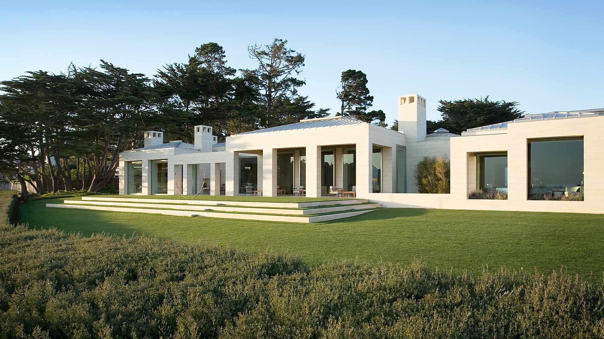
Monterey Peninsula Residence

Monterey Peninsula Residence

JL: What is on the top of your bucket list?

ST: Travel is always up there and I’m forever nursing a case of wanderlust.  So not necessarily in order - India for sure, Peru and Patagonia…Build my dream house one day… Perhaps my dream would be to tackle the interiors of the White House?   But that could end up a total nightmare...

JL: Favorite city in Europe?

ST: London…Paris…Rome…  you’re getting at that wanderlust thing with me.

JL: Favorite romantic weekend getaway?

ST: The Auberge du Soleil in the Napa Valley (Yes, I’m biased because I’ve worked on it for 30 years) … the Post Ranch in Big Sur is heavenly… and our little house in Montecito – simple perfection and muy romantico.

JL: What are you currently reading?

ST: I read multiple books at once and always have stacks by my bedside… Thrive by Arianna Huffington… Jay McInerney’s latest novel Bright Precious Days…  The Collected Stories of Louis Auchincloss, because he was a good friend of my father’s and I’m missing my dad… something about the Paleovedic Diet … A Pattern Language by Christopher Alexander which isn’t new but is utterly compelling for anyone interested in architecture, designing a house, getting it right… and the just released Interior Design Master Class by Carl Dellatore, a wonderful volume of essays on various design-related subjects to which I and many of my peers have contributed. A great read and a classic in the making which should be on everyone’s shelf!

Many thanks to Suzanne Tucker and Vera Vandenbosch for working with me on this feature!

Photo credits: Matthew Millman, Peter Estersohn, and Michal Venera

Miguel Villafranca & Brigitte Michelet - Villafranca Studio

Modern Day Stewardship of an Ancient Craft

By Joseph Lucier

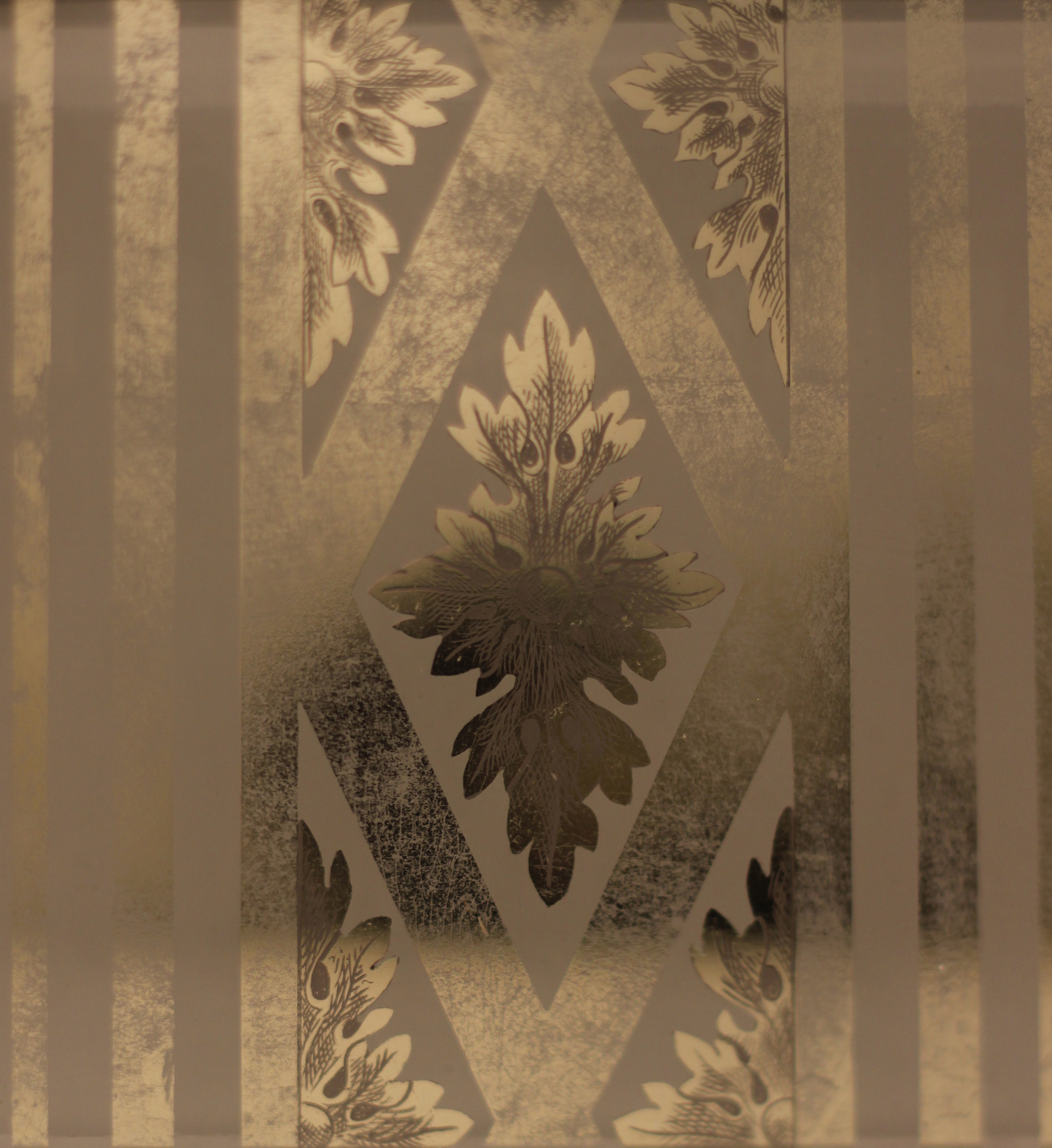
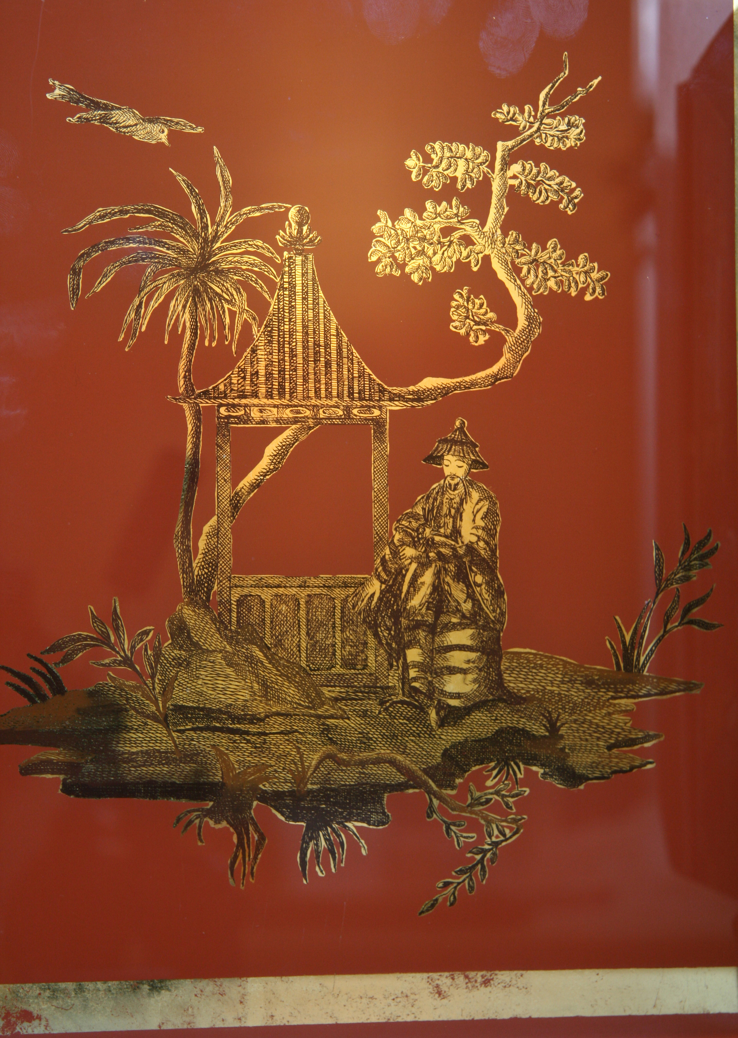
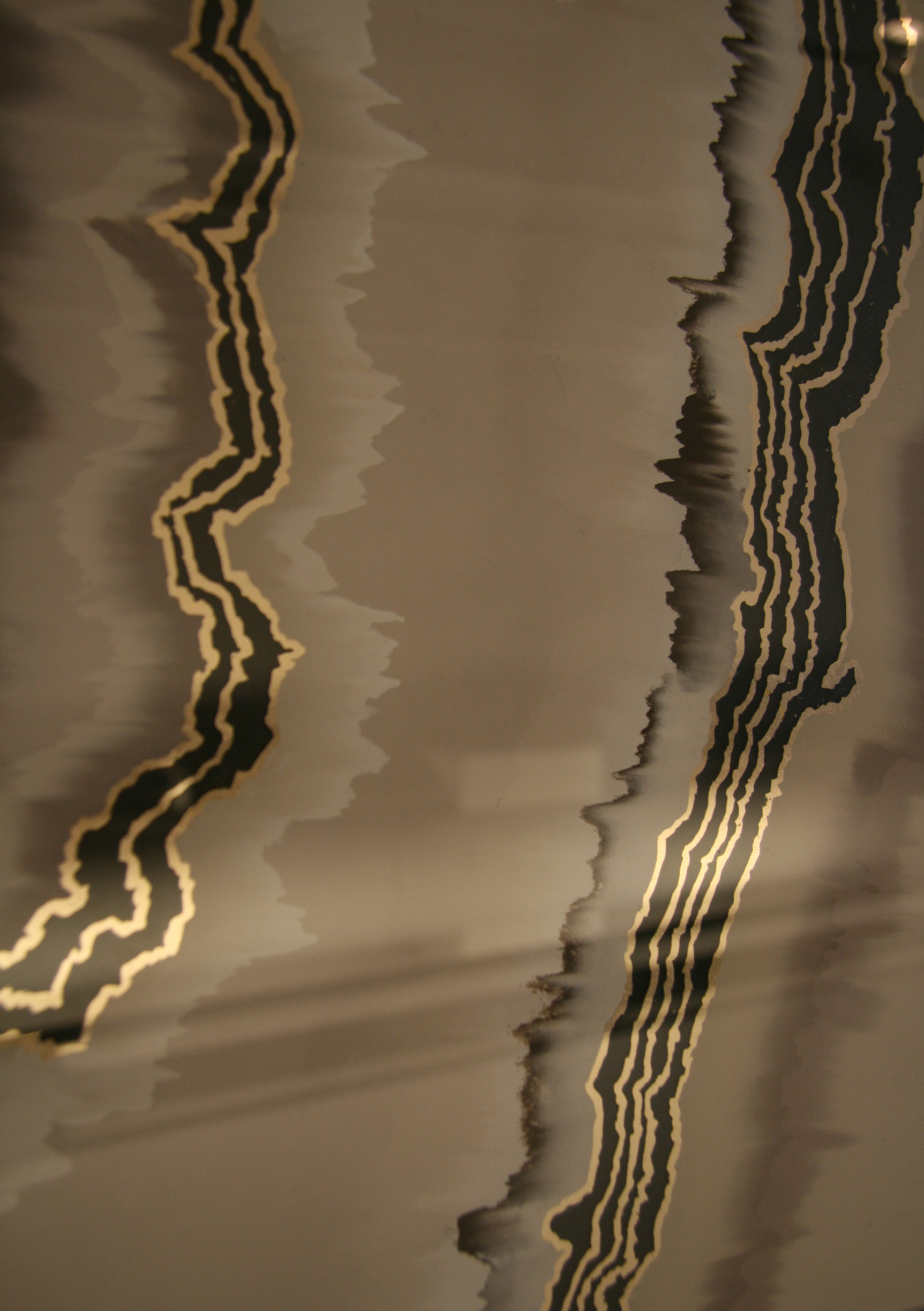
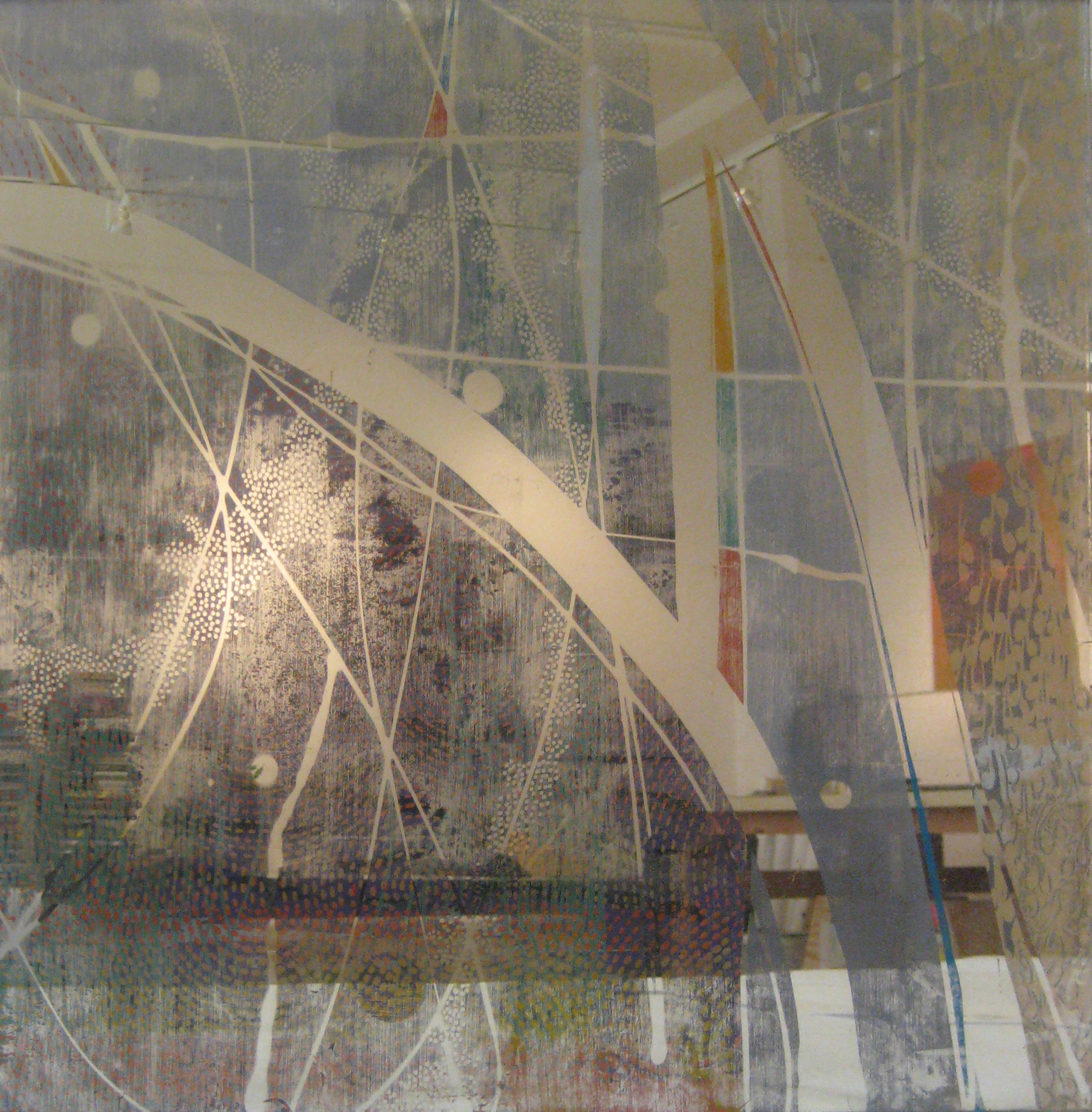
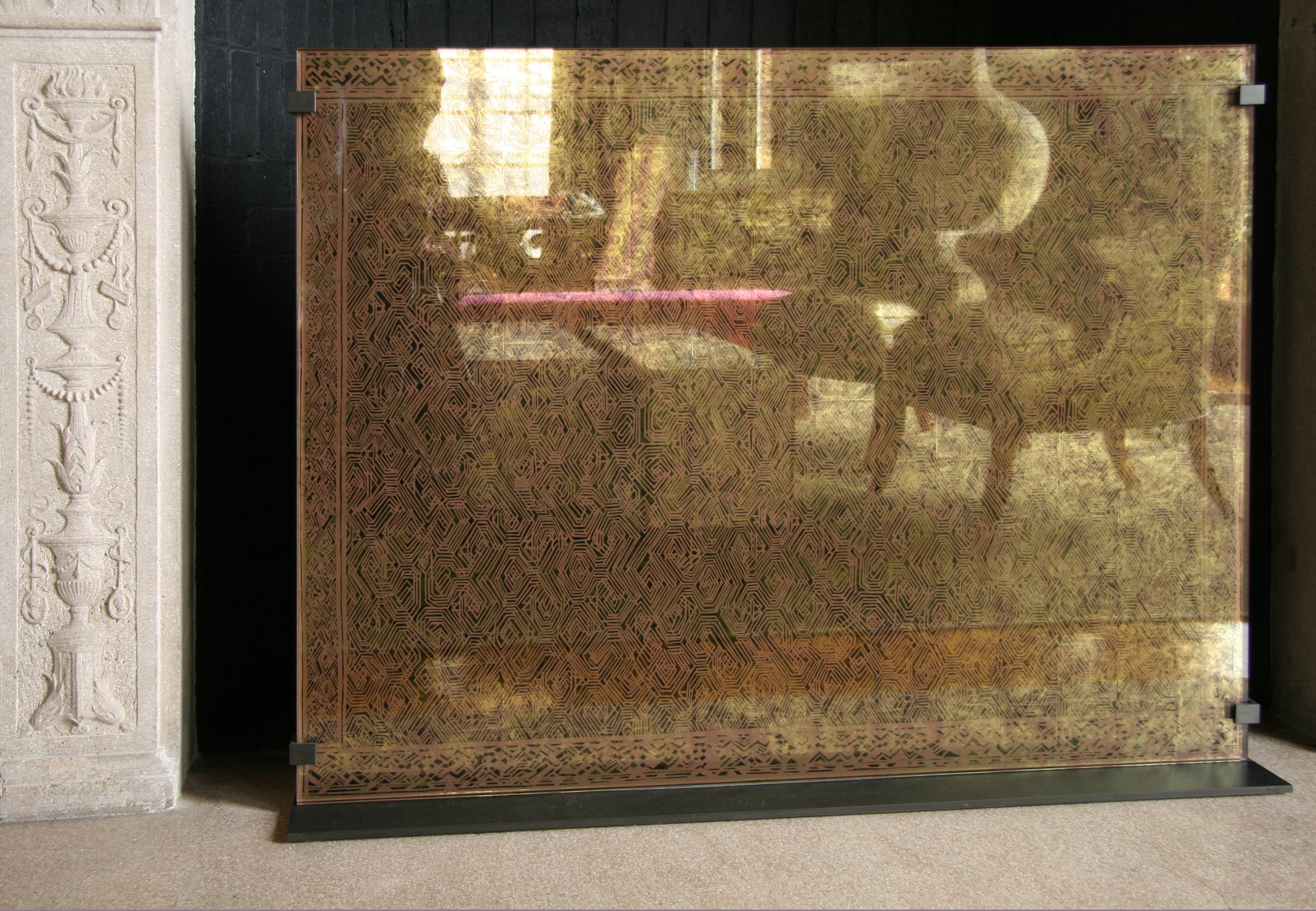
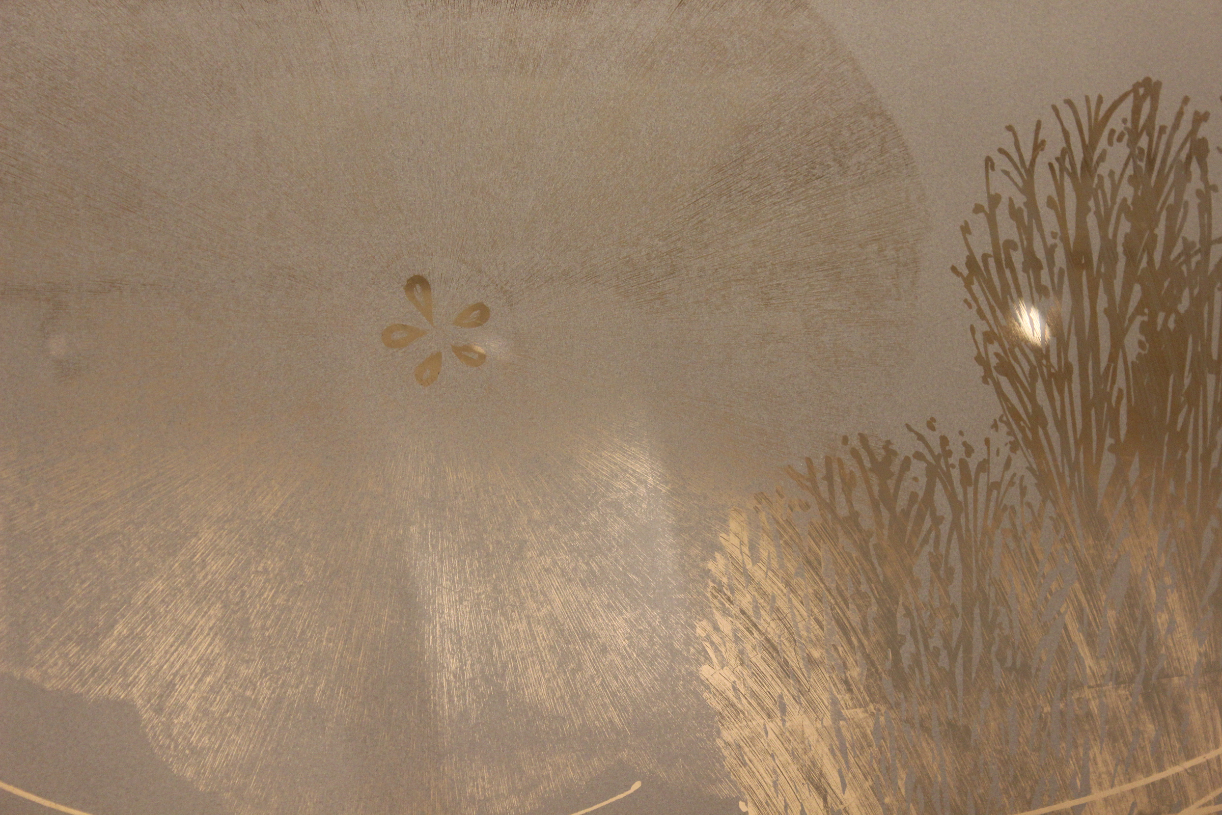
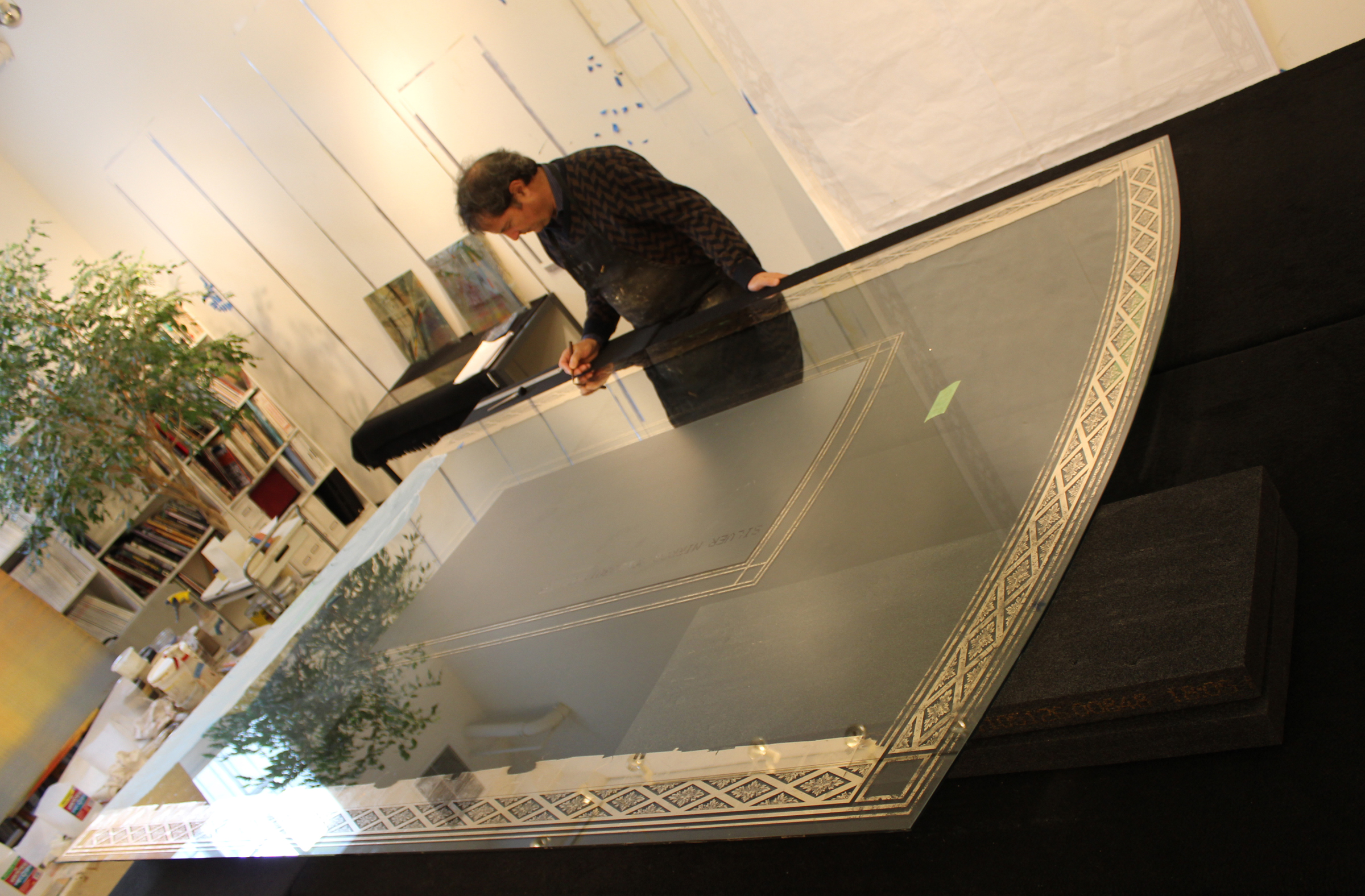
Verre églomisé is a technique dating back to the pre-Roman era, but its name is derived from 18th century French decorator and art dealer Jean-Baptiste Glomy (1711–1786), who is responsible for its revival. One of the key historical periods of the art form was in Italy during the 13th to 16th centuries when small panels of glass with designs formed by engraved gilding were applied to reliquaries and portable altars. In one of a number of related processes, the metal is fixed using a gelatin adhesive, which results in a mirror-like, reflective finish in which designs are then engraved.

Working out of a light filled studio in San Francisco's Bayview district, Brigitte Michelet and Miguel Villafranca design with passionate care and precision to keep this centuries old fine art technique alive. Collaborating with many of the Bay Area's top interior designers, their work graces the homes of knowledgeable clients that understand the importance of modern day artisanal patronage.  I was welcomed into Villafranca Studios recently by Brigitte's warm smile and a welcoming discussion of the technique led by Miguel. Theirs is a magical world where dreams come to life on the gold leaf adorned glass known as verre églomisé.

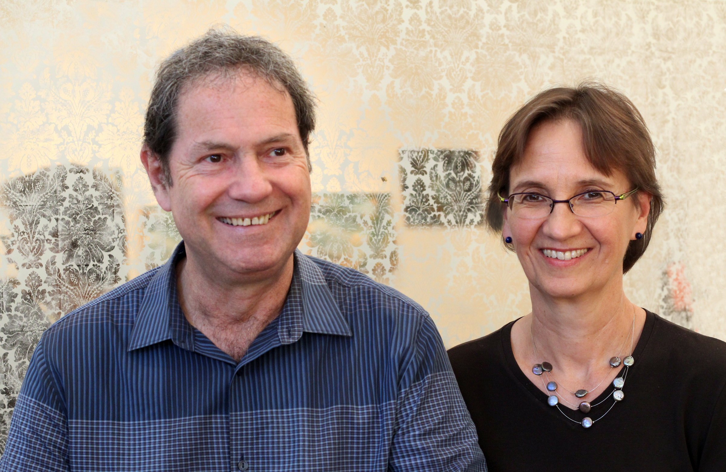
MIGUEL VILLAFRANCA & BRIGITTE MICHELET

MIGUEL VILLAFRANCA & BRIGITTE MICHELET

Joseph Lucier: Tell us about your studies in Paris that laid the foundation as professional fine artists.

Miguel Villafranca:  I studied architecture at The École Nationale Supérieure des Beaux Arts. Besides the disciplines inherent to the profession of architect, there was a large emphasis on architectural drawing, composition, perspective, landscape and human figure. At the same time, I took private painting classes using mediums such as oil paint, acrylic paint, and watercolor. With the school of architecture, we traveled twice a year to Italy, Spain, the South of France, and the Loire country to sketch and paint cityscapes and landscapes. These memorable experiences strengthened my training. It was at that time and in this school that, Brigitte and I met.

Brigitte Michelet: I also studied architecture for 2 years at The École Nationale Supérieure des Beaux Arts before attending The École Nationale Supérieure des Arts Décoratifs (ENSAD) for 4 years. Also casually called “the Arts Décos,” ENSAD is a school of art and design in Paris and is one of the most prestigious French grandes écoles.  I graduated from ENSAD where I studied with great teachers in different fields such as illustration, typography, graphic design, colors, animated movies, and engraving gaining a broad education in all the visual arts.

JL: What did you get out of being surrounded by centuries of art and architecture while being a student in Paris?

MV: Through being surrounded by centuries of art and architecture from a young age I acquired something we can call a “cultural capital.” It’s something intangible that becomes part of yourself and guides your aesthetic taste throughout your life providing bases and parameters to evaluate and appreciate beauty.

BM: I was born in Paris and studied there. It’s a magical city that had an enormous influence on me. I have always loved it, ever since I was a child, (I learned how to roller-skate under the Eiffel Tower!!). My exposure to Paris trained my eyes in a very unique way for all that is visual.

JL: Do you think there is a stronger sensibility and appreciation towards craftsmanship in Europe as opposed to the United States?

MV: I think that sensibility and appreciation towards craftsmanship manifest themselves in different ways in these two parts of the world. In the United States surprise and subsequently admiration and curiosity is often the response to a high level of savoir-faire. In Europe there is greater familiarity due to long-standing exposure to art in its many forms.

BM: I will not say stronger but different. In Europe, a cultural heritage has been transmitted through generations. European countries have a lot of savoir-faire in so many areas and there is a strong sense of aesthetics. In France there is a culture of memory so to speak; there, for centuries people have kept track of all kinds of methods, techniques in very diverse fields (food, arts, artisanship, architecture, etc.). It’s quite amazing what kind of treatises you can find in specialized libraries! The influence of history is strongly felt in Europe. The USA is a vast country that integrated many diverse influences in a shorter time period; being a young country, there is tremendous enthusiasm and eagerness in welcoming new possibilities and discoveries.

"I was fascinated by the double nature of the gold which appears darker or brighter and luminous depending on the circulation of light and depending on your own movementrevealing the kinetic aspect of églomisé glass which makes it so alive"

JL: What is it about verre églomisé that captured your attention and inspired you to learn the craft?

MV: Brigitte and I discovered verre églomisé many years ago in Paris while visiting an antique dealer. In his store, we saw a mirror with a frame in églomisé glass that left a strong impression on us. I was fascinated by the double nature of the gold which appears darker or brighter and luminous depending on the circulation of light and depending on your own movement, revealing the kinetic aspect of églomisé glass which makes it so alive.

BM: Yes, definitively light was a factor in this love affair! There was also the challenge of working in reverse that was appealing. When you paint on canvas or wood panel or whatever substrate, you build up layers of paint towards you because you will look at the final painting from that same side, the reverse side is not visible and the canvas or wood panel will even disappear from the sight of the viewer under the layers of paints. In églomisé the process is different. We are not only working on the back of the glass but we are also working with a reversed layout. So here is the challenge, you have to control what is happening on the front because it will be the visible side and consequently there is not a lot of space for mistakes! The glass panel plays three important roles. It is the substrate on which precious metals and pigments are applied, it is an integral part of what is seen due to its unique property of reflecting the light, and it importantly acts as the protection to the artwork itself. 

JL: How difficult was the process of teaching yourself this art form?  

MV & BM: When we started to focus on this art form, we saw that we could incorporate our lifelong experience as illustrators and decorative artists in the fields of painting, drawing, engraving, gilding and illustration.  It was a matter of adapting ourselves to working on glass and learning the principles connected to it.  We used all the knowledge and experience we had accumulated until then to master what we have called Églomisé Architectural Glass.  Our approach is a major change of scale from what the original technique was historically intended to be.

JL: What are some of the technical aspects that you have mastered over the years?

MV: I worked for 3 years in the 80s for a prestigious set décor atelier in Paris doing enormous canvases for the Opera de Paris and the Opera de Monte Carlo among others where I became very familiar with painting on a very large scale. Brigitte and I then became illustrators for magazines and books, drawing and painting on a very small scale; I switched from one-foot wide brushes to triple zero brushes, the smallest brush you can find! These two complementary experiences were very valuable to launch myself into the Églomisé Architectural Glass technique.

BM: Conceptual thinking in design, drawing and engraving.

JL: Have you had to educate design professionals to incorporate your work into their interior designs?

BM: We had the incredible luck to be in contact with extremely educated and talented interior designers; they recognized instantly the high value of our work and what they could do with it; it is rewarding to see that what we do is inspiring for them. So the process in that case is very enjoyable and we are very grateful to be involved in remarkable projects. Sometimes we meet clients who don’t know much about verre églomisé, which is perfectly understandable as it is not a common form of artwork and craftsmanship. In that case, we can help them with ideas, suggestions, concepts, showing them a variety of possibilities. We love the collaborative process of our work.

MV: Most of the time, the numerous samples we have, along with photos of completed projects, and a visit to our studio are enough to educate the designers or private clients who don’t know the technique of Eglomisé Architectural Glass.

JL: Are there particular qualities or personality traits that you see in yourselves and artisans who design for the home? 

MV: A great attention to detail as well as to the whole finished piece within its context. The ability to control and master our work ourselves from the very beginning of a project to the very end, a process that is not so common nowadays. I would also add that most of the artisans we have met are very kind, very gentle people, passionate about their work.

BM: I would like to also add that communication and the ability to listen are very important qualities in this profession. In the art field, sometimes respecting a project parameters can be seen as an obstacle to creativity, but I think it’s the opposite, they stimulate and promote creativity.

JL: Do you have a favorite placement for your work OR is there a particular room in the home that best takes advantage of the technique?

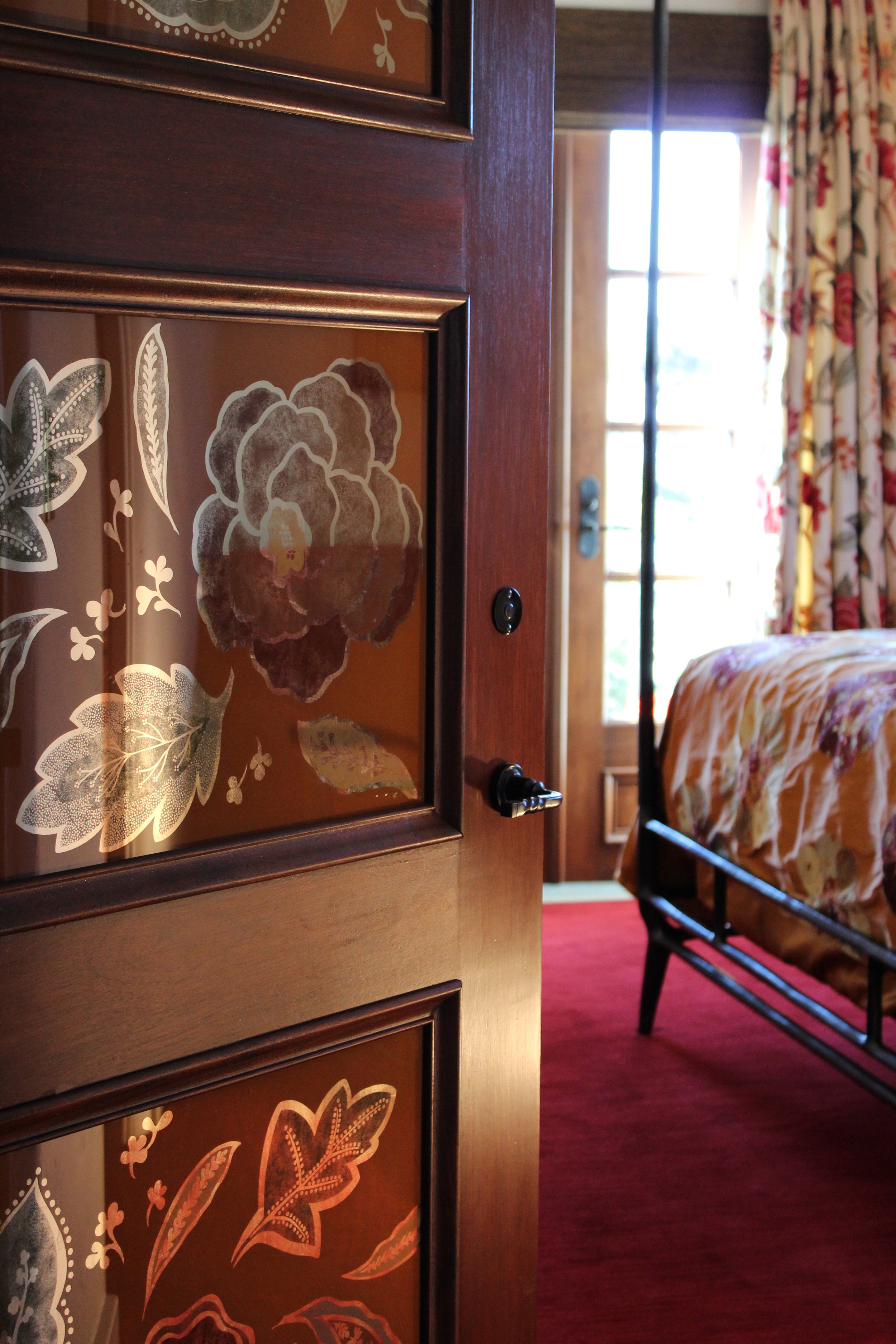
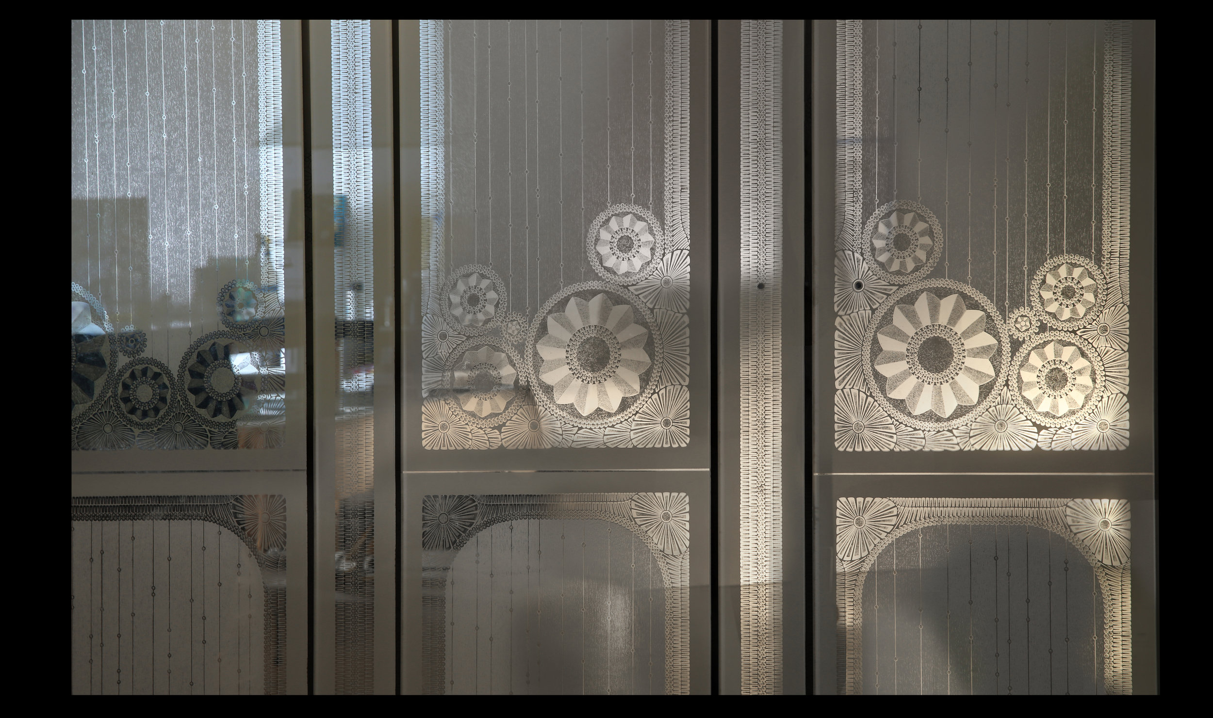
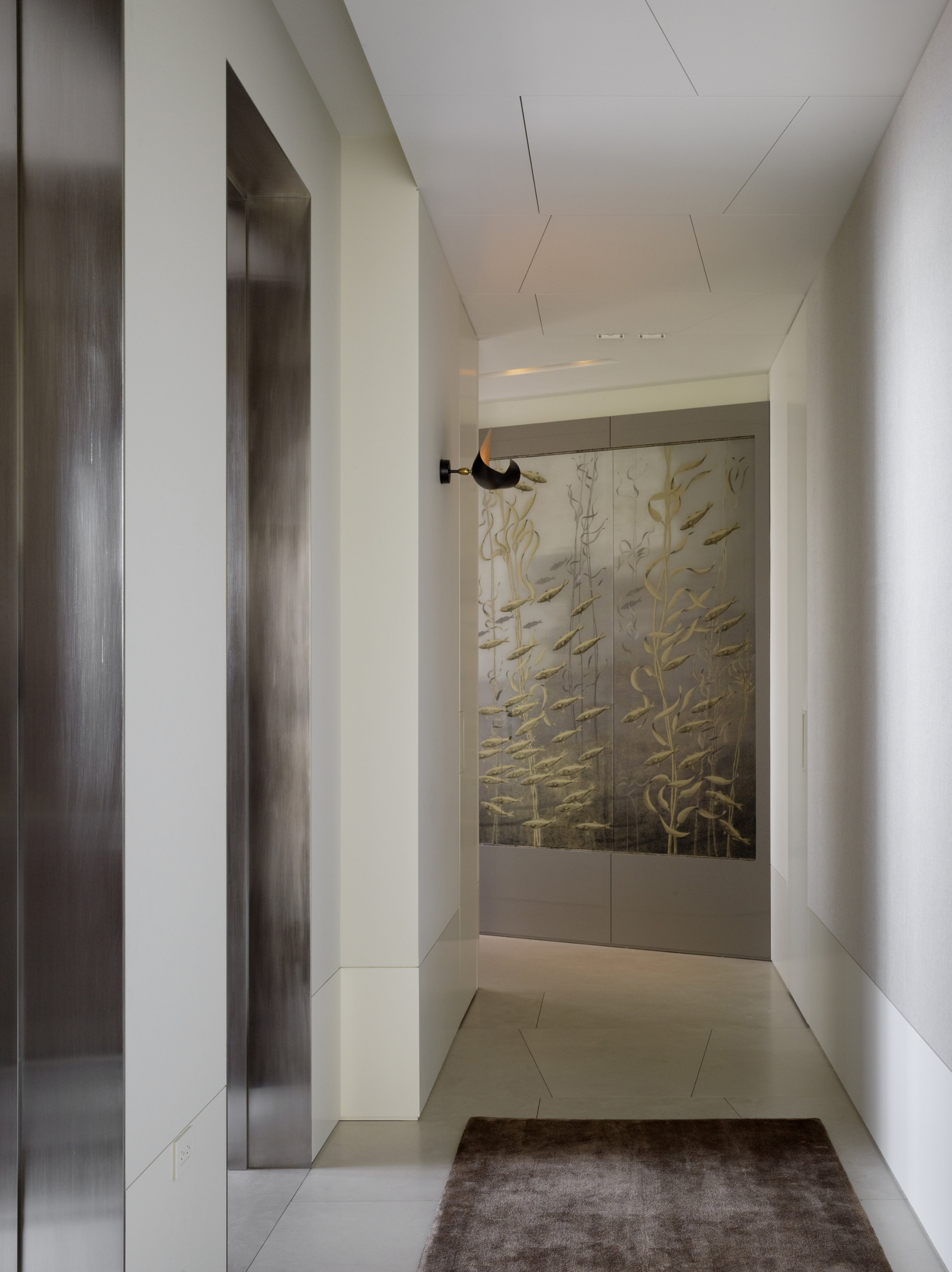
BM: Powder Rooms, Master bathrooms, dressing rooms, bar areas and kitchens are quite in demand because verre églomisé creates depth, space, and perspective along with an ethereal atmosphere. In addition, églomisé glass surfaces, in spite of their high refinement, are very easy to maintain and clean. Dining rooms, living rooms, foyers, hallways can be greatly enhanced either by églomisé glass paneling, an accent wall or an églomisé glass art piece.

MV: Églomisé Architectural Glass enhances each place where it is installed playing the role of a jewel within the space. As we can control the level of reflectivity of the panels they can go in every room of the home. For example, in a dining room, we can completely reduce the reflectivity of the panels since people prefer not to look at themselves while eating. Nevertheless the églomisé glass will create a poetic atmosphere with depth, perspective and soft reflections.

"Églomisé Architectural Glass enhances each place where it is installed playing the role of a jewel within the space."

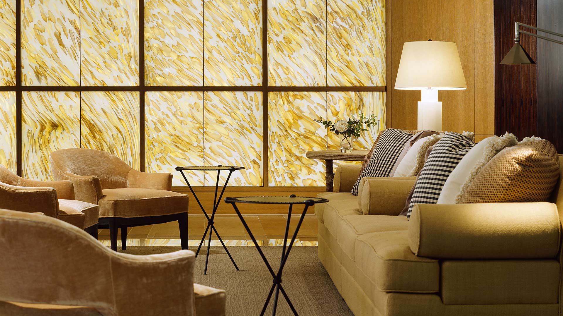
ÉGLOMISÉ GLASS MURAL COMMISSIONED BY ORLANDO DIAZ-AZCUY DESIGN ASSOCIATES FOR A SAN FRANCISCO PENTHOUSE

ÉGLOMISÉ GLASS MURAL COMMISSIONED BY ORLANDO DIAZ-AZCUY DESIGN ASSOCIATES FOR A SAN FRANCISCO PENTHOUSE

JL: What do you love about living in San Francisco?

MV: I love San Francisco! I think it would be difficult for me to live anywhere else in California because of the beauty of the Bay that one can enjoy from so many places in the city. I also love how close it is to the ocean, wine country, and the mountains.  I very much like the “Spirit of San Francisco” with its variety of people, and its multicultural aspect.

BM: San Francisco is a very vibrant and alive city full of charm. Because of its unique and exceptional location, surrounded by water, the quality of the light is very special, there is something ethereal about this city, it has an ever-changing mood. I even start to find charm in the fog! I like the diverse neighborhoods and the San Franciscans so far have taken great care of their city through time and it is very rewarding. It’s also very urban but at the same time the relation to nature is strong here, which is very healthy and contributes to the feeling of wellbeing.

JL: Favorite restaurants?

MV: Flour + Water for its creative dishes and its laid-back atmosphere - Saru Sushi Bar in Noe valley, a tiny little Japanese restaurant with exceptional tasty sushis in a warm, cozy atmosphere - Locanda in the Mission.

BM: Bar Tartine, my favorite Fusion restaurant, Una Pizza Napoletana, the most authentic pizza in San Francisco in a minimalist essential trattoria setting, and Farina.

JL: What are you reading?

MV: I am reading three books these days: The Great Transformation by Karl Polanyi, Llamadas Telefónicas  by Roberto Bolaño, and Rue Des Boutiques Obscures by Patrick Modiano who won the 2014 Literature Nobel Prize.

BM: Right now I am reading several books, three by Pr. Michel Pastoureau on colors, Bleu, Vert, and Noir. He is the first historian to specialize in the history of colors in depth, it’s very enriching. I’m also reading l’Africain by JMG Le Clézio, a beautiful novel based on childhood memories in Africa in the 30s-40s .

JL: What do you like to do in your free time?

BM: I never lived in a city by the sea before, so hiking by the ocean is one of my favorites things to do, it’s really regenerating. Spending time with Miguel and friends in the city’s museums, parks and gardens, in particular walking the many stairways in SF, it’s a great way to discover many surprising sides of the city.

MV: Besides all the promenades we do together, I like to practice new techniques in painting like encaustics (beeswax and color pigments).

MIGUEL VILLAFRANCA IN THE STUDIO

MIGUEL VILLAFRANCA IN THE STUDIO

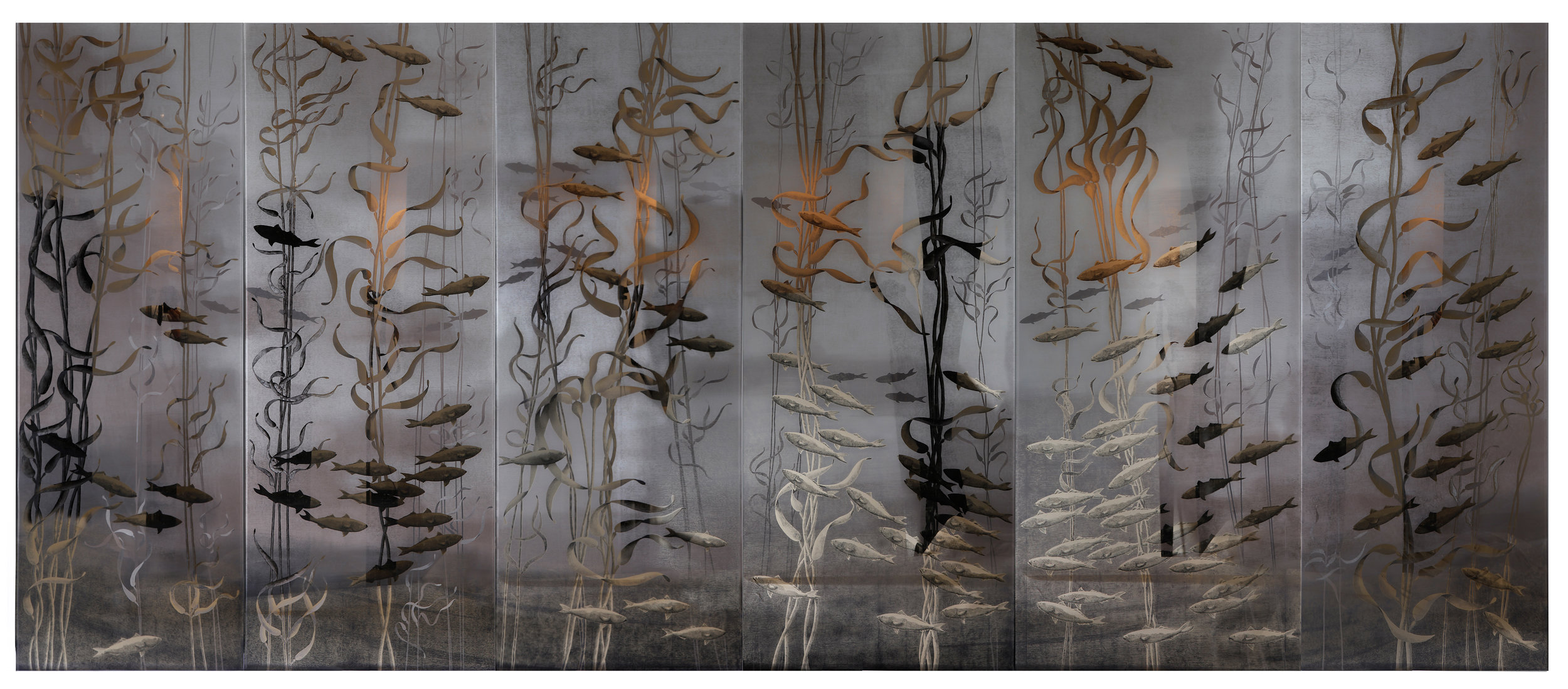
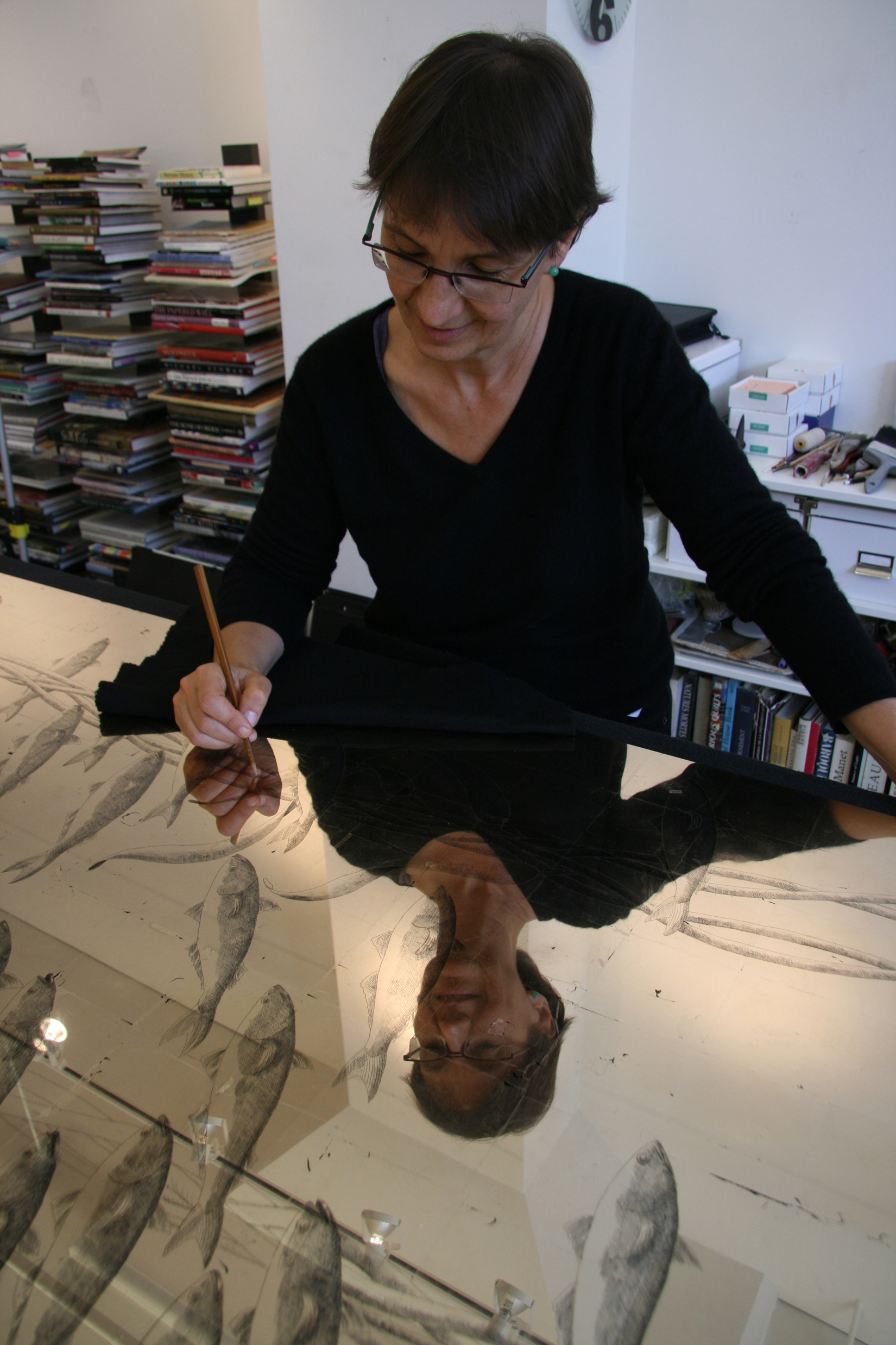
BRIGITTE MICHELET AT WORK ON SCHOOL OF FISHES

BRIGITTE MICHELET AT WORK ON SCHOOL OF FISHES

Please visit the website villafrancastudio.com

Projects included in this piece are from work with ODADA, The Wiseman Group, Navarra Design, Jabarra Athas Associates, and Kathy Best Design.

Photo credits: John Casado and Matthew Millman.

Villa Feltrinelli - BAMO

Sophisticated Italian luxury along the shores of Lake Garda

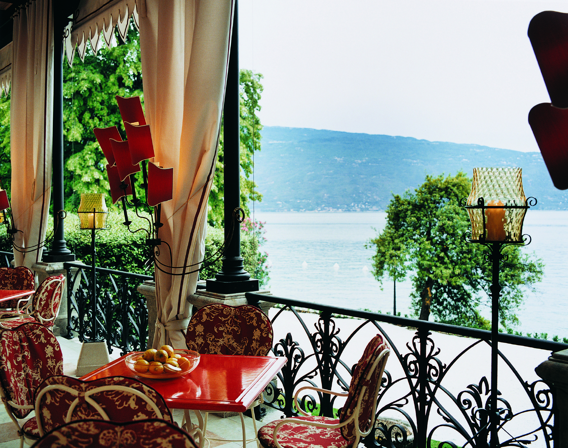
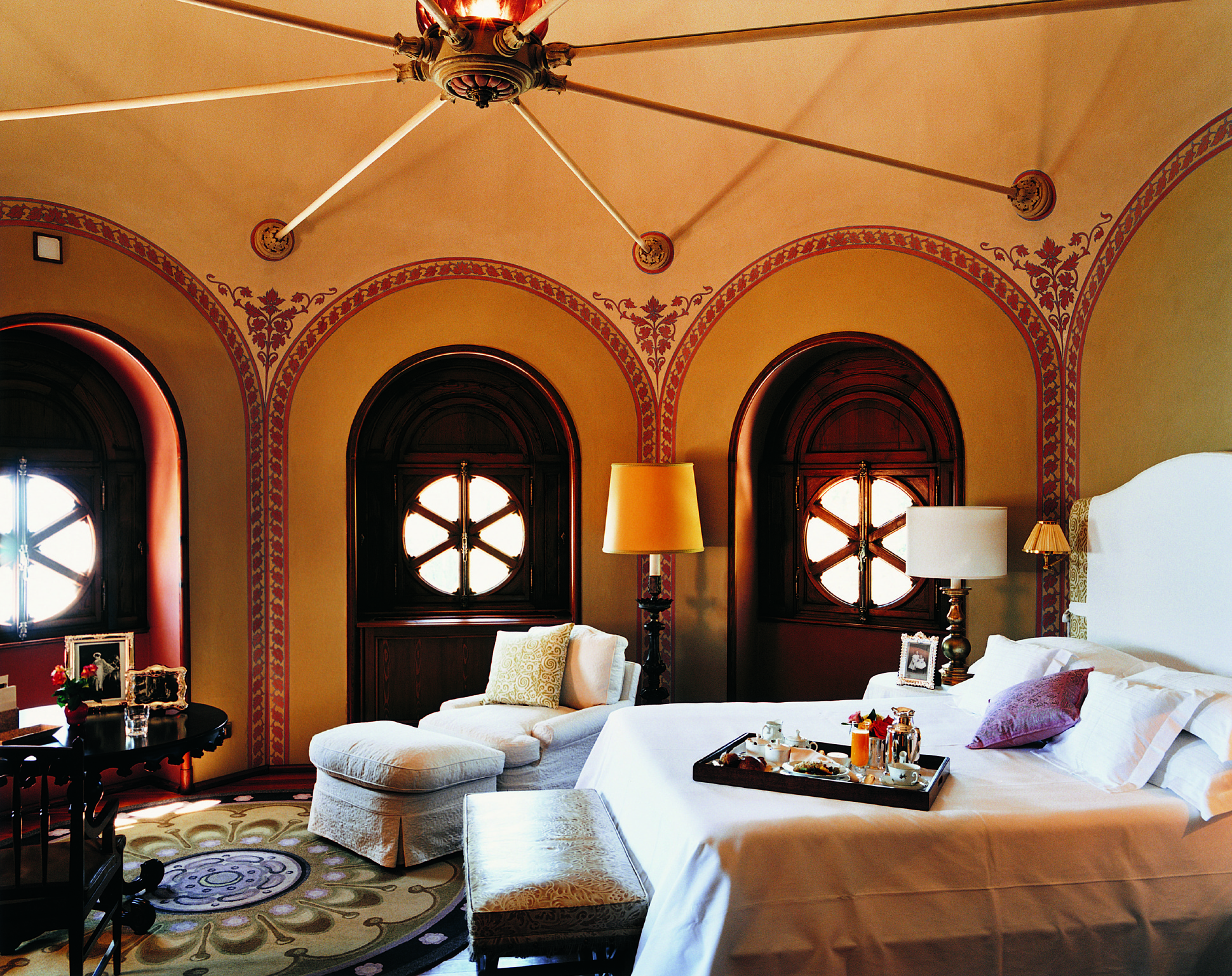
There is that day that we all wait for: when the phone rings and we are asked to come along for a ride – a ride into a dream from another world, maybe even another time.  Such was the case when Pamela Babey and Steve Henry of San Francisco’s premier design firm, BAMO, received a call from Bob Burns, an old client, friend, and collaborator. After the 1992 sale of his storied hospitality group, Regent International Hotels, legendary hotelier Bob Burns purchased Villa Feltrinelli along the shores of Italy’s Lake Garda and set about turning it into his perfect summer house.  Uncompromising to the last and with vast budgets blown, Burns ultimately brought in BAMO to fashion his retreat into one Europe’s most dreamy hotels.  
The Villa, built in 1788 for the Feltrinelli clan, had a storied past including an occupation by Italian dictator Mussolini, from 1943 to 1945, where he ran the Fascist puppet republic of Salo. Although the view of the water from his bedroom, now known as the Magnolia suite, didn’t appeal to him. Mussolini hated lakes.  Opening in 2001, Villa Feltrinelli offered guests a fantasy of towers and frescoes bathed in wonderfully lavish interiors and cradled by sumptuous lawns and pools of marble.  Having just completed a light-handed update of the Villa’s interiors in 2014, Pamela Babey and Steve Henry talk to CaenLucier about their personal stewardship of this legendary continental property.
Pamela Babey and Steve Henry

Pamela Babey and Steve Henry

CaenLucier: BAMO has a made name for itself in the hospitality space.  How did the firm get established working with hotel owners and operators?

Pamela Babey: With hotelier Bob Burns, it was with the Pfister office and a prior existing relationship with his earlier Regent Hotels. This led to the design of the Four Seasons Milan and the Villa Feltrinelli.  We first worked with Mandarin Hotels--probably because we were next door--and had experience in doing several hotels from previous offices and they were renovating.  It was a simpler process in the 1990’s.

CL: Villa Feltrinelli is such a magical location and a storied, family residence.  What was it that Bob Burns initially saw in the property and how did you work with his vision to create what welcomes guests today?

PB: Bob was fascinated by The Point in The Adirondacks.  The idea that one could stay in a lodge and feel “at home.”  The concept that you would not feel that you needed to lock your door, that everything was taken care of and personal.   Bob thought Italy could do this even better with more romance and style and the best food!  We began the discussions and the stories, worked with him for approval on the basics, and from there we just built a dream.

CL: You mentioned that exceptional hotels come from exceptional property owners.  How have you seen Burns’ style mature over the years as an hotelier?

PB: For me Bob did not mature… he was perfect, he had done this for years top to bottom.  Steve and I matured.  We learned to care about every little knob, and hook and painting: every cushion, every chair’s comfort and purpose.  It was an amazing experience.  Then to top it off, we worked hand in hand with the training of staff until the opening celebrations.  It was a complete sort of project rarely seen today.

"The setting of the house on the lake, the constant sounds of the waves, the breezes, and the majestic old trees in the gardens.  The Villa interiors are amazing, but when you add in the atmosphere of the surroundings, it becomes a full sensory experience."

CL: Do you remember the feeling you had when you saw the villa for the first time?

PB: YES, It was a chilly February night. The project manager picked me up from the Milano train, and we drove over the hill at Salo on a very damp night.  Driving up the lake for about an hour was rather romantic, and arriving at the villa, coming down the steep drive to a deserted house, was mysterious. Walking in through the padlocked doorway, into the poorly lit foyer was almost disheartening!  Its feeling was sort of lost in time, with no sparkle.   The next day under the sun and glitter of lake, all possibilities were apparent and the future was thrilling. 

Steve Henry: Absolutely, it was late afternoon and all the rooms were shuttered. Lightbulbs dangled in the center of each room by a wire illuminating the most wonderful painted ceilings and woodwork—all covered in decades of dust and cobwebs. I opened a shutter in what would become the bathroom of Turchese and a bird fluttered and snuck out to the gardens through a busted window.

CL: How does it feel now when you revisit the property?

PB: It feels fabulous!  It is breathtaking and such a marvelous location.  No wonder some guests come back each a season.

SH: It feels like going home. When Pamela and I returned in 2014, it was the first time I’d been back since the opening in 2001. Everything was absolutely the same as we’d left it. It was impeccable. We sat on the terrace and had a glass of prosecco as a guest departed in a helicopter right beside us.

CL: What parts of the property are most inspiring to you?

PB: The walk along the lakefront.  Sitting on the “front porch.” Closing the door behind you in the cool dark Veneziana room, I love it.

SH: The setting of the house on the lake, the constant sound of the waves, the breezes, and the majestic old trees in the garden. The Villa interiors are amazing but when you add in the atmosphere of the surroundings, it become a full sensory experience. 

CL: Did you try to give the interiors a specific Italian look and feel or, simply, old money elegance?

PB: Definitely understated.  No cliché glamour.   But guidelines of fresh, Italian. Italian-made, and with objects from the family visits around the world.

SH: When we first designed the Villa, I would bring things to show Pamela and she would always say to me, “That doesn’t look Italian. We have to make it an Italian country house”, so I learned!! As the project neared completion, everyone’s curiosity was so heightened. Mr. Malzonni, the head restoration expert was always puzzled, trying to understand what our final rooms would look like. He was expecting a very serious Italian museum-like approach and he was so pleased that we respected the integrity of the rooms but brought a very livable, relaxed atmosphere of a private home - one that was lived in and nurtured through the generations.

CL: When you completed the project, what rooms or attributes of your work please you the most?

SH: I was happy that we were able to achieve a really layered atmosphere.  As you walk from room to room, you truly feel like you are a guest in a luxurious private house. In other words, there is a very strong point of view that is consistent throughout all of the Villa.

PB: There is a feeling that you could “live there,” it is not untouchable and precious. It may not be apparent in the photos, but when there it is very comfortable wither you curl up on the terrace sofa with the newspaper and coffee, or drew up for dinner in the evening.

CL: How do you define luxury?

PB: Luxury here is a sense of freedom, an environment of pleasure and satisfaction.  A visual calm and the presence of nature is definitely a key player here.

SH: To me, luxury is being taken away from my day-to-day world and given a wonderful experience that enriches my life. Luxury is an escape from the real world.

CL: How did you approach your recent updating of the villa?  Were there specific items on the list to tackle and were there improvements that were identified organically from a second look?

SH: For our “new look” we were very careful not to change the mood, but we definitely lightened the palette and a new “summery attitude” to the rooms. The Villa is open from the spring through the early fall, so it’s a summer place by the lake.

PB: Part of how we approached it was to include artisans and workshops from the local area to do paintings and slipcovers, so they have a personal, vested connection to the property. We wanted most of what was done to be Italian, all of the craftsmen and workrooms are from the surrounding villages and towns: the painter, the woodworker, the seamstress.

CL: What is your viewpoint on the importance of a hotel’s guest reception experience?

SH: At the Villa, it’s a very old fashioned greeting – the charming married couple Gabi and Peter meet you on the front terrace with a bouquet and glass of champagne as your car sweeps down the drive and the front entry is brought into focus. It’s a bit like arriving at Downton Abbey. They whisk you inside and out onto the lakefront terrace while your luggage is taken to your room and unpacked for you.

PB: When arriving you see little glints of the lake through the trees, stepping inside to the cool foyer and seeing the full lake view is both exciting and calming.  I think this sets the mood for the visit.

CL: How does a particular property inform design decisions?

SH: You always have to let the individual property lead the way. You have to do what the project wants, not necessarily what you want as a designer. For the Villa, each guestroom is different and unique. Since it was to feel like a grand country house, there are tons of antiques and objects that we bought in little towns throughout the region. These give that personal flavor that we sought.

CL: How do you approach a master bedroom and bath in a hotel as opposed to a private residence?

SH: For a hotel, you are striving to please a broad range of tastes. For a residence you are working directly with one of two people to give them exactly what they need. The design becomes much more personalized.

PB: On this property we have sort of two styles, the Villa has a white marble and tile environment that is “more of the estate.” While the buildings scattered on the gardens, the Casa di Fiori, the Rustica, and the Limonaia, have hand-painted tile bathrooms that are a bit more of the “Italian Countryside.” Both have every comfort and every element well placed and thought of. 

"You always let the individual property lead the way. You have to do what the property wants, not necessarily what you want as a designer."

Jerimiah Goodman's Rendering of the Salon

Jerimiah Goodman's Rendering of the Salon

CL: What other hotels in Italy or, for that matter, internationally do you dream about?

PB: Aman in Venice (I want to redo it) and I want to see the Ritz in Paris.

CL: Speak to our readers about the importance of lighting.

SH: It is super critical and when it is done right, you aren’t consciously aware of it at all. You just know that something has been done to make the room look just right. What Bob Burns taught is that when dining, nothing makes a person’s face look more seductive than when lit by the warm light of a well-placed lamp. So when we designed the dining room at the Villa, we dotted red silk lampshades around the room, and created new wall sconces that look as if they had been there forever— and they have red shades too. Then we did clever things like developing historically evocative up-lights that softly light the old painted ceiling. Our lady in France who developed them from our sketch called them “the black lettuces.” Everything goes into place and then we dim all of the lights so that each one plays its own individual role.  

CL: How has your experience given you an eye and a feel for layering details and finishes?

SH: The layering of a room gives it personality and richness. A new client came to us to do their house in New York because they loved staying at the Villa on their wedding trip. When I quizzed them as to what they liked about the Villa, the husband said, “Everywhere my eye looked, I saw an intriguing detail.”

CL: At this point in your career, what would a dream project look like?

SH: Honestly it was our recent refresh of the Villa, because our client told us to “just do what you feel is right.” It takes a lot of confidence for a client to give you that brief and then to let you run free. They didn’t hover and question what we did. Every detail of every room was reconsidered but with the overarching idea that a return guest would arrive and think , I don’t know what was done but somehow it feels even lovelier that I had remembered.

Arrivederci...

Arrivederci...

Stacey Caen and Joe Lucier thank Pamela Babey, Steve Henry, and Alyssa Terry for the creation of this feature!
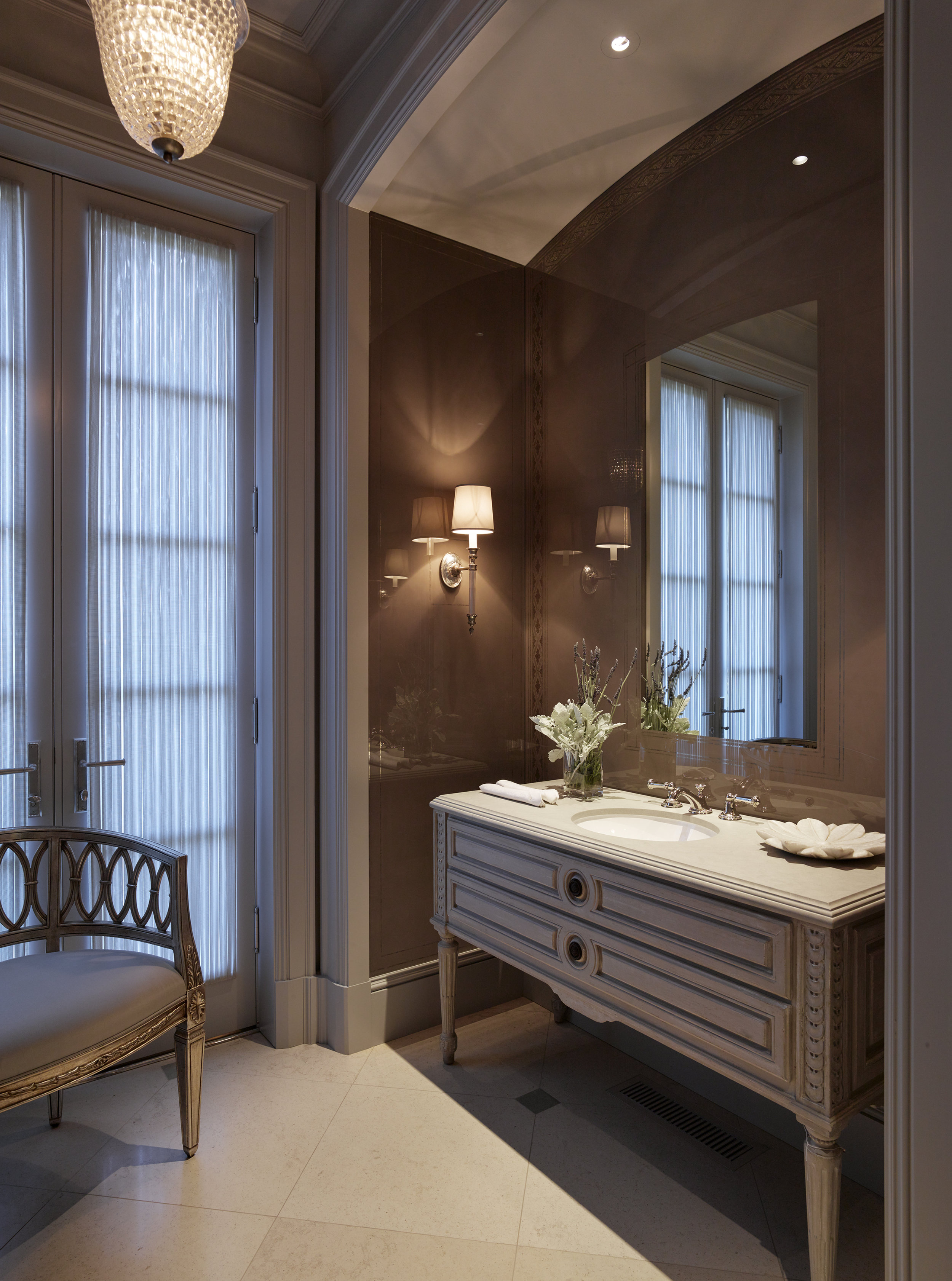
Image credits
Renderings: Jeremiah Goodman
Photographers: Oberto Gili, Henry Thoreau, Ottovio Tomasini, Lucas Allen, BAMO


BAMO - Residential & Hospitality Design

The timeless elegance and sophistication of BAMO

In 1991 BAMO was born.  Initially working together at Charles Pfister's eponymous San Francisco design firm, Pamela Babey, Michael Booth, Gerry Jue, and David Moulton set out to carry on the principles of Pfister’s firm as a foundation to explore their collective talents and create the BAMO alchemy of quality, service and attention-to-detail.  With the addition of principals Dorothy Greene and Steve Henry, the firm has built a reputation that solicits calls from the hospitality world’s top tier as well as the world’s most discerning residential clientele.  To experience a BAMO project is to admire a work of art – one that defies fads with timeless elegance, formulas with inventive design, and everyday life with the sophistication of true luxury.

CaenLucier had the opportunity to sit down with these San Francisco design luminaries to offer our readers an opportunity to hear the dialogue inside the heart and soul of BAMO. Enjoy the read!

BAMO - Gerry jue, dorothy greene, michael booth, steve henry, and pamela babey

BAMO - Gerry jue, dorothy greene, michael booth, steve henry, and pamela babey

CaenLucier: When BAMO formed in the early 1990s, what design principles were brought along from the team’s prior work with Charles Pfister?  Do any of those design maxims remain today?

Michael Booth: Yes, those maxims still resonate today. You need to watch the Charles Pfister video on YouTube. Pamela, Gerry and a little bit of me are interviewed extensively about Charles personally and his firm. You’ll learn all you need to know about the roots of that office. That said, we have moved on with our own identity and the Pfister legacy is part of our history.

Gerry Jue: We brought many design values with us from the Pfister office: e.g. a strict attention to detail, the importance of lighting, and clarity of color.  But we also felt that the new firm was, and still is, our opportunity to explore new ideas and new ways of achieving them.

CL: How have you seen the interior design profession change over the last 25 years?

MB: That’s a big question. Biggest for me is the level of sophistication and “worldliness” of our core client base which has grown dramatically.  

Dorothy Greene: Maybe as a result of this, we’ve seen a gradual change from illustrating or presenting a design to the client, to a more immersive process of narrating the full story of the design – from context and inspiration through to the resulting design concept.

GJ: The way designs are generated, studied and presented has changed drastically. Twenty five years ago everyone from partner to intern communicated about design through drawing - it was the common language regardless of age.  And drawings, along with physical models, were how we presented a design.  Since then, technology has really changed everything - from how we work inside the office to how clients expect design work to be presented, to how much financial resources are needed to service that technology.  And all of that in half the time we used to have!

"A true collaboration and open sharing of ideas between the architect and interior designer will create the most seamless and successful projects."

CL: Working on hospitality projects all over the globe, how do you best succeed with different cultural business practices and construction work ethics?

DG: That’s a great question.  Each country has its own cultural communication and construction process, and conducting work in, for instance, Brazil is a much different process than working in a country like Japan.  The key is to listen, observe, and adapt.  The goal is always the same – to have a successful project for everyone involved – and we realize that the road to reaching that goal may not be the same for each project.

CL: You have had a client in Japan for over 25 years.  What benefits and challenges, if any, does such a lengthy relationship offer?  

GJ: The benefits come from knowing each other so well; the challenges come from knowing each other so well, too.  We're like an old married couple!  It's a constant struggle to keep the relationship - and the work - from getting stale and predictable.  Sometimes we have to push hard to get new and innovative ideas approved.  Through it all, however, the trust and respect we have for each other comes through in the finished work. 

CL: When you dance the perfect dance with an architect during the design process, what does it look like?

MB: A beautiful marriage between inside and outside that one would never know or appreciate until you see it finished.   

DG: A true collaboration and open sharing of ideas between the architect and interior designer will create the most seamless and successful projects. 

CL: LEED certification receives a tremendous amount of attention these days.  You were involved in a “ground up” residential project in Portola Valley recently. What was that experience like?

MB: It was one of the most valuable and interesting later-life learning experiences I’ve had. It was a truly “hands on” learning process about sustainability and the holistic nature of the building, occupants and community beyond. For me sustainability is about responsibility.

CL: Does BAMO have a signature look in the hospitality world?

MB:  Quality.   

DG: A reputation in the hospitality world for quality, service and attention-to-detail.

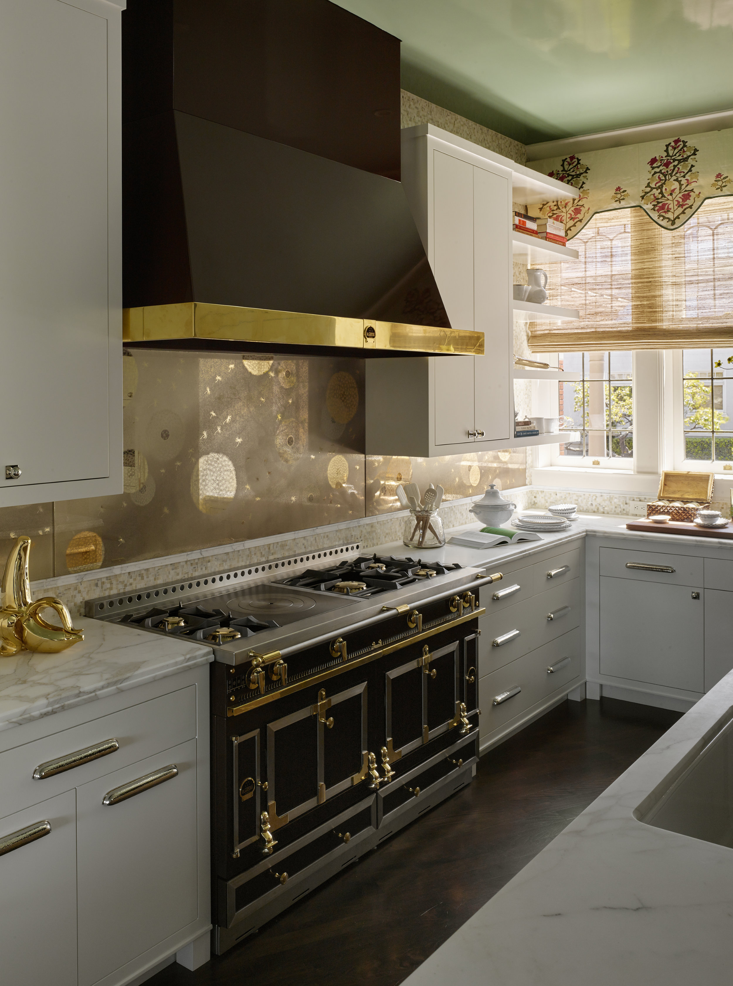
"One project having both hotel guests and residential owners opens up tons of exciting challenges...hotels that are as comfy as residences, and residences that are as glamorous as hotels."

CL: You are currently working on creating new ‘entry experiences’ and amenity areas for a few office building projects. Where do you see the similarities and/or differences in creating this experience as opposed to a hotel or a private residence?

GJ: That’s funny because our office clients want us to bring our hotel experience to the design of the building entry and amenity areas.  In either case, the goals are similar: create a ‘wow’ moment, foster activity and buzz, and make everyone look great. 

DG: Hotels and public lobbies play to a wider audience and usually aim to make a strong impact. When designing an entry to a private residence, sometimes the project calls for a ‘wow’ factor experience, but more often it takes on a more subtle and personal mood.

CL: BAMO has grown along with the advent of residential ownership being integrated into hotel projects.  You have recently completed such a mixed use project for the Four Seasons in Bangkok.  How have you seen this overall real estate package refined over the years?

GJ: In the early days, it seemed that the main purpose of residences was to pay for the hotel; now the hotel is often there to sell the residences.  Of course, from a design point of view, having both integrated into one project and having to think about both hotel guests and residential owners opens up tons of exciting challenges and opportunities: hotels that are as comfy as residences, and residences that are as glamorous as hotels.

CL: What are your favorite aspects of working with residential clients?

MB: Interpreting their goals and aspirations in ways they may not have thought of before.

CL:  Explain the importance of lighting.

MB: It is absolutely critical to the success of any interior design. It sets the mood, ambiance, and comfort of the occupants.  

CL: Are there any occupational hazards when you personally select a hotel for a special vacation?

MB: Many. The more expensive the hotel the greater potential for disappointment.

GJ: If it's not perfect, either the manager will drive you crazy or you will go crazy yourself!

CL: What does the perfect Sunday morning look like?

MB: Beautiful linen sheets, sleeping children, and a snoozing dog. 

DG: Coffee, quiet, and time to flip through the Sunday NYT and Saturday WSJ.  The only days of the week I get physical newspapers anymore….

GJ: Dark, because my eyes will be shut tight; comfy, because I'll be in my own bed; and quiet, because no one else is awake yet. 

CL: What are you reading?

MB:  "American Heiress" by Jeffrey Toobin

DG:  "Just Mercy" by Bryan Stevenson

GJ:  "Dead Wake" by Erik Larson and "The Shadow of the Wind" by Carlos Ruiz Zafón

CL: Do interior designers ever retire or do they design forever?

MB: They never retire, right up to designing their own funeral probably.

GJ: No, we will always rearrange the furniture in our hotel rooms!


Stacey Caen and Joe Lucier thank everyone at BAMO that came together for this feature!
Eric Friedman - Ryan Associates

The Devil is in the Details

For over three decades Ryan Associates have built exceptional homes in San Francisco, the Napa Valley and beyond.  Having had the pleasure of representing a number of these properties for sale, CaenLucier reconnects with Eric Friedman of the San Francisco based firm to discuss highlights of past and current residential projects, a look behind the scenes at the art of fine building and the ins and outs of working with architects, designers and his noteworthy clientele. 

CaenLucier: You have worked with Ryan Associates for over two decades.  How has the profession of high end renovations grown/changed over the years?

Eric Friedman: I don’t think we’re able to print houses yet, but there’s plenty of amazing modeling software out there that really helps to communicate design intent as well as solve the possibility of certain construction problems. We commonly use software to program the CNC router that make perfect parts every time, but for the most part we still make things by hand.

CL: What sets Ryan apart from other builders in the Bay Area?

EF: I think if you talk to our subcontractors they will tell you that there are many fine builders in our community, but Ryan is a league apart.  They’ll tell you that we do all of the things required to help them be successful enabling them to do their best work.  We’ve worked really hard to forge these mutually beneficial subcontractor relationships, but ultimately our design partners and clients are the winners.

CL: What are the most common mistakes clients make when interviewing a general construction firm to build their home?

EF: The danger that clients face is not understanding the consequences of hiring their team piecemeal.  They have to understand their motives and goals for the project and then need as much coaching as possible in unifying those interests in building their team. The traditional point of view of the owner is that you hire the architect first. The traditional approach works just fine if the architect believes, as we believe, that collaboration is a fundamental part of a successful project. One of the keys to our success has been our ability to team build on the client’s behalf.  It’s really a question of drawing out from the client what their top priorities are, what their design instincts are, and then start to match the correct design partners and resources.

CL: San Francisco has many talented designers and architects.  Who are a few of your favorites to work with?

EF: Our interest is in working with architects and designers who are invested in the collaborative process and who value the services we provide. We’re not attached to working with starchitects.

CL: How would you describe the perfect Ryan Associates client?

EF: The perfect Ryan client is clear around their goals, is invested in everybody being successful and wants to have fun along the way. It helps if they don’t think of themselves as a builder, designer or tradesperson.  Clients who understand they’re in a rarefied territory and rely on our expertise really get the best performance from us. 

CL: What is the most fun part of your job?

EF: I get to work with a range of incredibly talented and gifted people who inspire me on a daily basis.  Architects, engineers, all the makers and builders, but especially my co-workers for whom I have unlimited respect. It’s a really good feeling that comes when putting in an honest day working with our crew.

CL: Tell us something we don’t know about Ryan.

EF: We’re known for doing the big house on the hill, but our core business is the $1m to $5m remodel.  We are in the service business and are set up to do small projects and service work.  We want to take care of our clients’ homes forever regardless of the need.

CL: What is your most favorite project that you are working on right now?

We’re doing a modest but lovely 2,500 square foot bridge-to-bridge apartment on Russian Hill in a somewhat disintegrating 90 year old building.  The clients are so happy and excited that the good feeling has permeated the dozens of people that have contributed to the effort. It may or may not get published, however we’re very proud of what we’ve built.

Andrew Skurman - Andrew Skurman Architects

The City's Finest Classical Practitioner 

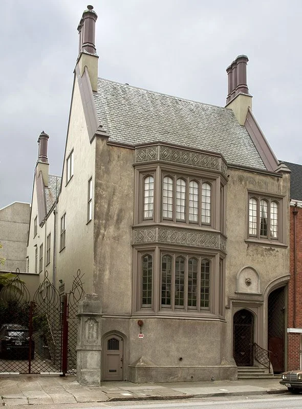
Launching our monthly series featuring San Franciscans of note, CaenLucier sits down with the city's leading classical architect, Andrew Skurman, to discuss his reinterpretation of one of Pacific Heights' last existing duplex apartments.  2000 Washington Street, originally designed by Conrad Alfred Meussdorffer in 1922, is one of the city's landmark residential buildings. It grandly sits adjacent to Lafeyette Park and the Spreckels Mansion where Danielle Steele resides when in town. 

CaenLucier: You have had many projects at both 2000 Washington Street and its elegant neighbor 2006 Washington.  What is it about these buildings that inspire the classical traditions your firm embraces?

Andrew Skurman:  2000 and 2006 Washington were built in the 1920s, with no expense spared, and with the most elegant classical interiors. One of the the apartments was designed by Julia Morgan. They all have high ceilings, large column free spaces and orientations that allow for an effortless reconfiguration that takes advantage of the glamour of classical design. 

It is by the way possible to recreate a classical home in a very modern building, but it takes a lot more effort. In order to do that, a client of ours built a second set of classical French windows in front of the building's standard modern windows. It does work really well and one cannot imagine the bare sheet rock walls behind the paneling, moldings and details

CL:  As I remember, your clients purchased the full floor apartment completely gutted. Did this offer any advantages?

AS:  When an apartment is old and in bad condition, it might be less expensive and one can achieve better results by gutting it rather than changing just part of it. You are then completely free to redo all the electricity, heating, and plumbing to modern standards, and to conceive a completely different floor plan that takes advantage of every square inch of available space.

Gutting allows for a complete re-creation and the imagination of the client can really flow. But in buildings of quality, there usually are elements that should not be eliminated but reworked. I love to find charming elements to retain and build upon. It saves expense as well as maintaining the original historical beauty. In one of these apartments, we reconfigured everything except for a delicate and beautiful dining room. Which we restored with care.

One of the apartments at 2000 Washington Street is morphing into something different for the third time. When we first created it, it had dark wood, a colorful palette, and traditional furniture. Then, under the magic wand of Fisher Weisman, it had a kind of a facelift, it was entirely painted white and became one of my favorite things: a classical background with modern furniture. We are now completing a third remodel on the same apartment! But our black and white marble floor in the entrance and many other features have remained through all the changes.

CL:  How do you feel your interior architecture decisions held up when the visual palette changed from traditional to contemporary after we sold it to our clients?

AS:  As an architect, it is wonderful to see a space you created evolve under the impetus of the new owner’s taste. There isn't just one kind of beauty, one esthetic or one architectural truth. I look forward to a diverse future, full of classical homes and homes that whisper their classicism.

CL:  What were your favorite aspects of the renovation when it was completed?

AS:  There is a gallery of arches, long and wide, which allows for the display of art better than a mere corridor. As one walks about 50’ through this 8’ wide space from the entrance hall to the living room, the view that pulls you forward is of the bay in its full glory. The gallery has a quality of light that reminds me of one of my favorite places: the Vasari corridor, in Florence, that jumps from the Uffizi Gallery over the Arno River to the Palazzo Pitti.  This is where the museum exhibits self-portraits of artists collected since the 16th century.

CL:  Were there any specific historical design elements that you incorporated into this project?

AS:  The language of classicism is so rich. The paneling details are from the Wren Period in England, a voluptuous raised panel. The pilasters are in a fancy Doric style from the baths of Caracalla in ancient Rome.  The black and white patterned paving in the entrance hall was inspired by Robert Adam (an 18th century Scottish architect). The muntins on the French doors and windows reference the fretwork on Chippendale furniture. 

CL:  You and Paul Wiseman worked on this project together originally (prior to working with Fisher-Weisman seen in these images).  What was the experience like working with designers of your caliber?

AS:  Paul Wiseman has a huge palette of talents, from pure classical to modern. He can create the most detailed interior or a luxurious modern home with great art on the walls. He excels at everything he touches. We speak the same design language and share many references. We recently had dinner together and I enjoyed every minute.

CL:  You regularly visit your residence in Paris.  How does your exposure to the city's timeless elegance enhance your design vocabulary?

AS:  In my constant research of classical beauty, I love to roam around the Europe, scrutinizing and analyzing the details: in the cathedral of Reims, the integration of restored medieval stained glass windows, cohabiting with others made in 2011 by Imi Knooebel; in London the saucer domes of St. Paul, with their lacy edges, Wren’s simple yet sculptural solution to the ceiling of the nave. I can visit the same building many times, and there is always something new that catches my eye. 

Paris is a stopover from which I go to all the other countries, Italy, my most beloved, where I go every year, but also to Spain and England, Germany and Greece. I was in Greece this summer. The Parthenon was covered with cranes. What a beautiful image of the constant efforts, even in a country with considerable economic problems, to maintain our common patrimony. I mentally took in once more the proportions of the majestic columns and their orders.

CL:  What are your favorite projects that you are working on now?

AS:  We are currently working on an addition to building that is a national monument at a major East Coast university. More next time we talk…

Glenn Rescalvo - Handel Architects

A New Millennium Elegance

In a forest of cranes punctuating our rapidly evolving skyline, the hand of Glenn Rescalvo of Handel Architects shines through. Rescalvo's signature Millennium Tower ushered in a new era of elegant high rise design in 2009 and set a high watermark for the building boom that was soon to come in San Francisco.  As a native San Franciscan, Glenn's knowledge and love of the city's diverse neighborhood culture gives developers the necessary viewpoint to build informed architecture that responds to and enhances the lives of the city's residents.  With projects in over fifteen neighborhoods including The Pacific at 2121 Webster, the new Millennium Partners tower at 706 Mission, and the boutique 240 Pacific located in the historic Jackson Square district, Glenn is charged with a diverse stewardship as his native environment takes new shape.  

Our time together with Glenn at Handel's Market Street offices reveals a man who has a deep love for his hometown of San Francisco, a dreamer's vision for shaping the city's modern skyline, and a grown up kid influenced by his father's passion for exposing him to great architecture at a young age.

CaenLucier: When did you know that you wanted to be an architect?

Glenn Rescalvo: I knew quite early in life that I loved design, especially the lines and shapes of cars like Porsches and Corvettes as well as the designs of modern objects coming out of Italy and Germany. I actually thought of going into industrial design at one point, but because my father was an architect, I was very exposed to building design and construction and it soon became part of my day-to-day life.  Where we traveled was usually chosen by the availability of great architecture.  At the age of seven my father took me to Brasilia to see Oscar Niemeyer's incredible work. It is something I will never forget.

CL: As a native San Franciscan, how do you feel your “home town” status reflects your approach as an architect during this historic boom?

GR: Being a native San Franciscan has its pluses and minuses. First of all, I'm very passionate about this city.  I love the topography, the climate, and the culture of what true San Francisco stands for. Yet many times I'm frustrated that we don't take better care of it and help it grow to become an even greater city. Having the opportunity to live in New York, I was able to witness how government and private interest can work together to create positive change. I don't see enough of that process in San Francisco and I really hope that we can improve upon it.

As an architect here, I always strive to help improve the level of architecture, but, just as importantly, I am passionate about improving the pedestrian realm. Creating great architecture is rewarding only if the project responds appropriately to its contextual place. Collectively as city, we need to improve on our streets, sidewalks and green spaces. New York City has done an amazing job of bettering its streets and providing green spaces throughout the city. I hope that, as we continue to grow, our goals will include improving the public realm through a mix of government and private development.

CL: Is San Francisco’s skyline getting more interesting with the Transbay Terminal Authority specifically overseeing the design approval process as opposed to the SF Planning Department being involved?

GR: Absolutely!  The skyline has improved tremendously, yet it is critical that these selected authorities continue to maintain the level of integrity and respectfulness to the design profession as they have done so far. To this point, I truly miss the existence of the San Francisco Redevelopment Agency which, in my personal opinion, was a tremendous tour de force allowing for great placemaking for creative architecture to occur.  The Yerba Buena Gardens district is an excellent case in point.  Ten years from now, I believe the Transbay Terminal district will be another "jewel" of the city.

CL: Tell us a little bit about your latest work with Chris Jeffries of Millennium Partners at 706 Mission.

GR: Millennium Partners has been at the forefront of elevating high-rise luxury residential living for many years and with each project that they develop in San Francisco, the concept, the programming, and the amenities are redefined. 706 Mission will be the latest Millennium project in San Francisco.  What will make this project unique from the Four Seasons and the Millennium Tower is that this development will not rely on a flagship hotel or an enormous numbers of units to support itself.  With only 142 units in 50 floors, 706 Mission will be the most exclusive residential tower in town. Chris Jeffries is a true visionary and sees opportunity in areas of the market that are considered non-existent. Many developments believe luxury is only about materials and views; that is only half of it. Design and service is the other half which is what makes Millennium projects so successful and memorable. We are very excited about 706 Mission, it will truly be one of San Francisco’s most impressive buildings.

CL: How has your work with Millennium over the years benefited from the intimacy of a long term relationship?

GR: Our relationship with Millennium Partners goes back over 20 years and, in that time frame, we have designed numerous projects throughout the country with them. Personally, it has been one of the most rewarding and meaningful experiences as an architect to be able to work collaboratively with a client that has vision, embraces good design, and believes in the spirit of trust and collaboration. Over the years together, we’ve worked toward perfecting luxury residential living.  With each new project, we build on what we’ve learned collectively from the past.

CL: What scale of residential design are you most enjoying working on at the moment?

GR: It’s difficult to say. I really love designing tall buildings and the gesture they can make to a city's skyline and urban form. More recently, we have been involved on much smaller scale projects. They have been very rewarding and exciting to work on, primarily because of the scale and interplay of spaces and the involved detailing.

CL: When you dream of creating the perfect residential project where would it be, how would it look, and what materials would you use?

GR: Blessed with amazing topography, San Francisco offers so many great opportunities for creating beautiful architecture.  If given the choice of where to design a residential project, I would choose a site in Sea Cliff overlooking the Pacific Ocean, Mt. Tamalpais, and Golden Gate Bridge.  It doesn't get any better than that!  The design would be contemporary with clean lines, but not cold or ultra-static. I would use a combination of natural materials ranging from a variety of woods, polished and raw concrete and vernacular stones. The design and material would embrace the landscape and the two would become one. Room locations, window placement, and outdoor spaces would all be established based on the movement of the sun and prevailing winds. Large overhangs with floor-to-ceiling glass space would also be key features.

CL: Tell us about working with Trumark Urban on their new project, The Pacific at 2121 Webster.

GR: This was our first project with Trumark. In this particular case, I would have to say that the stars were aligned. Both Trumark Urban and Handel Architects saw this development as a unique opportunity knowing it had to be executed extraordinarily well on all levels. One of the key factors to the success of this development was the fact that there would never be an opportunity to build anything this tall in Pacific Heights ever again. Not only was this an existing 9-story structure, it was structurally sound with a parking garage and 12' floor to floors offering with extraordinary views of the Golden Gate Bridge,  Mt. Tamalpais, and the Pacific Ocean.  With all of these factors, the process of team work and collaboration was quite seamless. Not only did the architecture need to be unique and refined, but, given the demographic and the quality one would expect to find in Pacific Heights, it was just as important that the interiors evoke a certain level of sophistication and elegance.  Trumark has been great to work with as they visualized the end product and never hesitated. They simply wanted to make this project better than anything on the market, which certainly made our job very rewarding.

CL: Jackson Square is such a beloved historic district in the city.  What decisions did you make to integrate 240 Pacific into its L shaped lot and maintain a dialogue with the surrounding buildings?

GR: When we began designing 240 Pacific, we knew that we needed to be extremely sensitive and cognizant of the history and urban fabric of the district. We wanted our design to embrace the location's history and elevate the quality of the neighborhood by creating a design that was contemporary yet sophisticated and contextual.  Historically known as the Barbary Coast, this area of San Francisco was one of the oldest neighborhoods in the city. The site sits on the northeast corner of Pacific and Battery where the Old Ship Saloon, dating back to 1851, anchors the corner. The Saloon became one of the key components to a variety of design decisions made for the project.  The use of masonry brick for the exterior facade relates the project to its neighbors.  We felt it was extremely important to maintain a level of continuity not only with the Old Ship Saloon at foreground of our project, but with most of the existing neighboring structures in the district. As we developed the design, we strategically proportioned the window openings and materials to resemble that of the surrounding environment.

CL: Where do you like to spend time away from work?                                                       

GR: I either like to be in the mountains skiing or on the ocean. When I travel to other cities - as great as it is - my mind is always working, absorbing images and ideas, and I'm not really relaxing.  When I'm either in the mountains or on the ocean, I have more time to reflect and be inspired.

CL: Favorite restaurants? 

GR: Cotogna and Spruce.

CL: What are you reading now?  

GR: The White Eskimo by Stephen Brown and The Four Quartet by Joseph Ellis

CL: What would you be doing professionally if you were not an architect? 

GR: Early on I really wanted to be a veterinarian.  I love animals and always had a way with them. Maybe next time around!

CL: Blondes or Brunettes…?

GR: Diversity is the best way to live life, but final answer...brunettes.


Orlando Diaz-Azcuy - ODADA

The Refined Sophisticate

Upon entering Orlando Diaz-Azcuy’s atelier in the old Brooks Brothers Building, one is transported into a world of symmetry, refinement, and shades of neutrality that provide a dreamlike atmosphere where impossibilities become suspended.  The bustle of Union Square below echoes his homeland of Cuba from where he immigrated before earning a Bachelor’s degree in Architecture from the Catholic University in Washington DC, and Master’s degrees in Landscape Architecture and Urban Planning from University of California at Berkeley.  Orlando made his way into early prominence during his partnership with Arthur Gensler where his trained eye and keen knack for integrating custom materials into high profile designs gained him recognition as Designer of the Year by Interiors Magazine.  Beginning his own firm in 1987, Orlando eventually transitioned from commercial work into the world of private residences from earlier relationships with John Levin of the Folger & Levin law offices downtown and his relationship with the Haas family.  Navigating through the traditional interior demands of the city’s beau monde to his signature contemporary vernacular was a patient process.  In time, Orlando’s deft sense of spatial relationships and his ability to incorporate traditional pieces into contemporary interiors made him the last word in a luxury tier where true sophistication is understood by so few.  Current clients reside in New York and the Hamptons and anticipate the completion of residences at 181 Fremont in San Francisco. 

Our recent time together with the impeccably mannered Orlando revealed a man who still lives to caress blank paper with pencil, tells a story with the twinkle of creative wit, and relaxes looking back over a career where his talents and life intermingled to result in timeless designs.

orlando diaz-azcuy

orlando diaz-azcuy

CaenLucier: What inspires your creativity in the design process?

Orlando Diaz-Azcuy: Everything. But peace of mind and quiet are essential. I must be happy where I am designing. If not, I put my pencil away. I design a lot in the middle of the night.

CL: You still like to create ideas with the intimacy of pencil on paper.  How have you seen technology aid and enhance the design process over the years?

ODA: Because I am of an older generation, eventually it will become as second nature to designers as the pencil has been to us. It all depends on the speed of your ideas and ability to illustrate them quickly on the computer.

CL: You and Arthur Gensler had a very successful business relationship for years.  How did it begin?

ODA: I was working for EPR (Environmental Planning and Research) in the early Seventies and designed the McDonald’s in John Portman’s Embarcadero Center.  The restaurant got a national recognition award that year.  Arthur was looking for a designer at the time and hired me.  We ended up having very good fortune together doing most of the law offices in town, the first United Airlines Red Carpet Room, the San Francisco International Terminal, Wells Fargo and Levi’s Plaza.  At Gensler’s 50th Anniversary event, Arthur was kind enough to say to the room how valuable my contribution had been to the success of the firm.

CL: What prompted you to go out on your own after so much time with Gensler?

ODA: I was approached by Hickory Business Furniture while at Gensler to help them transition their look from traditional to more contemporary without their clientele abandoning them.  The product did very well.  However, within an AIA membership, a professional could not design furniture and sell it to their clients.  Arthur and I made an agreement and rented a top floor in a nearby building to design furniture named ODA Design.  That’s how I began. The first summer, I decided not to go back to managing people.  The first collection was so successful that I had plenty of money and I told Arthur that I was not going to come back.  There was no animosity and I did not take any clients from Gensler.

p19crehau91qotqmr36914e4fds41.jpg

CL: How was the transition of going out on your own?

ODA: Initially, no one would hire me for residential work, because it is such a traditional town.  I even began with my own residence at 1050 Green Street in 1982 using more antiques in this traditional French building.  I knew French and English furniture as well as my competitors did, but that is not where my heart was.  Then I started doing something that no one was doing, which was taking new buildings, new interiors and placing a few antique pieces to give a soft feeling that can’t be discerned as traditional or contemporary, but it feels good.  This look started coming into vogue.  You started to see designers like Peter Marino and others in New York starting to move in this direction.  That is how I established my name here.  If someone wanted a comfortable, understated elegant house with no draperies or tassels…go to Orlando. 

CL: How have you refined your alchemy of informing modern design with traditional elements and furnishings?

ODA: Design is evolution and incorporation of all times.

CL: Which designers/architects that have preceded you do you admire?

ODO: A long list. Everyone gives you a little something as inspiration, but there are the ones that you relate to. For me, Josef Hoffman, Adolf Loos, Luis Barragan, Walter Gropius, Mies van der Rohe, Richard Meier.

CL: How were you selected to work on Jay Paul’s 181 Fremont project?

ODA: I was introduced to Jay through the architect, Heller Manus.  Jeffrey Heller and I had worked at together at Gensler.

CL: What has your involvement been like working with Jay Paul?

ODA: Very early on, I told the Jay Paul organization that the integrity of my designs had to be followed. I must participate in any modification or deviation from the original design. So far, it has been an excellent relationship.

CL: How would you compare or contrast 181 Fremont Street to 15 Central Park West, as both are pulling the center of established luxury to other parts of town.

ODA: 181 Fremont is about luxury of materials, the quality and quantity of space, while 15 CPW is acquired status by the social/business connections of the developer and the business profile of the tenants. 

CL: What are your current favorite luxury materials that you are incorporating into your designs?

ODA: I never have current materials or colors, etc. in mind. That is fashion. There is nothing like natural materials. They are timeless.

CL: If you could design a high rise project similar to 181 Fremont in any international city, what city would you choose?

ODA: Mexico City and Hong Kong.

CL: How would you define a privileged life?

ODA: One that is well-lived. Privilege is not about money, it is what you give and what is given to you.

CL: Favorite restaurant?

ODA: In San Francisco, A-16. I love Shelley and Greg.

CL: What are you currently reading?

ODA: The biography of Ruth Bader-Ginsburg, “RBG”. “The Sellout” by Paul Beatty. “The Course of Love”’ by Alain de Botton.

CL: What do you like to do during your free time?

ODA: Designing for design’s sake. Whatever comes to mind! Attending the opera and ballet. Being in our house in the country in Lucas Valley.

CL: In closing, Is there a private part of your life that you would like to share.

ODA: The pleasures and tribulations of being an immigrant. All you have to learn, to adapt on your own, without help.

odada - post street offices

odada - post street offices