A Burst From the Past

Cold cuts at eye level
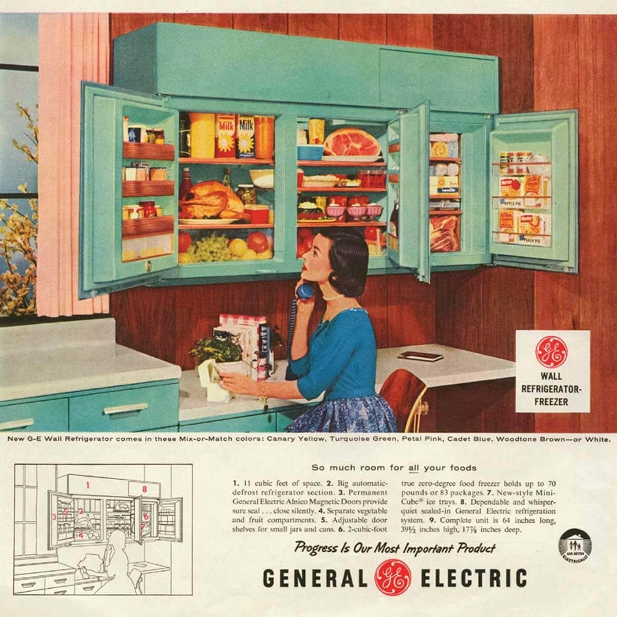
Major appliance manufacturer General Electric launched a number of industry firsts in the mid-'50s while advertising its products' modern appeal. The GE Wonder Kitchen featured a built-in range, dishwasher, disposal, and washer and dryer under a single countertop. The sleek wall-mount, side-by-side refrigerator/freezer, right, has the look of kitchen cabinetry.

Bursts of color
As bright shades debuted in 1950s kitchens, cooks could now choose appliances in hues of yellow, pink, blue or turquoise to help modernize their family gathering spot.

Working for you
This colorful kitchen is worth your minute of study. There are no wasted steps in serving meals or in cleaning up: A drop-leaf cart carries food from range and refrigerator to table in one trip. The folding doors of the dish cabinet open easily to place contents within easy reach. Featured in the House Beautiful April 1957 issue.

Mint green accent
This 1950s magazine illustration features a mint green oven that matches the slanted rafters, a polished brass pendant light, and elegant wood cabinetry. Note the white-brick wall – a predecessor to the metro tile – and the trendy gold-colored hardware, which can be seen in many modern homes today.

Domestic bliss
This magazine illustration features powder-blue units and contrasting copper-colored appliances. Note the archetypal sunburst clock, the under-cabinet dining nook, and of course the beaming housewife. An early ancestor of the industrial trend, the image reveals the roots of the exposed brick wall.

Pink is everywhere
It’s the 1950s. The war is over, and the United States is enjoying a wave of unprecedented prosperity. Millions of GIs returned, eager for the comforts of home that they had been missing, and everyone settled down to a kind of nationwide nesting. Record numbers of homes were being built in the newly developed suburbs, and the center of all those homes was the kitchen.


Lasting Love and Landmark #251

GLAZER-KEATING HOUSE 1110 TAYLOR STREET

GLAZER-KEATING HOUSE
1110 TAYLOR STREET


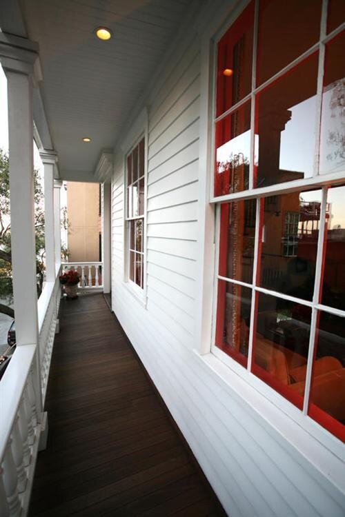
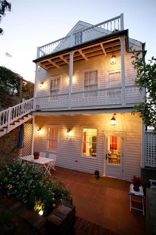
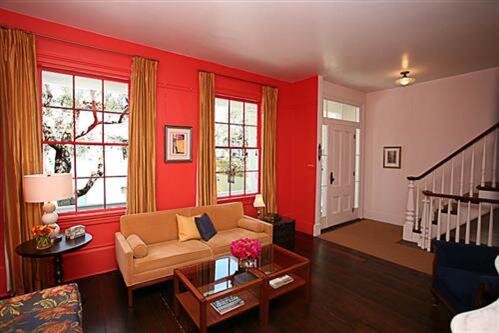
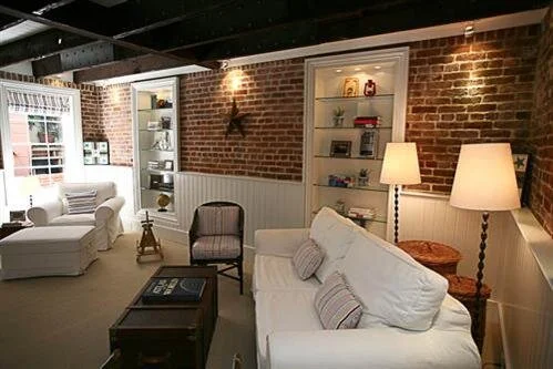
Built in 1906 shortly after the Great Earthquake and Fire, this Neo-Georgian dwelling served as the Coachman's House to the Flood Mansion, which still stands atop Nob Hill at 1000 California Street.

On October 16th 2002, the dwelling was finally designated by its owner, Dr. J Henry Glazer as: ZELDA d'ANGLETERRE GLAZER'S MEMORIAL LODGINGS, and such donated in his late wife's memory to the University of California , San Francisco for use and support of brain cancer research.


Dr. J Henry Glazer's love is clearly depicted in this tribute to his beautiful wife Zelda. The heartwarming history of their relationship and the reason he donated this classic home to help UCSF continue research to the horrible disease that took his wife's life.

A book simply called 1110 Taylor Street, San Francisco was also produced to explore the historic home and it's contents. It's a wonderful jaunt down memory lane and a fitting compliment for the historic neighborhood of Huntington Square.

A book simply called 1110 Taylor Street, San Francisco was also produced to explore the historic home and it's contents. It's a wonderful jaunt down memory lane and a fitting compliment for the historic neighborhood of Huntington Square.

Untangling the History of Christmas Lights

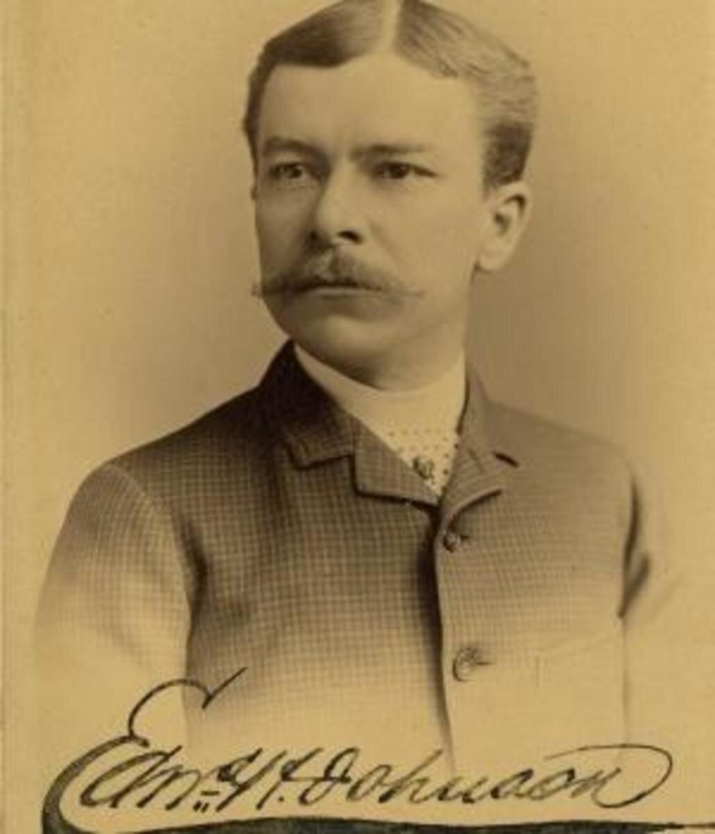
Edward Hibberd Johnson not only added flash and color to Christmas trees when he introduced electric lights in 1882, he saved lives in the process.

Early-Propp-Light-Set.jpg

As Christmas approached in the waning days of 1882, Edward Hibberd Johnson joined his fellow New Yorkers in decking the halls. Then as now, Yuletide traditions ran deep, and the 36-year-old once again undertook the annual ritual of decorating the parlor of his Manhattan home with a majestic evergreen. For this particular Christmas season, however, Johnson decided to freshen the cherished holiday tradition with a state-of-the-art innovation—electric lights.

Nearly three years had passed since Thomas Edison demonstrated the first practical light bulb, and few people were better acquainted with the emerging electrical technology than Johnson, the Wizard of Menlo Park’s trusted business associate. As a manager of the Automatic Telegraph Company in 1871, Johnson had shrewdly hired the 24-year-old Edison, but the whiz kid proved so brilliant and entrepreneurial that in short order their roles reversed and the boss became an employee for the famed inventor. Johnson worked as a vice president of the Edison Electric Light Company, and he was chief engineer for the electric generation system that Edison had unveiled in lower Manhattan that September.

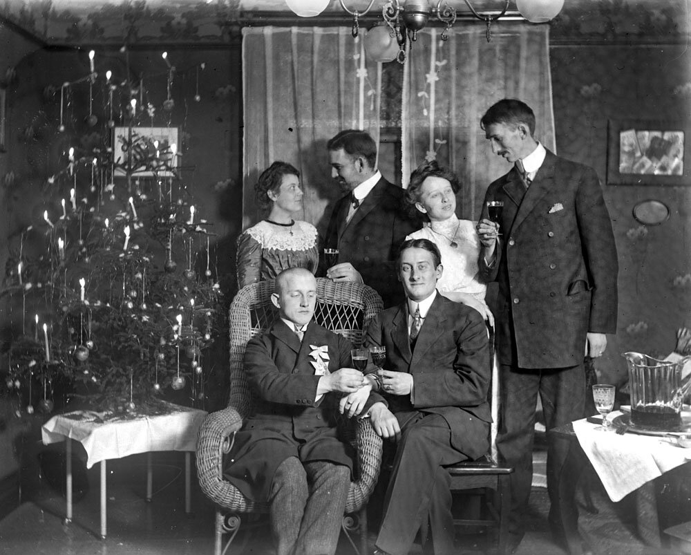
Now at Christmastime, Johnson prepared to make some history of his own. For centuries—according to some folklore all the way back to the 1500s when Protestant reformer Martin Luther wished to replicate the wintertime sight of stars twinkling among the evergreens—people had used wax candles to illuminate their Christmas trees. The candles may have been beautiful, but they were obviously a huge fire hazard. Every year as year the holiday approached, without fail newspapers printed tragic stories about Christmas trees accidentally catching fire and houses burning to the ground, sometimes with deadly consequences.

By replacing candles with electrical lights, Johnson not only greatly reduced the risk of Christmas trees going up in flames, he added flash and color as well. According to a reporter from the Detroit Post and Tribune who visited the home of Edison’s right-hand man, 80 brilliant red, white and blue hand-wired bulbs “about as large as an English walnut” lit up Johnson’s Christmas tree. An additional 28 lights sparkled on two wires mounted on the ceiling.

Johnson’s electrically lit tree was revolutionary—literally. It spun in a circle six times a minute on a little pine box as its lights flashed in “a continuous twinkling of dancing colors.” An electric current drawn from Edison’s main office powered the lights and the crank that rotated the tree. “I need not tell you that the scintillating evergreen was a pretty sight,” gushed the newspaper reporter. “One can hardly imagine anything prettier.”

Unbeknownst to Johnson, he also launched the annual Yuletide tradition of trying to one-up the neighbors with dazzling Christmas light displays. Once electrical power spread to Manhattan’s Gilded Age mansions, the city’s prominent socialites coveted the novel lights to showcase their Christmas trees at their ornate holiday parties. Those first bulbs, however, lacked screw-in sockets and required the tedious process of wiring each lamp individually, a task that few had the knowledge or time to undertake. As a result, members of high society spent as much as $300 per tree to hire electricians to install lights on their conifers and be on call in case a bulb burned out or broke.

High society spent as much as $300 per tree to hire electricians to install lights on their conifers and be on call in case a bulb burned out or broke.

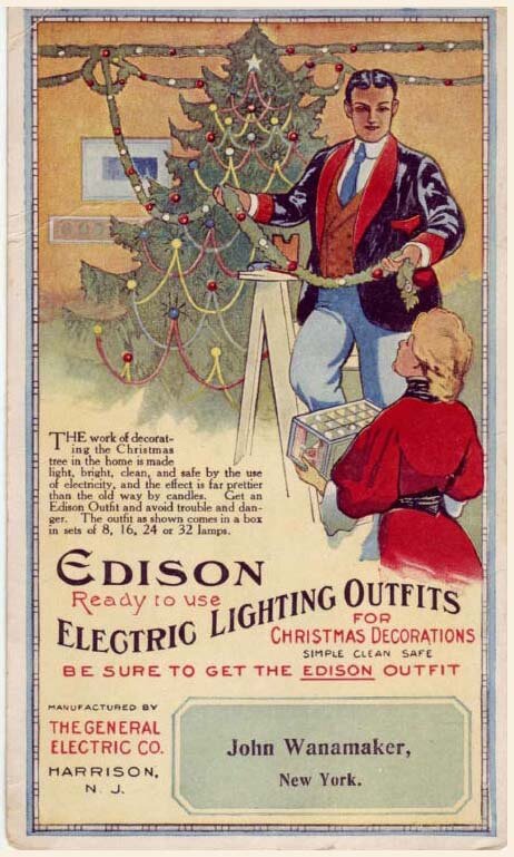
The White House Christmas tree became electrified in 1894 when President Grover Cleveland’s daughters were delighted by the evergreen that the Wheeling Register described as “very beautifully trimmed and decorated with tiny parti-colored electric lamps in place of the old time wax candles.” For most of the country, however, candles still remained the primary means of illuminating trees because of the limited availability of electric power and the cost and hassle of the Christmas lights themselves. That began to change at the turn of the 20th century when the General Electric Company started to produce and sell electric Christmas lights that did not require the services of an electrician to wire. The company accentuated the safety advantages of electric lights in their advertisements in popular magazines of the day such as The Saturday Evening Post and Harper’s Bazaar. “No danger from the lights on Christmas trees when Edison Miniature Lamps are used,” boasted the copy of one ad next to a dramatic drawing of a candle-lit tree engulfed in an inferno.

 In 1903, General Electric began to offer Christmas lights in eight-lamp strings, called festoons, that featured pre-wired porcelain sockets, miniature glass bulbs and a screw-in plug that attached to a wall or ceiling light socket. The $12 price for a three-festoon set was beyond the reach of most consumers, but department stores in some cities made the lights available for rental for $1.50.

By the 1940s when electrification had become standard in rural America, electric lights had replaced wax candles on most Christmas trees, and the danger of trees bursting into flames had been replaced by the annual frustration of untangling gnarled webs of Christmas light strands. For that, thank Johnson, the man who has been called the “Father of Electric Christmas Tree Lights.”

INTRODUCING: 3467 Pacific Avenue

PRESIDIO WALL TRADITIONAL
6 Bedroom | 6 Bath | Single-Family Home
Offered at $8,950,000

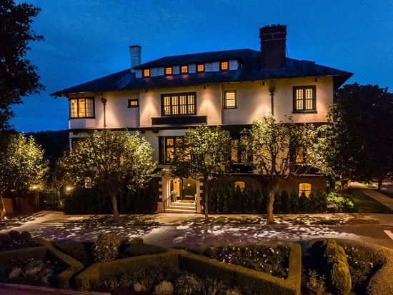
3467 Pacific Avenue is a rare generational opportunity to own a home along the Presidio Wall, one of San Francisco's most coveted locations. Originally built in 1909, the property was renovated and expanded in 1991 under the direction of Butler Armsden Architects. This six-bedroom residence is advantageously nestled on a 41' wide flat lot with gracious interiors benefiting from tremendous natural light and a visual connection to the captivating south garden. A thoughtful, four-level floor plan welcomes comfortable daily living with views of the Golden Gate Bridge towers emerging from the neighboring Presidio forest. With immediate access to the Presidio Wall Playground, the shops and restaurants of Sacramento Street, and abundant recreational opportunities in the Presidio, this stately home offers an inspiring locale to enjoy a true San Franciscan lifestyle.

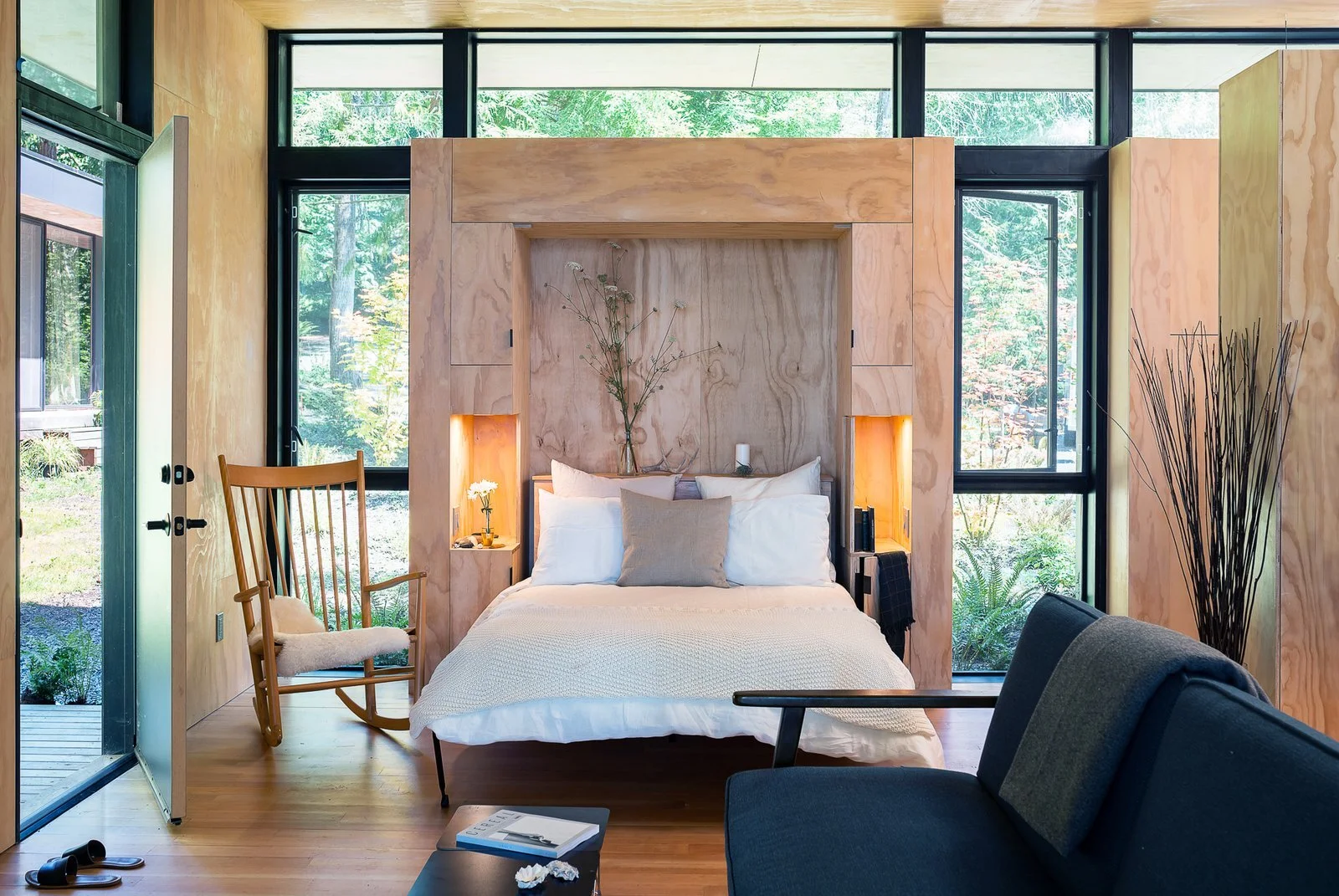
The Murphy Bed. A Love Story!

William Lawrence Murphy was the son of a 49’er gold rush prospector. He was born in 1876 near Stockton, California in the small gold rush town of Columbia. Prior to moving to San Francisco in his early 20s, Murphy had various jobs that included a being a horse-breaker, a small-town sheriff, and a stagecoach driver.

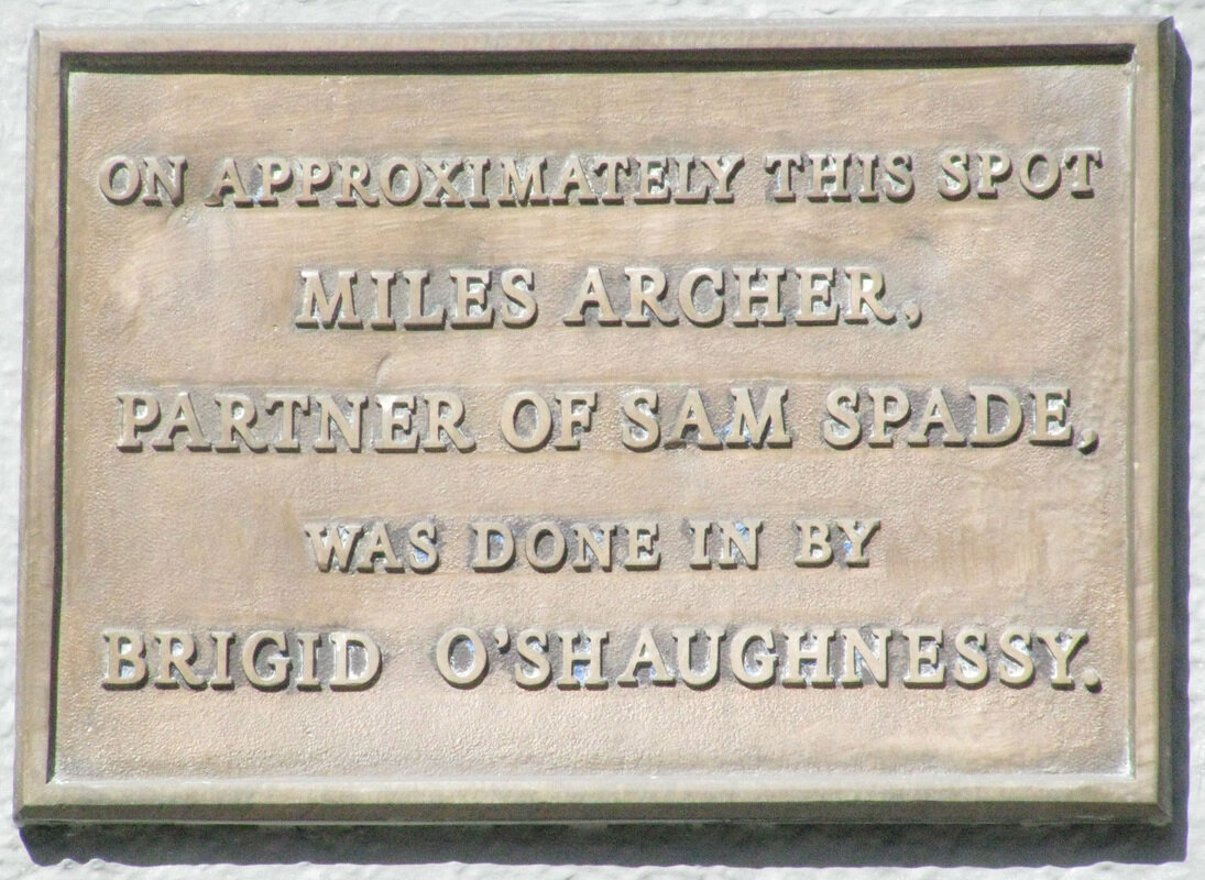
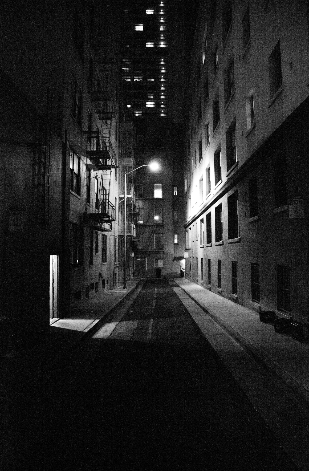
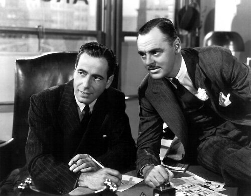
When he moved to San Francisco, he rented a small walk-up studio apartment at 625 Bush Street. Fans of Humphrey Bogart’s classic film, The Maltese Falcon, will remember its location as the spot where Sam Spade’s partner, Miles Archer, was shot. William began tinkering with hideaway beds when he found his one-room apartment too small to entertain friends or a particular young woman.

William was falling for a young opera singer named Gladys M. Kaighin. Courting customs at that time would not permit a lady to enter a gentleman's bedroom. So according to family legend, William Murphy had a blacksmith help him mount a mechanism that would make it possible to flip his bed into a closet. Once the closet door was closed, his bed disappeared, turning his once cramped quarters into a proper parlor. He had a strict moral code and he didn’t want to spoil any chance of winning Gladys’ heart. It worked! In 1901 William married Gladys and had one son.

Today the original Murphy Bed company is still run by the Murphy family. Clark W. Murphy is 3rd generation and has been the CEO since 1983.

A CBS segment on the history of the murphy bed, first created in the San Francisco area. What makes a murphy bed a murphy bed? August 4, 2010

Who did something similar before William L. Murphy?

Though the Murphy Bed history is mostly credited to William L. Murphy, several others had already experimented with space saving bed designs, and beds with similar functions had also been produced. The first documented catalog featuring folding beds was put on the street by Sears and Roebuck in 1895. According to one source Thomas Jefferson and Paul Revere also used Murphy Beds. Entrepreneur and inventor Sarah Elisabeth Goode (1855 – 1905) was the first African American woman to receive a United States Patent in 1885, for her bed. It could be folded up, and it looked like a desk with room for storage.


FUN FACT | 625 Bush and the Maltese Falcon

According to The Dashiell Hammett Tour, columnist Warren Hinckle collaborated with innovative, advertising copywriter, Howard Gossage, to place a plaque on the movie site. When Gossage died in 1969, Hinckle stored the plaque and forgot about it. About five years later someone spray painted "Miles Archer was shot here" on a sidewalk at Bush and Stockton. Hinckle remembered the plaque and retrieved it. On February 12, 1974, it was placed on the wall at Burritt Street by three compatriots: James Kennedy, the owner of the building, Marino Nibbi, a contractor, and City Supervisor Quentin Kopp.

Andrew Mann - Andrew Mann Architecture

Andrew Mann

Andrew Mann

CAENLUCIER: What is your current outlook on your practice?

ANDREW MANN: We’re busy. The office is involved in a number of exciting projects, including estates in the greater Bay Area, residential renovations in San Francisco and even a religious and cultural center in the South Bay. The latter is a very different building type for us, providing an opportunity to learn and grow.  And, all of our projects are collaborative endeavors with the designers, landscape architects, other architects, contractors and consultants with whom we work.  We like those types of enriching experiences.

CL: You worked with William Turnbull, Jr.after your graduate studies. How did your viewpoint towards design develop during your tenure at his firm?

AM: From Bill, I learned what it truly meant to be an architect, both in terms of design and as a professional. His work was rooted in a sense of place – climate, context, views. And that always informed the design ideas he developed.  His buildings were spatially rich, but honest and straightforward in their materials and construction – the perfect balance of complex and simple. And, Bill had an incredible sense of integrity in terms of his work, his relationships with his clients and how he treated his employees. He was a great mentor and I carry those lessons with me in my own practice.

CL: Talk about your connection to earlier generations of Bay Area architects and how the vernacular they left behind informs you today.

AM: The Bay Area has a rich architectural tradition of which William Turnbull, Jr. was just one contributor. I am interested in the architects that came before him, of his generation and those that came after, that like him, created work that was rooted in the same sense of place. There’s a lot to learn about form, detail, quality of light and the use of materials. I look to that for inspiration and aim to make my work part of that tradition.

CL: Do you bring a signature style to your work?

AM: The firm’s architecture is not defined by a specific style. The aesthetic of our projects ranges from warm modern to pared-down traditional. What defines them is an attention to the quality of natural light and an attention to crispness of line and detail.  When one looks at our portfolio, those characteristics are what unifies the body of work.

 CL: How do you approach the abstract design qualities of a new project?

AM: In the most straightforward sense, my job is problem solving. We start with an understanding of a client, their needs for their home and how they live.  We then take that and overlay the context of the site and see how that informs our generation of design ideas. The abstract qualities are the elements we develop that organize this information and generate architectural form. This might be the views through a building to the landscape beyond, or how natural light enters and enlivens the spaces, or how rooms are organized or the overall shape of the building. That’s hopefully where the spark occurs and allows us to develop more than just a functional solution, by creating a home for our clients that sparks joy and pleasure in their everyday lives.

CL: Discuss the fascination that architects have with stairways.

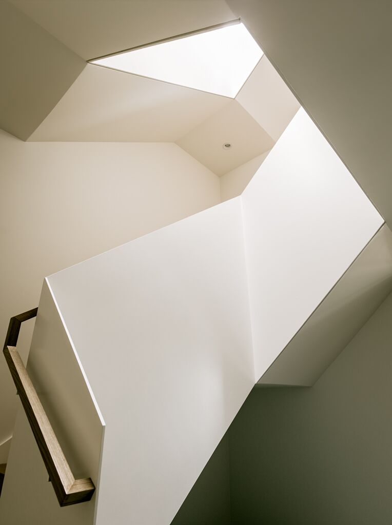
AM: Most often, as one moves through rooms, the experience is horizontal; stairways are the one place within buildings in which occupants have the opportunity to experience moving through space vertically. That changes one’s perspective and provides architects with the opportunity to design complex volumes with interesting views and perspectives. Stairways also typically just have the function of movement – one often doesn’t need to worry about furnishings or glare issues as one would in a living room or bedroom, for example. This allows for an opportunity to explore the use of natural light in different and more dramatic ways. And stairways are often the place in a house the unifies all of the other rooms and really creates the heart of the home.  

MEADOW ESTATE ANDREW MANN ARCHITECTURE

MEADOW ESTATE ANDREW MANN ARCHITECTURE

CL: If you could design a particular piece of furniture, what would it be and how would it look?

AM: I would design a dining room table. I recently had the opportunity to create the table for our new conference room and enjoyed the process of integrating form and function. What interests me about a dining table is that it’s about creating community and connection with those gathered around it through the generosity of food.  For me, a table has to be beautifully made, with perfect proportions, and provide a comfortable place to sit. My table would be made from wood, where the character of the material, the structure of the construction and the craft with which it was made were all inherent in its design.

 CL: You are involved with The Sea Ranch design committee. Talk about the importance of this work today and how it relates to the original design team’s ethos.

AM: The Sea Ranch is a very special place, with its groundbreaking approach to development through the relationship between the built environment and natural environment. The role of The Sea Ranch Design Committee is to review all proposed changes by property owners to buildings or landscapes and to evaluate how those changes fit with the ideals defined in the association’s Design Manual. The original buildings, with their rustic modern vocabulary, were constructed from the vernacular materials readily available at the time, primarily redwood, western red cedar and douglas fir. As time has passed, these materials have become more expensive and less available. And, climate change has impacted the area, creating an increased risk of wild fires, so buildings and landscapes need to be designed within that new context. The committee now grapples with how to foster creativity, encourage the use of new materials, be responsive to changes in climate and the resultant changes to building codes, while staying within the framework of the original vision. It’s an exciting undertaking.

CL: What would you be if not an architect?

AM: I would have loved to have been an artist, either painting or drawing. Architecture is a great way of balancing my desire to express myself visually with my interest in real-world problem solving, but it would be fun to just create.

CL: What are you reading?

AM: I have three books going right now.  I was recently in Charleston, South Carolina and realized that I wanted to learn more about the history of our country and how the institution of slavery has shaped us. To explore that, I’m reading Jill Lapore’s These Truths: a History of the United States.  To understand the city that I live in, I am also reading Season of the Witch: Enchantment, Terror and Deliverance in the City of Love, by David Talbot.  It’s about the tumultuous social history of the transformation of San Francisco between 1967 and 1982 and how that created the city we know today.  And, for a diversion from history, I’m reading The American Short Stories 2018, edited by Roxane Gay. I really like the short story format and how narrative unfolds in that context.

CL: Favorite weekend getaway?

AM: I would have to say The Sea Ranch. A swim in the pool, a walk along the bluff, good food and conversation with friends. The warmth of the sun, the cool ocean breeze, and the sound of the surf. The best.

CL: Top three bucket list items?

AM: A couple of years ago, I had the opportunity to travel to Machu Picchu, one of my bucket list destination. It was truly awe-inspiring. I don’t have my list ranked, but here are three others: Rome - I would love to live in the Eternal City for six months or so.  It’s my favorite city, with so much art, architecture and history layered upon one another.  It would be great to spend my time there sketching. Oh, and the food…. The Russia of my ancestors – I would be very interested to travel to see the towns in Eastern Europe from which my family emigrated.  I don’t suppose there is much to see, and any physical fragments of that earlier world are long gone, but I would like to get a feel of the place. And, I’d love to go to St. Petersburg. It’s a Baroque city conjured up from the marshes. It’s always intrigued me. Angkor Watt – It would be fascinating to go see this monument that is so important to the Cambodian culture. Like Machu Picchu, it’s a place that has held mystery for me since I was a child.

Angkor Wat

Angkor Wat

CAENLUCIER would like to extend our gratitude to Andrew Mann for his collaboration with us on this feature.

VISIT ANDREW MANN ARCHITECTURE HERE…

San Francisco Historical Home

Telegraph Hill Tavern and “Tea Party"
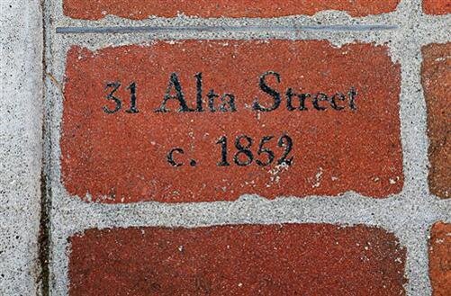
31 Alta Street, Telegraph Hill

From shipyard overlook to Prohibition era speakeasy, 31 Alta is a house with rich history, including stories of wild parties and resulting police raids. But perhaps its most impressive claim: that it’s the oldest surviving home in San Francisco.

In 1852, Captain Andrews built his home on the Eastern slope of Telegraph Hill, perched for a direct view of ships sailing into the shipyards below. The home remains virtually unchanged after over a century, during which San Francisco itself metamorphosed. Entire neighborhoods disappeared while others appeared; steep streets were graded over the hills; Coit Tower and a forest of skyscrapers grew in the distance.

A survivor of both the 1906 earthquake and subsequent great fire, 31 Alta traded hands several times prior to the 1920s but the most infamous inhabitant of throughout the last century was a reputed Russian noble, Myrtokleia Sawvelle who, according to David Myrick’s San Francisco’s Telegraph Hill, converted the brick dining room and kitchen into a “night club.” Myrick reports that printed cards were sent to a prospective clientele announcing her Telegraph Hill Tavern as having “all the atmosphere of the Montmarte with a Marine view.”

31 Alta, seen in this photo from the 1850s.

31 Alta, seen in this photo from the 1850s.

Apparently the views from the double balcony were even more striking than they are today. A photograph taken during the 1850s shows the broad, open view from Alta street before it was paved in the 1930s. Today that view is partially blocked by all the rest of the buildings now occupying the north side of Alta: modern architecture’s answer to straightforward utility. According to Myrick, Myrtolkleia (who came to be known as Myrtle) served tea at two in the afternoon, followed by dinner at six and supper after ten; while a Sunday morning brunch was offered from eleven to two.

On that eventful night in February 1927, Myrtle’s guests must have been carousing on the balconies and howling at the moon late into the night. However, the neighbors on Telegraph Hill were not putting up with it that night. The constabulary were called, and the Black Maria arrived to escort Myrtle and her party to the city jail for the rest of early morning.

Myrtle not only had considerable skill in the culinary arts and the charm to be a gracious hostess, but she was also a pro at public relations. While the press headlined the story “Wild ‘Tea Party’ Raided”, her account painted for the reporters a not unusual evening of tea and art appreciation. Apparently, Myrtle was giving a private exhibition of a new work of art by Elwood Decker described as “an esoteric blue damsel charging through a red fog.”

We were sitting around admiring Elwood Decker’s new painting,” relates Myrtle Sawvelle’s account in the press. We weren’t even drinking anything but tea and I was making a pan full of biscuits for a little supper when the police came and made us all get in that black wagon. Some of the guests who arrived late were making quite a bit of noise but we didn’t realize that this was disturbing anybody, she said. We are going to start all over again with a tea room and this time there will be no nights in jail.
— Myrtle Sawvelle

According to Myrick, it was not to be. Her food was exotic, her liquor was good — but her timing was poor because her teas were taking place during Prohibition. Her homemade brews landed her in jail again for 90 days, and she was promptly appointed jailhouse cook. Tackling her new job with gusto, Myrtle became the heroine of her fellow inmates. Her fellow prisoners never ate so well, in or out of jail, and it was a sad day when she was liberated. A year later, Myrtokleia retired to Carmel.

The current owner has owned the home since 2002 and placed it on the market for $3,800,000 in 2010 and again in 2011 for $1M less. The home did not sell and now seems to be used as a rental.

A few photos from when the home was on the market.

Holiday Cheer Throughout the Decades

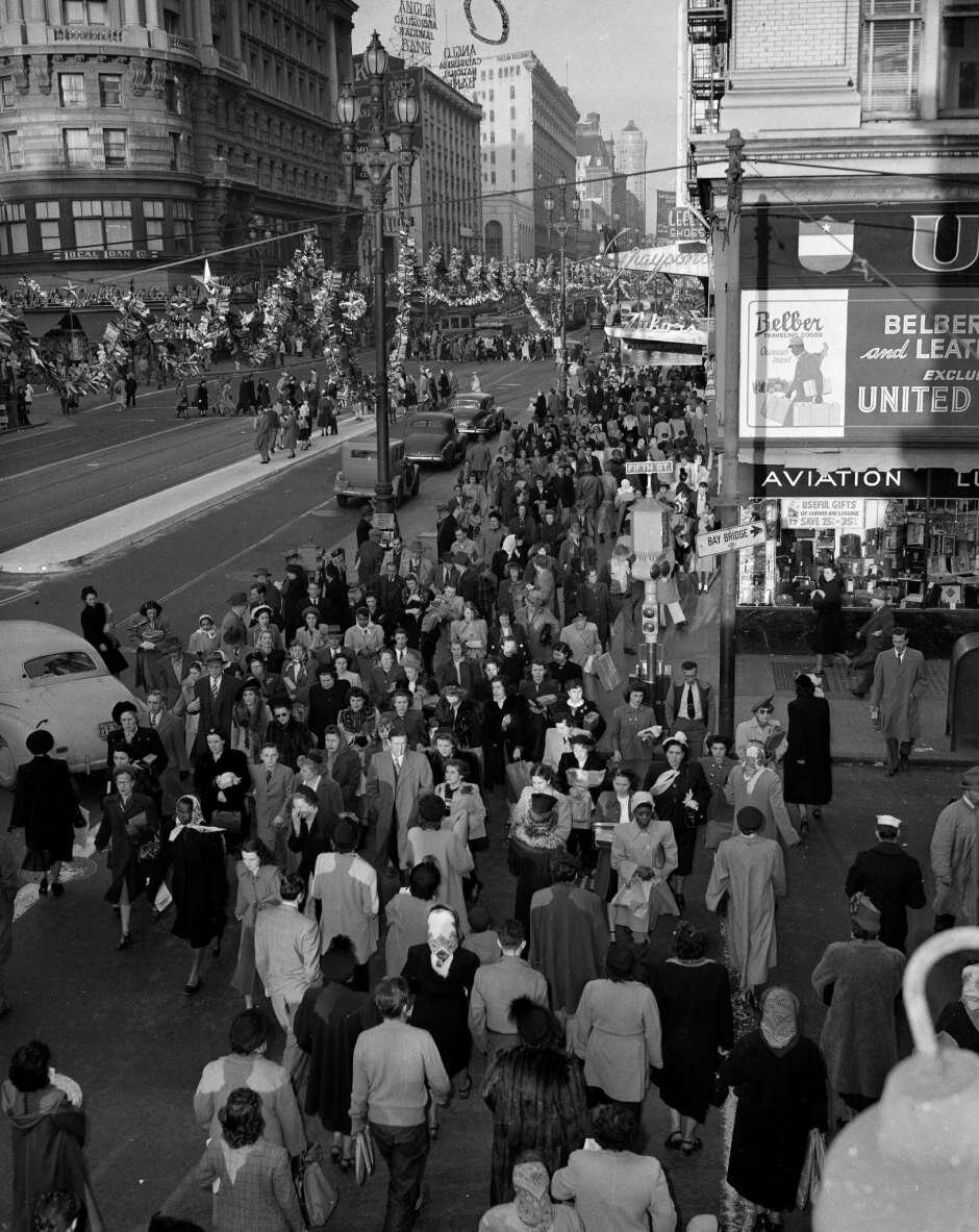
For its first century as a city, San Francisco celebrated the holidays with all the energy it could muster. With each tragedy, war and building boom, the holiday spirit seemed to be growing along with the city. The traditions arguably peaked in the 1950s, when optimism, good financial times and hometown spirit combined for some of the most magical Decembers in San Francisco. Through the good and bad times, San Francisco has always embraced the holiday spirit as depicted in the stories and quotes in this column.

Late 1800s

Yesterday was (meteorologically speaking) another dismal day, with drenching rain and miry street crossings, suggesting anything but cheerful reflections,” The Chronicle reported in 1869. “Yet the streets were full of men and women whose countenance showed no sympathy with the untoward surroundings.
— The Chronicle

By the 1870s, the newspaper was advertising multiple Christmas tree lots in San Francisco, including one owner who boasted he was cutting down the best of the “virgin redwood forest” in Marin County. There were early reports of charity, and boardinghouses served roast beef and plum pudding to miners and other men who were away from their families.

Jewish families were rising in economic and philanthropic clout at the end of the 19th century, and the city’s holiday celebrations started to reflect their traditions. The earliest coverage of Hanukkah was respectful (if not well researched) and never divisive.

The first Chronicle article to use the word Hanukkah, in 1897, was headlined “Hebrew Festival of Lights Observed — Children Assemble to Light a Taper.”

“‘The Festival of Lights,’ a pretty biblical celebration, replete with religious sentiment and forcibly recalling a heroic period of Hebrew history, was inaugurated yesterday at the Mission-Sabbath school,” The Chronicle wrote.

Rabbi Jacob Voorsanger’s speech to the congregation was also excerpted, and seemed to be aimed at the gentiles in the crowd as much as the Jews: “Maccabee was a hero, fighting for liberty as George Washington fought. The lesson of the Hebrew hero should grow strong in your hearts, making you faithful Jews and loyal citizens. Yours is a beautiful religion. You should be proud of being Hebrews. If you are true to your country your country will be benefited in good men and women.”

Early 1900s

Who could believe that there would be another merry Christmas in San Francisco for many a year?” The Chronicle editorial staff wrote after the 1906 earthquake and fire. “And yet the first return of this day is the merriest Christmas of all. It is something to think of. It is something to be proud of. It is something to pass on to our children and our children’s children, as a glorious exemplification of the way in which a heroic people meet a great crisis.
— The Chronicle

The April 18, 1906, earthquake and fire destroyed most of downtown, and many other businesses and homes. But if anything the holiday spirit grew in its wake. In the years that followed, as the city rebuilt and prepared for the Panama-Pacific International Exhibition of 1915, new traditions seemed to be added in the city every year.

In 1907, different charities decorated 12 large outdoor trees in San Francisco, with the aim of having one within walking distance of children in every city neighborhood. (The Chronicle called it “a perfect orgy of Christmas tree-ing.”)

1920s

There will be half-orphans there that are boarded with their mothers, whole orphans, and children who were sick or poor or abandoned,” an unnamed reporter wrote of one tree celebration on Nob Hill. “There will be children of all ages up to 14, and of all sizes and colors and creeds and nationalities, and all interested in Santa and sharing the Christmas joy.
— Unknown

Radio in the 1920s added hype to the holiday; many stations were sponsored by department stores, bringing more commercialization to the season. The KPO “Christmas party” on Dec. 24, 1929, included Christmas carols, a live visit from Santa Claus and “a Bavarian yodel number with jingle-bell accompaniment.”

1930s

Santa Claus again is making preparations for a visit to San Francisco, according to a radio-gram just received from the North Pole,” read one 1932 story, which ran in the news section next to articles about real-life crimes.
— The Chronicle

By the 1930s, Chronicle reporters were taking the ethically questionable (but well-intentioned) approach of reporting about Santa Claus as if they had interviewed him, or had a correspondent embedded in his workshop full of elves.

1940s

Christmas in San Francisco is quickly assuming all the traditional holiday color,” The Chronicle reported in 1949. “The city’s fire stations, normally prosaic brick structures with cavernous entrances, now have charmed themselves into Christmas wonderlands for the second year.
— The Chronicle

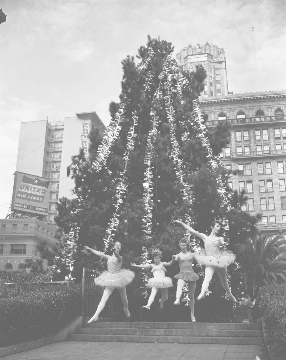
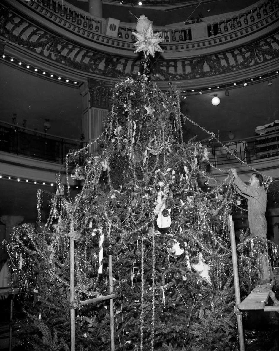
The end of World War II brought more families, more money and an all-time high for holiday revelry. Macy’s took its window displays to new levels of memorable. The City of Paris Christmas tree, rising at least four stories in the middle of the Union Square store, was a holiday destination for generations of children.

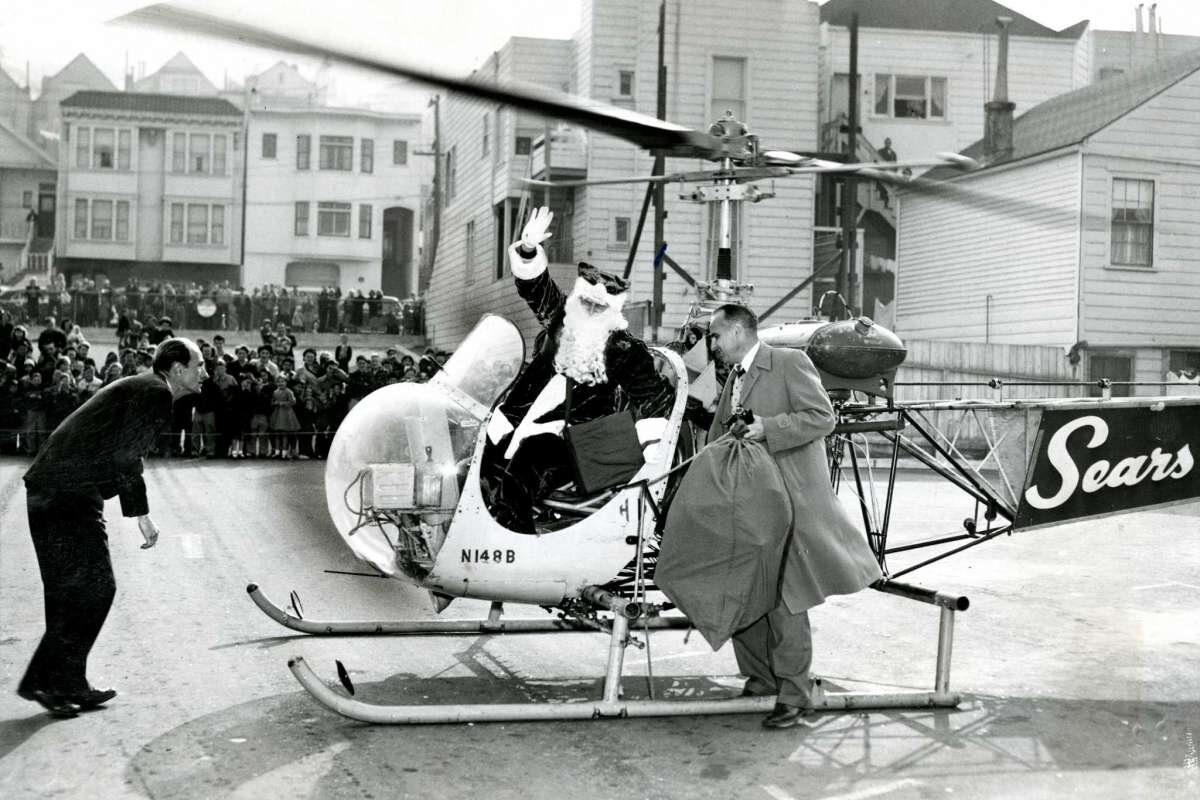
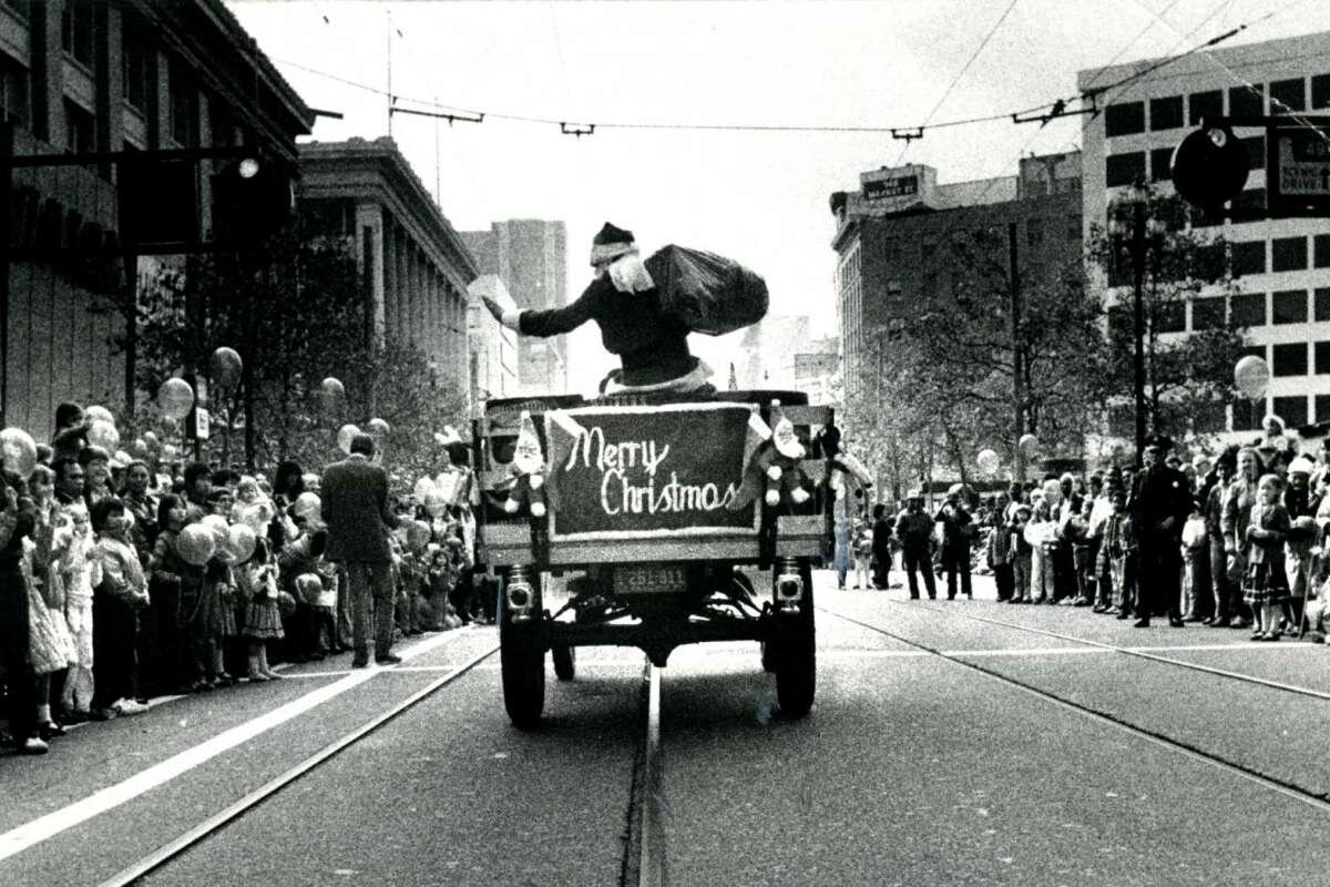
But the arrival of Santa Claus down Market Street was the focal point of the holiday excitement. In an era before Elvis started shaking his hips and before Willie Mays came to town, Santa Claus was the biggest rock star in the city. Thousands of children would line the streets as Santa arrived at the Emporium by carriage, helicopter and (most San Francisco of all) on the top of a Muni bus.

1950s

He appeared at the brink of Nob Hill, sitting in a chimney atop Muni’s No. 514, filled with a throng of happy children and an engineer at the controls of the public address system to broadcast Santa’s cheery, preseason greetings,” The Chronicle reported in 1952, on the eve of an election. “A torrent of multicolored balloons spilled from the top windows of the Emporium, and as he paused, Terry Gould, a Cub Scout of Pack 30 presented Santa with an ‘absentee ballot.’ Then the crowd, following behind Santa, surged into the store and up to The Emporium’s Christmas roof playground.
— The Chronicle

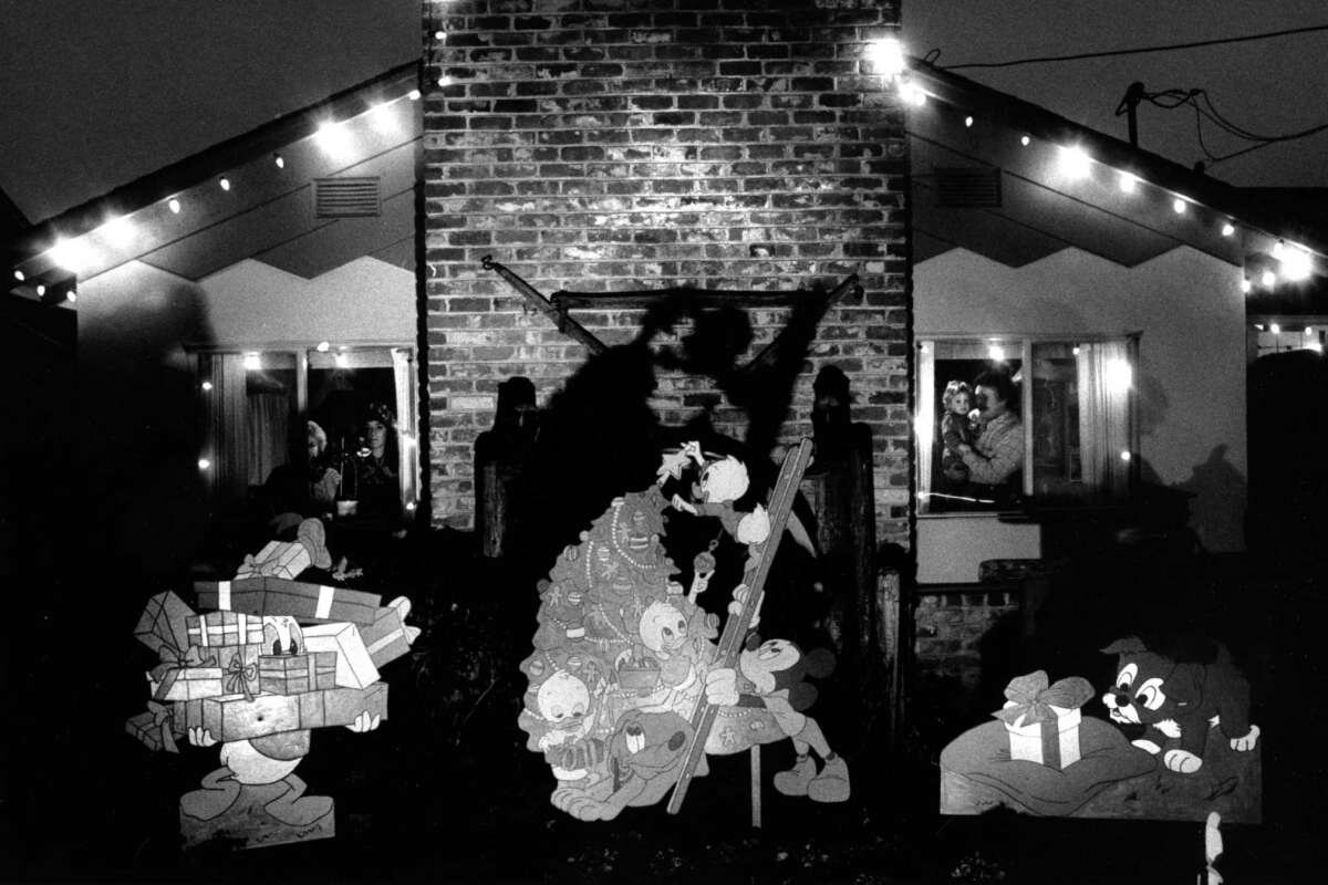
Possibly the greatest holiday tradition in San Francisco history, which lasted just three years from 1948 to 1950, was the decorating of the city’s firehouses. San Francisco Fire Department stations transformed their facades — turning the buildings into presents and toy factories and giant letters to Santa. Neighbors pitched in, building props and sewing costumes. Muni offered San Francisco children free tours of the finished product.

It was more than a playground. The Emporium had rides on the roof, including a carousel and giant slides. One year, the store on Market between Fourth and Fifth streets used a giant crane to lift a cable car to the top of the building.

The tradition ended, in true San Francisco fashion, with a battle between the unions and the city. After the citizens failed to pass a proposition that included a firefighter pay raise, the organizers decided decorating fire stations was too expensive. There were no fire stations decorated in 1951.

1960s and 70s

Santa Claus continued his parades through the 1960s and 1970s, but with television, “Star Wars” and arcade games stealing the hearts and imaginations of children, the sight of St. Nick became less of a novelty. The first mention of Kwanzaa was in 1977; once again treated respectfully, even if the celebration honoring African American culture was oversimplified.

The new Transamerica Pyramid in the 1970s transformed itself into a large red-and-green Christmas tree, and then stopped, according to Herb Caen, because of the high cost. There’s a bright light on top of the Pyramid now, and smaller buildings downtown have added colored lighting. But it’s all hard to see anyway, because newer construction blocks the view.

Today

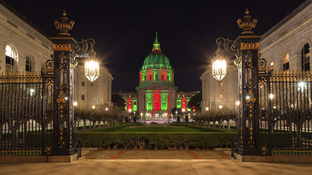
Progressive change was arguably positive for the city, but not as good for the San Francisco holiday spirit. Families have traditions, but there are fewer celebrations that unite San Francisco as a city. Union Square still has an ice rink. The San Francisco City Hall Christmas tree still exists (now named the more politically correct World Tree of Hope).

One of the last great traditions is one of the best: The Embarcadero Center rims each of its four buildings with lights, looking like a pile of shining presents near the waterfront. Take a ferry to Alameda or Larkspur, and you can pretend San Francisco is still embracing the old days, when Christmas in the city was the most important day of the year.

Or you can just read the old clippings. There are messages from previous generations, practically begging us not to forget to count our blessings and celebrate the season.

Special thanks to the Chronicle and Peter Hartlaub. These are excerpts from an article he wrote in 2015.

Landmark #119 and the Murder Mystery??

If you set out to unravel the facts behind one of San Francisco’s most gruesome murders, you’ll find yourself with a handful of details most likely culled from old ghost stories.

The tale always begins with Richard Craig Chambers, a silver baron from the Midwest. With his wealth, he moved to San Francisco and built the palatial home at 2220 Sacramento Street. Richard and his wife moved in in 1887. When Richard died in 1901, a few years after his wife, two of his nieces inherited the home.

It was an unhappy arrangement. The nieces did not get along. In some variations of the story, one niece built the house next door to get away from the other, Claudia Chambers. It is Claudia who meets the most unfortunate end — and under murky circumstances. Most sources say she died in a “farm implementation accident.” Many agree she was sawed clean in half. A few say it was no accident, that a deranged family member faked the accident in order to murder Claudia.


2220 Sacramento

Regardless of the circumstances, the Chambers mansion became synonymous with ghost stories. Ghost tours today still stop outside the home, warning curious looky-loos of Claudia’s spirit, which manifests itself in the form of flashing lights and shadows in the windows.

But the historical record says something else altogether: that almost none of this happened at all.

The truth behind the Chambers mansion

The first mistake becomes apparent immediately. There is no Richard Craig Chambers, the name universally attached to the historic San Francisco home. His name was Robert, as dozens of newspaper articles and census records attest. Some accounts also claim he was a U.S. Senator; Chambers never served in the Senate, although he was the Plumas County sheriff from 1858-62.

 He made his fortune as the superintendent of the Ontario silver mine near Park City, Utah. He eventually sold the mine to George Hearst, father of the newspaper magnate; by the time the mine tapered off, it had yielded $50 million in silver and lead.

Robert and his wife Eudora were well-known fixtures in San Francisco society but, for reasons lost to time, the pair never had children. Sometime before Eudora’s death in 1897, they took in two of Eudora’s nieces, Lillian and Harriet. If your interest is piqued by the mention of two nieces, they’ll become pertinent later on.

 Robert died of appendicitis, just short of 70, on April 11, 1901. The Chambers estate, valued at $1.5 million at the time, was split between Robert’s brothers and sisters. The house went to his sister Ada Chambers Martin, who appears to have lived in it with her husband until their deaths in the early 1910s. After that, the home passed to another Chambers sibling, Margaret.

 Those are the facts, backed up by newspaper accounts and property records. A further dive into census records and city directories turns up no trace of anyone named Claudia Chambers which, at least, should reassure anyone worried she was sawed in half.

A good ghost story, though, has some threads of truth, used to weave together the tale. And it seems Claudia’s haunted soul does have a model in reality: Eudora Chambers.


920x920.jpg

The history of Eudora Chambers

We know little about Robert’s wife Eudora, save for a few sad episodes recounted in the San Francisco Call. In May 1893, Eudora went missing from 2220 Sacramento St. Her friends and family searched for her, but the 40-year-old had vanished without a trace. A week later, a man found her wandering the beach near Mussel Rock, “very weak and helpless.” Although she’d been missing for seven days, the family doctor said she showed no signs of exposure. The doctor speculated she’d been taken in at some point during her lost days.

Eudora went missing from 2220 Sacramento St. Her friends and family searched for her, but the 40-year-old had vanished without a trace. A week later, a man found her wandering the beach near Mussel Rock, “very weak and helpless.”

Her strange behavior comes tragically into focus seven months later when the Call ran an article with the headline, “Mrs. R.C. Chambers Tries to Commit Suicide.” On New Year’s Eve, a train engineer near Valencia Street noticed a woman walking perilously close to the tracks. As the train approached, he saw her throw herself in its path. Remarkably, she was thrown clear of the tracks, suffering non-fatal injuries to her head and hip.

“From persons who are acquainted with the family it is learned that Mrs. Chambers is thought to be slightly unbalanced mentally,” the paper callously reported.

Three years later, Eudora was dead. Her cause of death is not known.

Then there is the matter of Eudora’s nieces, Lillian and Harriet. There was indeed conflict with the nieces but not between each other. After Robert’s death, Lillian and Harriet filed suit against his family, alleging they deserved a cut of the estate. According to the lawsuit, Lillian and Harriet were taken in by the Chambers after their own parents died and had been raised "like [their] children." On the condition Robert’s will would provide for them after his death, the sisters handed over their tract of land in Butte County.

After Robert’s death, Lillian and Harriet filed suit against his family, alleging they deserved a cut of the estate.

Because they "were treated with such kindness after the marriage and after the death of Mrs. Chambers ... they had no hesitancy in complying with Chambers’ request they deed the property to him," the Chronicle reported.

Upon his death, however, Lillian and Harriet learned there was no such provision. They sued the Chambers, hoping for at least the land in return, but after some years and several appeals, the nieces lost their case.

They never again lived in the house on Sacramento Street.


Last Sold November 8, 2013 for $4,085,000 by our very own Joseph Lucier.


The Chambers mansion, today

As for the mansion, it’s had a few incarnations since housing the Chambers family. In the late 1970s, it was turned into a 15-room luxury bed-and-breakfast. Among its many celebrity guests were Robin Williams, Barbra Streisand and John F. Kennedy Jr. At night, the Mansion Hotel hosted magic shows (flashes of light in the windows, anyone?) and private concerts (once, Liberace performed).

In 2000, the Mansion Hotel was sold to a private developer and turned into two townhouses. The real estate site Zillow estimates they're worth about $6 million each. Today, the mansion is nearly hidden from the street by bushes and trees, easily missed by anyone walking to or from Lafayette Park. 

For those hoping to find answers beyond the grave, there's one last footnote: There is no grave. An obituary indicates Robert was buried at Laurel Hill Cemetery, a defunct graveyard that was moved to Colma in the 1930s. At that time, the graves were dug up en masse, although occasionally forgotten coffins are found during present-day renovation projects.

Eudora Chambers' final resting place is a mystery.

Credit: Katie Dowd, SFGATE Monday, October 22, 2018

Profoundly low interest rates here to stay

Profoundly low interest rates are here to stay

After more than a decade of economic expansion, and despite everything from tariffs to tax cuts, it seems this is as high as US interest rates go. Meanwhile, the European Central Bank is debating whether to reduce its negative rate still further. Until this month, it was possible to imagine that pre-financial crisis levels of 4 to 5 per cent might eventually return. No longer.

According to their own projections, Fed officials believe rates will settle at 2.5 per cent in the long run. Subtract their 2 per cent inflation target and the real reward for capital is going to be a miserable 0.5 per cent. The equivalent rate in Europe and Japan will almost certainly be much lower. Such low levels of interest rates are a profound change from the past. (The federal funds rate was 6.5 per cent, and the real rate was about 4 per cent as recently as 2000.) Although interest rates touch almost every aspect of economic life, the developed world remains deep in denial about the consequences. Here are eight themes for investors and policymakers to ponder.

First, there is an intimate link between long-run interest rates and long-run economic growth. Perhaps capital is less relevant to the digital economy, but for interest rates to max out at such low levels sends an alarming signal about the prospects for future expansion.

Second, monetary policy is broken. In 2008-09, the Fed cut rates by 5 percentage points and it was not enough. Today it has far less room to respond to a recession. The Bank of Japan, which made no move on Tuesday, has all but given up trying to hit its 2 per cent inflation target. The ECB is in danger of going the same way. The world is dismally unprepared for a downturn: two of the world’s most influential central banks may start the next recession with their policy rate already below zero.

Third, if monetary policy is broken, fiscal policy must step in. That means either governments must approve higher spending and tax cuts in response to a recession or else give the central bank a fiscal tool in the form of “helicopter money”, essentially printing money to spend or distribute to the public. Alternatively, governments could set higher inflation targets and use fiscal policy to reach them now. That would give their central banks more room to cut when they need it.

Fourth, lower interest rates make debt more sustainable. This is particularly true for public debt, because countries actually borrow at these low risk-free rates, and somewhat true for private debt. For many countries, it makes sense to borrow more in order to invest. Predictions of financial crisis based on past levels of debt-to-gross domestic product are likely to be misleading.

Fifth, capital stock should rise relative to output. Investments that were once unprofitable now make sense: road upgrades to save a few minutes of time; expensive, niche drugs to help a few hundred people; or extra years of study to earn a graduate degree. Such projects may feel irrational. They are not.

Sixth, any asset in fixed supply is now more valuable, because its future cash flows can be discounted at a lower rate. A monopoly supplier of water or electricity, land in a city centre or the back catalogue of Disney: the capital value of these assets must rise, so their yield matches the lower interest rates. This trend is related to recent movements in wealth inequality. It also puts investors at risk of identifying financial bubbles that do not actually exist. One vital policy response would be to slash the return on capital allowed to utilities.

Seventh, demand for housing will rise. It is, after all, the main capital asset that most people use. There are two potential outcomes. Where it is possible to build, permanently lower interest rates will trigger an increase in the housing stock. If it is not possible to build, then houses will behave like assets in fixed supply, and soar in price. Thus falling interest rates make planning and zoning rules a crucial economic issue.

Eighth, low interest rates make it harder to save. In particular, they make it harder to save for a pension, and harder to live off whatever capital accumulates. This fact has been obscured by the one-off rise in price for scarce assets, many of which are owned by pension funds. But future returns are likely to fall. The result will force workers to accept some combination of later retirement, higher taxes, bigger pension contributions or lower incomes in old age.

It is possible that this bout of low interest rates will end. Perhaps the Fed is mistaken and it will have to raise rates sharply in the future. Perhaps a burst of technological progress will raise growth and boost demand for capital. But no one can choose to make that happen: this is not some perverse plot by Fed chair Jay Powell and ECB president Mario Draghi to make life miserable for the world’s savers. The long-run real interest rate balances the desire to save and demand to invest. Central banks are its servants not its masters. The trend towards lower real interest rates has lasted for decades and is as likely to continue as to reverse. With central banks moving to ease, it is time to stop waiting for rates to recover and face the world as we find it.

Written by Robin Harding
Published in the Financial Times
July 30, 2019

Mead Quin - Mead Quin Design

Mead Quin

Mead Quin

CAENLUCIER: How did you come to the profession of interior design?

Mead Quin: I stumbled into it. After studying Fine Arts at Vanderbilt University, I worked for years as a professional portrait artist. Life circumstances necessitated a change, and I found myself drawn to the field of interior design because of its creative qualities. I find there are many similarities between composing a painting and composing a space.

CL: How has your design work benefited from your scholastic training as a fine artist?

MQ: I approach a room as I would a canvas, using line, shape, color, value, texture and form to compose space. I have no formal training as a designer and rely completely on my intuition and artistic skills. My amazing team fills in with technical brilliance and helps me pull it all together. It’s quite fun!

“Anything Loro Piana. I would design an entire home with only Loro Piana textiles if I could.”

CL: Talk about your Pacific Heights project with Andy Skurman and how you two married your contemporary design feel with his classical architectural sensibilities.

MQ: Working with Andy Skurman was an incredible opportunity and inspiring from start of project to end. He is a brilliant architect, meticulous in his work and immensely respected in our industry. Our client, while appreciating classical architecture, wanted Andy to reach for a contemporary interpretation of it. Between the two of us, we were able to create a space that honored the classical “heart” of the space/building while feeling contemporary and fresh for the young family living in it.

CL: You recently worked with homeowners who have a noteworthy art collection.  How do you approach interiors to seamlessly integrate artwork?

MQ: When working with client’s who value art, interiors become the backdrop. They set the stage. I love finding ways of creating rich and livable spaces that support the art in one’s home rather than detract from it. It can be tempting as a designer to make your own “art” the story. I, however, find myself gravitating to design that considers the human first, no matter what is most important to them, whether it is the way they live or the art they collect.

CL: Looking to the past and present, who are some designers that inspire you?

MQ: John Pawson is always the front runner. I adore his minimalist approach. The attention to detail, line, form, necessity, and palette inspire my work. When wondering how to edit wisely and reach essence, I often pull his work out for guidance. I also love Joseph Dirand. Another minimalist at heart with a manner that is relaxed, elegant and poetic. If given the opportunity to hire anyone I want to design my own home, he’d be a front runner. Ilse Crawford for her human centric design. Rose Uniacke for her brilliantly understated interiors, use of color and antiques.

CL: Where are you getting your design inspiration from these days?

MQ: Salone del Mobile in Milan is at the top of my list. The convergence of brilliant designers, manufactures, thinkers and makers in one of the most beautiful cities is the epitome of artistic inspiration. The beauty literally takes my breath away. The fair is wonderful, but the city streets are indescribable, crawling with inspiring moments at every turn.

Full Floor Apartment - Pacific Heights

Full Floor Apartment - Pacific Heights

CL: You visited the Salone del Mobile in Milan earlier this year.  What were your impressions from this season’s trends and offerings?

MQ: Outdoor living. Furniture so beautifully designed, it could/can be used for indoors. It felt as though manufacturers were really understanding the value of connecting with nature, outdoor living, by designing comfortable, well-made and beautiful furniture to enjoy it in. Another theme was sustainability. Considering how production impacts our environment and how to minimize waste were key themes among many artists, especially at Rossana Orlandi… a must, must visit on your next trip to Milan. Most inspiring was the commitment to quality and good design while staying cognizant of how production and consumption impact our planet.

CL: Are there any furniture lines that you have an affinity towards?

MQ: There are so many wonderful lines. Flexform, a family owned Italian manufacturer, is at the top of my list. Everything is handmade and of the highest quality. The designs are beautiful, the craftsmanship exquisite and longevity exceptional. When working with clients, I cannot emphasis enough how important it is to purchase the highest quality possible. Buying well-made furniture that has timeless characteristics is better for our planet and easier on your wallet (long-term). I could go on… A smaller, local shop I’m enthralled with is Gary Hutton’s furniture. Some of his simple, metal tables are my very favorite. They are beautiful designed and crafted, have great proportion, are understated yet have impact. I just love them.

CL: What would your fantasy project be?

MQ: A home on the ocean. The sea is my happy place… there is nothing more beautiful to me than the large expanse of water, the cadence of the waves making their way to shore and the soft shades of blue, grey and green fluctuating with the time of day. It would be a dream to work on a home situated at the ocean’s edge with a client who wanted to experiment with softening the lines between indoors and out.

CL: Favorite weekend getaway?

MQ: Right now, honestly, home. Life is full. There is nothing better than getting to Friday and knowing I have a whole weekend at home. I love resting, reading, working on our space, spending time with friends and family, walking to the local farmers market, sleeping in, starting the day with coffee, ending it with wine, enjoying all that Oakland has to offer in between. It’s a pretty good life and I’m grateful.

CL: Favorite restaurants?

MQ: Bartavelle Café in Berkeley. A sweet, little, European-inspired café, positioned between Acme Bread and Kermit Lynch Wine Merchant, is hands down my favorite food in the East Bay. I could eat the Persian Breakfast, full of herbs, soft cheeses, cucumber and house made jam every day for the rest of my life and be happy. They are serious about their coffee, discerning about their wine and make a killer olive oil cake. It’s a must try and a can’t go wrong.

CL: What are you reading?

MQ: I am rereading Healing Spaces by Esther Sternberg. She is a scientist who explores environmental influences on mental and physical health. I am fascinated with the notion that the space we create can impact health and happiness in profound ways. In the book she suggests, “people who have learned to associate a place with a positive feeling – or with hopes that the place will heal – will benefit from simply being in that place.” This excites me more than anything else about the work we do… that we might be creating homes in which our clients can thrive, feel happy, heal, connect with nature, find solitude and community, etc. is what drives me to keep learning, exploring and creating.

Quintessential Mead Quin Design

Quintessential Mead Quin Design

CAENLUCIER would like to extend a BIG thank you to Mead for her work on this feature with us.

VISIT MEAD QUIN DESIGN HERE…

The Big Scoop on Landmark #260

Michael de Young was the patriarch of one of the most powerful and influential families in San Francisco. He arrived to San Francisco during the Civil War years in 1854 from St. Louis with his mother Cornelia “Amelia” and brother Charles. De Young’s father, Miechel, was said too have died of a stroke during their journey.

In 1865, Michael and Charles entered the publishing business as teenagers by borrowing a $20 gold piece from their landlord. They used the money to buy an old desk, several fonts of used type, some newsprint, and then tucked themselves away in the corner of their landlord's Clay Street print shop. The brothers started with a free theater program sheet called The Daily Dramatic Chronicle, which debuted on January 16, 1865. The four-page Daily Dramatic conveyed itself to be "a daily record of affairs -- local, critical, and theatrical," but was seen as a gossip sheet. The two teenagers handed out the Daily Dramatic at hotels, theaters, restaurants, and saloons, and by the end of their first week they had payed their landlord back. According to the de Young’s, the Daily Dramatic Chronicle would be “the best advertising medium on the Pacific Coast.”

Dramatic+Chronicle.jpg

By the end of their first month, the de Young's had increased the circulation of their fledgling effort to over 2,000 copies. It was an encouraging start, but that successful first month would be soon forgotten when the de Young’s broke free from their role as upstarts and scored an even more remarkable coup.

Abraham Lincoln President of the United States 
assassinated by John Wilkes Booth

Word of the president's death appeared in the de Young’s first "extra" edition, hitting the streets several hours before the city's other daily journals reported on the national tragedy. The de Young’s had quickly legitimized their position as news reporters, marking the first pivotal step in their bid to become aggressive, competitive journalists. By the 1870s their paper was so influential and widely read that the de Young’s could make or break a politician, policy, business deal, or any other matter of importance in Northern California. We now know this paper as the San Francisco Chronicle.

Over the following years, Michael De Young and his wife Katherine had five children:

  • Charles de Young (1881–1913)

  • Helen de Young (1883–1969), who married George T. Cameron (1873–1955)

  • Constance Marie de Young (1885–1968), who married Joseph Oliver Tobin (1878–1978)

  • Kathleen Yvonne de Young (1888–1954), who married Ferdinand Thieriot (1883–1920)

  • Phyllis D. de Young (1892–1988), who married Nion Robert Tucker (1885–1950)


In 1911, Michael H. de Young purchased two lots on the south side of California Street between Gough and Octavia Streets, directly adjacent to his own estate. He gave the deeds to two of his daughters, Helen, wife of George E. Cameron, and Constance, wife of Joseph O. Tobin, an executive at Hibernia Bank and member of one of San Francisco's oldest and wealthiest families. Michael also offered to build homes on these lots for the couples and their young families. For a few years nothing happened as both the Tobin and Cameron families chose to live in the affluent town of Hillsborough, south of San Francisco. But in 1913, Michael’s wife Katherine succumbed to cancer and the couple’s only son, Charley, died in a fishing accident. These family tragedies prompted de Young’s daughters to reconsider their father’s earlier offer.

The M.H. and Katherine de Young estate at 1919 California Street

The M.H. and Katherine de Young estate at 1919 California Street

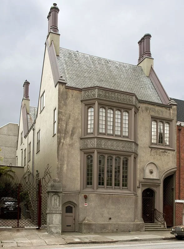
In 1915, de Young commissioned prominent architect Willis Polk to design a Tudor Gothic Revival style home on the lot adjacent the family estate. The original plan was to build two “mirror image” houses next to each other with a large half archway at the side of each house meant to complement, and complete, the neighboring home.

The “Tobin House” was first to be constructed and included a steeply pitched, slate-clad roof with projecting stuccoed chimneys topped with decorative copper chimney pots. A large, two-story bay window, with tall arched casement windows and small panes of leaded glass, dominates the eastern side of the front facade and is capped with Neo-Gothic inspired decorative panels. The half arch, formed with molded bands, leads into the a recessed side passage. The understated front door, east of the half arch, is accented with a lion’s head. With good fortune, Polk’s original intent of unpainted stucco, resembling stone to match the California Street lamp posts in front of the de Young mansion, has stood the test of time.

Ultimately, Helen de Young had plans other than to build a complementary home next to her happily ensconced sister, Constance. Thus, the second half of the mirror image house was never built leaving an abruptly ending archway where it meets the next building. The original de Young mansion met the wrecking ball in the 1940s, but not before portions of The Thin Man (1936), starring William Powell and Myrna Loy, were filmed there.

Today, 1969 California presents itself better than ever as it stands out among surrounding homes. The owners of this private residence have lovingly restored the interiors to keep the integrity and beauty of its original architecture. Willis and M. H. would be proud.

Jennifer Dunlop Fletcher - SFMoMA

The LOFTY HEIGHTS Interview

Jennifer Dunlop Fletcher

Jennifer Dunlop Fletcher

C A E N L U C I E R: As a girl who knew exactly what she wanted to do at a young age, talk about your current state of mind as SFMOMA’s Helen Hilton Raiser Curator of Architecture and Design.

Jennifer Dunlop Fletcher: At a young age, I saw museum exhibitions as one way to address a gap in arts education and introduce important ideas, new forms and processes seen in architecture and design, and revisit history with a broad audience. I still have those goals as well as an interest in engaging in public dialogue with designers, museum visitors and colleagues. It’s more important than ever to listen, share and take action.

CL: How have you seen the Snoetta designed new museum substantiate the position of  SFMOMA on the national and international museum scene?

JDF: I’ve noticed that tremendous additions to SFMOMA’s collection, including the Fisher Collection loan, which were acquired during the building’s closure, broadened SFMOMA’s audience and engagement significantly.

CL: Is there a favorite work that you enjoy visiting in the museum?

JDF: It is always a treat to walk through the Dan Graham sculpture on the small outdoor balcony on the 4th floor overlooking the Yerba Buena Garden.

CL: In what direction do you see the Architecture and Design department at SFMOMA growing in the years ahead.

JDF: Now that the department and collection is well-established and going on thirty years at SFMOMA, we’ll continue to focus on works that generate new ideas and dialogues, while also turning our attention to visionary contemporary works from the Bay Area and beyond. 

CLICK TWICE TO WATCH VIDEO OF SFMOMA A+D COLLECTION

CLICK TWICE TO WATCH VIDEO OF SFMOMA A+D COLLECTION

CL: Your new show, Sea Ranch: Architecture, Environment, and Idealism, just opened. How did the idea develop from your initial proposal to a public exhibition.

JDF: SFMOMA’s Architecture + Design gallery has very high walls, and much of the original 1960s designs for The Sea Ranch are small hand-drawings. My colleague and co-curator on the exhibition, Joseph Becker and I decided to recreate a full-scale version of one of the earliest Condominium units to fill the central space, and surround it with drawings and photographs on the gallery walls. Since The Sea Ranch is a bit far, it was important that visitors have an opportunity to experience the interior configuration of the architecture. 

CL: What was your most exciting find during your research for the show?

JDF: There were so many exciting finds! Every day I have a new favorite. Constance Beeson’s 1966 film of a Halprin Workshop showing The Sea Ranch site and people experiencing nature with intent and intensity was as exciting as finding architect Joseph Esherick’s initial Hedgerow house studies. We looked at thousands of drawings and photographs, and narrowed it down to just under one hundred works on view—each one is a gem.

CL: It has been many years since your department published a book in conjunction with a show.  What did you learn from the process.

JDF: While the essay writing is arduous it is so rewarding, and feels like a luxury to be able to spend time considering a subject or period. A book is a more private experience than an exhibition, but can be revisited repeatedly. For me, it is a pleasure to return to an exhibition catalog and remember seeing each work depicted

CL: FOG Fair is this week.  What do you enjoy most about the fair?

JDF: I love speaking to so many people about exciting design for four days straight.

CL: How has FOG Art + Design supported your department’s efforts?

JDF: The FOG Forum supports SFMOMA’s Architecture + Design collection building.

JDF IN DISCUSSION WITH BOBBIE STAUFFACHER SOLOMON AT FOG FAIR 2019

JDF IN DISCUSSION WITH BOBBIE STAUFFACHER SOLOMON AT FOG FAIR 2019

CL: What are some of you favorite museums?

JDF: The Zumthor-designed Kolumba Museum in Cologne, Germany, the new Fondazione Prada in Milan by Koolhaas and the Museo Nacional de Antropologia in Mexico City, . . .

CL: Any favorite architects and designers?

JDF: The ones that keep surprising and challenging me!

JDF ON PANEL WITH JONY IVE

JDF ON PANEL WITH JONY IVE

Visit SFMOMA

C A E N L U C I E R thanks Jennifer for taking the time to work on this piece with us.

The Survival of Landmark #7

Audiffred Building

Landmark #7
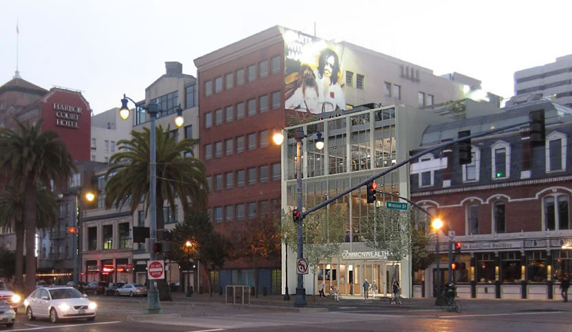
1-21 Mission Street

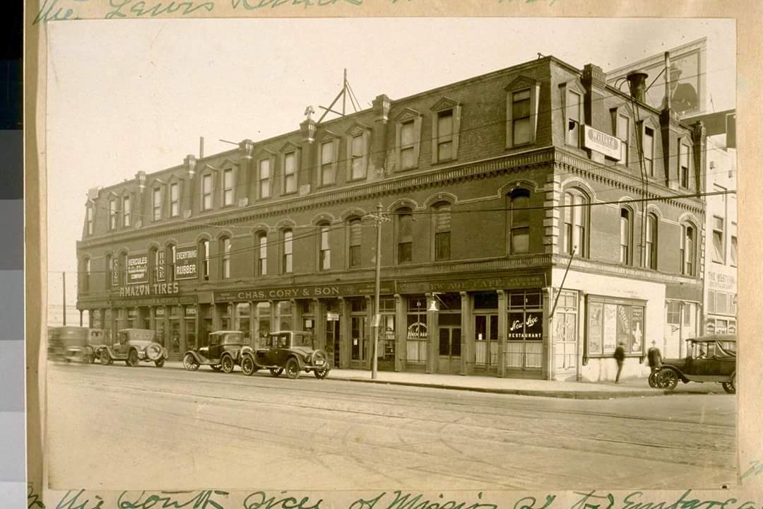
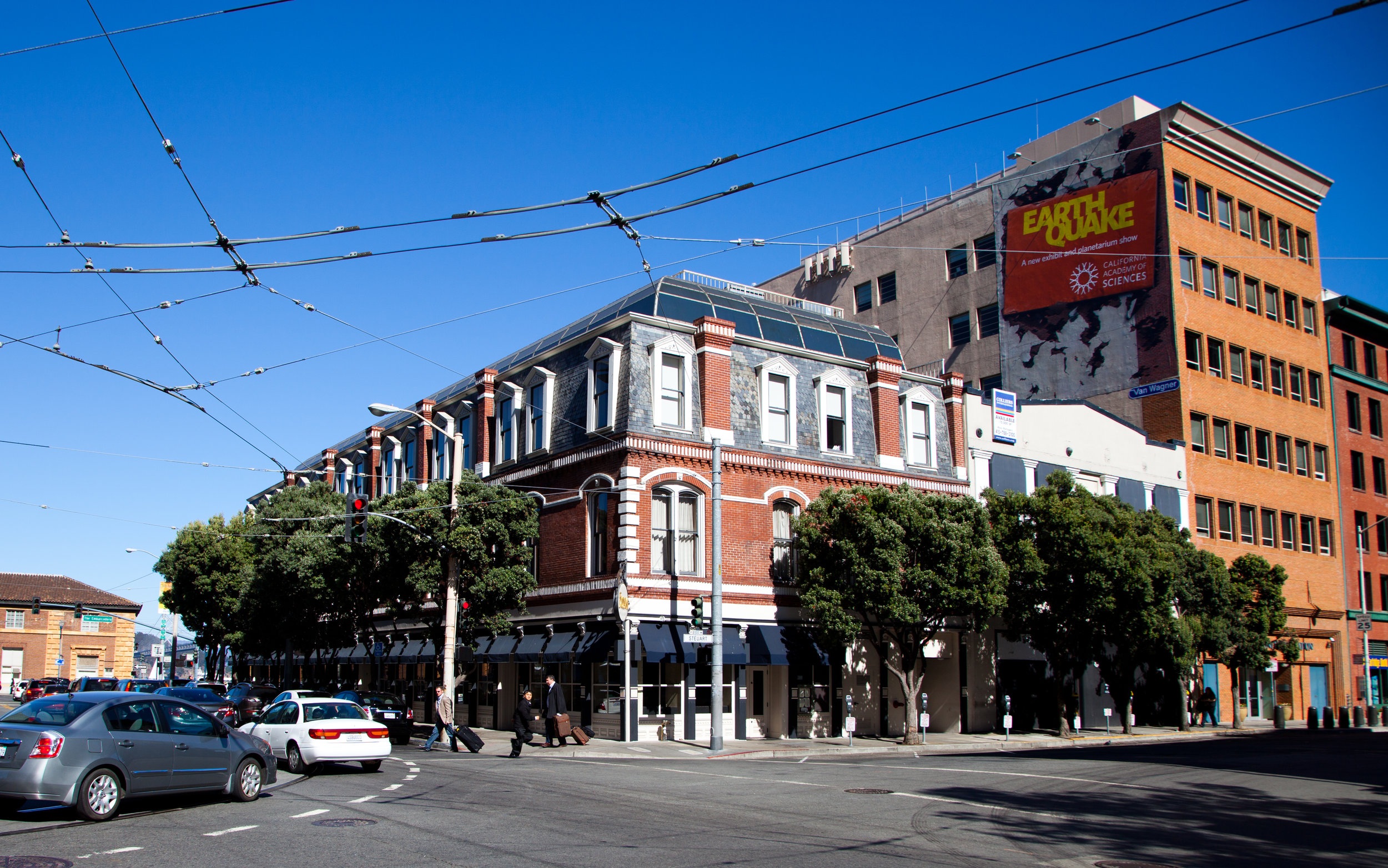
In the late 1800’s, Hippolite d'Audiffret ("Audiffred"), a Frenchman who had been living in Mexico, reportedly walked to San Francisco from Veracruz due to the increasing French nationals unpopularity with native Mexican country men and women. Upon his arrival in the city, Hippolite d'Audiffret built a profitable business selling charcoal in Chinatown. The Audiffred Building was constructed for him in 1889 to presumably house his business. Over the years this corner building had many tales of survival that added to the fabric of its legacy. This history and it’s unusual architectural style led to the Audiffred Building being designated Landmark #7. To this day, it is one of the few surviving buildings on the waterfront.

1906
San Francisco had the busiest waterfront on the west coast with a harbor filled with ships, bustling commerce, and shops serving every maritime need. At the turn of the 19th century, the Audiffred Building’s first floor retail spaces were rented to a restaurant and three saloons. The Bulkhead Saloon was one of these tenants.

In an attempt to stop the fires following the 1906 earthquake, the San Francisco Fire Department wanted to create a firebreak between the burning city and the wharfs. They blasted every other building with dynamite except the Ferry Building. As the tale is told, the fireman spared the Audiffred Building because they received an offer they couldn’t refuse. The very wise bartender at the Bulkhead saloon bribed the firemen with a keg of whiskey and a cart full of wine if they would spare the building. Needless to say, the building was saved.

“The very wise bartender at the Bulkhead Saloon bribed the firemen with a keg of whiskey and a cart full of wine if they would spare the building. Needless to say, the building was saved.”

1934
The Audiffred Building served as headquarters for the 1934 West Coast Waterfront strike that lasted eighty-three days when longshoreman in every west coast port walked out. The strike peaked with “Bloody Thursday,” a day when sailors Howard Sperry and Nick Bordoise were shot dead by police outside. A monument commemorates this tragedy at the corner of Steuart and Mission streets.

1934 West Coast Waterfront Strike, As A Monument, Dedicated To Events Or People, As An Exhibit of Art

1934 West Coast Waterfront Strike, As A Monument, Dedicated To Events Or People, As An Exhibit of Art

1946 - 1955
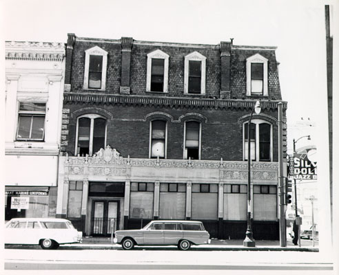
With the decline of San Francisco's waterfront in the mid-twentieth century, the Seven Seas Club for homeless sailors moved into the building in 1946. Bohemian artists and writers including Elmer BischoffHoward HackFrank LobdellHassel Smith, Martin Snipper, and Lawrence Ferlinghetti occupied lofts and studios on the two upper floors. The living spaces had no electricity and were condemned in 1955 as unsafe for living quarters.

1978
A fire from a gas main break gutted the building in 1978 leaving it scheduled for demolition. The building was saved by public demand. The Audiffred Building became the City of San Francisco's Landmark #7 and was placed on the National Register of Historic Places in May 1981.

1983 – 1984
A domed penthouse was added in the reconstruction after the fire. The building was subsequently bought by real estate developer Dustan Mills. In 1983–1984 it was refurbished and repurposed into office space by William E. Cullen.

1991
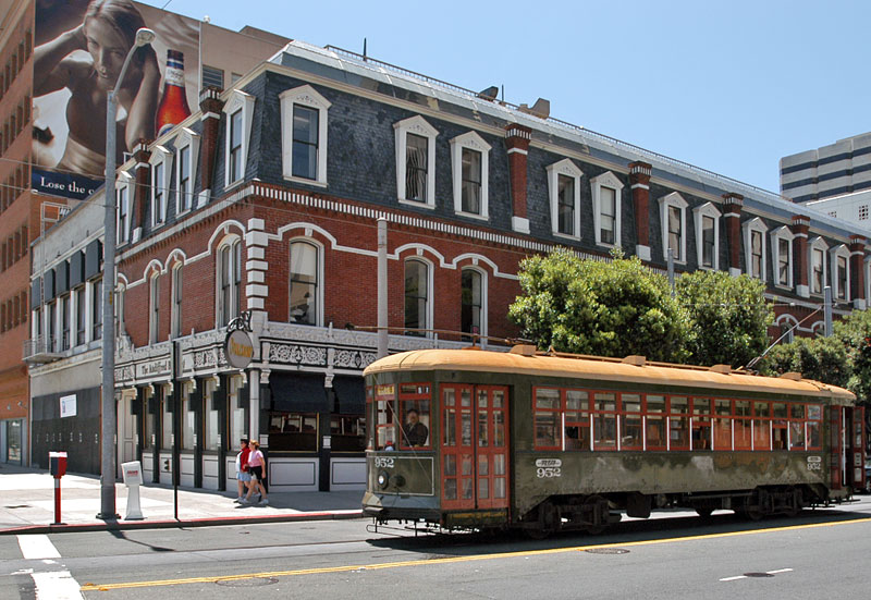
It was restored over a two-year period, and then in 1991, after the removal of the Embarcadero Freeway, the handsome building again saw the light of day.

1993 - Present
Since 1993, the Audiffred Building has housed Boulevard restaurant.

A Balancing Act

Disparities Between Listing and Sales Prices Signal a Need to Adjust to Cooling Market

How both buyers and sellers should act in the face of a real estate slowdown

Across the U.S., home buyers are demonstrating less urgency than they have in recent years, according to an October market report from Redfin. While demand remains strong, the report found, over one-third of homes for sale nationwide had a price cut of more than 1%, with discounts on the rise compared to last year.  

The gap between homes’ listing prices and sales prices is widening in a number of markets. The California Association of Realtors, for instance, found that the state’s sales-to-list-price ratio hit its lowest point in 20 months in October.

A large disparity between listing and sales prices can indicate that sellers are increasingly out of step with a changing market, and it may be time for a reality check—as well as discounts on listing prices.

In a sales situation, buyers and sellers alike must keep as up to date as possible on market data and set realistic expectations. Sellers often err on the side of using obsolete comps to price their homes, which leads eventually to discounts in a cooling market. Buyers, on the other hand, must keep in mind that discounts don’t mean huge bargains, but rather increased negotiability.

"We often see houses listed with the expectation of sellers that pricing has been continuing upward, and a lot of times, they price their homes by extrapolating continued upward market movement," said Paul Habibi, professor at the UCLA Ziman Center for Real Estate. "But once the market stalls out, those houses sit on the market for longer, there’s a scarcity of buyers, and lower bids. Sellers start to lower their asking prices or else accept offers below list."

However, real estate analysts say, a decrease in sales-to-list-price ratios does not forebode a significant downturn.

"If you look at the broader economy, the fundamentals are still strong," said Daryl Fairweather, chief economist with Redfin. "The GDP is growing, and unemployment is low. Sales prices are still growing. In order for it to be a real reason to worry, prices would have to start going negative."

Still, it pays for both buyers and sellers to be armed with the most current information about the state of this slight cooldown in the U.S., and to know how to interpret and act on disparities between asking and sales prices.

Where We Are Seeing Disparities Now

The hot Seattle real estate market seems to have reached a turning point, with the average home selling for 0.6% below listing price in October, the first time prices were below asking since 2014.

"Prices have gone up so much recently in Seattle that buyers have reached a point where they’re saying they’re not going to accept these," Ms. Fairweather said. "And with mortgage interest rates going up, more people are thinking of renting instead of buying."

Seattle is not the only market experiencing a slowdown in sales and sales prices. In Los Angeles, too, 23.8% of sellers sold their homes for below the listing price this September, while the median home price in Los Angeles County saw a 3.6% gain, the smallest in three years.

"We’ve had double-digit annual price increases in several of the years after the recession," Mr. Habibi said. "Now we’re seeing the market start to slow down because the pace of annual increases is generally unsustainable at that rate."

Third quarter market reports also reflected a cooling of home sales in Manhattan. The borough is experiencing its most significant slowdown in a decade, with sales declining by 11% compared to quarter three of last year, according to Stribling & Associates. As in Seattle and Los Angeles, this is leading to an increase in disparities between asking and sales prices.

"On the whole, there is more negotiability, and an increase in inventory," said Elizabeth Ann Stribling-Kivlan, president of Stribling & Associates. "We had a real run, but we’re definitely seeing a slowdown. But I don’t think that’s a bad thing."

What These Disparities Mean

Nationwide, home sales are decreasing, and property is lingering on the market for longer. But other real estate experts agree with Ms. Stribling-Kivlan that this does not presage a major economic downturn.

Instead, they say, the trend represents a normalizing of the market after moving for several years at a frenetic pace.

"There are consistent clues that we’re seeing a shift in the velocity of the market, and moving away from an extreme sellers market," said Javier Vivas, director of economic research for Realtor.com. "There’s some uncertainty that happens when you’re coming down from great heights. But those higher-priced, historically hot markets are really now getting more of that correction and moderation."

Another challenge for luxury real estate in some areas is oversupply. In Manhattan, a construction boom of high-end condos has led developers to begin dropping their asking prices. The average price of a Manhattan apartment decreased  4% to $1.93 million in the third quarter of this year plus, there’s a seven-month supply of apartments, up from a five-month supply last year.

But again, this data should not be interpreted as a sign of impending crisis. And the diversity of the market in New York means that what is true for one sector may not be the case for another.

"New York is fragmented, with co-ops, condos, resales, and new development, as well as borough by borough," Ms. Stribling-Kivlan pointed out. "It’s been interesting to watch the very high end, which has had increased activity to some degree. For the very wealthy, there has been an incredible amount of wealth created in terms of the stock side of this economy. They may be buying for less money, but they’re seeing a good deal and taking advantage."

How Buyers Should Respond

One advantage buyers seem to have over sellers is their access to more current information about markets.

"Sellers may be pricing based on comps that are months old. In a changing market, what your neighbor’s home sold for a few months ago may not be what you can sell for now," Ms. Fairweather said. "Meanwhile, buyers are looking at what’s currently on the market and really trying to get the best value."

However, buyers may be vulnerable to a misunderstanding of what a slight slowing of the pace of the market means for them. They should not, experts caution, expect to land substantial bargains.

"There’s a misconception that prices will decline at some point," Mr. Vivas said. "It can happen in extreme cases, but usually prices don’t decline in a growing economy. It’s about a deceleration in the pace of growth."

And at the high end, he added, some investors may be sitting tight to see how they will be impacted by the changes to the U.S. tax code enacted at the beginning of 2018, which has placed tighter restrictions on the deductions wealthy homeowners can take for property taxes and mortgage interest.

"The big wild card is the tax impact, especially at the end," Mr. Vivas said. "In tracking this entire year, the consensus is the impact [of the new tax code] is being buffered by the fact that people haven’t received their tax filings yet. We might see that come April and May, people think twice about where they put their money."

How Sellers Should Respond

Just as closely analyzing the most current data on home sales is crucial for buyers, sellers, too, must seek out the most up-to-date information  to price their homes correctly.

The current increase in disparities between asking and sales prices indicates that many sellers, though, are setting their home’s value according to an earlier, faster market.

"Sellers notoriously overshoot fair values because of personal attachment to their place of residence," Mr. Habibi said.

However, he cautioned, sellers cannot necessarily rely on agents to provide the best dollar value for their home, either: "Agents do the opposite. They under-list to sell quickly and move on to the next listing. One needs to look at the actual data and be as objective as possible."

Studying the most current market data is critical to listing your home as closely as possible to what buyers will now realistically be willing to pay. Sellers should look at homes that have gone into contract in their area recently, taking into consideration asking and sales prices, and the amount of time those properties sat on the market.

It’s also important to hire a seasoned broker who has experience selling in cooling markets.

"They can take an analysis of the raw data and use it to justify what a good price guide would be," Ms. Stribling-Kivlan said. "They’ll also have an anecdotal idea of what people out there are looking for."

Be prepared, too, for your home to attract fewer would-be buyers and to linger on the market for longer than it would have in the faster-paced market of previous years.

"Buyers are now going to have more options, and there’s not as much urgency, and not as many multiple offers," Mr. Vivas said. "Be prepared for single-offer scenarios. Some properties will stay on the market longer, but they will sell. But the premium you were getting in 2016 is probably not going to be there in 2018 or 2019."

All this may persuade those thinking of selling to put their plans on pause and wait to see if the market speeds up again. But you should figure more than just raw data into your calculus of whether now is the right time to sell.

"Residential real estate is an emotional commodity. People see prices coming down and get a little hesitant," Ms. Stribling-Kivlan said. "But great fortunes are made in a changing market. Just because prices are down doesn’t mean you have to wait it out. Figure out what your personal and financial needs are."

Originally Published in The Wall Street Journal, November 23, 2018

Investing in Real Estate with Your IRA

Real estate can fund your retirement—but brace yourself for lots of risk and rules.

Self-directed individual retirement accounts allow people to diversify their investments into assets other than the traditional stocks, bonds and mutual funds that make up most retirement plans. Examples of alternative investments include real estate, precious metals and oil and gas holdings. The catch: The IRS requires a qualified trustee or custodian to administer the assets, such as handling transactions and managing paperwork and reports. So far, only about two dozen companies in the U.S. can act as custodians of self-directed IRAs. 

One of these is Advanta IRA, a self-directed retirement plan administrator in Largo, Fla., which oversees about $820 million in assets. “A lot of our clients are already real-estate investors, so their IRA is simply a new source of capital,” says Scott Maurer, director of business development for Advanta IRA. “And for others, they don’t like being at the whim of the stock market.”

At Advanta, investors open an account, fund it by transferring cash from an existing IRA, and then identify the property they wish to purchase—which typically is a single-family house that will be rented out. Advanta purchases the property on behalf of the investor’s IRA. Nearly all the transactions are cash deals, bypassing mortgage lenders. Rental income from the property is remitted to Advanta, which also pays the bills for the property. The cost for this service: about $200 to open the account and purchase the property and then a flat $295 a year to manage the account. (The company doesn’t handle property repairs or maintenance, tasks typically performed by a property-management company.)

The rules governing real-estate IRAs are anything but simple. IRA owners are forbidden from engaging in certain transactions regarding the property. Even something as simple as mowing the lawn of a property you own in an IRA can run afoul of IRS regulations—and render the account owner susceptible to losing the IRA’s tax-favored status, which could trigger taxes and penalties. That’s because IRS rules require contributions to an IRA to be made in cash, not in services, Mr. Maurer says. In fact, the U.S. Government Accountability Office issued a report on retirement security last month and stated that “people who invest their retirement accounts in unconventional assets—such as real estate or virtual currency—may be placing their savings at risk.”

Bob Starks has been purchasing real estate for his IRA since 2009. “I do have some stocks and bonds, but 80% of my IRA is in real estate,” says Mr. Starks, a commercial real-estate agent in Duluth, Ga., who owns five rental houses and a small apartment building. He’s also flipped over 20 houses through his IRA. 

Since Mr. Starks is 71½ years old, he’s now required to take required minimum distributions of his retirement funds, so he’s tapping his rental income.

JUMBO JUNGLE TIPS

Here are some things to consider when creating a real-estate IRA. Consult a tax professional or financial adviser for the finer points of self-directed plans.

• Not for everyone. “There are plenty of easy opportunities to invest in real estate using mainstream methods like mutual funds or real-estate investment trusts,” says Mari Adam, a certified financial planner in Boca Raton, Fla. “It only makes sense to do direct real-estate investments if you’re a seasoned pro and are convinced the project you’re investing in is an absolute winner.” 

• Hire a property manager. The best way to ensure that you comply with applicable landlord-tenant laws and avoid prohibited transactions is to hire a third-party professional to manage the properties in your IRA. Expect to pay a commission equal to the first month’s rent and 6% to 10% of the monthly rent thereafter, says Mr. Starks. 

• Distribution options.Some investors take distributions from their real-estate IRAs “in kind,” by having the account administrator actually deed to them a percentage of the property, according to Jason Craig, president of the Entrust Group, a self-directed IRA administrator in Oakland, Calif. “For example, I can take out a 10% distribution and then re-register the asset so my IRA owns 90% and I personally own 10%,” he says.


By Robyn A. Friedman 

Originally Published in the Wall Street Journal

San Francisco's Top 10 Private Sales in 2018
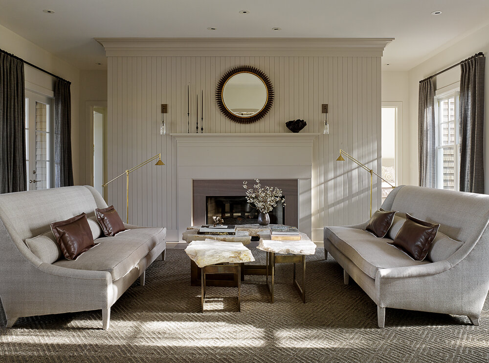
2920-Broadway-Street

2920 Broadway Street - $39,000,000

2006-Washington-Street

2006 Washington Street Maisonette - $25,000,000

840-El-Camino-del-mar

840 El Camino Del Mar - $21,900,000

34-Maple-Street

34 Maple Street - $18,500,000

3090-Pacific-Avenue

3090 Pacific Avenue - $16,500,000

3020-Pacific-Avenue

3020 Pacific Avenue - $16,500,000

19-Arguello-Boulevard

19 Arguello Boulevard - $12,800,000

3659-Washington-Street

3659 Washington Street - $12,500,000

2209-Pacific-Avenue

2209 Pacific Avenue - $12,300,000

2090-Vallejo-Street

2090 Vallejo Street - $12,000,000

Gary Hutton - Gary Hutton Design

La Dolce Vita

By Joseph Lucier

Gary Hutton's atelier along the bustle of Polk Street is an oasis of filtered light and elegant balance emitting an aura of omnipotent stability rooted in decades of experience and creative talent.  As a self described "elder of design," Gary offers clients a creative experience distilled from a time when interiors were assembled with artistic craft and measured patience.  In addition, Gary Hutton Design produces furnishings that whisper luxury through a marriage of design prowess and partnerships with master fabricators and craftspeople. Most of all though, it is Gary's affable personality and enthusiasm for the journey that gives his clientele the courage to leap into the unknown with him to create uniquely individual residences, always with yearning for la dolce vita.  

Gary Hutton

Gary Hutton

CaenLucier: How does the city of San Francisco influence and inspire you?

Gary Hutton: Having grown up only an hour south of the city, San Francisco was always accessible and part of my family’s regular outings.  So, the City was always part of my consciousness.  What struck me most when I actually moved here in 1973 was the openness and acceptance of all sorts of crazy lives and points of view.  The freedom to be one’s authentic self is an inspiration every day.

CL: Describe the lasting impact of studying under Wayne Thiebaud, Robert Arnison, and Bill Wiley during your undergraduate years at UC Davis?

GH: The faculty at UC Davis instilled in me an intellectual curiosity that stays with me to this day. Each of these artists strove in their own way to find a new or better avenue to do the things they did.  Parameters were to be questioned and re-evaluated, sometimes kept, and sometimes thrown out.  These incredible artists taught me to always look deeper.

CL: How have your professional relationships helped your career?

GH: In design school one day a professor said, “Look around the room. The people here will be the most important assets in your career”.  While that didn’t exactly turn out to be true, the general principle is such. It is most true that the job of an interior designer cannot be accomplished alone.  There are so many moving parts, from the realtor to the builder to the curtain maker.  Each and every one is vital in making a project a success.  It is also paramount to let these professionals do their jobs, as they usually know more about their part than you!

CL: What has changed and what has stayed the same over your time as a designer?

GH: In the many long years that I’ve been in this industry, from sample boy at Scalamandre while in school to my current status as one of the elders of Design in San Francisco, I have witnessed interior design go from an artistic craft-based business to one of corporate conglomerates facilitating a very real commoditization of thought. One only needs to take a cursory look to see that there is a very real lack of individuality.  These large conglomerates are selling a “look” and the public is thoughtlessly eating it up.  What remains the same is the dedication of real design professionals who look beyond the online trends and do great work regardless of style.

CL: What advice would you offer the new crop of designers in San Francisco?

GH: Step away from the computer! There is no program or VR in the world that will give you the sensation of sitting on a down filled, mohair velvet covered sofa.  Nor is there a monitor in the world that can convey the exquisite luster of a bi-colored silk taffeta.  The computer can be a useful tool, but it cannot deliver a sensual experience.  If our interiors do not produce a sensual experience, we have failed.  And remember that information is NOT knowledge.  Experience creates knowledge.  Get out into the world and learn.

CL: What makes your satisfied with a project? How do you measure your success?

GH: Design is problem solving, unlike art which is self-expression.  This nugget of truth was beaten into us as students at CCA. It is my yardstick to measure success and satisfaction.  If the myriads of problems that make up a project are resolved then I can take some satisfaction in that.  Of course, a happy client at the end is very important, but invariably if the problems are solved the client IS happy.  Sometimes the problem is perfecting the furniture plan to work with the client’s particular situation.  Sometimes the problem is divining what the client really wants versus what they ask for. When one “gets it right” that is success.  That is what motivates me every day.

CL: Talk about the importance of your relationships with the fabricators that create your furniture designs?

GH: In some ways being an interior designer is like being Jeff Koons.  There is a conceptual whole that must be made real by a team that understands the nuance that differentiates this design from someone else’s. Designers, like Mr. Koons, seldom, if ever, actually do the physical work.  I have been blessed to have developed a group of superior craftsmen and women who share that passion.  To make something as minimal as my “A” Series tables requires craftsmanship that is extraordinary.  I do believe that there is a Zen energy that lives in pieces that people have put their heart and soul into.  This quiet energy of near perfection is what we strive for in every piece.  It does take a village.

Gary Hutton Custom Creations

Gary Hutton Custom Creations

CL: Your four decade relationship with art collector Chara Schreyer culminated in the 2016 publication, ART HOUSE. What benefits have you enjoyed during these years of patronage? What has this collaboration taught you?

GH: How does one even begin to broach the subject of a 40 year collaboration?  In a very real sense, we grew up together.  Chara had not yet begun collecting in a serious way and I was just starting out on my own.  We did many projects outside of those in the book.  We explored together developing a mutual trust and a love of material invention. Most of the time it worked.  Of course there were failures, but that trust never wavered.  Understand please, that we didn’t always agree about specifics and to this day sometimes still don't, but we always agreed on the concept and what the final goals were. Chara has taught me that there is real value in trust as well as beauty.

Gary Hutton & Chara Schreyer

Gary Hutton & Chara Schreyer

ART HOUSE by Assouline


CL:  Favorite weekend getaway?

GH: Going to my boyfriend’s house in Vallejo

CL: Favorite restaurants? Locally, nationally, globally.

GH: We are so lucky here in the Bay Area.  We have choices that are the envy of the world, but I always go back to Zuni.  I have been going there since the early 80’s when the kitchen was a Webber grill out in the alley behind the restaurant. I recently had the pleasure of eating at Upland in NYC.  Wonderful food, beautiful place, and lively crowd.  One felt immersed in New York City energy! In LA, I always go to Luques. It is exquisite food without being precious.  I HATE tweezer food.  It is a low-key environment that was actually one of Barbara Barry’s first restaurant interiors. In Paris, I love the newly re-done café at the Ritz.  That room is my ideal of what Elegant French is all about and the food is good too!

CL: What are you reading?

GH: I am currently reading or have just finished four books that I am mad about!

Stoned, Jewelry, Obsession and How Desire Shapes the World by Aja Raden. This is a gorgeous read.  The language is beautiful and it opens the door to a new view of world history.  This is my second time reading it and it is even better than the first!

The Art Instinct Beauty Pleasure and Human Evolution by Denis Dutton. Not exactly an easy read, but this book has changed the way I see the world and the aesthetic choices that we make every day.

The Gourmand’s Way: Six Americans in Paris and the Birth of a New Gastronomy by Justin Spring. Wildly interesting read about the overlap of Americans in Paris after WWll.  Some are familiar (Childs, MFK Fisher, Toklas, Olney) and some are not (Liebling and Lichine), but all with a major impact on American food today.  Fun read with tons of information.

Hollywood by Charles Bukowski. I admit that I bought it because an artist I admire, John Register, did the cover art, and Martin Muller of Modernism Gallery gifted me with a signed print of it many years ago.  You can see it at Bix too!  A classic down and dirty story of the underbelly of LA told as only Bukowski could.  Keep it away from the kids!

CL: Secret guilty pleasure?

GH: Eating chocolate bars with almonds and sea salt while binge watching the Canadian PBS show “How it's Made.”

VISIT GARY HUTTON DESIGN

Thank you Gary for your work on this feature.

John Maniscalco - John Maniscalco Architecture

The Rigor of Quiet Design

By Joseph Lucier

Working in a sun drenched and music filled Hayes Valley atelier, John Maniscalco Architecture embraces each client relationship as a unique opportunity to create an inspiring residence that elevates the natural qualities of light and space. Spring boarding from 'big building' design work at Gensler and other internationally recognized firms, Maniscalco founded his own studio with the guiding principle of rigorous design that creates a framework for and an interplay with California's spectacular site specific environments.  Our time with John revealed a gentle giant who finds himself in the good fortune of a full roster of adventurous clients and projects that engage his unique talent for actualizing quiet design in the physical world.

John Maniscalco

John Maniscalco

Caen Lucier: What early interest lead you to study architecture at school?

John Maniscalco: As a young person, I was definitely a “maker” and had my hands in a lot of different expressive forms (drawing, writing, music), but was lucky enough to have a pivotal high school art teacher who took a moment - and it was just a moment - to give a gentle nudge and ask if I had ever considered studying architecture. The following day, I received an invitation to a summer architecture program at Harvard for high school students and so it began. Sitting in the Carpenter Center (Corbusier’s only US building!), the discoveries that summer were pretty vast, and at the end of the program, my professor suggested I apply to the architecture program at Cornell, where I spent the next five years beginning the journey I continue today, but the realization that I could do design work and listen to music simultaneously really unlocked something for me. I realized that they fed off each other, and it’s a practice I keep to this day.

CL: Talk about your experience of moving to San Francisco to help develop Gensler’s architecture department in the early 1990’s.

JM: In 1989, I was recruited to come to San Francisco to join a small team of architects within the larger context of Gensler’s San Francisco office. Gensler was, and is, a remarkable place doing significant work all over the world. This team was charged with a new and concerted push toward building the architecture side of the practice in San Francisco. The team had members from some of the best firms in the country, so for a young architect, it was a wonderful environment to learn from some generous mentors. That little group spawned a solid group of now well-established SF firms.

CL: How has your skill set designing high rise towers and institutional structures affected the residential work you do?

JM: When you are designing a large structure, the scale alone demands a discipline and a rigor, both in conceptual design and execution.  As we approach our residential work, we are trying to apply the same level of discipline. Our work tends to be precise in execution, and as a result, it’s unforgiving for a builder. A rigorous process, careful documentation, and strong communication are our most effective tools to communicate our intention to the craftsmen in the field. I’ve often described to clients that while residential work may seem simpler to design than a high-rise tower, it’s composed of a million unique conditions. It takes a lot of work and a special team to execute these projects.

CL: How do your clients benefit from this aspect of your professional background?

JM: Our work is defined by a very clean but warm architectural expression which places focus on the interplay of space and light. In many ways, the simplicity of the final details belies the complexity of the assemblies and the work that goes into making something that feels quiet and intuitive. While the clients may not be focused on the day to day design process or the rigor of our development and documentation, we’d like to think they see the benefit of that rigor as they live in the homes. I’ve been told it is a slow discovery process over time, and I enjoy the idea that all of the thought we put into the process slowly reveals itself.

CL: Is there a common sensory feeling that your designs produce or that you aim to achieve?

JM: We aim for our work to have a quiet quality of serenity. As architects in California, we are lucky enough to work in some of the most spectacular environments imaginable, and often our goal is to enhance the experience of these places by framing unexpected views, defining unusual spatial sequences, and encouraging users to see things in a different way. Ultimately, it becomes an exercise in creating a framework through which one can experience these things. In “getting out of the way,” rather than “look at me,” we combine a thoughtful interplay of space and light to achieve a calming effect.

CL: What is it about your client relationships that is rewarding throughout the design process?

JM: Each client is unique and takes us somewhere we would not go on our own. They bring history, goals, dreams, and expectations. They welcome us into their family life and we work together to create something unique for them. That journey and the often unexpected result is the most rewarding part of the process

CL: What was the pivot point that directed you towards exclusively working in the residential space?

JM: While working for a large firm in SF on a competition for a new town center, some friends who had bought one of the early lofts in SOMA asked me to help them add a bedroom to their unit. They thought it would be a few walls and a door, but looking for any design opportunity available, I saw a series of movable translucent screens coupled with custom furniture pieces that formed flexible rooms, allowed light to penetrate, and provided them with storage they sorely lacked. They had no budget, so a friend and I built it for them. I had solved a problem they didn’t know they had and they were exceptionally grateful. They told me the work we had done changed their lives, and at that moment, I discovered how meaningful the personal client connection was for me. Really enjoy getting to know people, learning about their goals, their dreams for their home, and doing our best to exceed those expectations. 

CL: Tell us about how you developed your first San Francisco home in Cole Valley.

JM: My wife, Mary, and I were renting in Cole Valley in 1997, about to be married, and looking for a home. As we searched, our limited budget pushed us further and further away into areas that we didn’t feel connected to. Beginning to lose hope, we stumbled upon a listing for a very small house on a steep block and pursued it. The current tenant would not let anyone in, so we wandered up to Tank Hill to get a sense of the house and property. With our youthful exuberance in full display, we decided that regardless of what was there, we could do something with it and bought it virtually sight unseen. We did a major project on it, jacking the house up two-stories and rebuilding all aspects of the house - doing much of the work ourselves on nights and weekends. It was the first house I did, the start of our practice, and it was our family home until 2011.

CL: What personal inspiration do you draw from your current home in the city?

JM: Our current home sits in a unique condition adjacent to the Presidio, and our goals for the project were shaped by the site in many ways. Like all of our work, we aimed for a kind of “quiet” architecture - spaces that deferred to the beauty of the surrounding environment, rather than try to compete with it. We quickly realized that its location afforded us the unique opportunity to create a country house in the city, and that is very much the way it feels. We have the benefit of connection to a great urban neighborhood, but a sense of living immersed in nature. To reinforce that feeling of connectedness to nature, the house incorporates organic elements and materials throughout. The overall feeling is one of deep serenity, and that is very unique for an urban home.

JMA - 19th Street

JMA - 19th Street

CL: There is an adage that architects are no good until they are fifty. Does your current viewpoint support that opinion?

JM: Well, it’s an adage and certainly not a universal truth - there are many, many great architects under fifty - but I think the essence of the adage is that architecture can be a slow learning cycle. Using the phraseology of the tech world, it’s difficult as a young architect to “move fast and break things,”  as the cycle from design to construction is long and the product is expensive. In my opinion, for any designer, the opportunity to build what you have designed - regardless of the scale - will forever inform your process. Finding those opportunities and endlessly iterating until you get an idea from your head into the world - that’s where the work and the reward lies for me.

CL: Talk about your personal passion and interest towards the “built form.”

JM: My interest in seeing our ideas take physical form is central to our practice. The goal of our work is to create unique site-specific and client-specific solutions, and the tools we work with are space, materiality, and light. The architectural and construction process are all focused on an end result that combines those things in a remarkable way. 

CL: Over the arch of your career, how has technology changed the way you do your job?

JM: The world of digital representation has changed everything, both positively and negatively. We have access to incredible visualization tools that enable us to translate ideas into architectural form quickly and easily. As wonderful as those tools are, they are not an end unto themselves, and it is easy to fall in love with imagery. It’s important for us to constantly refocus on the end result - the built form, space, light, materiality…

Dry Creek Valley

Dry Creek Valley

CL; What do you do to recharge your batteries?

JM: Make as much music as possible, see as much music as possible, and spend time with my wonderful family.

CL: Favorite restaurants in the city?

JM: Rich Table, The Progress

CL: Travel destinations on your short list?

JM: New Zealand, Patagonia, the Maldives…I could go on…

CL: What are you reading?

JM: Lincoln in the Bardo by George Saunders, Falling Man by Don DeLillo

VISIT JOHN MANISCALCO ARCHITECTURE

Thank you, John for your work on this feature.