A Burst From the Past

Cold cuts at eye level
Major appliance manufacturer General Electric launched a number of industry firsts in the mid-'50s while advertising its products' modern appeal. The GE Wonder Kitchen featured a built-in range, dishwasher, disposal, and washer and dryer under a single countertop. The sleek wall-mount, side-by-side refrigerator/freezer, right, has the look of kitchen cabinetry.

Bursts of color
As bright shades debuted in 1950s kitchens, cooks could now choose appliances in hues of yellow, pink, blue or turquoise to help modernize their family gathering spot.

Working for you
This colorful kitchen is worth your minute of study. There are no wasted steps in serving meals or in cleaning up: A drop-leaf cart carries food from range and refrigerator to table in one trip. The folding doors of the dish cabinet open easily to place contents within easy reach. Featured in the House Beautiful April 1957 issue.

Mint green accent
This 1950s magazine illustration features a mint green oven that matches the slanted rafters, a polished brass pendant light, and elegant wood cabinetry. Note the white-brick wall – a predecessor to the metro tile – and the trendy gold-colored hardware, which can be seen in many modern homes today.

Domestic bliss
This magazine illustration features powder-blue units and contrasting copper-colored appliances. Note the archetypal sunburst clock, the under-cabinet dining nook, and of course the beaming housewife. An early ancestor of the industrial trend, the image reveals the roots of the exposed brick wall.

Pink is everywhere
It’s the 1950s. The war is over, and the United States is enjoying a wave of unprecedented prosperity. Millions of GIs returned, eager for the comforts of home that they had been missing, and everyone settled down to a kind of nationwide nesting. Record numbers of homes were being built in the newly developed suburbs, and the center of all those homes was the kitchen.


Lasting Love and Landmark #251

GLAZER-KEATING HOUSE 1110 TAYLOR STREET

GLAZER-KEATING HOUSE
1110 TAYLOR STREET


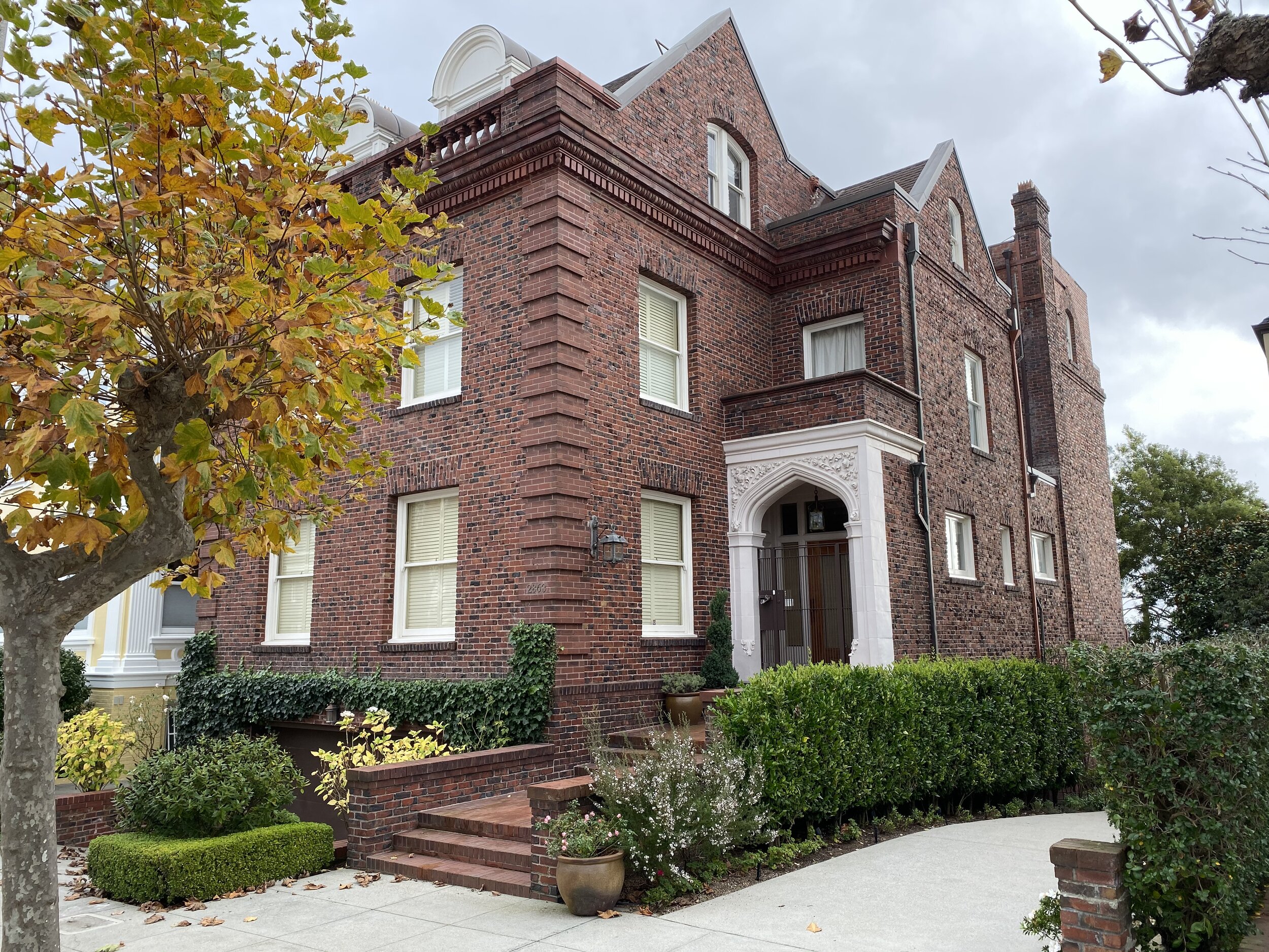
Built in 1906 shortly after the Great Earthquake and Fire, this Neo-Georgian dwelling served as the Coachman's House to the Flood Mansion, which still stands atop Nob Hill at 1000 California Street.

On October 16th 2002, the dwelling was finally designated by its owner, Dr. J Henry Glazer as: ZELDA d'ANGLETERRE GLAZER'S MEMORIAL LODGINGS, and such donated in his late wife's memory to the University of California , San Francisco for use and support of brain cancer research.


Dr. J Henry Glazer's love is clearly depicted in this tribute to his beautiful wife Zelda. The heartwarming history of their relationship and the reason he donated this classic home to help UCSF continue research to the horrible disease that took his wife's life.

A book simply called 1110 Taylor Street, San Francisco was also produced to explore the historic home and it's contents. It's a wonderful jaunt down memory lane and a fitting compliment for the historic neighborhood of Huntington Square.

A book simply called 1110 Taylor Street, San Francisco was also produced to explore the historic home and it's contents. It's a wonderful jaunt down memory lane and a fitting compliment for the historic neighborhood of Huntington Square.

INTRODUCING: 3467 Pacific Avenue

PRESIDIO WALL TRADITIONAL
6 Bedroom | 6 Bath | Single-Family Home
Offered at $8,950,000

3467 Pacific Avenue is a rare generational opportunity to own a home along the Presidio Wall, one of San Francisco's most coveted locations. Originally built in 1909, the property was renovated and expanded in 1991 under the direction of Butler Armsden Architects. This six-bedroom residence is advantageously nestled on a 41' wide flat lot with gracious interiors benefiting from tremendous natural light and a visual connection to the captivating south garden. A thoughtful, four-level floor plan welcomes comfortable daily living with views of the Golden Gate Bridge towers emerging from the neighboring Presidio forest. With immediate access to the Presidio Wall Playground, the shops and restaurants of Sacramento Street, and abundant recreational opportunities in the Presidio, this stately home offers an inspiring locale to enjoy a true San Franciscan lifestyle.

Andrew Mann - Andrew Mann Architecture

Andrew Mann

Andrew Mann

CAENLUCIER: What is your current outlook on your practice?

ANDREW MANN: We’re busy. The office is involved in a number of exciting projects, including estates in the greater Bay Area, residential renovations in San Francisco and even a religious and cultural center in the South Bay. The latter is a very different building type for us, providing an opportunity to learn and grow.  And, all of our projects are collaborative endeavors with the designers, landscape architects, other architects, contractors and consultants with whom we work.  We like those types of enriching experiences.

CL: You worked with William Turnbull, Jr.after your graduate studies. How did your viewpoint towards design develop during your tenure at his firm?

AM: From Bill, I learned what it truly meant to be an architect, both in terms of design and as a professional. His work was rooted in a sense of place – climate, context, views. And that always informed the design ideas he developed.  His buildings were spatially rich, but honest and straightforward in their materials and construction – the perfect balance of complex and simple. And, Bill had an incredible sense of integrity in terms of his work, his relationships with his clients and how he treated his employees. He was a great mentor and I carry those lessons with me in my own practice.

CL: Talk about your connection to earlier generations of Bay Area architects and how the vernacular they left behind informs you today.

AM: The Bay Area has a rich architectural tradition of which William Turnbull, Jr. was just one contributor. I am interested in the architects that came before him, of his generation and those that came after, that like him, created work that was rooted in the same sense of place. There’s a lot to learn about form, detail, quality of light and the use of materials. I look to that for inspiration and aim to make my work part of that tradition.

CL: Do you bring a signature style to your work?

AM: The firm’s architecture is not defined by a specific style. The aesthetic of our projects ranges from warm modern to pared-down traditional. What defines them is an attention to the quality of natural light and an attention to crispness of line and detail.  When one looks at our portfolio, those characteristics are what unifies the body of work.

 CL: How do you approach the abstract design qualities of a new project?

AM: In the most straightforward sense, my job is problem solving. We start with an understanding of a client, their needs for their home and how they live.  We then take that and overlay the context of the site and see how that informs our generation of design ideas. The abstract qualities are the elements we develop that organize this information and generate architectural form. This might be the views through a building to the landscape beyond, or how natural light enters and enlivens the spaces, or how rooms are organized or the overall shape of the building. That’s hopefully where the spark occurs and allows us to develop more than just a functional solution, by creating a home for our clients that sparks joy and pleasure in their everyday lives.

CL: Discuss the fascination that architects have with stairways.

AM: Most often, as one moves through rooms, the experience is horizontal; stairways are the one place within buildings in which occupants have the opportunity to experience moving through space vertically. That changes one’s perspective and provides architects with the opportunity to design complex volumes with interesting views and perspectives. Stairways also typically just have the function of movement – one often doesn’t need to worry about furnishings or glare issues as one would in a living room or bedroom, for example. This allows for an opportunity to explore the use of natural light in different and more dramatic ways. And stairways are often the place in a house the unifies all of the other rooms and really creates the heart of the home.  

MEADOW ESTATE ANDREW MANN ARCHITECTURE

MEADOW ESTATE ANDREW MANN ARCHITECTURE

CL: If you could design a particular piece of furniture, what would it be and how would it look?

AM: I would design a dining room table. I recently had the opportunity to create the table for our new conference room and enjoyed the process of integrating form and function. What interests me about a dining table is that it’s about creating community and connection with those gathered around it through the generosity of food.  For me, a table has to be beautifully made, with perfect proportions, and provide a comfortable place to sit. My table would be made from wood, where the character of the material, the structure of the construction and the craft with which it was made were all inherent in its design.

 CL: You are involved with The Sea Ranch design committee. Talk about the importance of this work today and how it relates to the original design team’s ethos.

AM: The Sea Ranch is a very special place, with its groundbreaking approach to development through the relationship between the built environment and natural environment. The role of The Sea Ranch Design Committee is to review all proposed changes by property owners to buildings or landscapes and to evaluate how those changes fit with the ideals defined in the association’s Design Manual. The original buildings, with their rustic modern vocabulary, were constructed from the vernacular materials readily available at the time, primarily redwood, western red cedar and douglas fir. As time has passed, these materials have become more expensive and less available. And, climate change has impacted the area, creating an increased risk of wild fires, so buildings and landscapes need to be designed within that new context. The committee now grapples with how to foster creativity, encourage the use of new materials, be responsive to changes in climate and the resultant changes to building codes, while staying within the framework of the original vision. It’s an exciting undertaking.

CL: What would you be if not an architect?

AM: I would have loved to have been an artist, either painting or drawing. Architecture is a great way of balancing my desire to express myself visually with my interest in real-world problem solving, but it would be fun to just create.

CL: What are you reading?

AM: I have three books going right now.  I was recently in Charleston, South Carolina and realized that I wanted to learn more about the history of our country and how the institution of slavery has shaped us. To explore that, I’m reading Jill Lapore’s These Truths: a History of the United States.  To understand the city that I live in, I am also reading Season of the Witch: Enchantment, Terror and Deliverance in the City of Love, by David Talbot.  It’s about the tumultuous social history of the transformation of San Francisco between 1967 and 1982 and how that created the city we know today.  And, for a diversion from history, I’m reading The American Short Stories 2018, edited by Roxane Gay. I really like the short story format and how narrative unfolds in that context.

CL: Favorite weekend getaway?

AM: I would have to say The Sea Ranch. A swim in the pool, a walk along the bluff, good food and conversation with friends. The warmth of the sun, the cool ocean breeze, and the sound of the surf. The best.

CL: Top three bucket list items?

AM: A couple of years ago, I had the opportunity to travel to Machu Picchu, one of my bucket list destination. It was truly awe-inspiring. I don’t have my list ranked, but here are three others: Rome - I would love to live in the Eternal City for six months or so.  It’s my favorite city, with so much art, architecture and history layered upon one another.  It would be great to spend my time there sketching. Oh, and the food…. The Russia of my ancestors – I would be very interested to travel to see the towns in Eastern Europe from which my family emigrated.  I don’t suppose there is much to see, and any physical fragments of that earlier world are long gone, but I would like to get a feel of the place. And, I’d love to go to St. Petersburg. It’s a Baroque city conjured up from the marshes. It’s always intrigued me. Angkor Watt – It would be fascinating to go see this monument that is so important to the Cambodian culture. Like Machu Picchu, it’s a place that has held mystery for me since I was a child.

Angkor Wat

Angkor Wat

CAENLUCIER would like to extend our gratitude to Andrew Mann for his collaboration with us on this feature.

VISIT ANDREW MANN ARCHITECTURE HERE…

Top Ten Sales of 2019

0272ce4c-16c6-4ddc-a676-bcf7c5baa0a0.jpg
 

Life at the top with CAENLUCIER

2019 saw continued strong sales activity in San Francisco’s prime single family home market above $10,000,000. Of these top ten sales, six properties were transacted privately under the expert guidance of residential professionals. Now more than ever, UHNW market participants are benefitting from their agents opportunity network, valuation expertise, and discreet transaction practices.


For further details on any of these sales, please contact CAENLUCIER at info@caenlucier.com

Landmark #119 and the Murder Mystery??

If you set out to unravel the facts behind one of San Francisco’s most gruesome murders, you’ll find yourself with a handful of details most likely culled from old ghost stories.

The tale always begins with Richard Craig Chambers, a silver baron from the Midwest. With his wealth, he moved to San Francisco and built the palatial home at 2220 Sacramento Street. Richard and his wife moved in in 1887. When Richard died in 1901, a few years after his wife, two of his nieces inherited the home.

It was an unhappy arrangement. The nieces did not get along. In some variations of the story, one niece built the house next door to get away from the other, Claudia Chambers. It is Claudia who meets the most unfortunate end — and under murky circumstances. Most sources say she died in a “farm implementation accident.” Many agree she was sawed clean in half. A few say it was no accident, that a deranged family member faked the accident in order to murder Claudia.


2220 Sacramento

Regardless of the circumstances, the Chambers mansion became synonymous with ghost stories. Ghost tours today still stop outside the home, warning curious looky-loos of Claudia’s spirit, which manifests itself in the form of flashing lights and shadows in the windows.

But the historical record says something else altogether: that almost none of this happened at all.

The truth behind the Chambers mansion

The first mistake becomes apparent immediately. There is no Richard Craig Chambers, the name universally attached to the historic San Francisco home. His name was Robert, as dozens of newspaper articles and census records attest. Some accounts also claim he was a U.S. Senator; Chambers never served in the Senate, although he was the Plumas County sheriff from 1858-62.

 He made his fortune as the superintendent of the Ontario silver mine near Park City, Utah. He eventually sold the mine to George Hearst, father of the newspaper magnate; by the time the mine tapered off, it had yielded $50 million in silver and lead.

Robert and his wife Eudora were well-known fixtures in San Francisco society but, for reasons lost to time, the pair never had children. Sometime before Eudora’s death in 1897, they took in two of Eudora’s nieces, Lillian and Harriet. If your interest is piqued by the mention of two nieces, they’ll become pertinent later on.

 Robert died of appendicitis, just short of 70, on April 11, 1901. The Chambers estate, valued at $1.5 million at the time, was split between Robert’s brothers and sisters. The house went to his sister Ada Chambers Martin, who appears to have lived in it with her husband until their deaths in the early 1910s. After that, the home passed to another Chambers sibling, Margaret.

 Those are the facts, backed up by newspaper accounts and property records. A further dive into census records and city directories turns up no trace of anyone named Claudia Chambers which, at least, should reassure anyone worried she was sawed in half.

A good ghost story, though, has some threads of truth, used to weave together the tale. And it seems Claudia’s haunted soul does have a model in reality: Eudora Chambers.


920x920.jpg

The history of Eudora Chambers

We know little about Robert’s wife Eudora, save for a few sad episodes recounted in the San Francisco Call. In May 1893, Eudora went missing from 2220 Sacramento St. Her friends and family searched for her, but the 40-year-old had vanished without a trace. A week later, a man found her wandering the beach near Mussel Rock, “very weak and helpless.” Although she’d been missing for seven days, the family doctor said she showed no signs of exposure. The doctor speculated she’d been taken in at some point during her lost days.

Eudora went missing from 2220 Sacramento St. Her friends and family searched for her, but the 40-year-old had vanished without a trace. A week later, a man found her wandering the beach near Mussel Rock, “very weak and helpless.”

Her strange behavior comes tragically into focus seven months later when the Call ran an article with the headline, “Mrs. R.C. Chambers Tries to Commit Suicide.” On New Year’s Eve, a train engineer near Valencia Street noticed a woman walking perilously close to the tracks. As the train approached, he saw her throw herself in its path. Remarkably, she was thrown clear of the tracks, suffering non-fatal injuries to her head and hip.

“From persons who are acquainted with the family it is learned that Mrs. Chambers is thought to be slightly unbalanced mentally,” the paper callously reported.

Three years later, Eudora was dead. Her cause of death is not known.

Then there is the matter of Eudora’s nieces, Lillian and Harriet. There was indeed conflict with the nieces but not between each other. After Robert’s death, Lillian and Harriet filed suit against his family, alleging they deserved a cut of the estate. According to the lawsuit, Lillian and Harriet were taken in by the Chambers after their own parents died and had been raised "like [their] children." On the condition Robert’s will would provide for them after his death, the sisters handed over their tract of land in Butte County.

After Robert’s death, Lillian and Harriet filed suit against his family, alleging they deserved a cut of the estate.

Because they "were treated with such kindness after the marriage and after the death of Mrs. Chambers ... they had no hesitancy in complying with Chambers’ request they deed the property to him," the Chronicle reported.

Upon his death, however, Lillian and Harriet learned there was no such provision. They sued the Chambers, hoping for at least the land in return, but after some years and several appeals, the nieces lost their case.

They never again lived in the house on Sacramento Street.


Last Sold November 8, 2013 for $4,085,000 by our very own Joseph Lucier.


The Chambers mansion, today

As for the mansion, it’s had a few incarnations since housing the Chambers family. In the late 1970s, it was turned into a 15-room luxury bed-and-breakfast. Among its many celebrity guests were Robin Williams, Barbra Streisand and John F. Kennedy Jr. At night, the Mansion Hotel hosted magic shows (flashes of light in the windows, anyone?) and private concerts (once, Liberace performed).

In 2000, the Mansion Hotel was sold to a private developer and turned into two townhouses. The real estate site Zillow estimates they're worth about $6 million each. Today, the mansion is nearly hidden from the street by bushes and trees, easily missed by anyone walking to or from Lafayette Park. 

For those hoping to find answers beyond the grave, there's one last footnote: There is no grave. An obituary indicates Robert was buried at Laurel Hill Cemetery, a defunct graveyard that was moved to Colma in the 1930s. At that time, the graves were dug up en masse, although occasionally forgotten coffins are found during present-day renovation projects.

Eudora Chambers' final resting place is a mystery.

Credit: Katie Dowd, SFGATE Monday, October 22, 2018

Profoundly low interest rates here to stay

Profoundly low interest rates are here to stay

After more than a decade of economic expansion, and despite everything from tariffs to tax cuts, it seems this is as high as US interest rates go. Meanwhile, the European Central Bank is debating whether to reduce its negative rate still further. Until this month, it was possible to imagine that pre-financial crisis levels of 4 to 5 per cent might eventually return. No longer.

According to their own projections, Fed officials believe rates will settle at 2.5 per cent in the long run. Subtract their 2 per cent inflation target and the real reward for capital is going to be a miserable 0.5 per cent. The equivalent rate in Europe and Japan will almost certainly be much lower. Such low levels of interest rates are a profound change from the past. (The federal funds rate was 6.5 per cent, and the real rate was about 4 per cent as recently as 2000.) Although interest rates touch almost every aspect of economic life, the developed world remains deep in denial about the consequences. Here are eight themes for investors and policymakers to ponder.

First, there is an intimate link between long-run interest rates and long-run economic growth. Perhaps capital is less relevant to the digital economy, but for interest rates to max out at such low levels sends an alarming signal about the prospects for future expansion.

Second, monetary policy is broken. In 2008-09, the Fed cut rates by 5 percentage points and it was not enough. Today it has far less room to respond to a recession. The Bank of Japan, which made no move on Tuesday, has all but given up trying to hit its 2 per cent inflation target. The ECB is in danger of going the same way. The world is dismally unprepared for a downturn: two of the world’s most influential central banks may start the next recession with their policy rate already below zero.

Third, if monetary policy is broken, fiscal policy must step in. That means either governments must approve higher spending and tax cuts in response to a recession or else give the central bank a fiscal tool in the form of “helicopter money”, essentially printing money to spend or distribute to the public. Alternatively, governments could set higher inflation targets and use fiscal policy to reach them now. That would give their central banks more room to cut when they need it.

Fourth, lower interest rates make debt more sustainable. This is particularly true for public debt, because countries actually borrow at these low risk-free rates, and somewhat true for private debt. For many countries, it makes sense to borrow more in order to invest. Predictions of financial crisis based on past levels of debt-to-gross domestic product are likely to be misleading.

Fifth, capital stock should rise relative to output. Investments that were once unprofitable now make sense: road upgrades to save a few minutes of time; expensive, niche drugs to help a few hundred people; or extra years of study to earn a graduate degree. Such projects may feel irrational. They are not.

Sixth, any asset in fixed supply is now more valuable, because its future cash flows can be discounted at a lower rate. A monopoly supplier of water or electricity, land in a city centre or the back catalogue of Disney: the capital value of these assets must rise, so their yield matches the lower interest rates. This trend is related to recent movements in wealth inequality. It also puts investors at risk of identifying financial bubbles that do not actually exist. One vital policy response would be to slash the return on capital allowed to utilities.

Seventh, demand for housing will rise. It is, after all, the main capital asset that most people use. There are two potential outcomes. Where it is possible to build, permanently lower interest rates will trigger an increase in the housing stock. If it is not possible to build, then houses will behave like assets in fixed supply, and soar in price. Thus falling interest rates make planning and zoning rules a crucial economic issue.

Eighth, low interest rates make it harder to save. In particular, they make it harder to save for a pension, and harder to live off whatever capital accumulates. This fact has been obscured by the one-off rise in price for scarce assets, many of which are owned by pension funds. But future returns are likely to fall. The result will force workers to accept some combination of later retirement, higher taxes, bigger pension contributions or lower incomes in old age.

It is possible that this bout of low interest rates will end. Perhaps the Fed is mistaken and it will have to raise rates sharply in the future. Perhaps a burst of technological progress will raise growth and boost demand for capital. But no one can choose to make that happen: this is not some perverse plot by Fed chair Jay Powell and ECB president Mario Draghi to make life miserable for the world’s savers. The long-run real interest rate balances the desire to save and demand to invest. Central banks are its servants not its masters. The trend towards lower real interest rates has lasted for decades and is as likely to continue as to reverse. With central banks moving to ease, it is time to stop waiting for rates to recover and face the world as we find it.

Written by Robin Harding
Published in the Financial Times
July 30, 2019

Mead Quin - Mead Quin Design

Mead Quin

Mead Quin

CAENLUCIER: How did you come to the profession of interior design?

Mead Quin: I stumbled into it. After studying Fine Arts at Vanderbilt University, I worked for years as a professional portrait artist. Life circumstances necessitated a change, and I found myself drawn to the field of interior design because of its creative qualities. I find there are many similarities between composing a painting and composing a space.

CL: How has your design work benefited from your scholastic training as a fine artist?

MQ: I approach a room as I would a canvas, using line, shape, color, value, texture and form to compose space. I have no formal training as a designer and rely completely on my intuition and artistic skills. My amazing team fills in with technical brilliance and helps me pull it all together. It’s quite fun!

“Anything Loro Piana. I would design an entire home with only Loro Piana textiles if I could.”

CL: Talk about your Pacific Heights project with Andy Skurman and how you two married your contemporary design feel with his classical architectural sensibilities.

MQ: Working with Andy Skurman was an incredible opportunity and inspiring from start of project to end. He is a brilliant architect, meticulous in his work and immensely respected in our industry. Our client, while appreciating classical architecture, wanted Andy to reach for a contemporary interpretation of it. Between the two of us, we were able to create a space that honored the classical “heart” of the space/building while feeling contemporary and fresh for the young family living in it.

CL: You recently worked with homeowners who have a noteworthy art collection.  How do you approach interiors to seamlessly integrate artwork?

MQ: When working with client’s who value art, interiors become the backdrop. They set the stage. I love finding ways of creating rich and livable spaces that support the art in one’s home rather than detract from it. It can be tempting as a designer to make your own “art” the story. I, however, find myself gravitating to design that considers the human first, no matter what is most important to them, whether it is the way they live or the art they collect.

CL: Looking to the past and present, who are some designers that inspire you?

MQ: John Pawson is always the front runner. I adore his minimalist approach. The attention to detail, line, form, necessity, and palette inspire my work. When wondering how to edit wisely and reach essence, I often pull his work out for guidance. I also love Joseph Dirand. Another minimalist at heart with a manner that is relaxed, elegant and poetic. If given the opportunity to hire anyone I want to design my own home, he’d be a front runner. Ilse Crawford for her human centric design. Rose Uniacke for her brilliantly understated interiors, use of color and antiques.

CL: Where are you getting your design inspiration from these days?

MQ: Salone del Mobile in Milan is at the top of my list. The convergence of brilliant designers, manufactures, thinkers and makers in one of the most beautiful cities is the epitome of artistic inspiration. The beauty literally takes my breath away. The fair is wonderful, but the city streets are indescribable, crawling with inspiring moments at every turn.

Full Floor Apartment - Pacific Heights

Full Floor Apartment - Pacific Heights

CL: You visited the Salone del Mobile in Milan earlier this year.  What were your impressions from this season’s trends and offerings?

MQ: Outdoor living. Furniture so beautifully designed, it could/can be used for indoors. It felt as though manufacturers were really understanding the value of connecting with nature, outdoor living, by designing comfortable, well-made and beautiful furniture to enjoy it in. Another theme was sustainability. Considering how production impacts our environment and how to minimize waste were key themes among many artists, especially at Rossana Orlandi… a must, must visit on your next trip to Milan. Most inspiring was the commitment to quality and good design while staying cognizant of how production and consumption impact our planet.

CL: Are there any furniture lines that you have an affinity towards?

MQ: There are so many wonderful lines. Flexform, a family owned Italian manufacturer, is at the top of my list. Everything is handmade and of the highest quality. The designs are beautiful, the craftsmanship exquisite and longevity exceptional. When working with clients, I cannot emphasis enough how important it is to purchase the highest quality possible. Buying well-made furniture that has timeless characteristics is better for our planet and easier on your wallet (long-term). I could go on… A smaller, local shop I’m enthralled with is Gary Hutton’s furniture. Some of his simple, metal tables are my very favorite. They are beautiful designed and crafted, have great proportion, are understated yet have impact. I just love them.

CL: What would your fantasy project be?

MQ: A home on the ocean. The sea is my happy place… there is nothing more beautiful to me than the large expanse of water, the cadence of the waves making their way to shore and the soft shades of blue, grey and green fluctuating with the time of day. It would be a dream to work on a home situated at the ocean’s edge with a client who wanted to experiment with softening the lines between indoors and out.

CL: Favorite weekend getaway?

MQ: Right now, honestly, home. Life is full. There is nothing better than getting to Friday and knowing I have a whole weekend at home. I love resting, reading, working on our space, spending time with friends and family, walking to the local farmers market, sleeping in, starting the day with coffee, ending it with wine, enjoying all that Oakland has to offer in between. It’s a pretty good life and I’m grateful.

CL: Favorite restaurants?

MQ: Bartavelle Café in Berkeley. A sweet, little, European-inspired café, positioned between Acme Bread and Kermit Lynch Wine Merchant, is hands down my favorite food in the East Bay. I could eat the Persian Breakfast, full of herbs, soft cheeses, cucumber and house made jam every day for the rest of my life and be happy. They are serious about their coffee, discerning about their wine and make a killer olive oil cake. It’s a must try and a can’t go wrong.

CL: What are you reading?

MQ: I am rereading Healing Spaces by Esther Sternberg. She is a scientist who explores environmental influences on mental and physical health. I am fascinated with the notion that the space we create can impact health and happiness in profound ways. In the book she suggests, “people who have learned to associate a place with a positive feeling – or with hopes that the place will heal – will benefit from simply being in that place.” This excites me more than anything else about the work we do… that we might be creating homes in which our clients can thrive, feel happy, heal, connect with nature, find solitude and community, etc. is what drives me to keep learning, exploring and creating.

Quintessential Mead Quin Design

Quintessential Mead Quin Design

CAENLUCIER would like to extend a BIG thank you to Mead for her work on this feature with us.

VISIT MEAD QUIN DESIGN HERE…

The Big Scoop on Landmark #260

Michael de Young was the patriarch of one of the most powerful and influential families in San Francisco. He arrived to San Francisco during the Civil War years in 1854 from St. Louis with his mother Cornelia “Amelia” and brother Charles. De Young’s father, Miechel, was said too have died of a stroke during their journey.

In 1865, Michael and Charles entered the publishing business as teenagers by borrowing a $20 gold piece from their landlord. They used the money to buy an old desk, several fonts of used type, some newsprint, and then tucked themselves away in the corner of their landlord's Clay Street print shop. The brothers started with a free theater program sheet called The Daily Dramatic Chronicle, which debuted on January 16, 1865. The four-page Daily Dramatic conveyed itself to be "a daily record of affairs -- local, critical, and theatrical," but was seen as a gossip sheet. The two teenagers handed out the Daily Dramatic at hotels, theaters, restaurants, and saloons, and by the end of their first week they had payed their landlord back. According to the de Young’s, the Daily Dramatic Chronicle would be “the best advertising medium on the Pacific Coast.”

Dramatic+Chronicle.jpg

By the end of their first month, the de Young's had increased the circulation of their fledgling effort to over 2,000 copies. It was an encouraging start, but that successful first month would be soon forgotten when the de Young’s broke free from their role as upstarts and scored an even more remarkable coup.

Abraham Lincoln President of the United States 
assassinated by John Wilkes Booth

Word of the president's death appeared in the de Young’s first "extra" edition, hitting the streets several hours before the city's other daily journals reported on the national tragedy. The de Young’s had quickly legitimized their position as news reporters, marking the first pivotal step in their bid to become aggressive, competitive journalists. By the 1870s their paper was so influential and widely read that the de Young’s could make or break a politician, policy, business deal, or any other matter of importance in Northern California. We now know this paper as the San Francisco Chronicle.

Over the following years, Michael De Young and his wife Katherine had five children:

  • Charles de Young (1881–1913)

  • Helen de Young (1883–1969), who married George T. Cameron (1873–1955)

  • Constance Marie de Young (1885–1968), who married Joseph Oliver Tobin (1878–1978)

  • Kathleen Yvonne de Young (1888–1954), who married Ferdinand Thieriot (1883–1920)

  • Phyllis D. de Young (1892–1988), who married Nion Robert Tucker (1885–1950)


In 1911, Michael H. de Young purchased two lots on the south side of California Street between Gough and Octavia Streets, directly adjacent to his own estate. He gave the deeds to two of his daughters, Helen, wife of George E. Cameron, and Constance, wife of Joseph O. Tobin, an executive at Hibernia Bank and member of one of San Francisco's oldest and wealthiest families. Michael also offered to build homes on these lots for the couples and their young families. For a few years nothing happened as both the Tobin and Cameron families chose to live in the affluent town of Hillsborough, south of San Francisco. But in 1913, Michael’s wife Katherine succumbed to cancer and the couple’s only son, Charley, died in a fishing accident. These family tragedies prompted de Young’s daughters to reconsider their father’s earlier offer.

The M.H. and Katherine de Young estate at 1919 California Street

The M.H. and Katherine de Young estate at 1919 California Street

In 1915, de Young commissioned prominent architect Willis Polk to design a Tudor Gothic Revival style home on the lot adjacent the family estate. The original plan was to build two “mirror image” houses next to each other with a large half archway at the side of each house meant to complement, and complete, the neighboring home.

The “Tobin House” was first to be constructed and included a steeply pitched, slate-clad roof with projecting stuccoed chimneys topped with decorative copper chimney pots. A large, two-story bay window, with tall arched casement windows and small panes of leaded glass, dominates the eastern side of the front facade and is capped with Neo-Gothic inspired decorative panels. The half arch, formed with molded bands, leads into the a recessed side passage. The understated front door, east of the half arch, is accented with a lion’s head. With good fortune, Polk’s original intent of unpainted stucco, resembling stone to match the California Street lamp posts in front of the de Young mansion, has stood the test of time.

Ultimately, Helen de Young had plans other than to build a complementary home next to her happily ensconced sister, Constance. Thus, the second half of the mirror image house was never built leaving an abruptly ending archway where it meets the next building. The original de Young mansion met the wrecking ball in the 1940s, but not before portions of The Thin Man (1936), starring William Powell and Myrna Loy, were filmed there.

Today, 1969 California presents itself better than ever as it stands out among surrounding homes. The owners of this private residence have lovingly restored the interiors to keep the integrity and beauty of its original architecture. Willis and M. H. would be proud.

Jennifer Dunlop Fletcher - SFMoMA

The LOFTY HEIGHTS Interview

Jennifer Dunlop Fletcher

Jennifer Dunlop Fletcher

C A E N L U C I E R: As a girl who knew exactly what she wanted to do at a young age, talk about your current state of mind as SFMOMA’s Helen Hilton Raiser Curator of Architecture and Design.

Jennifer Dunlop Fletcher: At a young age, I saw museum exhibitions as one way to address a gap in arts education and introduce important ideas, new forms and processes seen in architecture and design, and revisit history with a broad audience. I still have those goals as well as an interest in engaging in public dialogue with designers, museum visitors and colleagues. It’s more important than ever to listen, share and take action.

CL: How have you seen the Snoetta designed new museum substantiate the position of  SFMOMA on the national and international museum scene?

JDF: I’ve noticed that tremendous additions to SFMOMA’s collection, including the Fisher Collection loan, which were acquired during the building’s closure, broadened SFMOMA’s audience and engagement significantly.

CL: Is there a favorite work that you enjoy visiting in the museum?

JDF: It is always a treat to walk through the Dan Graham sculpture on the small outdoor balcony on the 4th floor overlooking the Yerba Buena Garden.

CL: In what direction do you see the Architecture and Design department at SFMOMA growing in the years ahead.

JDF: Now that the department and collection is well-established and going on thirty years at SFMOMA, we’ll continue to focus on works that generate new ideas and dialogues, while also turning our attention to visionary contemporary works from the Bay Area and beyond. 

CLICK TWICE TO WATCH VIDEO OF SFMOMA A+D COLLECTION

CLICK TWICE TO WATCH VIDEO OF SFMOMA A+D COLLECTION

CL: Your new show, Sea Ranch: Architecture, Environment, and Idealism, just opened. How did the idea develop from your initial proposal to a public exhibition.

JDF: SFMOMA’s Architecture + Design gallery has very high walls, and much of the original 1960s designs for The Sea Ranch are small hand-drawings. My colleague and co-curator on the exhibition, Joseph Becker and I decided to recreate a full-scale version of one of the earliest Condominium units to fill the central space, and surround it with drawings and photographs on the gallery walls. Since The Sea Ranch is a bit far, it was important that visitors have an opportunity to experience the interior configuration of the architecture. 

CL: What was your most exciting find during your research for the show?

JDF: There were so many exciting finds! Every day I have a new favorite. Constance Beeson’s 1966 film of a Halprin Workshop showing The Sea Ranch site and people experiencing nature with intent and intensity was as exciting as finding architect Joseph Esherick’s initial Hedgerow house studies. We looked at thousands of drawings and photographs, and narrowed it down to just under one hundred works on view—each one is a gem.

CL: It has been many years since your department published a book in conjunction with a show.  What did you learn from the process.

JDF: While the essay writing is arduous it is so rewarding, and feels like a luxury to be able to spend time considering a subject or period. A book is a more private experience than an exhibition, but can be revisited repeatedly. For me, it is a pleasure to return to an exhibition catalog and remember seeing each work depicted

CL: FOG Fair is this week.  What do you enjoy most about the fair?

JDF: I love speaking to so many people about exciting design for four days straight.

CL: How has FOG Art + Design supported your department’s efforts?

JDF: The FOG Forum supports SFMOMA’s Architecture + Design collection building.

JDF IN DISCUSSION WITH BOBBIE STAUFFACHER SOLOMON AT FOG FAIR 2019

JDF IN DISCUSSION WITH BOBBIE STAUFFACHER SOLOMON AT FOG FAIR 2019

CL: What are some of you favorite museums?

JDF: The Zumthor-designed Kolumba Museum in Cologne, Germany, the new Fondazione Prada in Milan by Koolhaas and the Museo Nacional de Antropologia in Mexico City, . . .

CL: Any favorite architects and designers?

JDF: The ones that keep surprising and challenging me!

JDF ON PANEL WITH JONY IVE

JDF ON PANEL WITH JONY IVE

Visit SFMOMA

C A E N L U C I E R thanks Jennifer for taking the time to work on this piece with us.

SOLD: Quintessential Pacific Heights Residence

This beautiful top floor, two bedroom condominium sold in four days! This swift sale bridged the gap to allow our sellers a stress free purchase of a larger Pacific Heights home. They were thrilled with our seamless sales cycle.

$1, 550,000 - Seller Represented

Iconic Coca Cola Sign

Coca+Cola+SF.jpg

San Francisco History

Standing 112 feet above Bryant Street atop a three-story building in San Francisco's South of Market area, the Coca Cola billboard has been a landmark for drivers going to and from the Bay Bridge since 1937 -- One year after the bridge opened to traffic.

The Spencerian script of the logo with its glowing background in a shade known as Coca-Cola Red was originally illuminated with neon. It alternately twinkled and shone for the better part of seven decades, but in 2010 it began showing its age.

Seventy-feet long and 30 feet high, the new sign is about the same size as its predecessor, but the look at night is crisper and the colors seem more vibrant.

The work to remove the original lighting system and reface the billboard with 4,800 CFLs for the white lettering and strip LEDs for the background took crews working day and night. The billboard was dark for only four days.

When I return from a long trip, I can always count on one of my favorite signs to light up and welcome me back to San Francisco. I am sure for years to come.......

The Survival of Landmark #7

Audiffred Building

Landmark #7
1-21 Mission Street

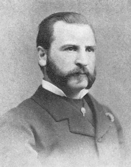
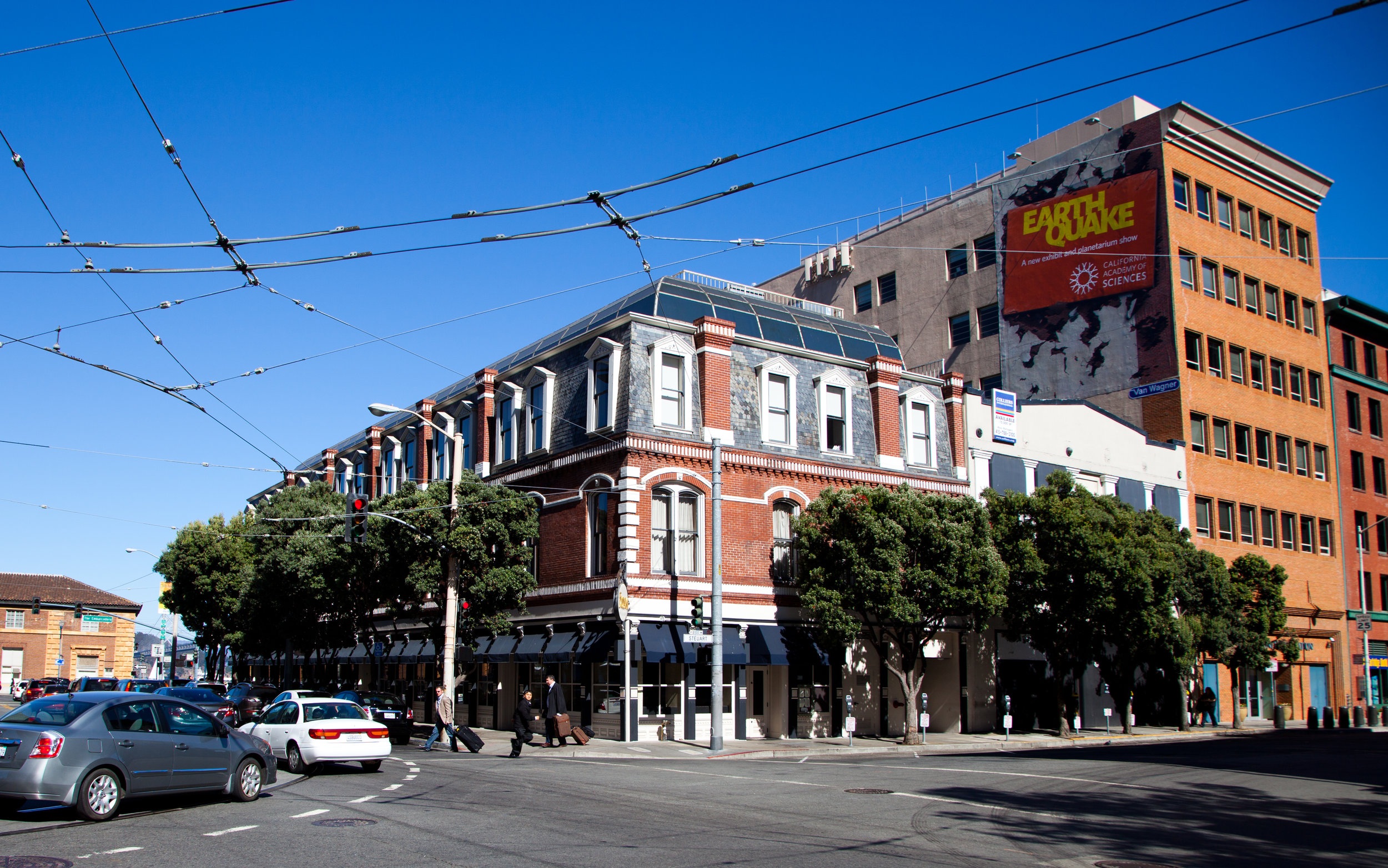
In the late 1800’s, Hippolite d'Audiffret ("Audiffred"), a Frenchman who had been living in Mexico, reportedly walked to San Francisco from Veracruz due to the increasing French nationals unpopularity with native Mexican country men and women. Upon his arrival in the city, Hippolite d'Audiffret built a profitable business selling charcoal in Chinatown. The Audiffred Building was constructed for him in 1889 to presumably house his business. Over the years this corner building had many tales of survival that added to the fabric of its legacy. This history and it’s unusual architectural style led to the Audiffred Building being designated Landmark #7. To this day, it is one of the few surviving buildings on the waterfront.
1906
San Francisco had the busiest waterfront on the west coast with a harbor filled with ships, bustling commerce, and shops serving every maritime need. At the turn of the 19th century, the Audiffred Building’s first floor retail spaces were rented to a restaurant and three saloons. The Bulkhead Saloon was one of these tenants.

In an attempt to stop the fires following the 1906 earthquake, the San Francisco Fire Department wanted to create a firebreak between the burning city and the wharfs. They blasted every other building with dynamite except the Ferry Building. As the tale is told, the fireman spared the Audiffred Building because they received an offer they couldn’t refuse. The very wise bartender at the Bulkhead saloon bribed the firemen with a keg of whiskey and a cart full of wine if they would spare the building. Needless to say, the building was saved.

“The very wise bartender at the Bulkhead Saloon bribed the firemen with a keg of whiskey and a cart full of wine if they would spare the building. Needless to say, the building was saved.”

1934
The Audiffred Building served as headquarters for the 1934 West Coast Waterfront strike that lasted eighty-three days when longshoreman in every west coast port walked out. The strike peaked with “Bloody Thursday,” a day when sailors Howard Sperry and Nick Bordoise were shot dead by police outside. A monument commemorates this tragedy at the corner of Steuart and Mission streets.

1934 West Coast Waterfront Strike, As A Monument, Dedicated To Events Or People, As An Exhibit of Art

1934 West Coast Waterfront Strike, As A Monument, Dedicated To Events Or People, As An Exhibit of Art

1946 - 1955
With the decline of San Francisco's waterfront in the mid-twentieth century, the Seven Seas Club for homeless sailors moved into the building in 1946. Bohemian artists and writers including Elmer BischoffHoward HackFrank LobdellHassel Smith, Martin Snipper, and Lawrence Ferlinghetti occupied lofts and studios on the two upper floors. The living spaces had no electricity and were condemned in 1955 as unsafe for living quarters.

1978
A fire from a gas main break gutted the building in 1978 leaving it scheduled for demolition. The building was saved by public demand. The Audiffred Building became the City of San Francisco's Landmark #7 and was placed on the National Register of Historic Places in May 1981.

1983 – 1984
A domed penthouse was added in the reconstruction after the fire. The building was subsequently bought by real estate developer Dustan Mills. In 1983–1984 it was refurbished and repurposed into office space by William E. Cullen.

1991
It was restored over a two-year period, and then in 1991, after the removal of the Embarcadero Freeway, the handsome building again saw the light of day.

1993 - Present
Since 1993, the Audiffred Building has housed Boulevard restaurant.