Untangling the History of Christmas Lights

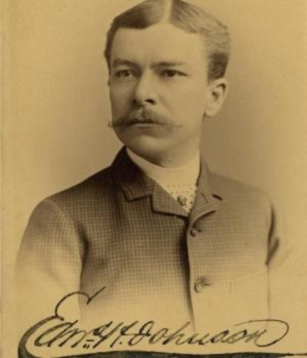
Edward Hibberd Johnson not only added flash and color to Christmas trees when he introduced electric lights in 1882, he saved lives in the process.

Early-Propp-Light-Set.jpg

As Christmas approached in the waning days of 1882, Edward Hibberd Johnson joined his fellow New Yorkers in decking the halls. Then as now, Yuletide traditions ran deep, and the 36-year-old once again undertook the annual ritual of decorating the parlor of his Manhattan home with a majestic evergreen. For this particular Christmas season, however, Johnson decided to freshen the cherished holiday tradition with a state-of-the-art innovation—electric lights.

Nearly three years had passed since Thomas Edison demonstrated the first practical light bulb, and few people were better acquainted with the emerging electrical technology than Johnson, the Wizard of Menlo Park’s trusted business associate. As a manager of the Automatic Telegraph Company in 1871, Johnson had shrewdly hired the 24-year-old Edison, but the whiz kid proved so brilliant and entrepreneurial that in short order their roles reversed and the boss became an employee for the famed inventor. Johnson worked as a vice president of the Edison Electric Light Company, and he was chief engineer for the electric generation system that Edison had unveiled in lower Manhattan that September.

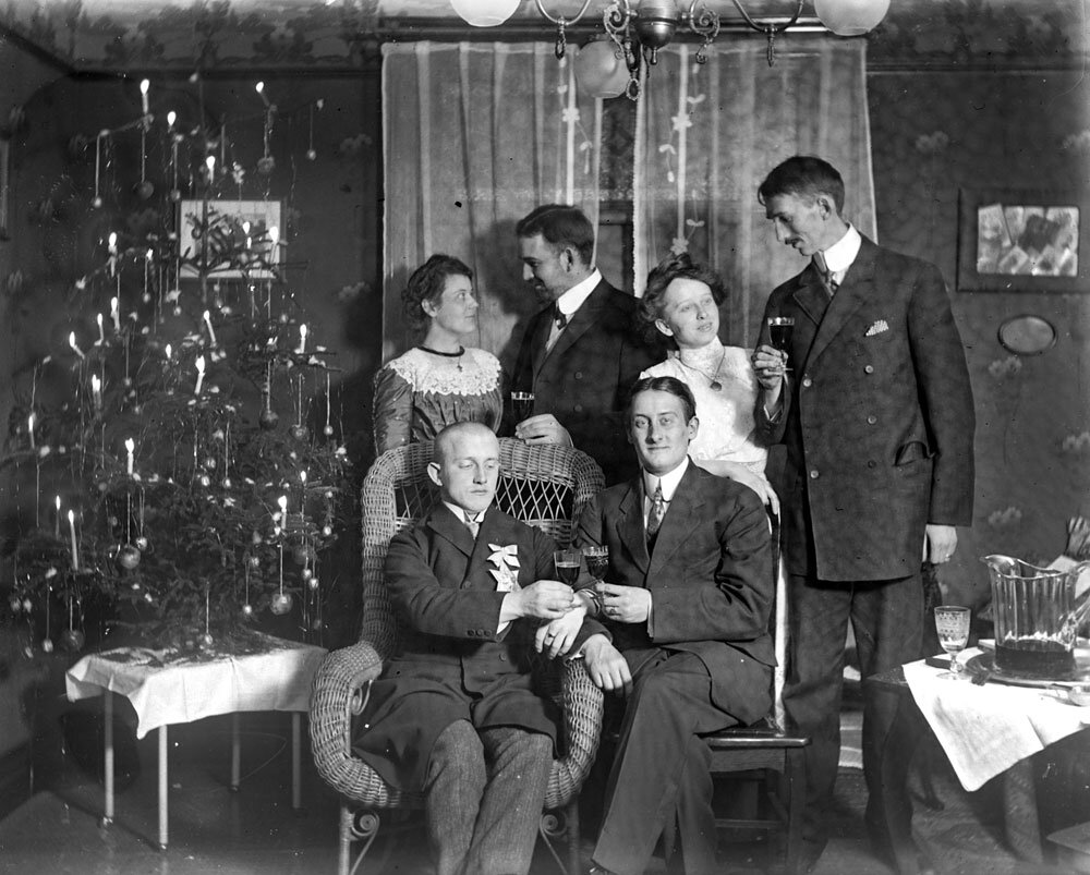
Now at Christmastime, Johnson prepared to make some history of his own. For centuries—according to some folklore all the way back to the 1500s when Protestant reformer Martin Luther wished to replicate the wintertime sight of stars twinkling among the evergreens—people had used wax candles to illuminate their Christmas trees. The candles may have been beautiful, but they were obviously a huge fire hazard. Every year as year the holiday approached, without fail newspapers printed tragic stories about Christmas trees accidentally catching fire and houses burning to the ground, sometimes with deadly consequences.

By replacing candles with electrical lights, Johnson not only greatly reduced the risk of Christmas trees going up in flames, he added flash and color as well. According to a reporter from the Detroit Post and Tribune who visited the home of Edison’s right-hand man, 80 brilliant red, white and blue hand-wired bulbs “about as large as an English walnut” lit up Johnson’s Christmas tree. An additional 28 lights sparkled on two wires mounted on the ceiling.

Johnson’s electrically lit tree was revolutionary—literally. It spun in a circle six times a minute on a little pine box as its lights flashed in “a continuous twinkling of dancing colors.” An electric current drawn from Edison’s main office powered the lights and the crank that rotated the tree. “I need not tell you that the scintillating evergreen was a pretty sight,” gushed the newspaper reporter. “One can hardly imagine anything prettier.”

Unbeknownst to Johnson, he also launched the annual Yuletide tradition of trying to one-up the neighbors with dazzling Christmas light displays. Once electrical power spread to Manhattan’s Gilded Age mansions, the city’s prominent socialites coveted the novel lights to showcase their Christmas trees at their ornate holiday parties. Those first bulbs, however, lacked screw-in sockets and required the tedious process of wiring each lamp individually, a task that few had the knowledge or time to undertake. As a result, members of high society spent as much as $300 per tree to hire electricians to install lights on their conifers and be on call in case a bulb burned out or broke.

High society spent as much as $300 per tree to hire electricians to install lights on their conifers and be on call in case a bulb burned out or broke.

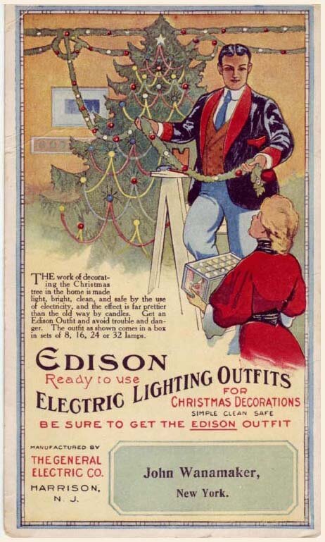
The White House Christmas tree became electrified in 1894 when President Grover Cleveland’s daughters were delighted by the evergreen that the Wheeling Register described as “very beautifully trimmed and decorated with tiny parti-colored electric lamps in place of the old time wax candles.” For most of the country, however, candles still remained the primary means of illuminating trees because of the limited availability of electric power and the cost and hassle of the Christmas lights themselves. That began to change at the turn of the 20th century when the General Electric Company started to produce and sell electric Christmas lights that did not require the services of an electrician to wire. The company accentuated the safety advantages of electric lights in their advertisements in popular magazines of the day such as The Saturday Evening Post and Harper’s Bazaar. “No danger from the lights on Christmas trees when Edison Miniature Lamps are used,” boasted the copy of one ad next to a dramatic drawing of a candle-lit tree engulfed in an inferno.

 In 1903, General Electric began to offer Christmas lights in eight-lamp strings, called festoons, that featured pre-wired porcelain sockets, miniature glass bulbs and a screw-in plug that attached to a wall or ceiling light socket. The $12 price for a three-festoon set was beyond the reach of most consumers, but department stores in some cities made the lights available for rental for $1.50.

By the 1940s when electrification had become standard in rural America, electric lights had replaced wax candles on most Christmas trees, and the danger of trees bursting into flames had been replaced by the annual frustration of untangling gnarled webs of Christmas light strands. For that, thank Johnson, the man who has been called the “Father of Electric Christmas Tree Lights.”

Iconic Coca Cola Sign

Coca+Cola+SF.jpg

San Francisco History

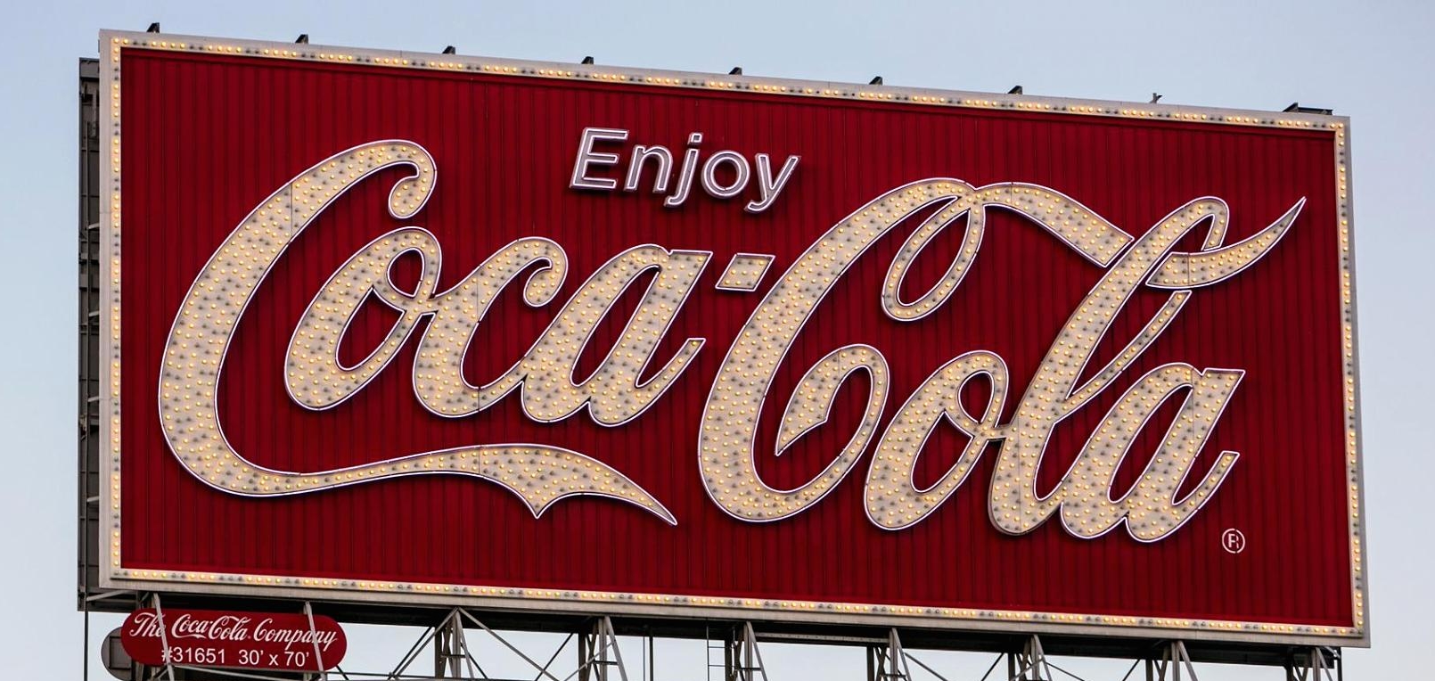
Standing 112 feet above Bryant Street atop a three-story building in San Francisco's South of Market area, the Coca Cola billboard has been a landmark for drivers going to and from the Bay Bridge since 1937 -- One year after the bridge opened to traffic.

The Spencerian script of the logo with its glowing background in a shade known as Coca-Cola Red was originally illuminated with neon. It alternately twinkled and shone for the better part of seven decades, but in 2010 it began showing its age.

Seventy-feet long and 30 feet high, the new sign is about the same size as its predecessor, but the look at night is crisper and the colors seem more vibrant.

The work to remove the original lighting system and reface the billboard with 4,800 CFLs for the white lettering and strip LEDs for the background took crews working day and night. The billboard was dark for only four days.

When I return from a long trip, I can always count on one of my favorite signs to light up and welcome me back to San Francisco. I am sure for years to come.......

Cass Calder Smith - CCS Architecture

The Urbane Taste Maker

By Joseph Lucier

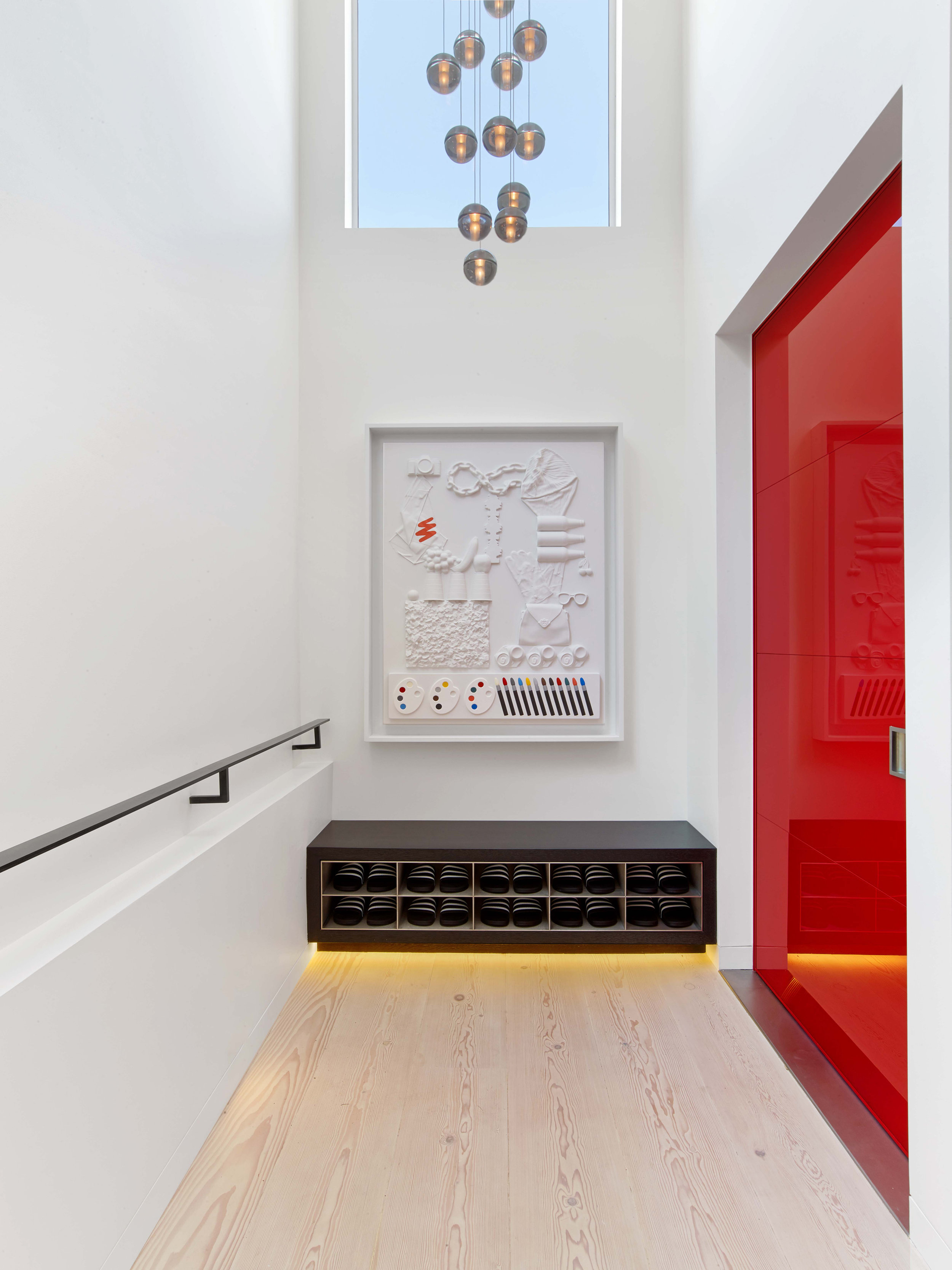
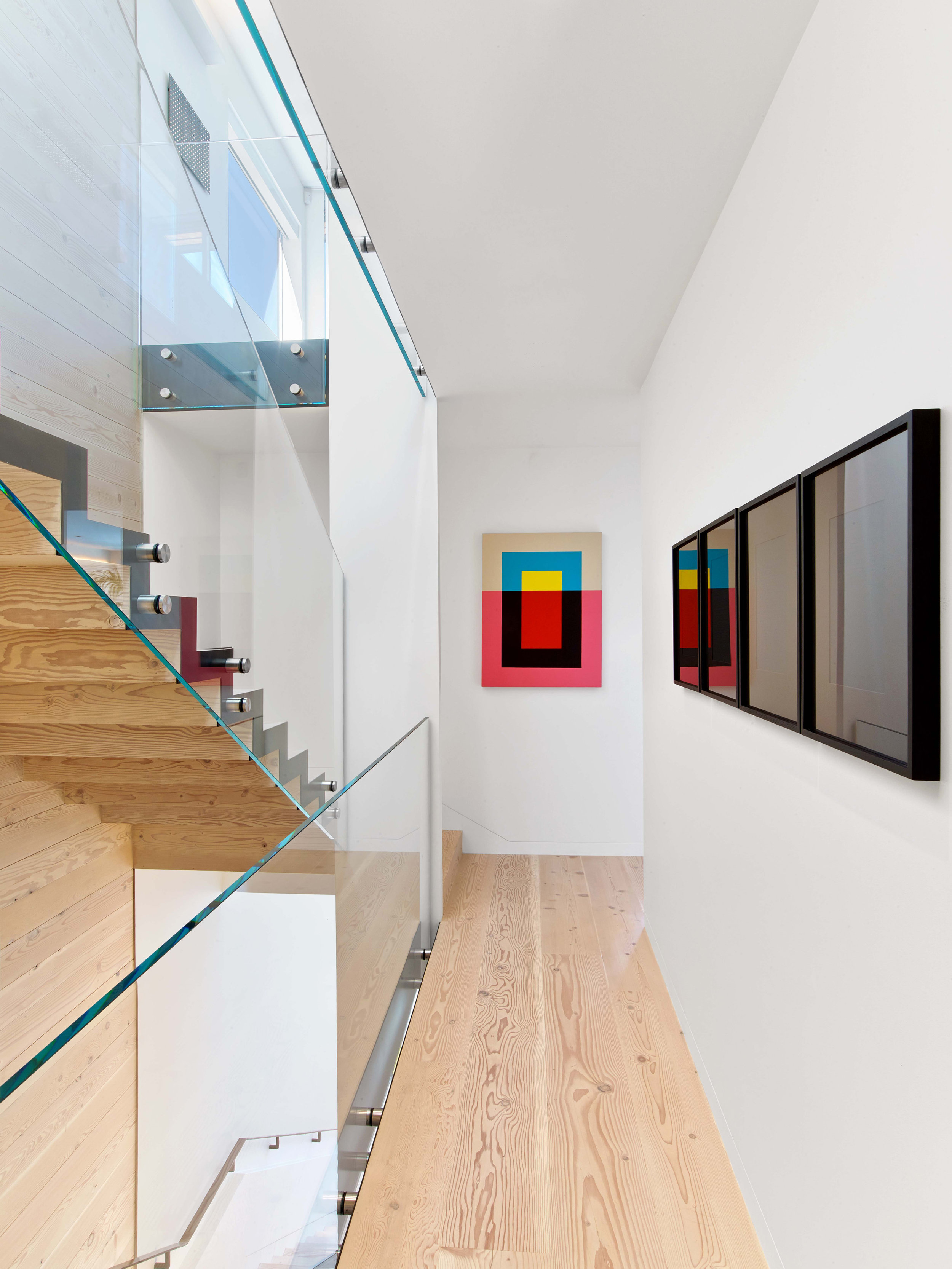
It was half way through a relaxed lunch at Absinthe earlier this year, when I realized the man across the table was simply my type of guy. Well-educated, urbane, and witty with just the right amount of New Yorker mixed into the conversation. Cass Calder Smith publicly wove himself into the hearts of San Franciscans with his smash hit design of Restaurant LuLu only to offer encore performances in Rose Pistola, Perbacco, and Twenty Five Lusk. Venturing further into the more private world of his residential practice, one will see in Mr. Calder Smith’s refined hand a talent for capturing the elusive je ne sais quoi that makes a home feel just right. With an interdisciplinary firm supported by offices in New York and San Francisco, Cass remains informed and engaged by a metropolitan lifestyle that excites the mind and propels his creative spirit.

CASS CALDER SMITH

CASS CALDER SMITH

Joseph Lucier: What is your current state of mind regarding your practice and projects that your firm is working on? 

Cass Calder Smith: My state of mind feels pretty well-balanced with a nice amount of architectural satisfaction, based on working with some great clients that have remarkable projects.  From a creative standpoint, there is also a nice balance between residential and commercial work, where we are doing both the architecture and the interiors. We have new projects starting up that demand fresh ideas and others with construction finishing, which is gratifying as they come to life. My firm has three other partners and a very skilled staff with diverse experience.  We have worked together a long time, which has a notable calming factor. 

 JL: How did growing up with successful creative parents foster your early interest in design and architecture? 

CCS: It was always appealing having parents with creative careers and more so since many of their friends had similar careers. In a general way, I saw the creative process in action and so later in life as I studied architecture it felt like a familiar culture. My father Howard Smith was particularly influential due to his immersive success as a journalist and academy-award winning film maker in 1960’s-70’s New York City. He was ambitious, creative, and worked really hard…strongly believed in ideas as a kind of currency. That was a very motivating influence and still is in relation to the process of architectural design.  When my parents split up in the 70’s, my mother moved us to an off-the-grid California commune where everybody built their own outlaw houses from scratch – many of which I helped on as a teenager. This taught me a lot about design and building, and also a sense for craft and materials.

JL: Talk about your studies at UC Berkeley and how they gave you both a foundation and a jumping off point for your career.

CCS: I loved going to Cal – both as an undergraduate and as a graduate student five years later. I teach a studio there every few semesters so I keep in touch with academia.  By the time I was a graduate student, I was pretty grounded already, due to being a self-employed designer-builder during the five years between degrees. This led me to delve further into design and theory rather than practical reality since I knew I would get back to that in the real world soon. For my two years of graduate school I occupied myself in a series of excellent design studios and seminars, which were very fortifying and led to a good amount of creative confidence. As a jumping off point, I was very fortunate to start getting commissions as I was still studying and so by the time I finished, I just kept going project by project.  Two pivotal ones that I began while a student and then finished soon after were a large modernist house in Belvedere and the smash-hit Restaurant LuLu in SF. With those two projects under my belt and a degree from Berkeley, I rented an office in South Park, carefully hired some staff, and officially launched.  

JL: As a firm with offices in New York and San Francisco, do you find any distinct East/West coast cultural or design maxims that differentiate client tastes and needs?

CCS: I would say the differences are noticeable, but subtle. New York is such a cauldron of ambition and commerce, which leads to a higher intensity – and so that influences many aspects that range from getting selected to creative expectations. From the corner store to the design studio, it’s just more competitive.  In the Bay Area, I find that clients are a little more open to new ideas and are also very much involved as collaborators, which I enjoy, and think is very valuable to the success of their projects. In New York, the clients tend to have us ‘do our thing’ with less of a collaborative ethos. Peoples lifestyles are more casual and less urban on the west coast and so since we aim to design projects (especially houses) to align with people’s lifestyles, that drives design in certain ways.  

JL: Does your interdisciplinary practice of working in the hospitality, commercial, and residential spaces offer a fruitful design feedback loop? 

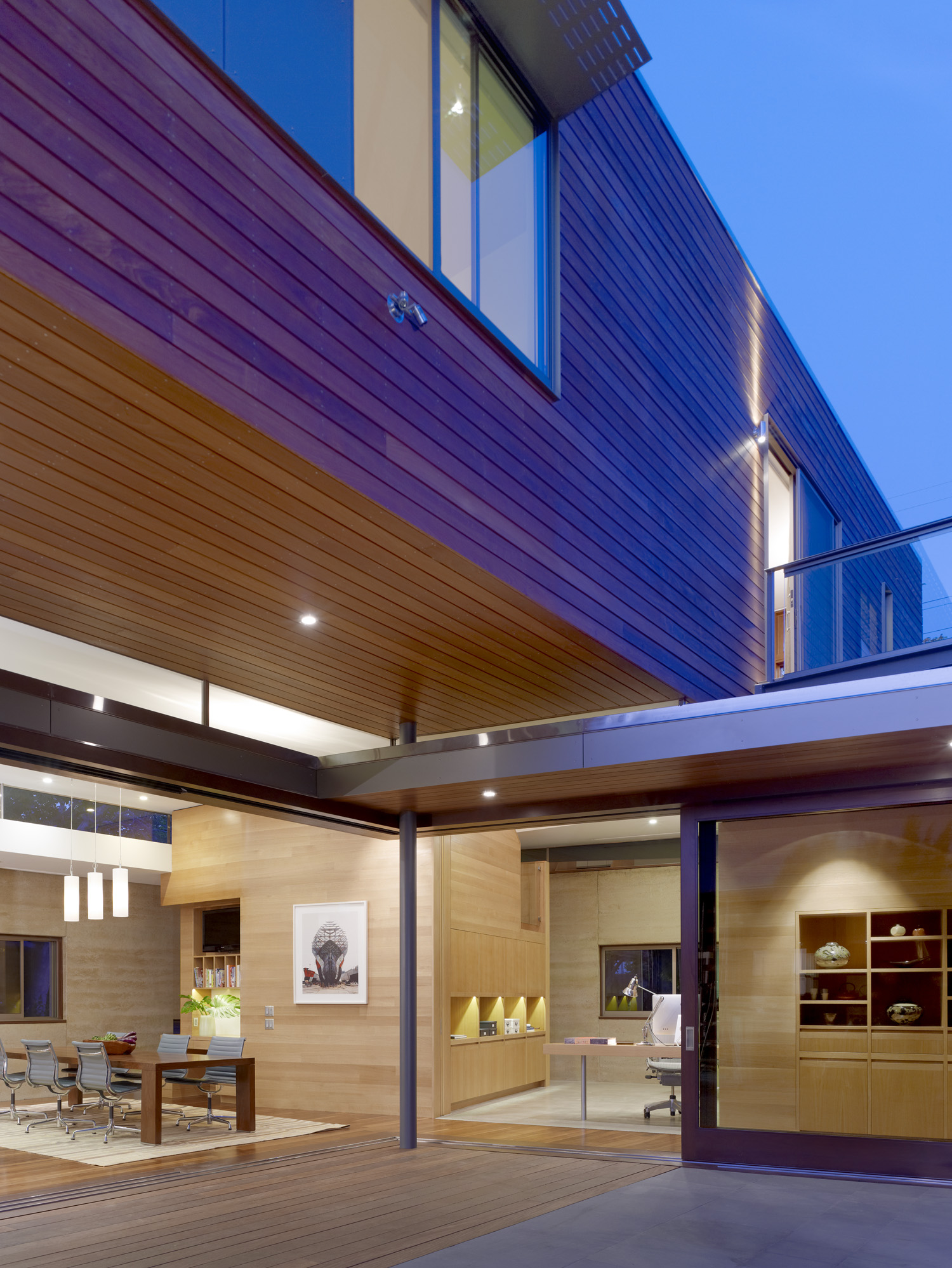
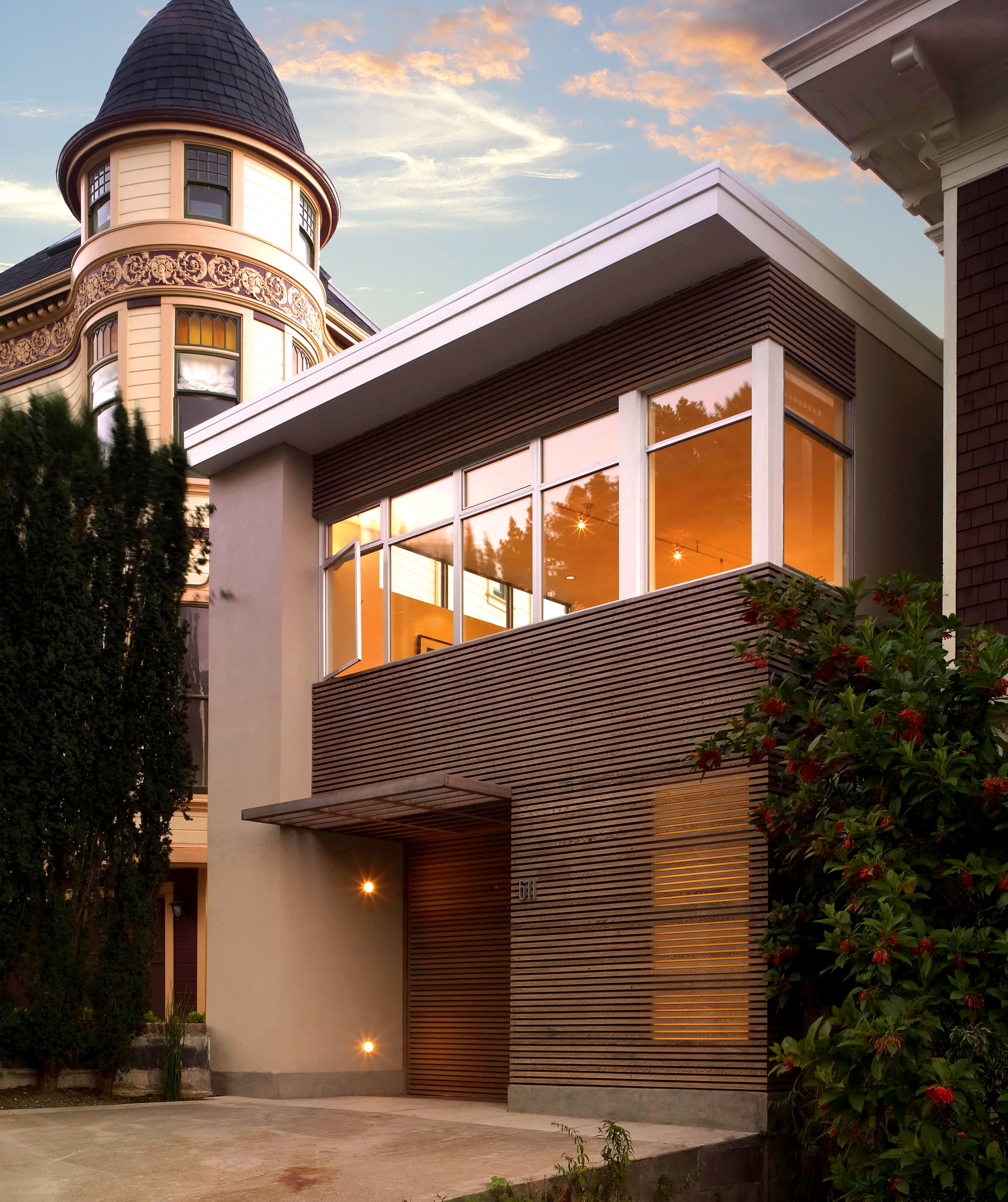
CCS: Yes, but possibly more so in their opposites.  The restaurants we work on we interpret and design as ‘public places’ with the attributes of shared space, drama, people-watching, and socializing. Homes are very much the opposite with the attributes of privacy, retreat, personalized space, and are lifestyle-specific.  Those differences have established a clarity of thinking that helps derive concepts that work for each.  On a similarity level, we do like to work with more residential materials within restaurants because we know that people enjoy them and feel more comfortable around what they live with.  The commercial kitchen has made its way into the home over the years as we have all seen and so this back and forth is always evolving with interest. As my firm has designed a lot of homes and restaurants in the Bay Area, one common thread to both is that they are generally designed for our local lifestyle culture, which I refer to as ‘casual modernism’.  We also work on show rooms, offices, and some writers’ studios.  My sense is that having a range of design experience makes any architect better for any individual project type. 

 JL: When given the opportunity to design a home from the ground up, talk about your process of siting the property. 

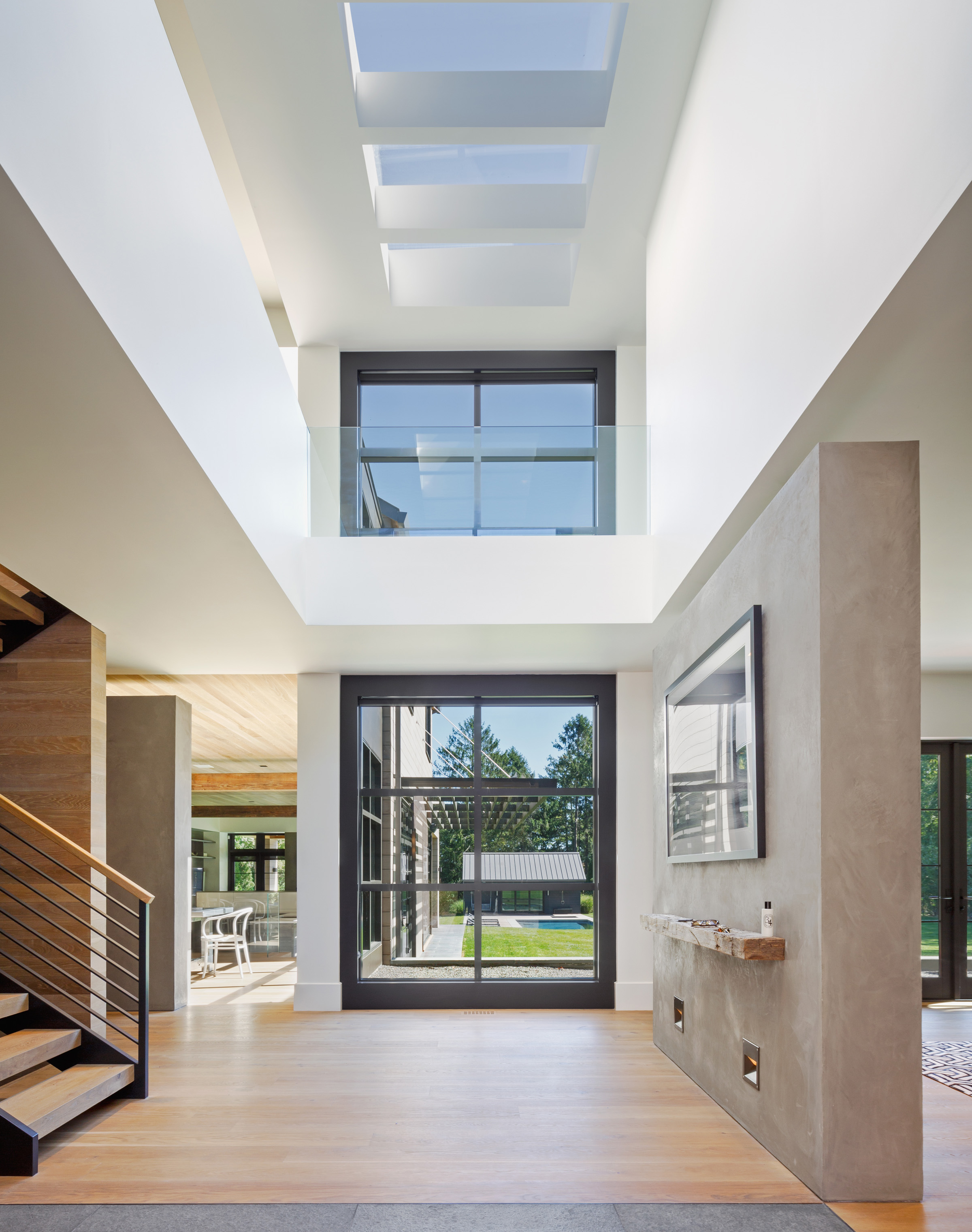
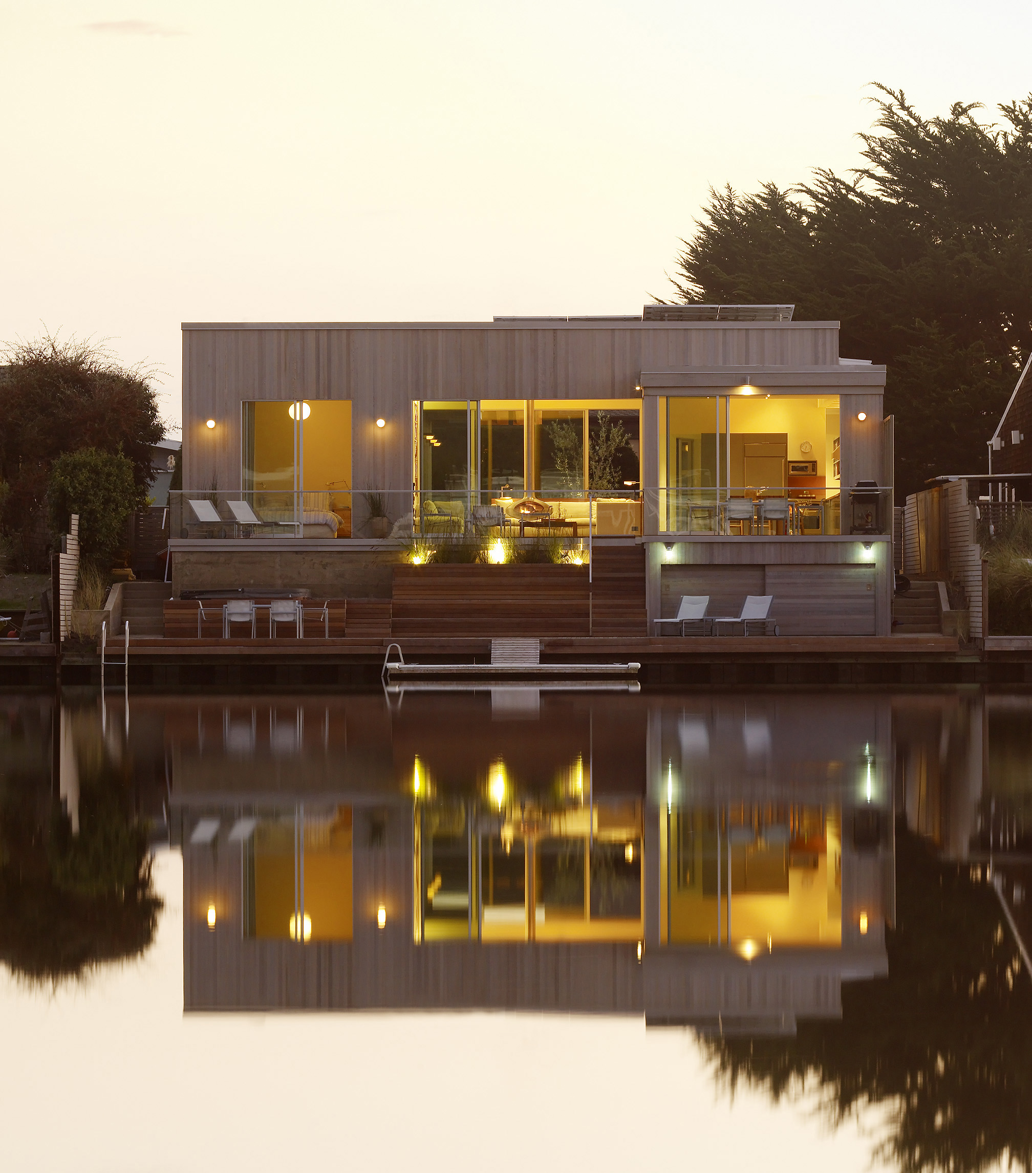
CCS: That’s my favorite commission, and siting a house is often the most important creative act and problem to solve. First, I get to know the site as deeply as possible.  I will go there at different times of the day, observe the sun, wind, views, and often sketch what is there for a richer awareness of the characteristics. This analysis and research then directly leads to design. Its best for the client to be on site for part or all of this - as they always have valuable insight.  Then it’s about creating as many ways of siting the house as possible and this usually entails thinking about what the shape and general design of the house will be. The key factors are views, solar orientation, and topography, and how to maximize the indoor-outdoor dynamic.  On large sites its sometimes the macro solving of where to put the house, not just about how best to situate it. Then once there’s a solution, have it staked out to be sure it’s as expected.  Often there will be tweaks from this. 

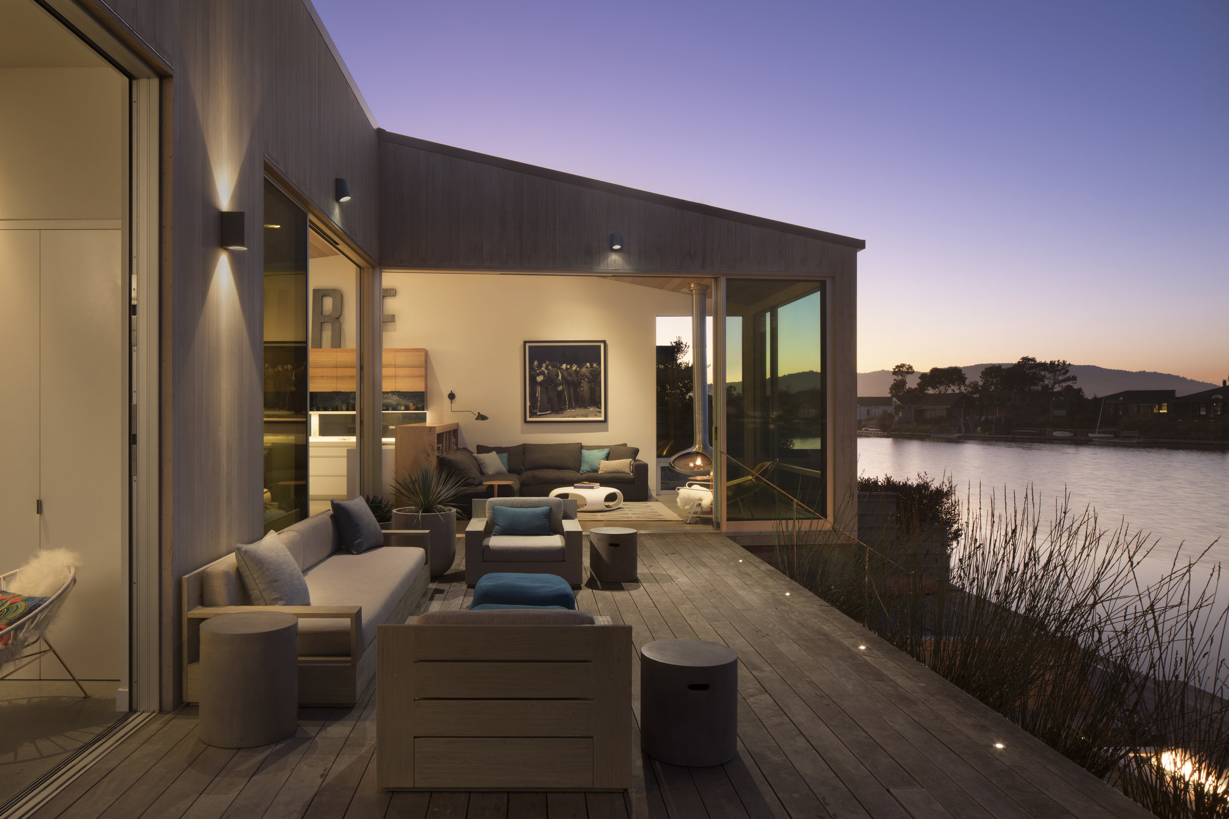
SEADRIFT LAGOON HOME

SEADRIFT LAGOON HOME

JL: Who are the architects, both past and current, that inspire you?

CCS: From the past; Le Corbusier, Mies Van Der Rohe, Richard Neutra, and Alvar Alto to name a few for their distinct and pioneering modernism, plus a few artists like Donald Judd and Andy Warhol, and Fred Sandback. Current Architects include the talented Rem Koolhaas, Herzog & Demeuron, Saana, and Tadao Ando.    

 JL: When discussing architectural heritage, which cities would you most likely spotlight?

CCS: You’ve got to start with Rome since it spans almost every era and historical movement. Paris is great as textbook urbanism and drop-dead beauty. Tokyo always amazes. I’m partial to New York as a native, but Chicago is really the city for exemplary American Architecture – especially the twentieth century. I have been getting back into Venice the last few years too…the water, no cars, a place kind of preserved.

JL: What does the experience of teaching students at UC offer you? 

CCS: Having a balance between practice and academia just feels right as an architect. The better you feel, the better your think. It’s motivating to be around the young energetic talent. It also makes you walk your talk more than usual, since there’s a lot of explaining to students to think conceptually and as outside of the box as possible and then back at the office you can’t forget that.  Design schools are really creative and artistic places and so being part of that feels like it keeps you on your game. It’s also nice to give back with design knowledge and wisdom. 

 JL: What did you get out of your involvement with the Civic Design Review Committee for the SF Arts Commission.

CCS: That was a pretty vast experience for eight years with much more responsibility than I expected. In public hearings we reviewed and then approved every public building to be built in SF over that time. This ranged from Moscone’s expansion, to libraries, to play structures in parks…essentially anything on city-owned property. I acquired a lot of valuable experience from my involvement on much larger scale buildings than I work on in my practice, and also got to work with some of the top architects in the Bay Area. Public- sector work is different than private-sector, and so that added experience helped my perspective on all work. It’s good for architects to work in various scales and so this was a benefit to the continuous learning curve.

JL: What is your favorite weekend getaway?
CCS: I frequently stay home designing and drawing at a nice big table, but if not then weekends at the Chateaux Marmont in LA are always liberating. I also enjoy Indian Springs in Calistoga floating around in that big warm pool.  

JL: Bucket list items yet to be realized?
CCS: For travel; Cairo and the Nile, then Marfa Texas. Someday I want to build my own Glass House in the country. Since I gave up motorcycles, I want to start car racing.

JL: Favorite restaurants? Internationally, nationally and locally.
CCS: Internationally; J-Sheeky and The Woolsey in London. I’m a little more into the classics. Nationally, I jump to New York, where I like Oya, Marea, and Houseman. And   Locally, I still and will always love Zuni. I’m a big fan of Hog Island Oyster, and also Poncho Villa Taqueria too. 

JL: What are you currently reading?
CCS: Always reading a New Yorker striving to keep up, but also finishing up Bruce Springsteen’s autobiography. 

Visit CCS Architecture

Many thanks to Cass Calder Smith and Melissa Werner for working with me on this feature!

Photo Credits: Colin Miller, Paul Dyer, Joe Fletcher, Eric Laignel.