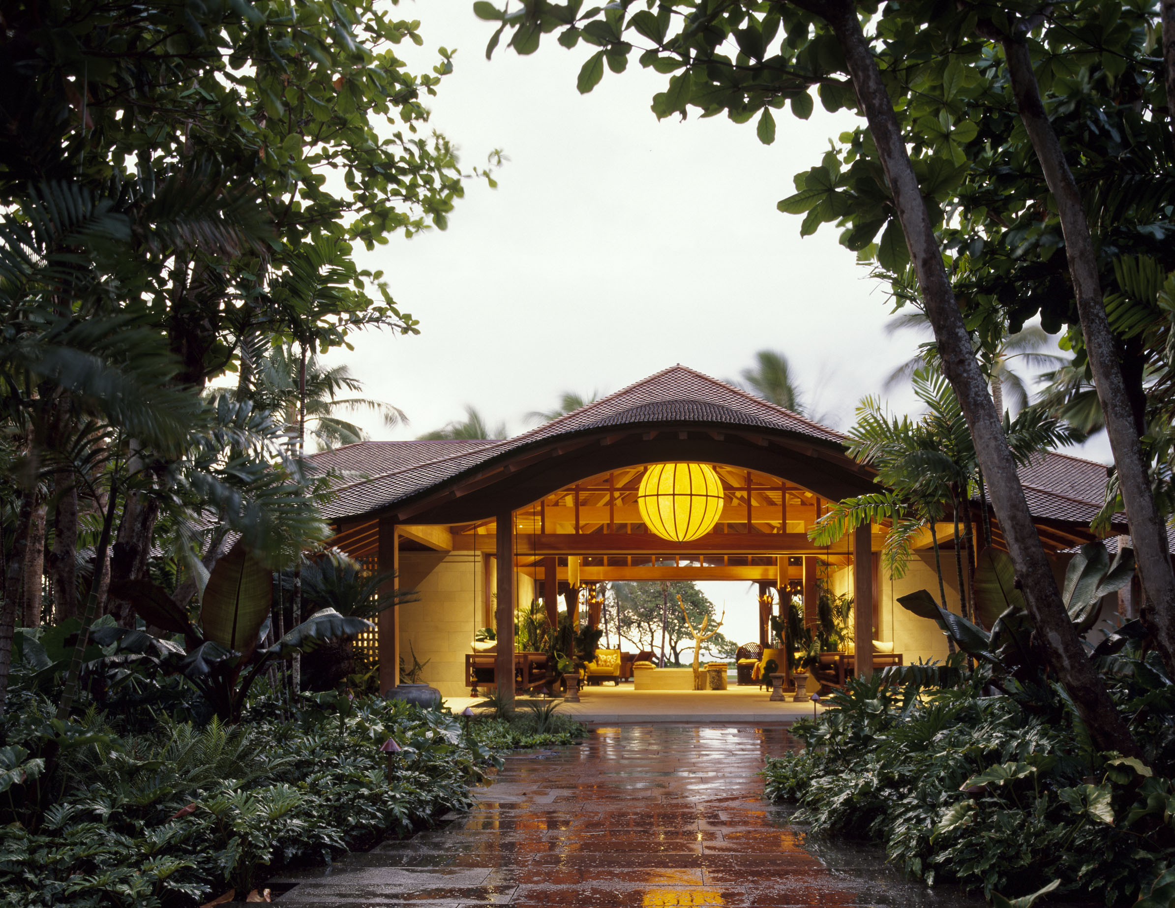
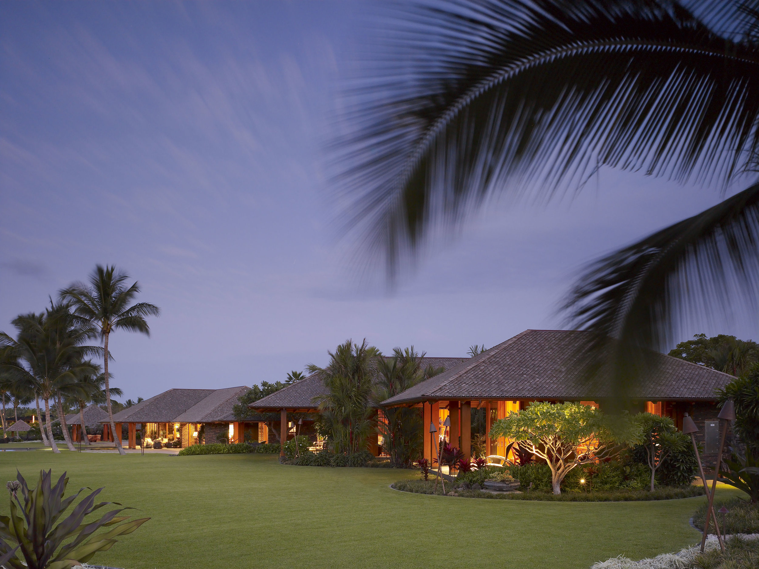
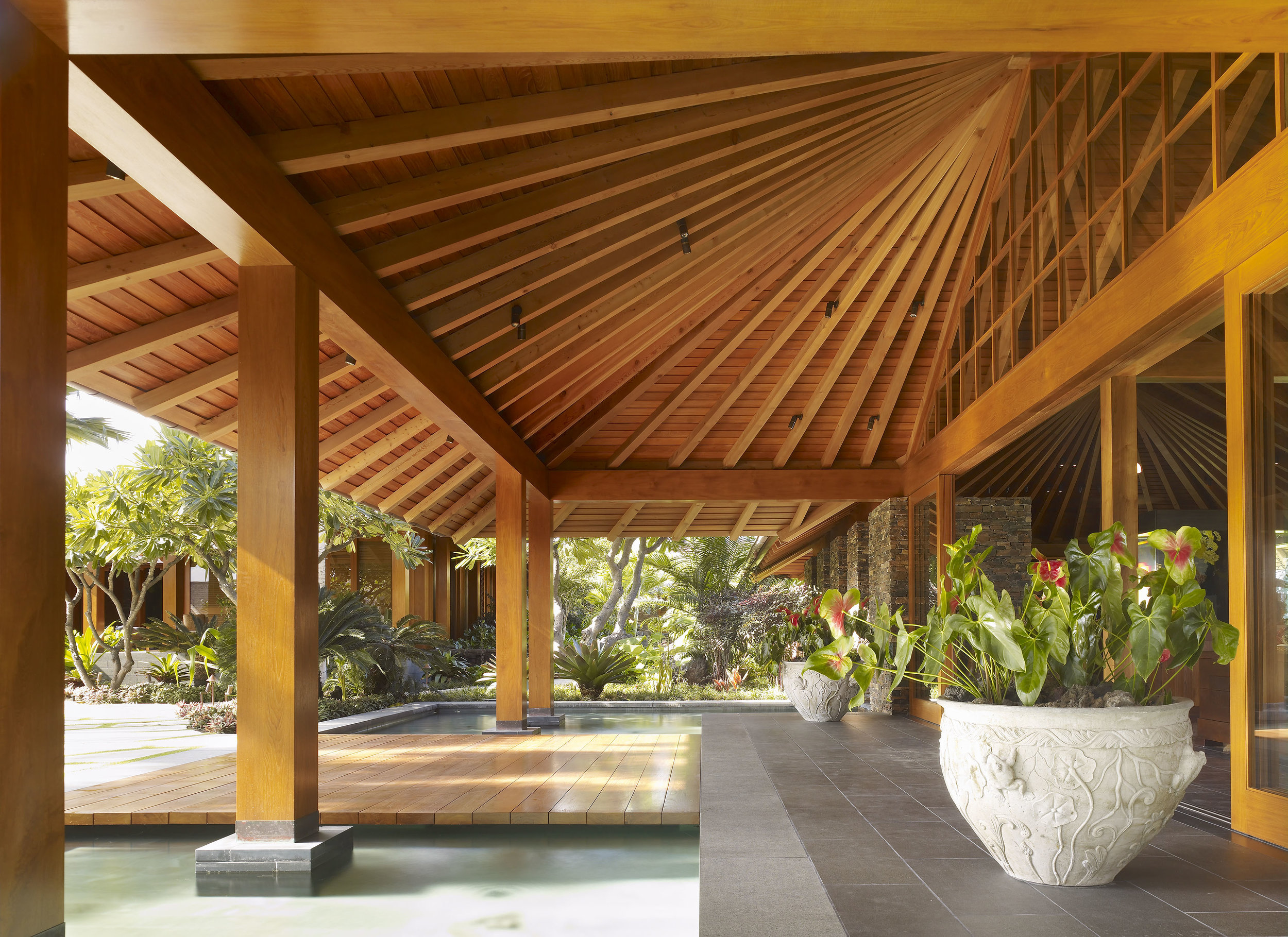
Shay Zak - Zak Architecture

A Leeward Design Touch

By Joseph Lucier

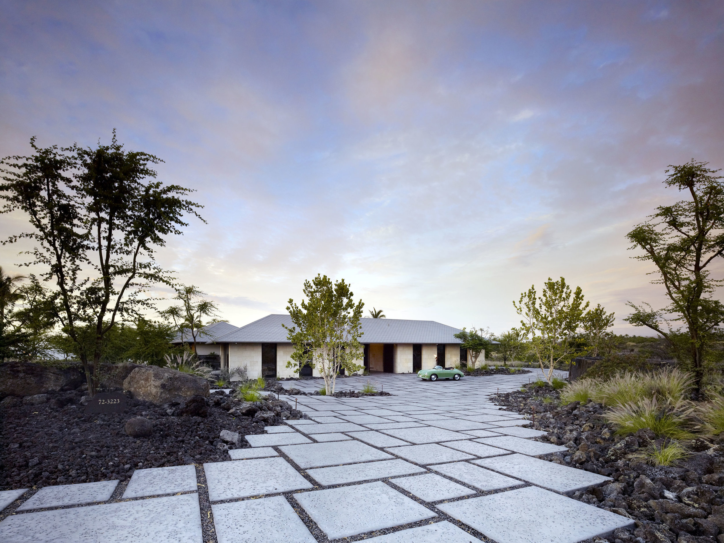
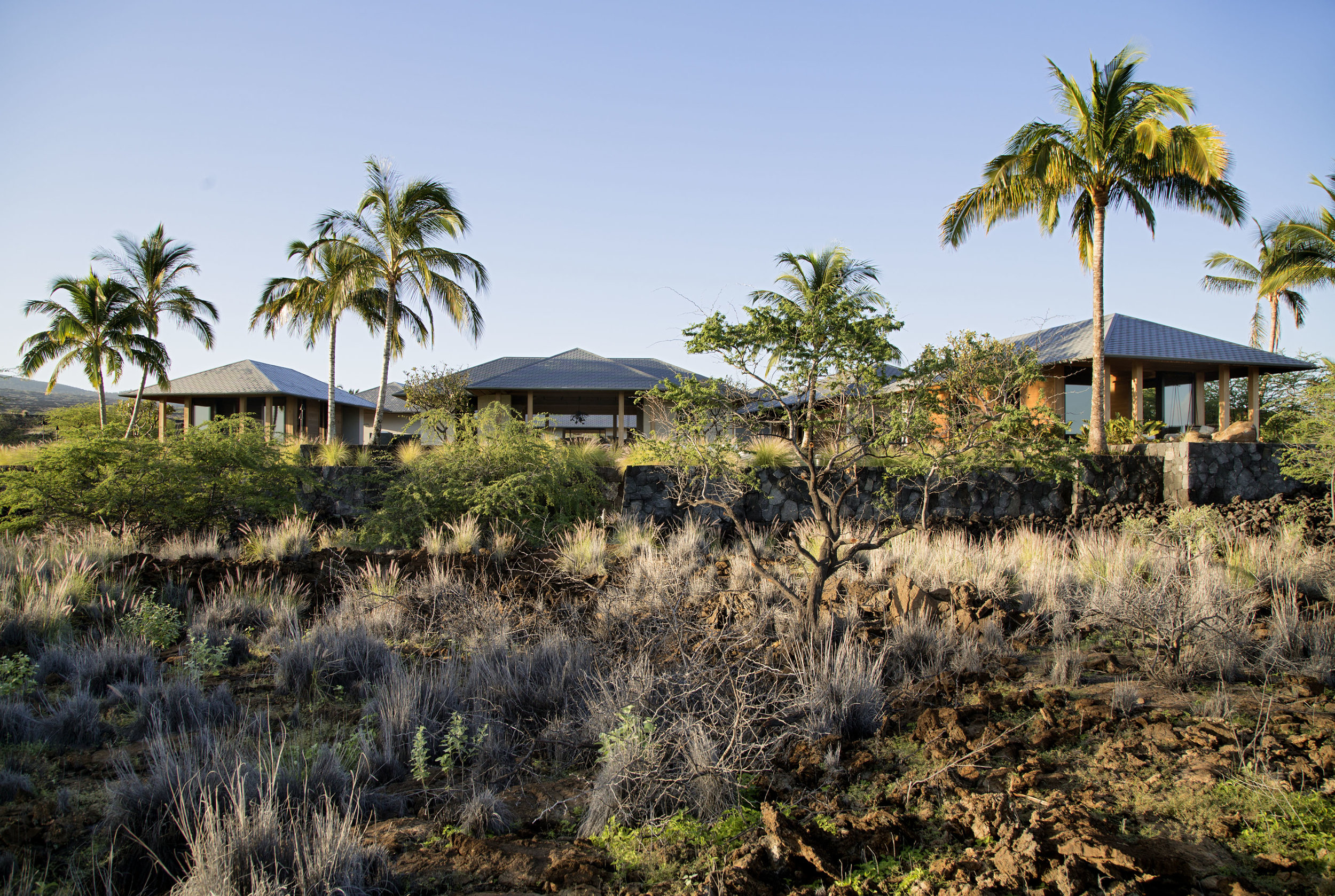
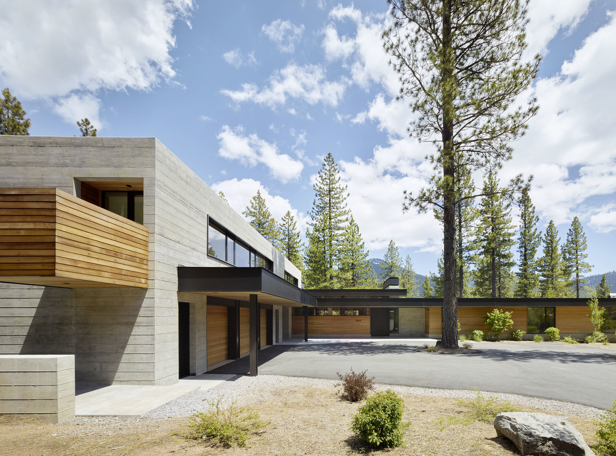
Shay Zak's masterful alchemy of architectural relationships between a home and its site has made him the last word in estate design along Hawaii's Kona Coast and beyond.  His passion for symmetry belies his chosen San Francisco home along the undulating curves of the city's famed Lombard Street. Yet this decision to reside amongst the cacophony of tourists flowing down Russian Hill must intuitively help inform the design decisions he calculates amidst the crashing waves and flowing lava rock surrounding the island homes he thoughtfully sites.  I have had the good fortune to know Shay for quite some time and was pleased to have the opportunity to learn more about the man behind Hawaii's noteworthy leeward designs.

SHAY ZAK

SHAY ZAK

Joseph Lucier: When was the seed planted for your interest in architecture?

Shay Zak: It was my Senior year of high school.  I always had an alert interest in the arts.  I loved painting, drawing, photography and sculpture.  I also loved to build things out of wood, metal and anything I could get my hands on.  So, I thought engineering was it for me.  However, a friend of mine at the time was applying to architectural schools and I thought, perfect, something that combines my two passions, that is for me.  Architecture it was going to be.  I never looked back.

 JL: Who are the architects that inspire you?

 SZ: I am a collector of Architectural Monographs.  I have a wall full of them in my office and I pull them out every day.  All good architects inspire me.  They reside both from afar and right her in San Francisco.  The most important architects for me are the ones that have found their original voice.  Like Rothko, Mondrian, Serra, they invented a new language.  It is their own, they invented it, and they own it.   This is nirvana to any artist, and to the Architect.   Rafael Moneo, the brilliant Spanish architect, was my mentor in graduate school and he had a huge influence on me.  He has his own language. He really can’t help himself.  I call that an original voice and as it falls upon the realm of genius.  As for the masters of yesteryear, I always return for inspiration to Louis Khan.

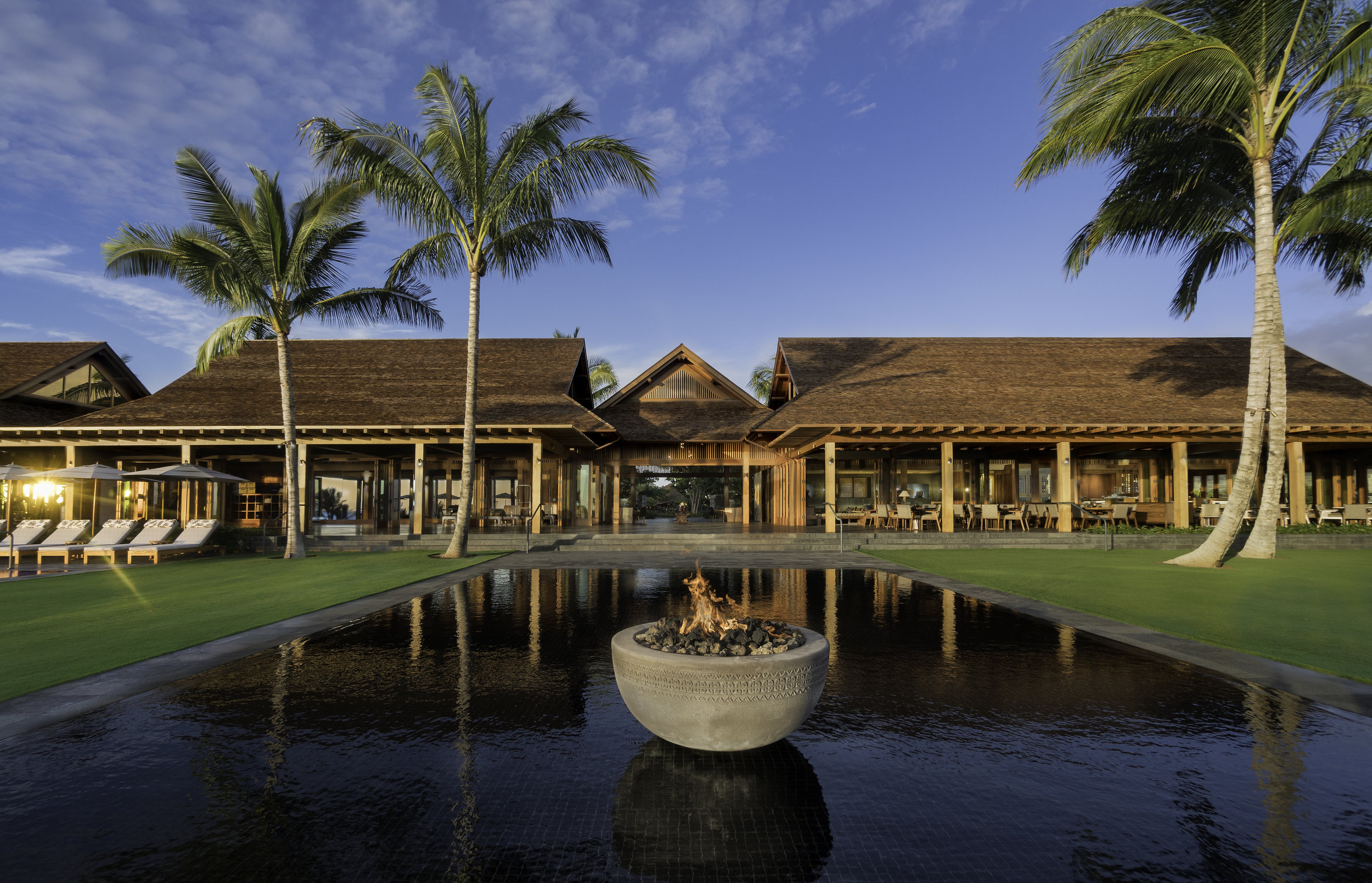
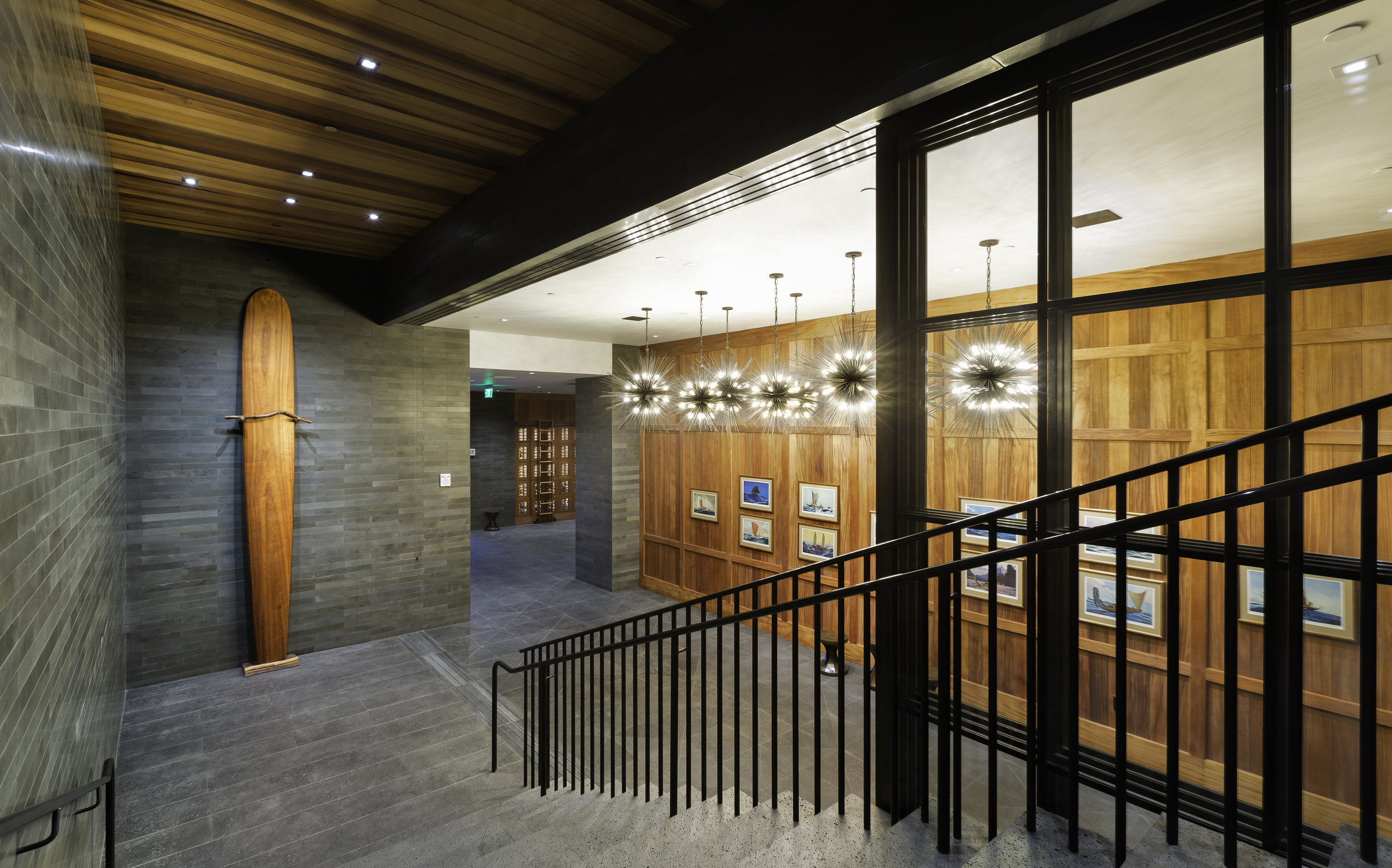
BEACH CLUB AT KOHANAIKI

BEACH CLUB AT KOHANAIKI

JL: What did you learn from your education at Harvard and work at SOM that gave you a foundation to start your own architecture firm? 

 SZ: At Harvard, I learned that there is a lot of design diversity out there.  We had Peter Eisenman, Rafael Moneo, Zaha Hadid and Frank Gehry, to name a few, all teaching students in one large open communal design studio.  At Harvard, the unexplored had no place.  The lesson from SOM was how to design excellent clean tight modern commercial buildings and high-rise towers.  Then the assignment was to make a killer presentation to the sell it to our clients and close the deal.  The best part about SOM was that I met such talented colleagues that become friends as they develop their own private practices.

JL: If they wrote the book “What They Don’t teach you at Harvard Design School,” what would you tell students there?

SZ:  If you want to write a Fee Proposal, you are on your own.

JL: How do you bring the classical principals of scale, balance and proportion into your designs?

SZ: I was born with symmetry on the brain and try as I might it is hard for me to shake it.  However, I am also a minimalist and a modernist too.  A ying yang perhaps.  So, I have learned to embrace both.  As I develop the composition for a new design, I take great pleasure in how to combine them into one thing. 

JL: You have become well known for your work in Hawaii.  How did you begin working on the islands?

SZ:  I was fortunate to be asked to design one of the first custom homes for the new Four Seasons Resort, Hualalai, on the big Island.  It was completed in 1999 and this house led to several other commissions.  We are now designing homes at several Big Island communities as well as on the islands of Lanai and Kauai.  We have completed over 30 homes in Hawaii and have many new projects in the works.

JL: How do you approach a site when beginning the design process?

 SZ:  I look at different forces that affect the site.  I study the site’s history, place, personality and, of course, its topography.  Only then can I take the character of the owner and their program and put pen to paper.

 JL: Talk about the importance of quality materials and craftsmanship in the look and feel of a completed home.

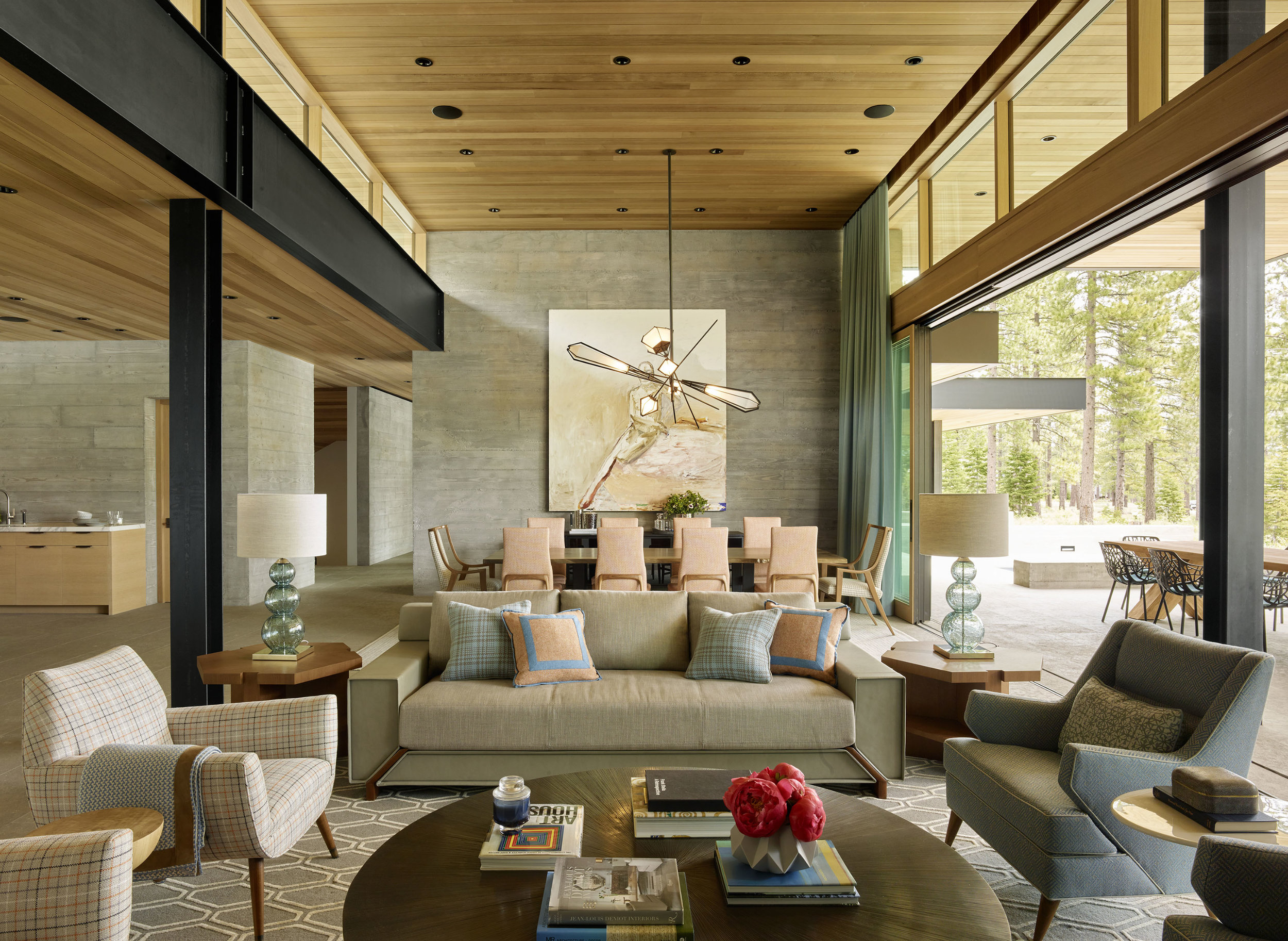
SZ: Quality of material for me is key to our work and non-negotiable.  I like to think that we don’t design for decades but for generations.  My question for building materials is ‘will this material get better with age.’

JL: In your mind’s eye, where would your personal dream home be located and what would it look like?

 SZ: That’s a tough on.  When FLW was asked what his favorite project was, he famously said ‘My next one.’ I feel like that too.  My wife and I are designing a home for ourselves now up in St. Helena.  It’s sort of a Barn typology detailed with crisp minimal detailing.  That is my current dream home in the works.

JL: Discuss the importance of travel in keeping ideas fresh in your work.

 SZ:  This is key.  I travel as much as I can and they typically are art and architecture themed trips.  A few years ago, my daughter and I flew into Bilbao and spent ten days driving through Spain to see incredible new and old architecture with a special focus on Rafael Moneo.  As architects, we must travel to better understand our own work.

JL: What do you do to recharge your batteries?

SZ:  Play a little golf with family and friends and break the Ducati out for a spin.

JL: Favorite weekend getaway?

 SZ: St. Helena, Pebble Beach, and Kohanaiki, HI.

JL: Top three restaurants around the world?

 SZ: French Laundry, Balthazar, Fish & Chips at London’s Tate Modern.

JL: What are you reading?

SZ: Lou Reed. The book just came out by Anthony DeCurtis.  Lou is the best!

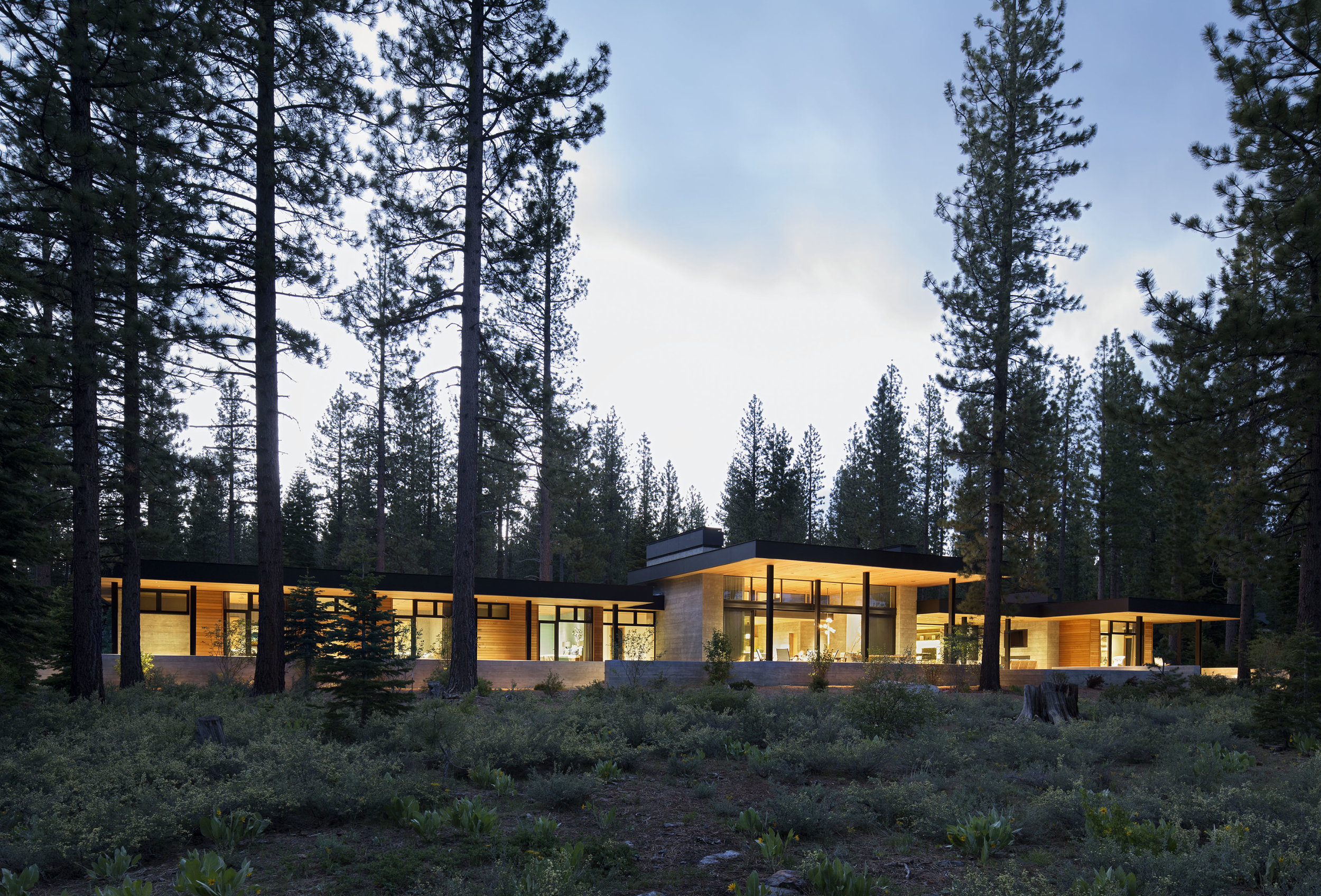
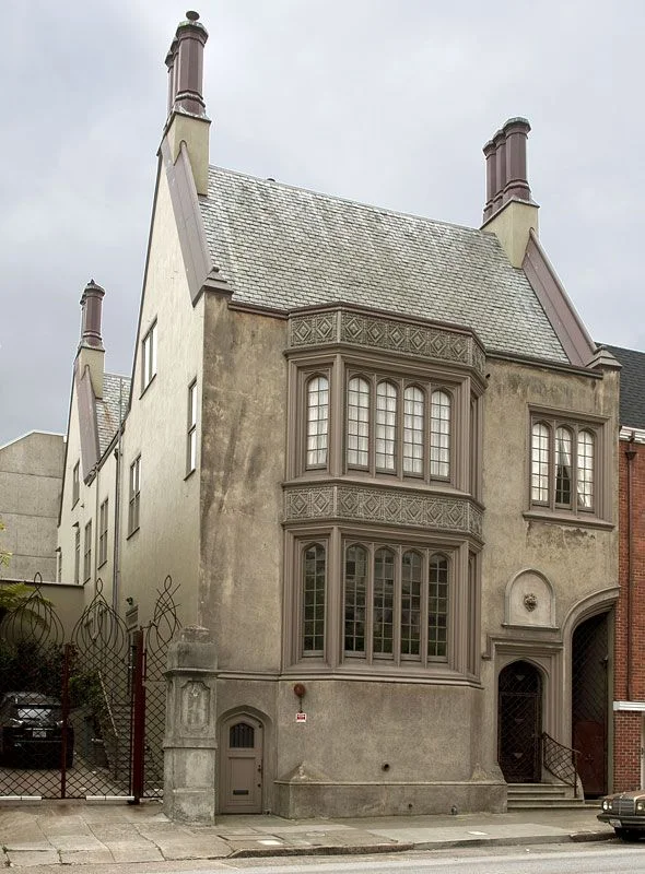
ZAK ARCHITECTURE - 245 VALLEJO STREET, SAN FRANCISCO

ZAK ARCHITECTURE - 245 VALLEJO STREET, SAN FRANCISCO

Andrew Skurman - Andrew Skurman Architects

The City's Finest Classical Practitioner 

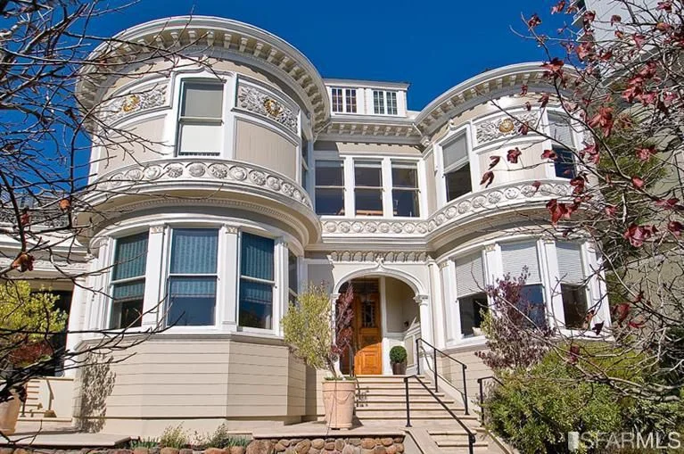
Launching our monthly series featuring San Franciscans of note, CaenLucier sits down with the city's leading classical architect, Andrew Skurman, to discuss his reinterpretation of one of Pacific Heights' last existing duplex apartments.  2000 Washington Street, originally designed by Conrad Alfred Meussdorffer in 1922, is one of the city's landmark residential buildings. It grandly sits adjacent to Lafeyette Park and the Spreckels Mansion where Danielle Steele resides when in town. 

CaenLucier: You have had many projects at both 2000 Washington Street and its elegant neighbor 2006 Washington.  What is it about these buildings that inspire the classical traditions your firm embraces?

Andrew Skurman:  2000 and 2006 Washington were built in the 1920s, with no expense spared, and with the most elegant classical interiors. One of the the apartments was designed by Julia Morgan. They all have high ceilings, large column free spaces and orientations that allow for an effortless reconfiguration that takes advantage of the glamour of classical design. 

It is by the way possible to recreate a classical home in a very modern building, but it takes a lot more effort. In order to do that, a client of ours built a second set of classical French windows in front of the building's standard modern windows. It does work really well and one cannot imagine the bare sheet rock walls behind the paneling, moldings and details

CL:  As I remember, your clients purchased the full floor apartment completely gutted. Did this offer any advantages?

AS:  When an apartment is old and in bad condition, it might be less expensive and one can achieve better results by gutting it rather than changing just part of it. You are then completely free to redo all the electricity, heating, and plumbing to modern standards, and to conceive a completely different floor plan that takes advantage of every square inch of available space.

Gutting allows for a complete re-creation and the imagination of the client can really flow. But in buildings of quality, there usually are elements that should not be eliminated but reworked. I love to find charming elements to retain and build upon. It saves expense as well as maintaining the original historical beauty. In one of these apartments, we reconfigured everything except for a delicate and beautiful dining room. Which we restored with care.

One of the apartments at 2000 Washington Street is morphing into something different for the third time. When we first created it, it had dark wood, a colorful palette, and traditional furniture. Then, under the magic wand of Fisher Weisman, it had a kind of a facelift, it was entirely painted white and became one of my favorite things: a classical background with modern furniture. We are now completing a third remodel on the same apartment! But our black and white marble floor in the entrance and many other features have remained through all the changes.

CL:  How do you feel your interior architecture decisions held up when the visual palette changed from traditional to contemporary after we sold it to our clients?

AS:  As an architect, it is wonderful to see a space you created evolve under the impetus of the new owner’s taste. There isn't just one kind of beauty, one esthetic or one architectural truth. I look forward to a diverse future, full of classical homes and homes that whisper their classicism.

CL:  What were your favorite aspects of the renovation when it was completed?

AS:  There is a gallery of arches, long and wide, which allows for the display of art better than a mere corridor. As one walks about 50’ through this 8’ wide space from the entrance hall to the living room, the view that pulls you forward is of the bay in its full glory. The gallery has a quality of light that reminds me of one of my favorite places: the Vasari corridor, in Florence, that jumps from the Uffizi Gallery over the Arno River to the Palazzo Pitti.  This is where the museum exhibits self-portraits of artists collected since the 16th century.

CL:  Were there any specific historical design elements that you incorporated into this project?

AS:  The language of classicism is so rich. The paneling details are from the Wren Period in England, a voluptuous raised panel. The pilasters are in a fancy Doric style from the baths of Caracalla in ancient Rome.  The black and white patterned paving in the entrance hall was inspired by Robert Adam (an 18th century Scottish architect). The muntins on the French doors and windows reference the fretwork on Chippendale furniture. 

CL:  You and Paul Wiseman worked on this project together originally (prior to working with Fisher-Weisman seen in these images).  What was the experience like working with designers of your caliber?

AS:  Paul Wiseman has a huge palette of talents, from pure classical to modern. He can create the most detailed interior or a luxurious modern home with great art on the walls. He excels at everything he touches. We speak the same design language and share many references. We recently had dinner together and I enjoyed every minute.

CL:  You regularly visit your residence in Paris.  How does your exposure to the city's timeless elegance enhance your design vocabulary?

AS:  In my constant research of classical beauty, I love to roam around the Europe, scrutinizing and analyzing the details: in the cathedral of Reims, the integration of restored medieval stained glass windows, cohabiting with others made in 2011 by Imi Knooebel; in London the saucer domes of St. Paul, with their lacy edges, Wren’s simple yet sculptural solution to the ceiling of the nave. I can visit the same building many times, and there is always something new that catches my eye. 

Paris is a stopover from which I go to all the other countries, Italy, my most beloved, where I go every year, but also to Spain and England, Germany and Greece. I was in Greece this summer. The Parthenon was covered with cranes. What a beautiful image of the constant efforts, even in a country with considerable economic problems, to maintain our common patrimony. I mentally took in once more the proportions of the majestic columns and their orders.

CL:  What are your favorite projects that you are working on now?

AS:  We are currently working on an addition to building that is a national monument at a major East Coast university. More next time we talk…

TASTEMAKERS

Inspired Design Enhances Daily Life

By Joseph Lucier

San Francisco has always been known as a city of bold moves, be they social, political, or found in our noteworthy personalities around town, but restraint bordering on insipidity seems too often plague San Francisco's architectural landscape.  Love it or not, fervent opposition is a native trait of the City's residents, but it has been hurdled before to yield landmarks known the world over.  The Transamerica Pyramid, designed by architect William Pereira in 1969, comes quickly to mind as detractors during planning and construction sometimes referred to the design as "Pereira's Prick". John King of the San Francisco Chronicle summed up an improved opinion of the building in 2009 as "an architectural icon of the best sort - one that fits its location and gets better with age."  Yet where is the opposition found today towards “safe bets” that developers deliver to planning and, thus, usher to the marketplace when current economic opportunities could equally fuel cutting edge design, top quality materials, and high caliber construction meant to inspire buyers and residents alike?

This high/low conundrum begs the proverbial question between developers and consumers of who is the chicken and who is the egg.  While we were all Millennials at one point, albeit as Baby Boomers, Gen Xers or Gen Y, who likely entered the market without a well-defined sense of taste, the question remains; can the risk of higher investment for quality materials coupled with exciting architectural design be delivered by developers and applauded by consumers?  In the late 1990’s the architect David Baker and Holliday Development redeveloped the Clock Tower building at 461 2nd Street as uniquely designated “live/work” lofts.  This 1907 building, originally constructed for the Max Schmidt Lithograph Corporation, offered a new product to buyers who excitedly embraced the exposed brick and timber components and were introduced to open plan New York loft living. Not only was the live/work designation tenaciously fought for by the developers, these lofts were cool!  The market responded positively leading to further investor confidence with the 1996 redevelopment of the Oriental Warehouse at 650 Delancey Street, ultimately adding more high quality housing stock of lasting integrity.

David Baker's innovative clock tower lofts

David Baker's innovative clock tower lofts

Fast forward to 2014 with Stanley Saitowitz’ 8 Octavia Street rising from a triangular lot left bare after the destruction of the Central Freeway.  Saitowitz is a big thinker and a bright spot in the city’s architectural discourse.  He feels that "architecture is a frame, an open field which facilitates the dreams and desires of the inhabitants. In this way architecture can be viewed as an instrument, a way to extend the exuberant parts of life, a tool for liberation." In an ocean of floating milk toast that the SF Planning Department often unwittingly finds itself wading through, 8 Octavia gave the City an opportunity to embrace the shock of the new. DDG's (the developer) investment of economic and intellectual capital paid off hopefully inspiring future sentinel attempts to stave off less inspired designs imposed on residential marketing firms.  With 47 units and a ground floor retail component, 8 Octavia had the ability to spread out risk on the balance sheet, but what is to be done to support San Francisco’s tastemakers burning desire to express a bold move residing on a singular property?

stanley Saitowitz design at 8 octavia

stanley Saitowitz design at 8 octavia

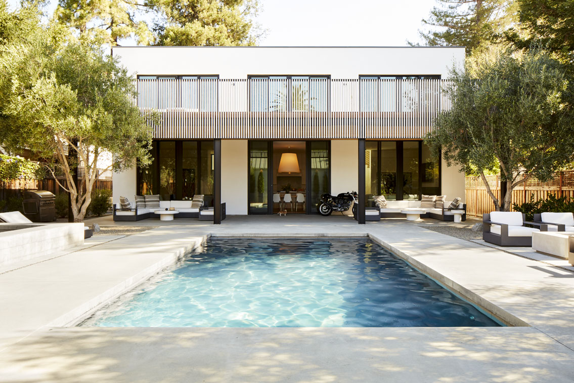
As the ante moves up in the world of luxury single family home redevelopment, we re-engage the chicken vs. egg paradox with all of the eggs falling into one basket.  I certainly applaud any developer who puts on his investor’s cap to accurately assess the economic factors and consumer tastes required to make a profit, but tastemakers must unflaggingly resolve the uncertainty of being rewarded for a project that rigorously takes on new design theory, uses exotic (and expensive) materials, and boldly informs the market on what THEY consider important. Do we really have to see yet another $8mm+ spec house with a bowling ball plan entertaining level punctuated with a Carrera marble kitchen island leading to a wall of glass Nano doors with no sense of progression, no mystery, and therefore, no true allure and passion? Please say no!  Real estate agents wave their hand to the tune of hundreds of thousands of additional dollars saying that the developer “offers a blank canvas” for the new buyer to make the property their own.  Let us encourage developers to play offense and personally take on these blank canvases instead of kicking them down the road to the marketplace.

uninspired formula developer product delivered to 2015 market

uninspired formula developer product delivered to 2015 market

I believe there is a market for the tastemakers who are willing to risk investment and inform San Franciscan's on what is chic and how inspired design can enhance daily life.  Baker and Saitowitz have shown that we collectively await developers willing to show us what can be and what we can embrace.  Developers willing to harness the winds of innovation, creativity, and technology, the true lifeblood of the San Francisco Bay Area, will be patiently rewarded by those seeking the allusive framework of high quality design and construction during these interesting times.