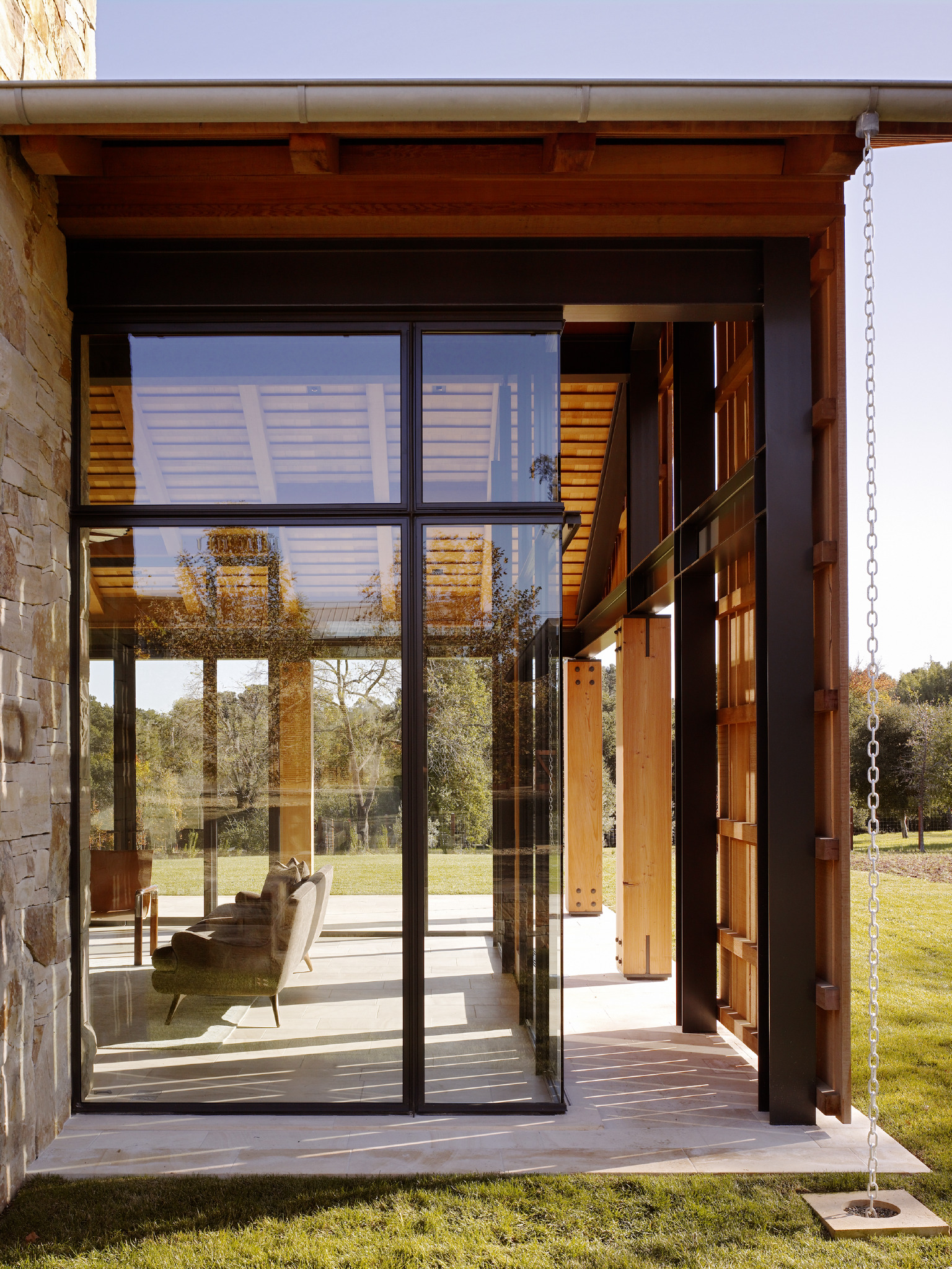
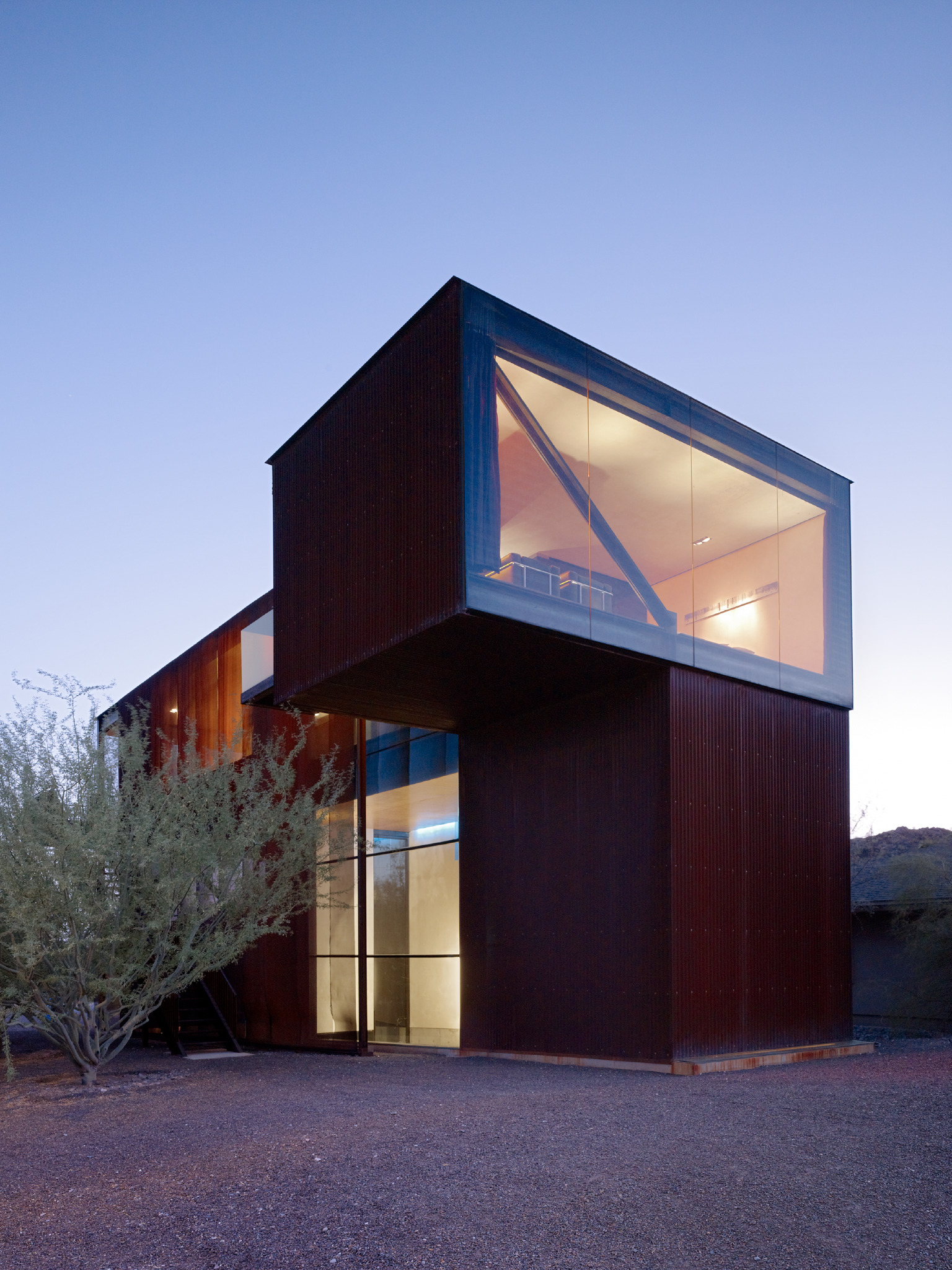
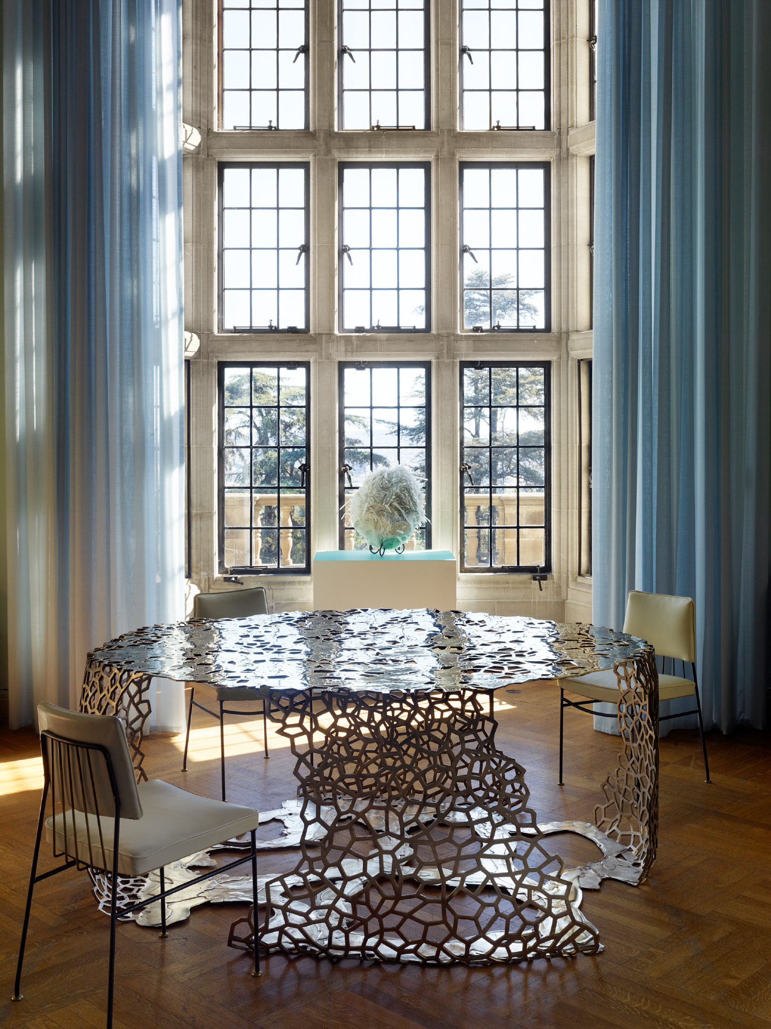
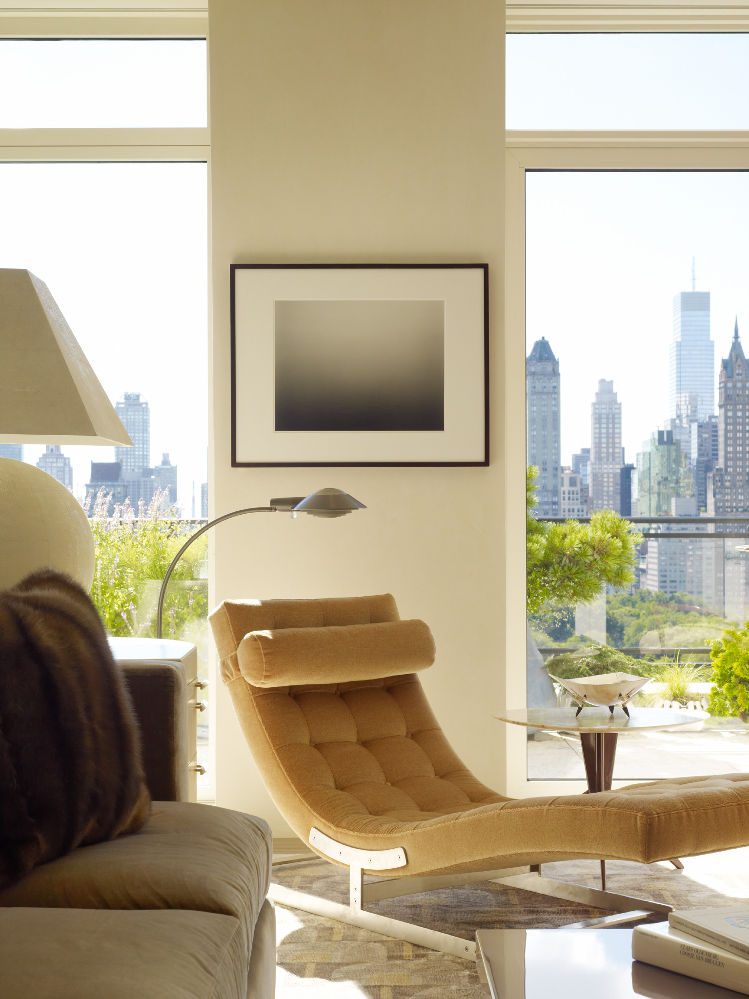
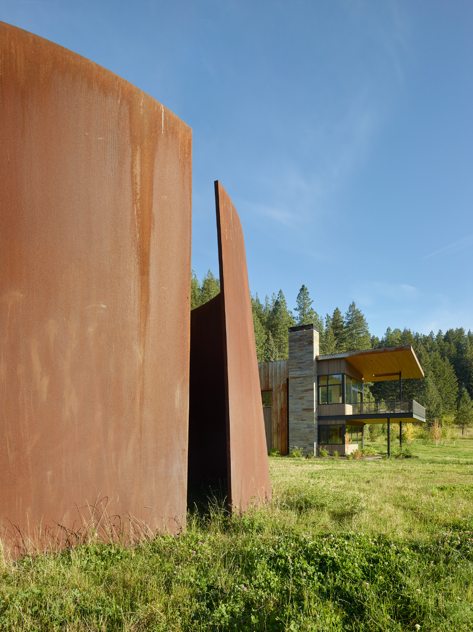
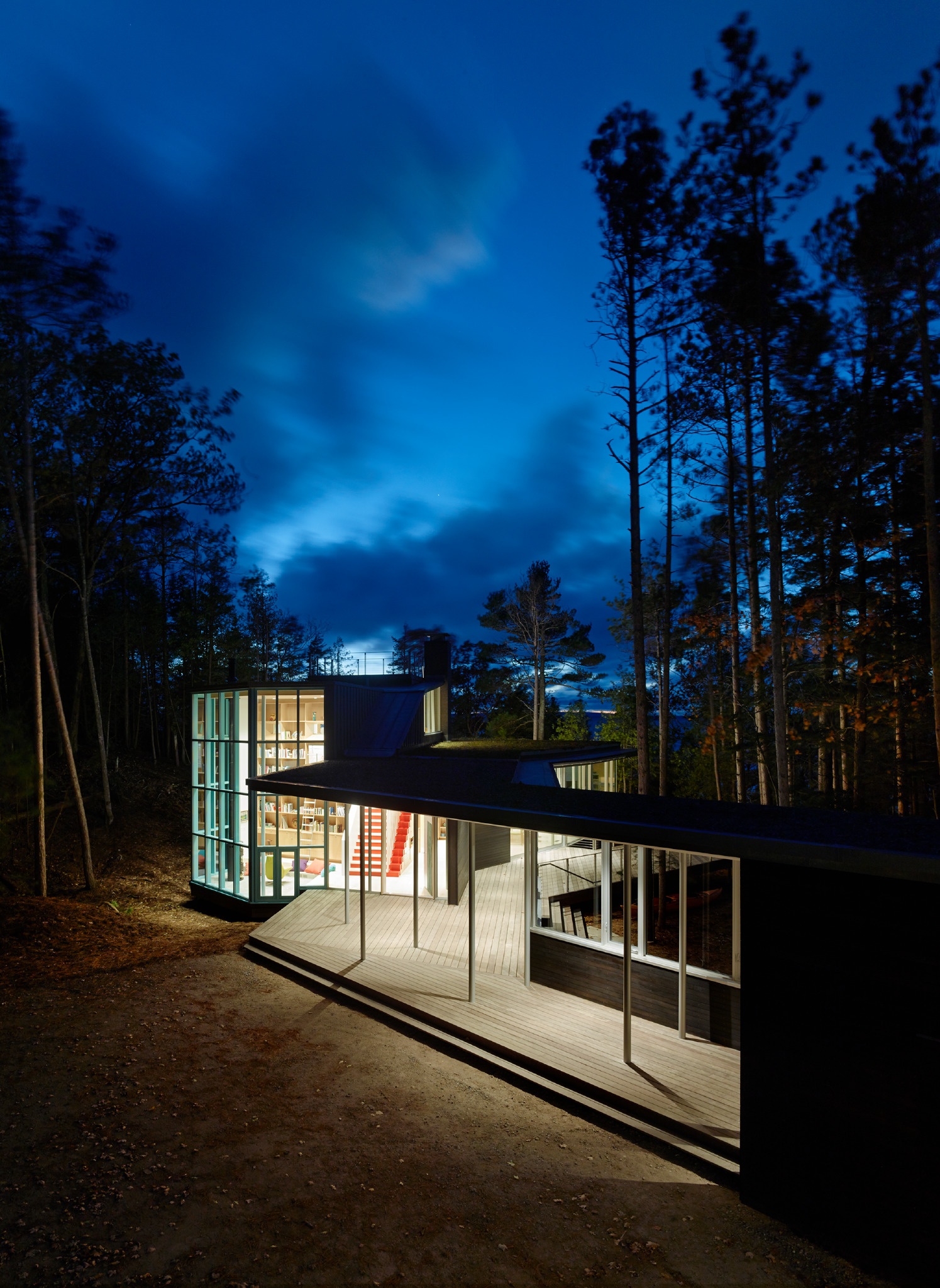
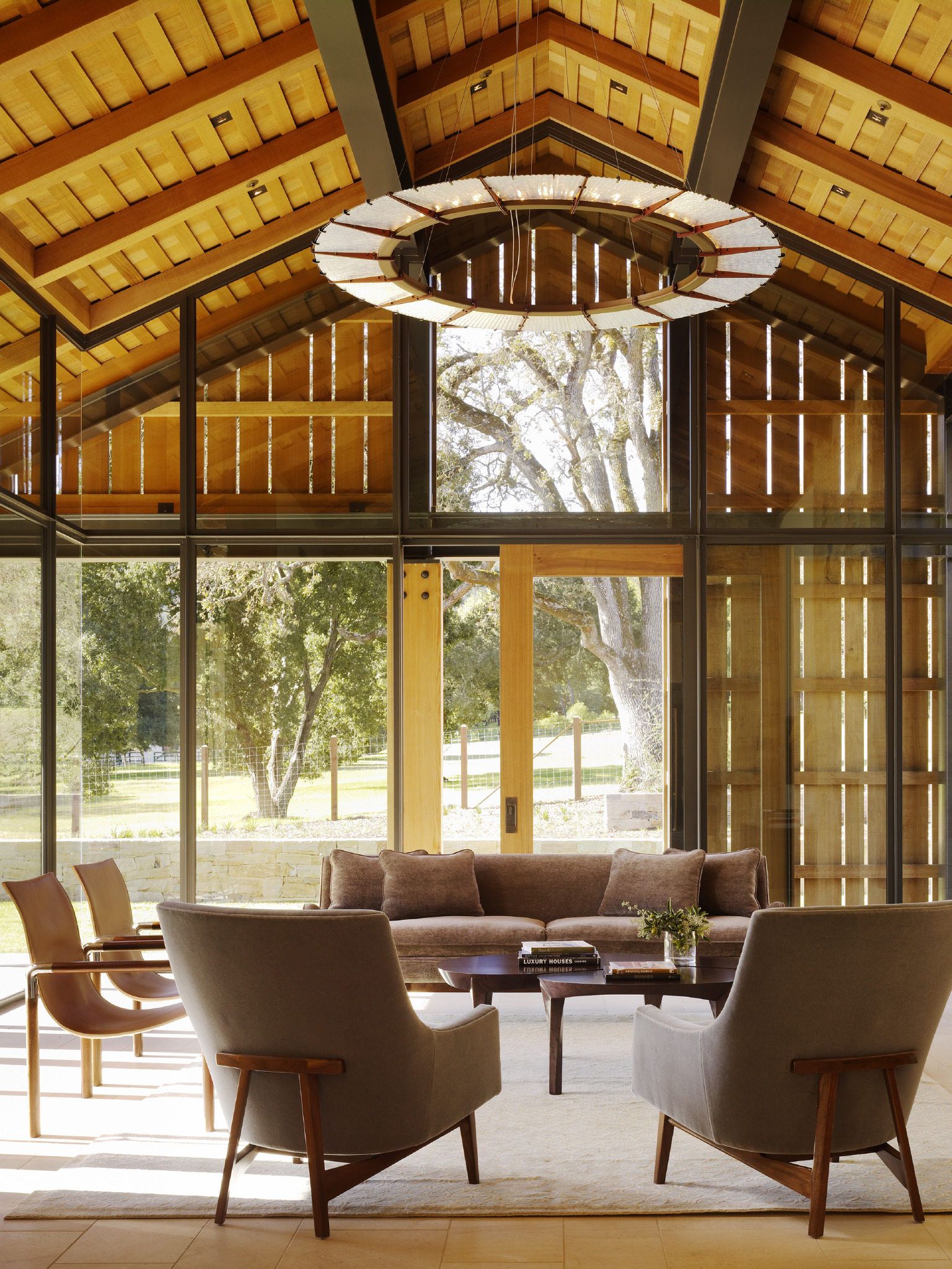
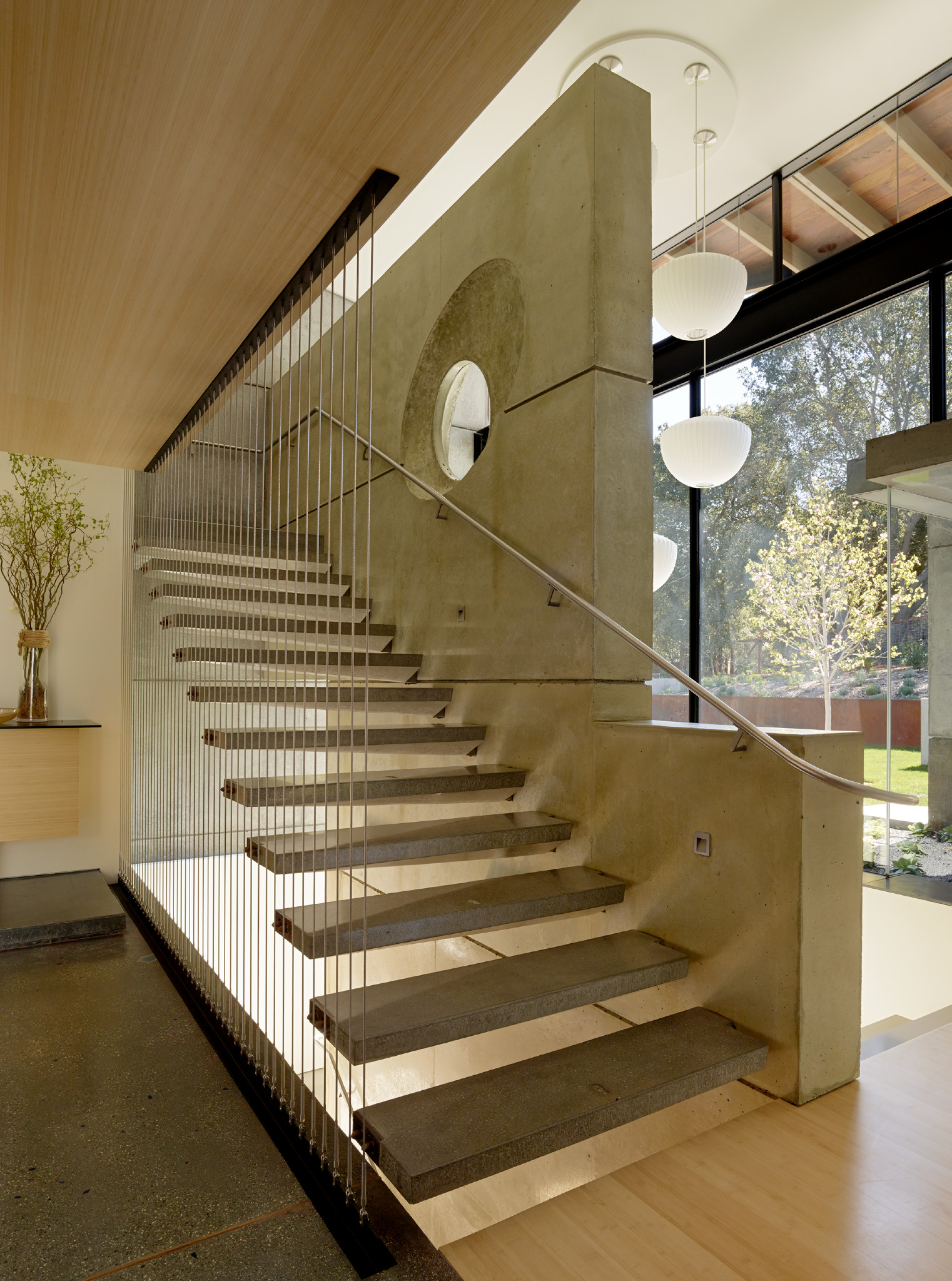
Matthew Millman - Residential Photography
/Love At First Click
By Joseph Lucier
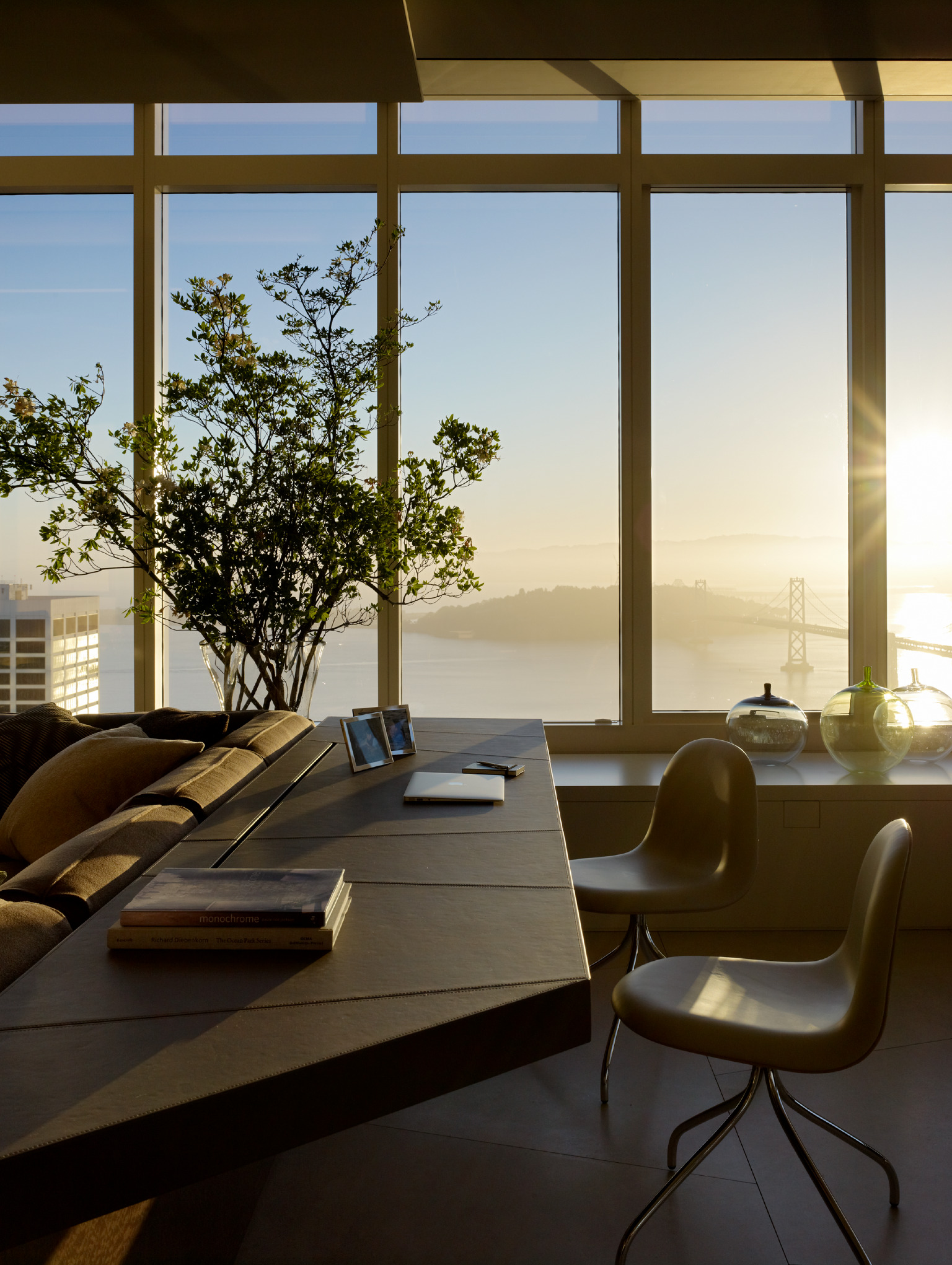
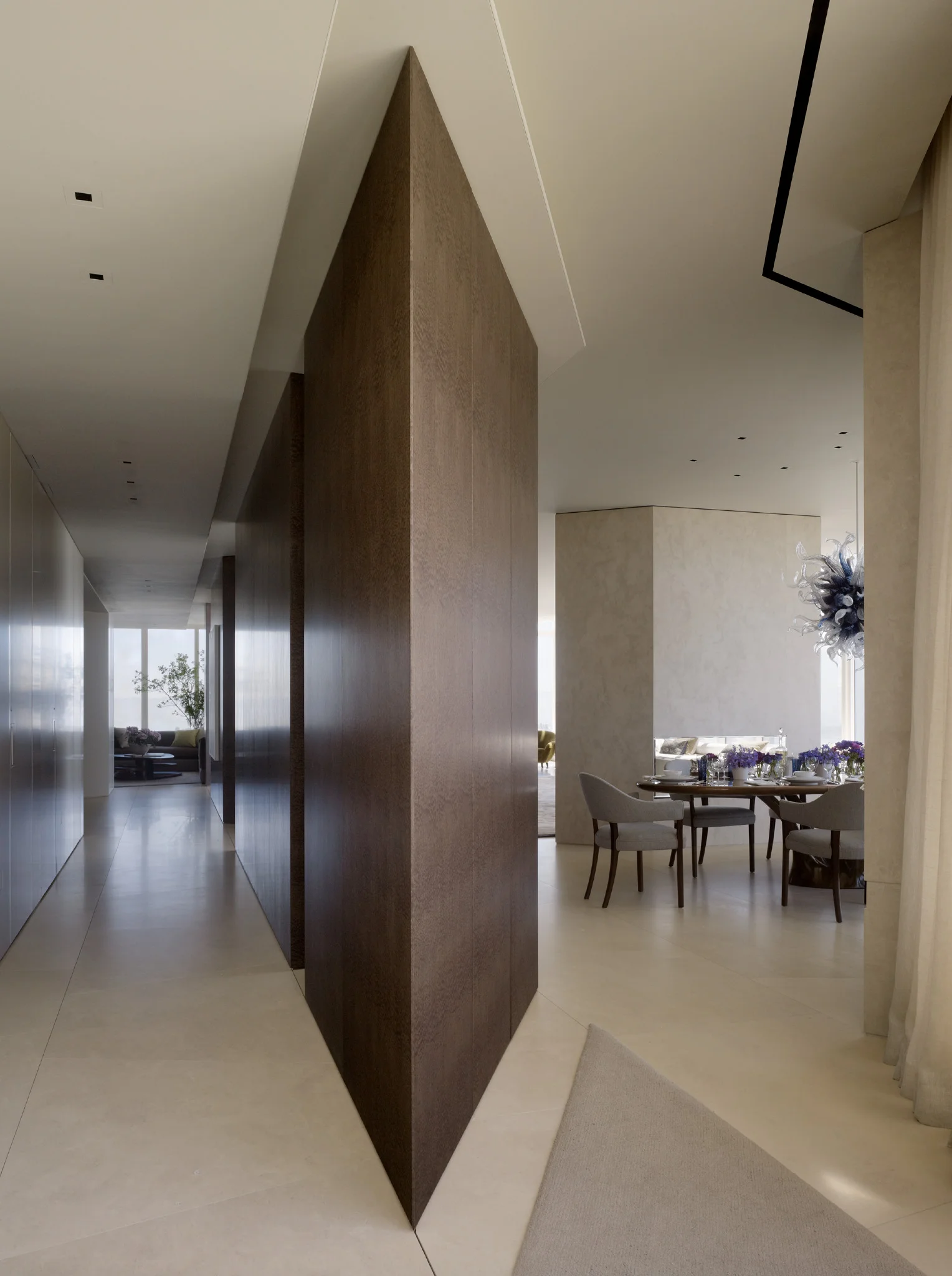
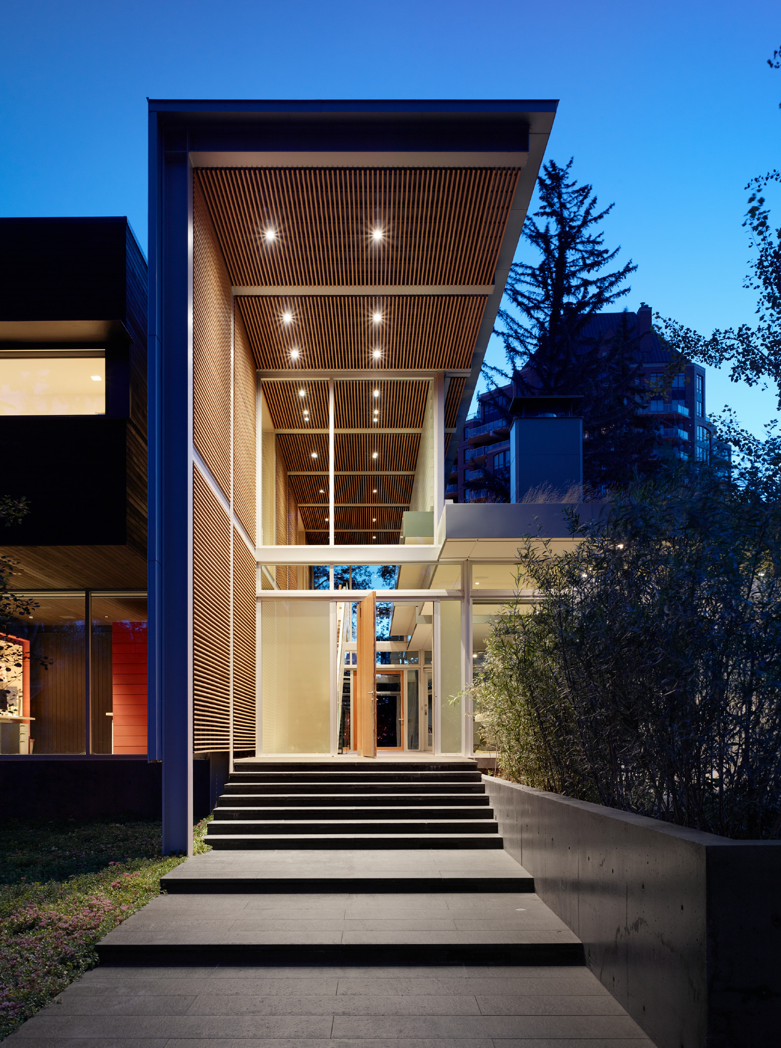
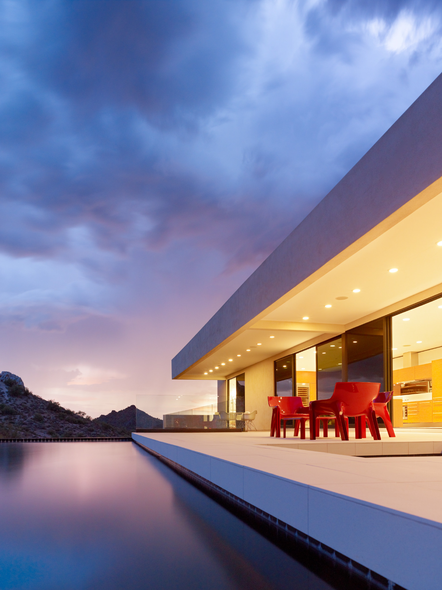
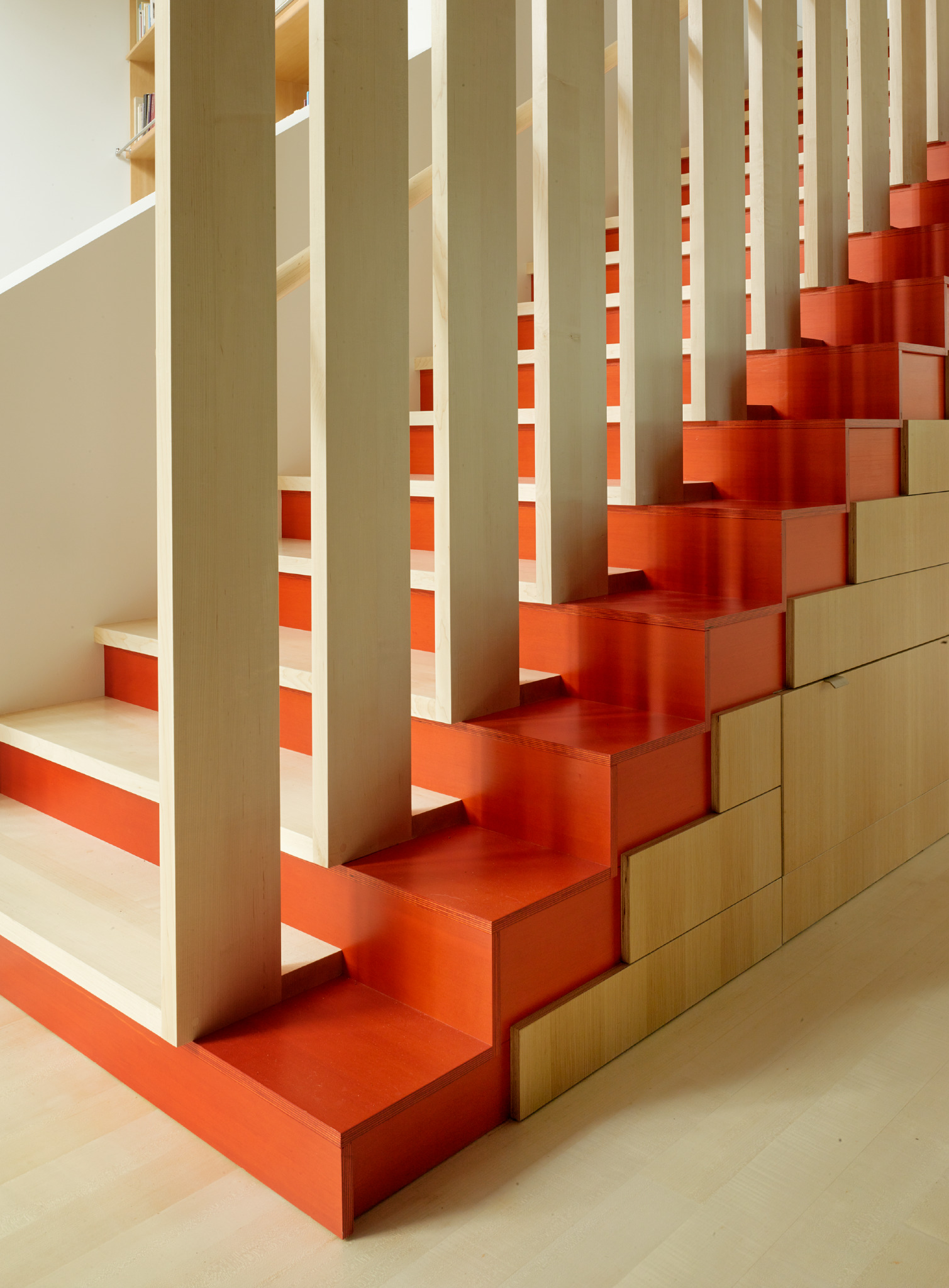
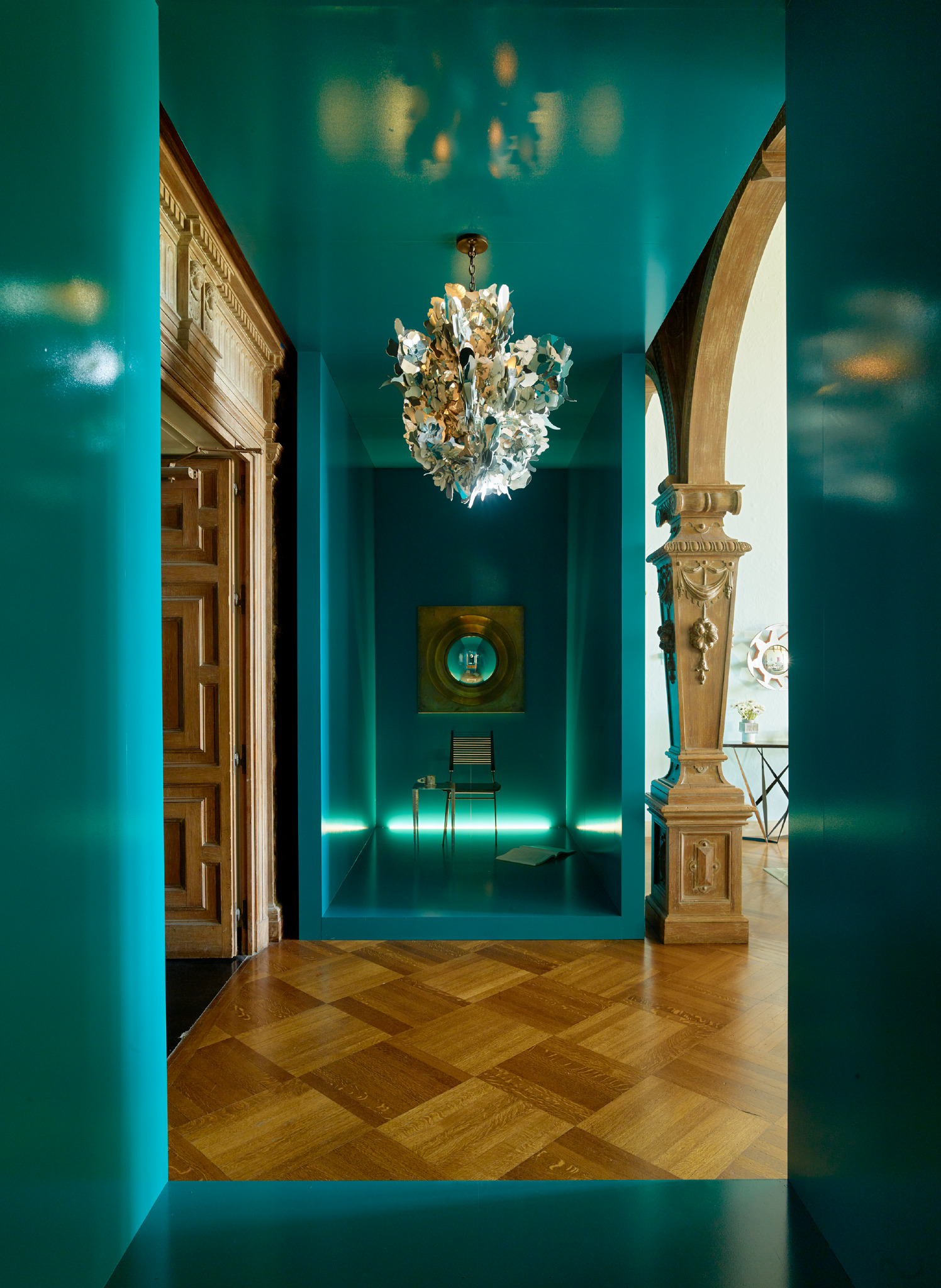
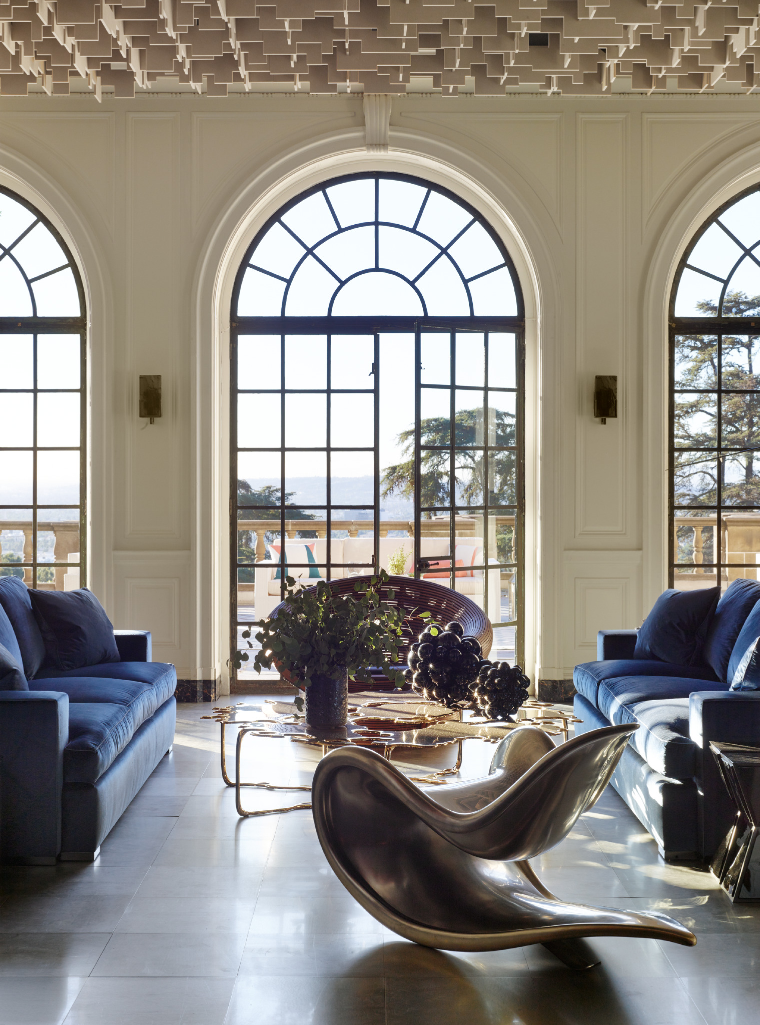
They say it's better to be lucky than good, but what if you have the good fortune to be given both in equal measure. Matthew Millman was smitten by photography from his years of schooling and landed early on at the top of Los Angeles' photography community benefiting from the guidance of Tim Street-Porter. Subsequent commissions from recognized interior designers and architects offered Millman the opportunity to train his eye and hone his skill in some of California's most iconic homes. Today his name is synonymous with the striking images we see in the world's top shelter magazines and design related monographs. The patience and skill he employs to tap into the essence of the designers hand transforms the fine line between dreams and reality. We recently sat down with Matthew and found a man confident in his craft, reflective on what the years have taught him, and still filled with the youthful passion for the next job.
Matthew Millman
Joseph Lucier: What drew you to the magic of photography as a life-long passion?
Matthew Millman: It really was love at first click. I started photographing in high school and have been actively photographing ever since. I have been a professional photographer for 25 years. Back then, and to this day, I have always loved how a well crafted photograph can tell a powerful and immediate visual story.
JL: Who were your mentors early in your career and how did they shape you as a professional?
MM: Three photographers, whom I worked for early on, really shaped my career. Tim Street-Porter showed me the art of photographic storytelling. Grant Mudford taught me about rigor and how photography can reveal an architect’s intent. Richard Barnes helped me to think of design photography as art photography. In addition, so many architects and designers, such as Joshua Aidlin, Paul Wiseman, and Orlando Diaz-Azcuy, have given me daily lessons in architecture and design.
JL: When photographing architecture, talk about the importance of light in the composition.
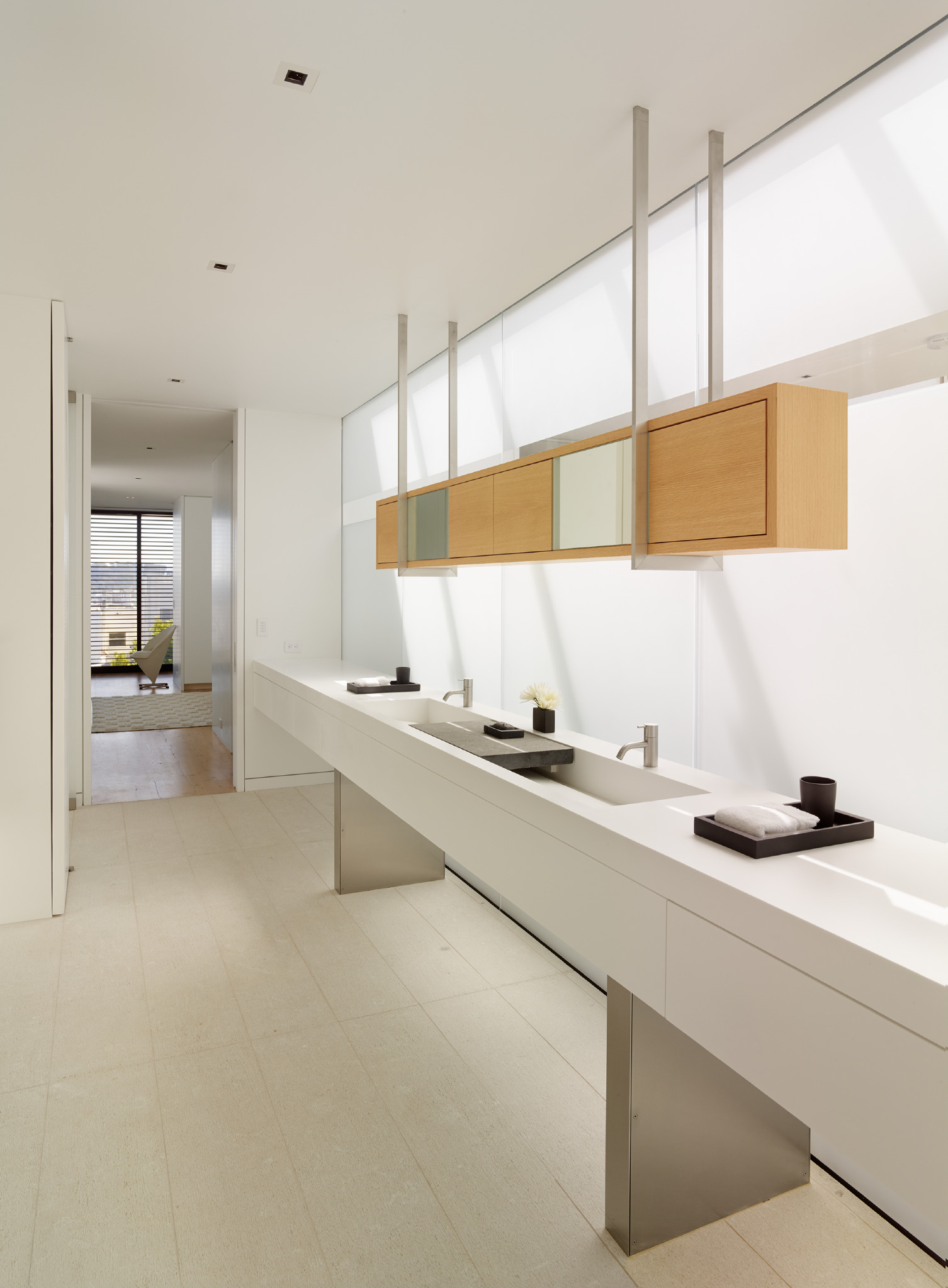
MM: Light is everything in photography. But even more important, light is essential to us as people. It is how we experience so much of our world. So being attuned to light as I photograph is critical in trying to capture the most meaningful aspects of a project and a designer’s intent. I spend every minute of every shoot day following the path of the sun and tracking light throughout a project, looking for moments where light reveals form, infuses emotional qualities into a project, such as warmth, or creates tension in space.
JL: What is your process of identifying the essence of a home and its interiors prior to a photo shoot?
MM: When I come into a project, I know very little about it. My first impressions and initial sense of wonder are very helpful in starting to identify the best shots. Much of the time, the parts of a project that I am first wowed by end up being the spots for the best shots. I try to maintain that naïve joy and exploration throughout the process of photographing a project. It is great to walk through a project before the actual shoot day to start to develop an understanding for the project. If that is not possible, I start a shoot day by trying to walk every inch of a project and freshly look at everything before we dive in. At the same time, the depth and subtly of a project can only be experienced over time. So, throughout a shoot day, I am always searching for new aspects or surprises in a home. Until the sun sets and the shoot is over, it is a constant exploration to understand more about a project, the designer’s intent, and the best ways to represent it.
JL: What photographers do you most admire?
MM: Aleksandr Rodchenko. I didn’t know it at the time, but I think one of the reasons I always loved Rodchenko’s photos is that he was also a graphic designer. I am a formalist and Rodchenko’s images are so solidly monolithically composed. The work of Robert Maplethorpe really impacted me as a young photographer. His sense of drama and high style helped me see photographs as more than documents. I love Edward Weston for the surprise contained in every one of his images. Never formulaic, never stale, Edward’s passion for the story in an image above the structure of an image really resonates with me. Hiroshi Sugimoto. I love how Sugimoto’s photos are about something but really about another thing altogether. His ability to make a pretty straight forward image into an much deeper conceptual conversation is inspiring, I hope to simplify my images down to that level of complexity one day.
JL: How have you seen the shelter publication industry change over the years?
MM: Since I started, the primary change in shelter magazines has been to print design stories that are more reflective of how people live and to photograph these stories in more authentic ways. The high visual drama and opulent wealth seen in design publications two decades ago lead to a revolt seen in magazines like Dwell. The new era of design stories focus on homes that people can more easily relate to or to use as inspiration for improving their own homes. The photographic style of storytelling drifted from heavy lighting to only using available natural light and including people more naturally or candidly in the shots. For me, personally, I like that there are more ways to tell design stories and more focus on the humanity in a home to go along with the impressive structure of the house.
JL: Did the presentation of homes change at Architectural Digest when longtime editor Paige Rense Noland stepped down and Margaret Russell took the helm?
MM: Architectural Digest had become stale toward the end of Paige Rense’s editorship. Margaret Russell brought her fresh crisp daylight washed style from Elle Décor to AD. For a while, it made a big difference but, oddly, the magazine drifted back towards the Paige Rense days. Now, with Amy Astley at the helm, AD feels much more contemporary and fashionable. The stories are looser and more youthful. It will be exciting to see where Amy takes the magazine.
JL: Do you find any current magazines showcasing photography in a new and exciting way?
MM: Cultured, Gallerie, Disegno, Fiera, and Design LA.
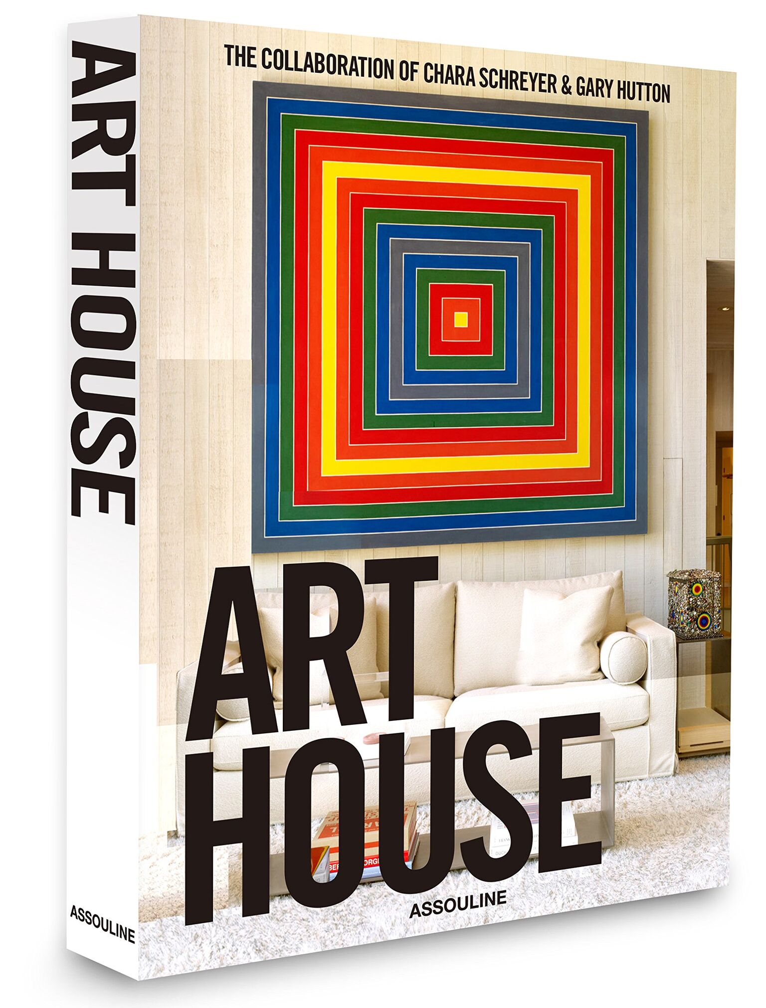
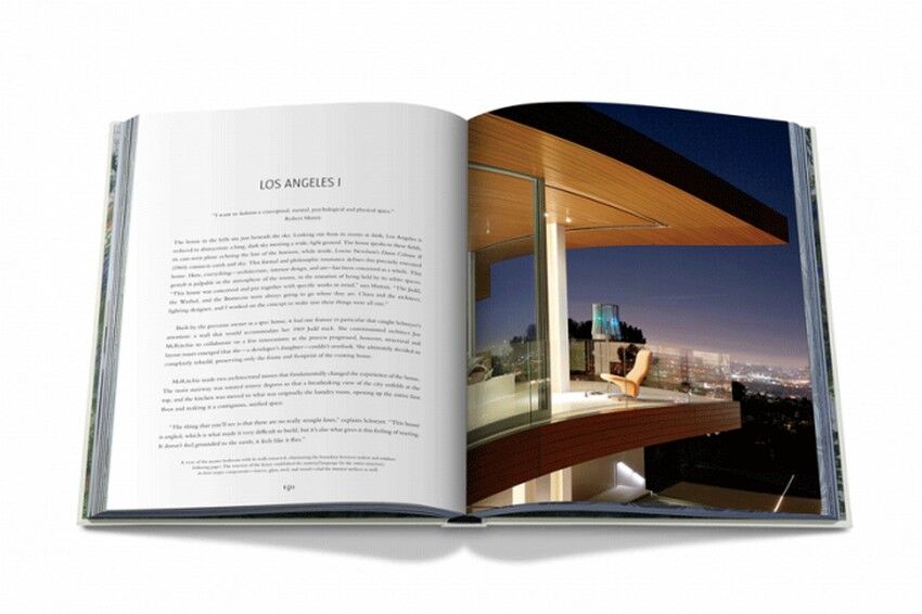
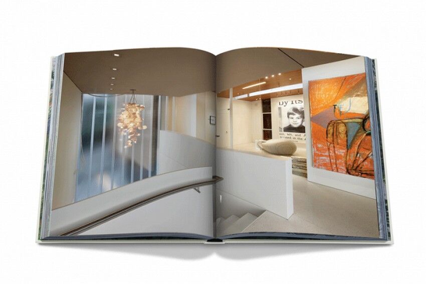
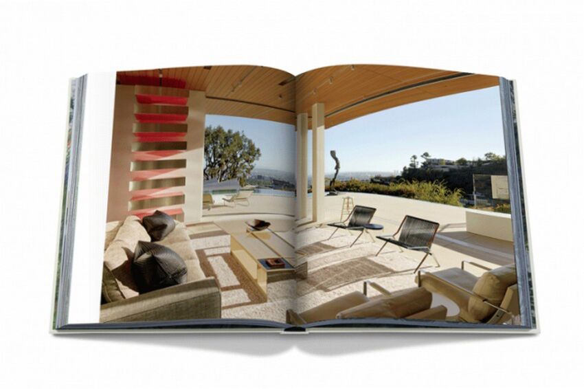
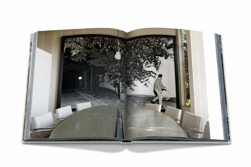
ART HOUSE - Published by Assouline
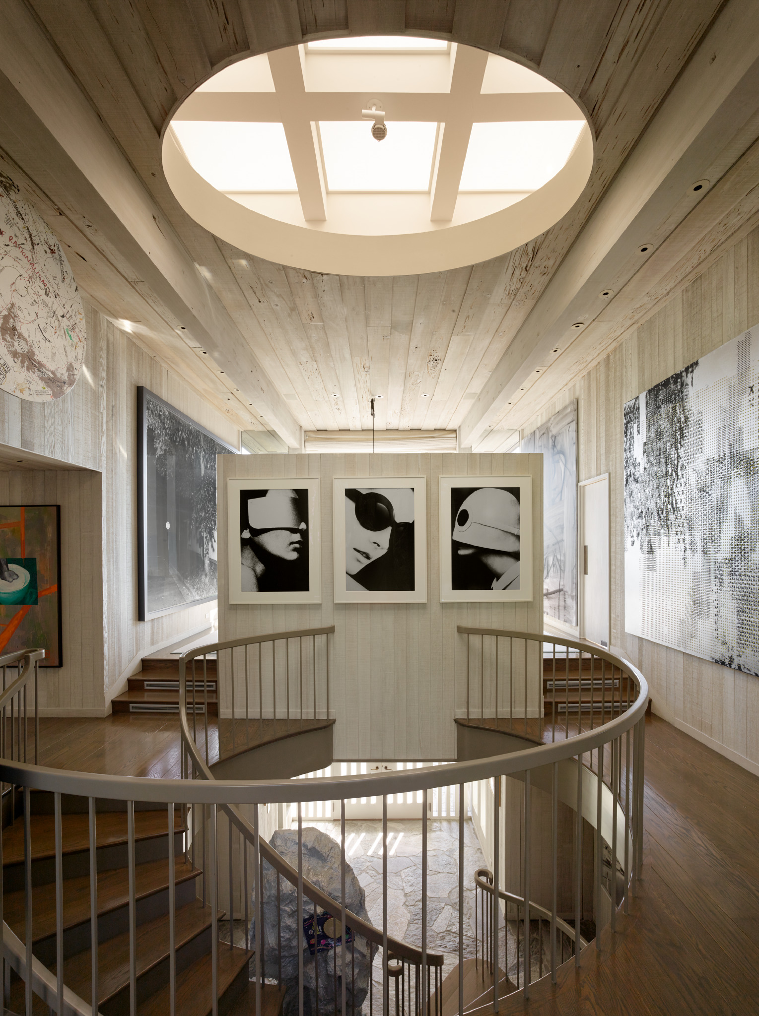
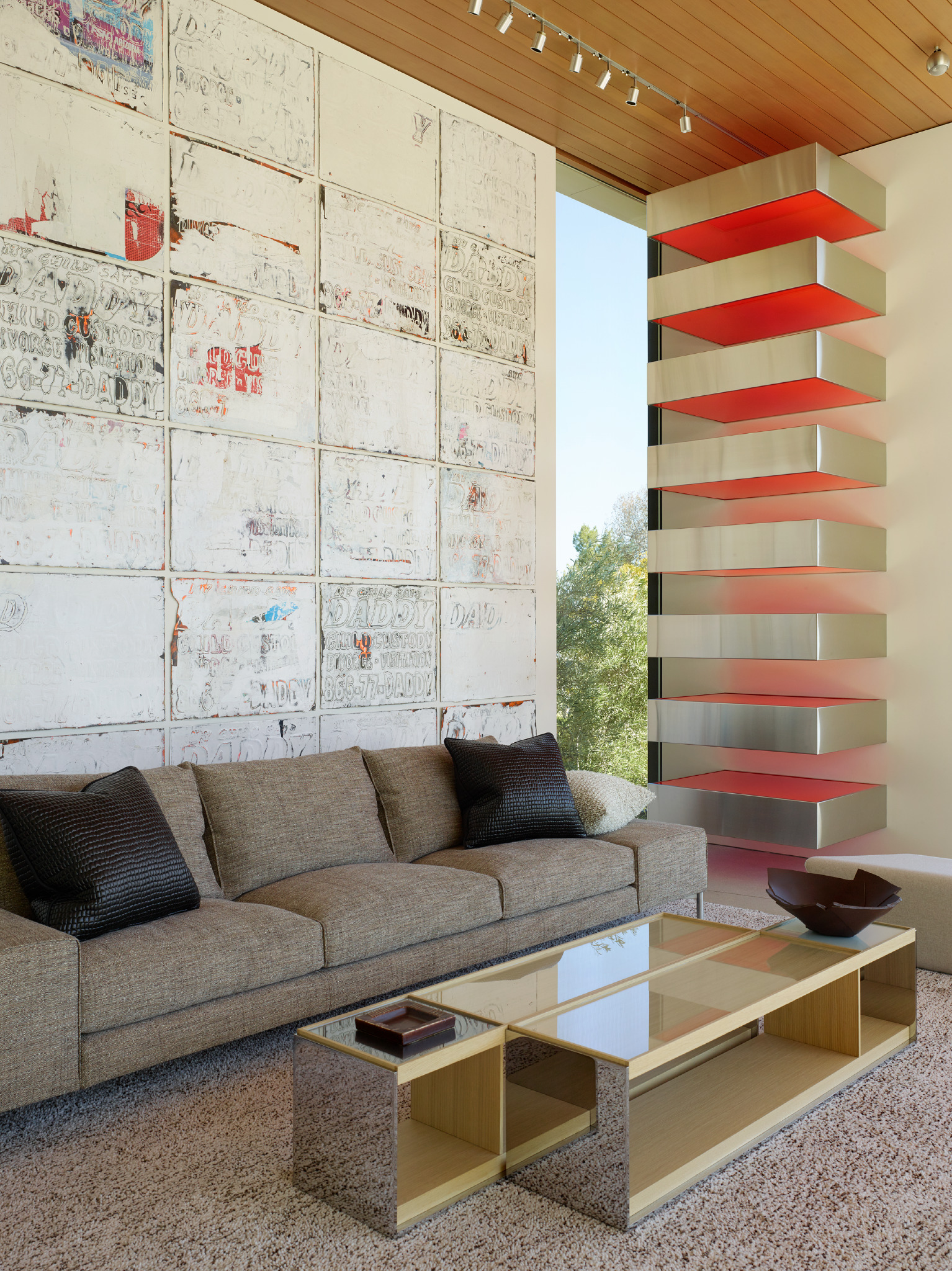
JL: Talk about the process of working with Chara Schreyer on the monograph showcasing her art collection and homes in ART HOUSE.
MM: I met Chara Schreyer through interior designer Gary Hutton about a decade ago and I have been photographing Chara Schreyer’s homes and extensive art collection ever since. Chara, Gary, and my work together culminated in the book, Art House (Assouline, 2016). Chara’s homes are more like private museums and, as such, require a different more restrained and contemplative photographic approach then other homes. Chara’s art collection is exceptionally curated and very personal. The collection has really pushed my photography to be more creative and less literal. The freedom and access Chara afforded me has allowed me to experiment in ways impossible on normal shoots. The result has been one of the most artistically meaningful experiences of my career. I think the book Art House reflects the depth and intimacy of the process.
JL: If you weren’t a photographer, what would you be doing professionally?
MM: Psychologist
JL: Favorite weekend getaway?
MM: Indian Springs in Calistoga
JL: Top three items on you bucket list?
MM: Visit Vals in Switzerland. Learn to play the trumpet. Print a book of my personal art photography
JL: Favorite restaurants?
MM: In my hood… Chez Panise Café and Cheese Board. Beyond... Bamboo in Hawaii, Versailles in LA, The Kitchen in Jackson Hole and Hartwood in Tulum, MX.
JL: What are you reading?
MM: Six Four by Hideo Yokoyama.
VISIT MATTHEW MILLMAN PHOTOGRAPHY
Thank you, Matthew for your work on this feature.


