Suzanne Tucker - Tucker & Marks
/The Timeless Elegance of Suzanne Tucker
BY JOSEPH LUCIER
As a little girl, Suzanne Tucker grew up in the idyllic southern California enclave of Montecito, rearranging all the ornaments on the family Christmas tree. It was no surprise that she would eventually begin a career as an aspiring young designer with the legendary Michael Taylor, setting the stage to become the last word in interior design for San Francisco’s beau monde and beyond. Having enjoyed a friendship with Suzanne for over a decade, I have had the pleasure of intimately witnessing the weave she creates from intermingling a passion for design with her zeal for living. Suzanne's attention to every detail and a genuine caring personality, topped with an unerring sensibility for scale and proportion, give her interiors a sense of refined comfort and livability that speak to the very essence of her well heeled clientele. Her ability to frame classical principles with a modern sensibility allows homeowners the comfort of Tucker's guided collaboration. I spoke with Suzanne between projects in Pebble Beach, Aspen, and the Yellowstone Club to learn a little more about what makes the “Queen of Custom” tick.
Joseph Lucier: Was there something inside of you as a child giving you a notion that someday you would enter the world of interior design?
Suzanne Tucker: My mother will tell you she saw the decorating inclination in me when I was a very little girl, apparently spending hours rearranging all the ornaments on the Christmas tree. But growing up in Montecito, the world was my architectural and horticultural oyster. My sister and I would spend days on end building forts and creating fantasies, roaming through next door properties with romantic names like Lotusland, Val Verde, and El Mirador. I loved tagging along with my parents to their friends' parties so I could see their houses and explore their gardens. Art classes outside of my school curriculum were a must and it seemed a given that I would gravitate towards the arts, art history, architecture and design when I was in college. I studied interior architecture and design at university and was happiest when totally immersed in the art department. For a moment I had seriously considered architecture school but all that tedious math and years of more schooling seemed so boring - I wanted to get out into the “real world”! It may sound a bit odd but I didn't set out with the intention of having a career. I followed what I loved, traveled to Europe, lived in London, worked for some inspiring people, had some incredible mentors, and it all fell into place. Interior design is a fantastic profession - constantly evolving, always challenging, very hard work, and immensely rewarding.
JL: Having grown up in Santa Barbara, are there any stylistic elements of the Tucker & Marks look that owe themselves to this part of California's architectural, interior, and landscape design heritage?
ST: Absolutely, although I was also strongly influenced by living in London for several years – another architectural feast and a great decorating influence. But Santa Barbara is in my soul and has had a powerful effect on me, given the importance and beauty of the local architecture, the inherently gracious houses, historic precedents of style, enchanted gardens, the unique quality of the light, and the colors of the mountains and beaches. All of this lives deep in my visual and sensual memories, grounding how I create layered and elegant environments for others. I would say London gave me my extended education in decorating and architecture with courses at the V&A that were invaluable and the deeper understanding of a “proper house”: how rooms should flow, how a house should function, the graciousness of space, putting a house together and the ease of living comfortably, whether casual or formal.
JL: How did you come to work for Michael Taylor and, more interestingly, how did you manage to stay in a position that tested so many before you?
ST: There are several very funny stories in answer to that question, but that’s for a tell-all book. I consider myself very fortunate to have landed that job – even though to get my foot in the door, I had to swallow my pride and start as Michael’s secretary – albeit one with rather pathetic secretarial skills who could barely type. But that lasted all of three months when he figured out I actually knew something about decorating and began taking me to client meetings and involving me in the projects. Michael was notorious for hiring and firing and was an incorrigible bully to his staff. I suppose I stayed because I wasn't afraid to speak my mind – chalk it up to chutzpah or naiveté, or a mix of both – and he respected that… and was amused by it. Michael, lovable tyrant that he was, took me under his wing as “teacher’s pet”, spoiled and indulged me, and thus became my greatest mentor. After his death, Tim and I bought his interiors business and the furniture line Michael Taylor Designs was sold to Paul Weaver who built it into the line it is today.
JL: What element of Taylor’s style, both in business and design, did you take into the formative years of Tucker & Marks?
ST: I couldn’t help but be greatly influenced by Michael's mastery of scale and proportion, his use of color and light, and his knowledge of furniture and antiques. And those are all aspects that I utilize in some form or fashion every single day in my work. I’ve definitely done my own thing, but every once in awhile, I find that I pause and ask myself “What would Michael do with this space?” And as to the business, Tim (Marks) and I have modeled ours along the same high-end service and custom design work that Michael did. But the best part is that he showed us how not to run a business and how not to treat employees. He was abysmal at both.
"Michael, lovable tyrant that he was, took me under his wing as 'teacher’s pet', spoiled and indulged me, and thus became my greatest mentor."
JL: How has your design style developed over the years?
ST: Stylistically I’ve never been trendy. Trends are great for fashion but the kiss of death in decorating. Who wants to live in yesterday’s fad? My own style has always aligned with what is current yet timeless, elegant yet approachable, more classic than cool. And my design philosophy has always been the same: scale and proportion are key; color is subjective; make it individual – make it timeless - make it beautiful. I always strive to create uniquely personalized residences that reflect my clients – who they are, how they want to live, and I hope, where they ultimately are most themselves - at home.
JL: You have done a number of units in 2006 Washington Street in Pacific Heights. How do you keep the ideas fresh as you go from apartment to apartment?
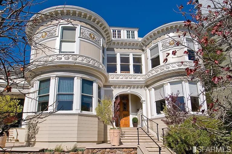
ST: That’s easy for me because I don’t have a cookie-cutter look. For me, each project is about the client – who they are, how they live, their likes and dislikes, and my job is to create something that is personally reflective, so much them, that it’s beyond anything they could dream on their own. A house should reflect those who live in it not the decorator, and should become a personal haven. And 2006 is my most favorite San Francisco building – great architecture, full floor apartments, a classic circular flow, excellent proportions, light on all sides and fabulous views.
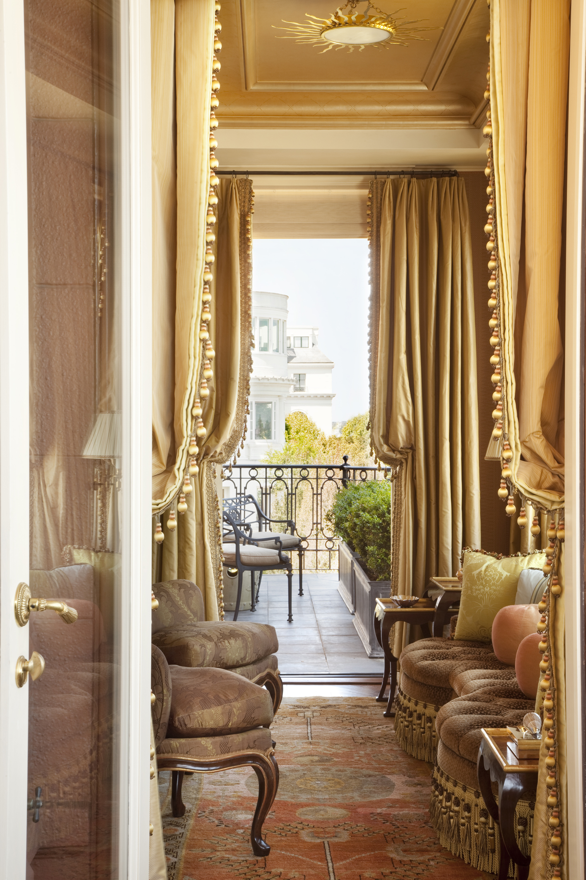
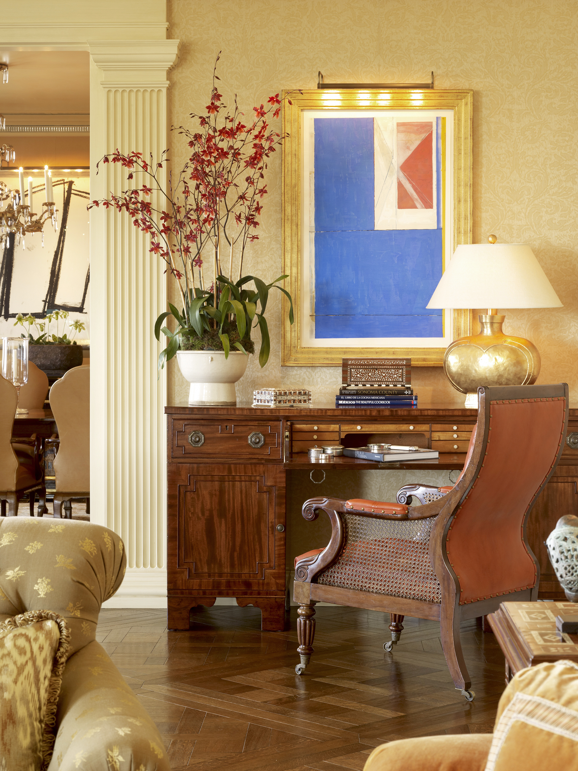
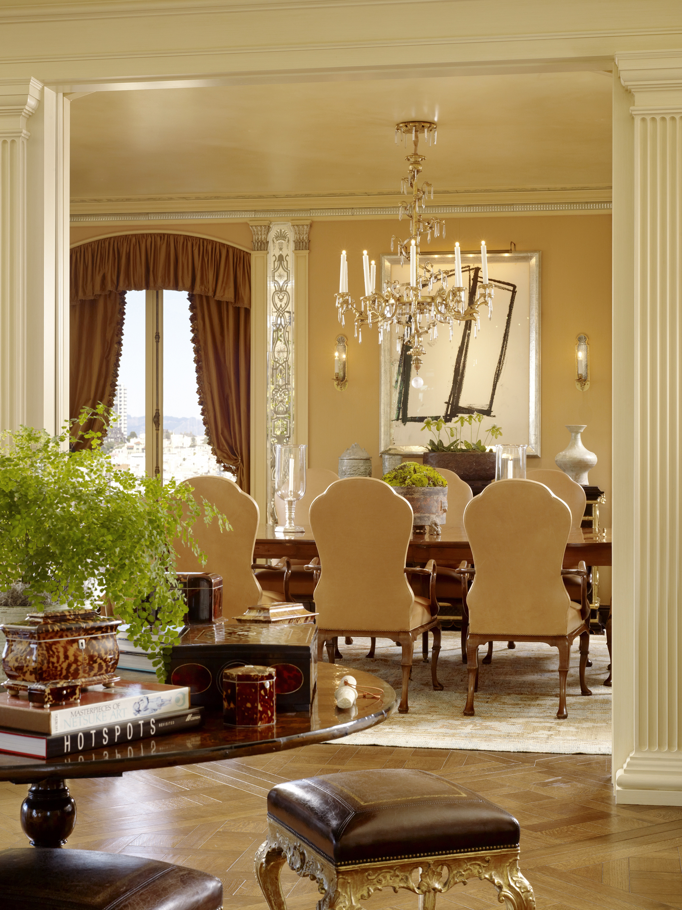
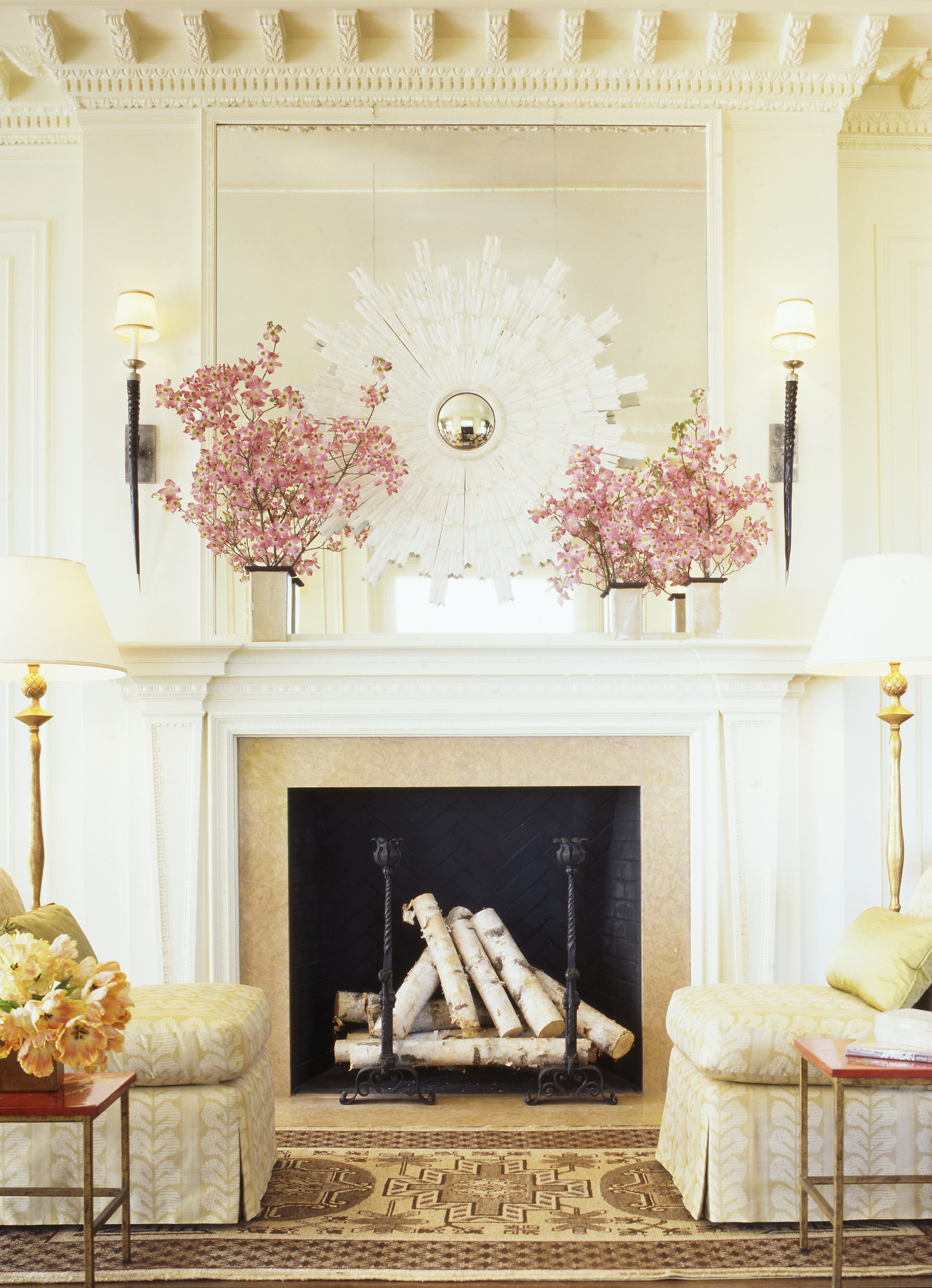
Apartment at 2006 Washington Street
JL: As a founder of the Institute of Classical Architecture & Art’s Northern California Chapter and a current national board member, what importance do you place on the stewardship of these centuries old design and proportion principles?
ST: For me this stewardship, as you call it, is vital. Classicism today is still about the essentials of scale and proportion and balance. Education is the key and the ICAA still teaches these fundamental courses that are no longer being taught in 99% of the architecture schools in the country. My interiors work is not about being a slave to traditional formality or unimaginative constraints, but rather, it’s about a suitable approach in today’s world. I find that many clients and even some architects associate classic design simply with predictable forms—arches, columns, pediments, moldings, etc. But even the most modern structure needs to have its grounding in classical proportions. For my work it’s maintaining a creative focus that is both timely and timeless because it’s based in a classic approach. The human eye will pick up an imbalance and the psyche will know when rooms feel harmonious and others feel discordant – it’s not about the style or the colors, modern or traditional, it’s all about the proportions.
JL: What are your secrets to perfectly marrying art, antiques, and furnishings?
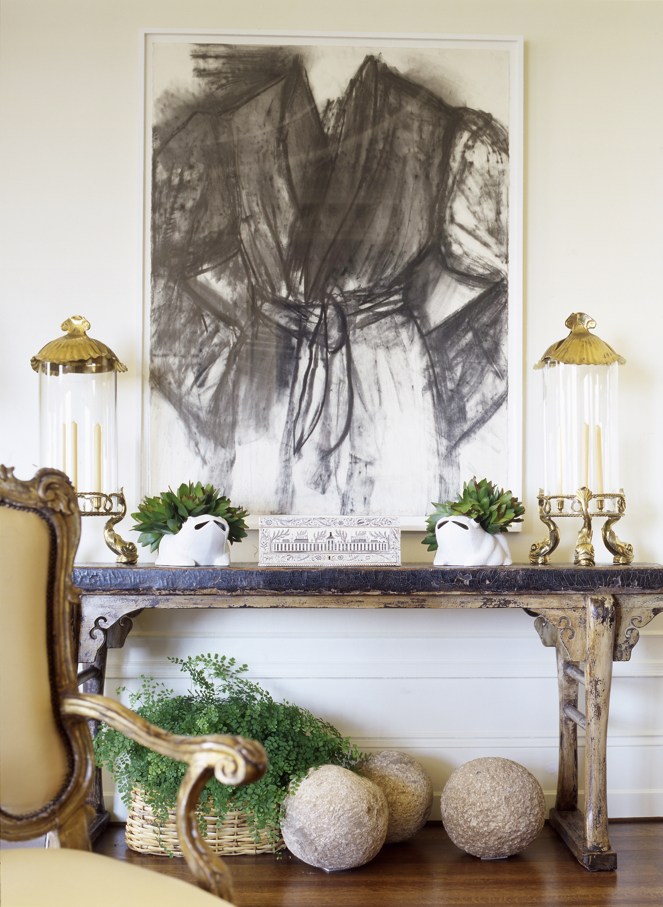
ST: The rigid rules are gone – thank goodness. There are some definite “Don’ts” – don’t buy a “suite” of furniture, don’t buy pairs of everything, don’t hang art too high, don’t have everything in a room brand new. I love the mix so I would say never to be afraid of putting a piece of great value - art or antiques - next to a flea market find. Mix the high with the low – it will have more character. I'm also not a purist and definitely believe in mixing contemporary pieces with antiques, modern elements with antiquities. But regardless of style or era, the balance of the furniture and elements in a room are always the most important. Does it fit? Does it look out of place? Look at the lines, study the bones... If it speaks to you, buy it! Live with it and love it, don't forget to feed it with a good wax and pass it onto the next lucky person. And approach art the same way… love it? Buy it! Move it to different walls, live with it in different spaces.
JL: As this year’s chair of The San Francisco Fall Art and Antiques Show, how do you see this highly regarded event keeping up with the times as current tastes veer away from traditional antiques?
ST: Interestingly enough, we are finding there is still a very strong market for the high-end collectors – that has never changed. And the pendulum has definitely swung back to mixing the old with the new, the antiques with the modern. In the design world we are always talking about the mix – it’s nothing new and the most chic interiors have always had those ingredients. I always encourage my clients to have at least one piece with some age in a room. It does not have to be over-the-top expensive, but antiques resonate with history's silent voices. The appeal resides in a patina only achievable with time: their very imperfections speak to me of soul and character and life lived. Besides, a room filled with all new things is so boring… and remember, you don’t want to be the oldest thing in the room!
The San Francisco Art & Antiques Show in its 35th year is one of the oldest and most revered antiques shows in the country and was actually the first show to have international dealers exhibiting. It’s a not-to-be-missed opening night in San Francisco and there are some exciting changes this year to keep things current and fresh. The word "Art" is now added to the name of the show by popular demand from many dealers. The art world goes hand in hand with the decorative arts and collecting plus it opens the show up to a broader range of art galleries exhibiting this year. We have also invited our dealers to think beyond antiques and bring pieces from antiquity to present day (no more 50-year cut-off date). With architect Andrew Skurman, we have reconfigured the entire layout of the show, making the booths much more interactive and compelling, displaying contemporary art with antiquities and 18th century with modern. Wandering through the show is always a visual feast but I think this year it will be particularly compelling especially with the Animalia theme.
"A house should reflect those who live in it not the decorator, and should become a personal haven."
JL: With purchasing becoming more independent through online bidding at Sotheby’s and Christie’s, do you still work with clients on an advisory basis when they acquire items at auction?
ST: Absolutely. I am often bidding at auctions around the world for my clients or for myself. And while I rely on the auction house experts to advise on condition and value, there is nothing like seeing a piece in person. Working with trusted dealers is where you really learn about furniture, what makes something valuable, what to collect and what to avoid. Trust the experts!
JL: Any favorite current projects?
ST: I consider myself rather fortunate at the moment as all my projects are truly exciting and inspiring for me. They are also quite geographically varied - here in San Francisco, a breathtaking penthouse for dear friends, a historic Italianate Renaissance house in Presidio Heights, and another historic French house in Pacific Heights, a very cool “surf shack” down the coast and an exquisite 1920's Spanish compound in Pebble Beach. My work takes me all over from Napa, Tahoe, Santa Barbara and Los Angeles, to a spectacular ranch in Aspen with multiple structures for a dedicated environmentalist, a family vacation home at the Yellowstone Club in Montana, and an ongoing project in Little Rock, Arkansas with clients of 28 years. They’re all my favorites!
JL: How have you seen the design profession change over the years?
ST: Certainly the 80’s had the most profound impact on the profession when we lost so many to the AIDS epidemic. It’s hard for young designers to understand the magnitude - the loss of knowledge and expertise, the taste and talent, that old-school know-how. And the designers we lost back then would now be the mentors to the new ones now. There is a generation that has missed out on that experience. The internet and the digital revolution have certainly impacted our profession in a life-changing way. While I embrace the fact that information is so much more readily available, ultimately the pillars upon which a good design business is built remain the same no matter what: impeccable customer service, excellent relationships with clients, vendors and other partners, and plain old hard work. You simply cannot get that surfing the internet. But having product easily available to the customer is not a bad thing – Mr. Macy did that years ago with the concept of mass merchandising in his department stores. But everyone needs to decide for themselves – are you a Macy’s customer or Bergdorf Goodman? Me? I’m unapologetically the latter.
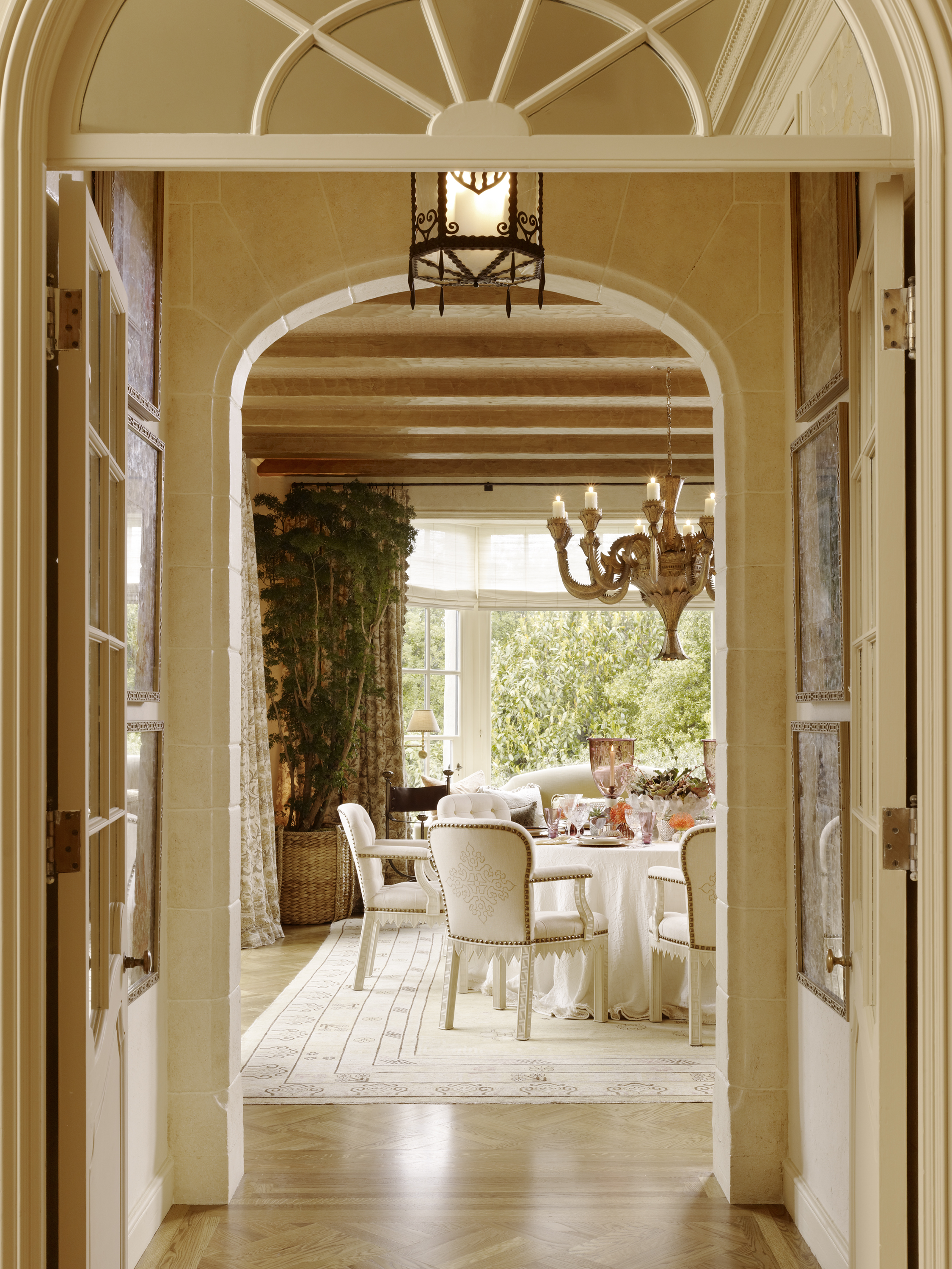
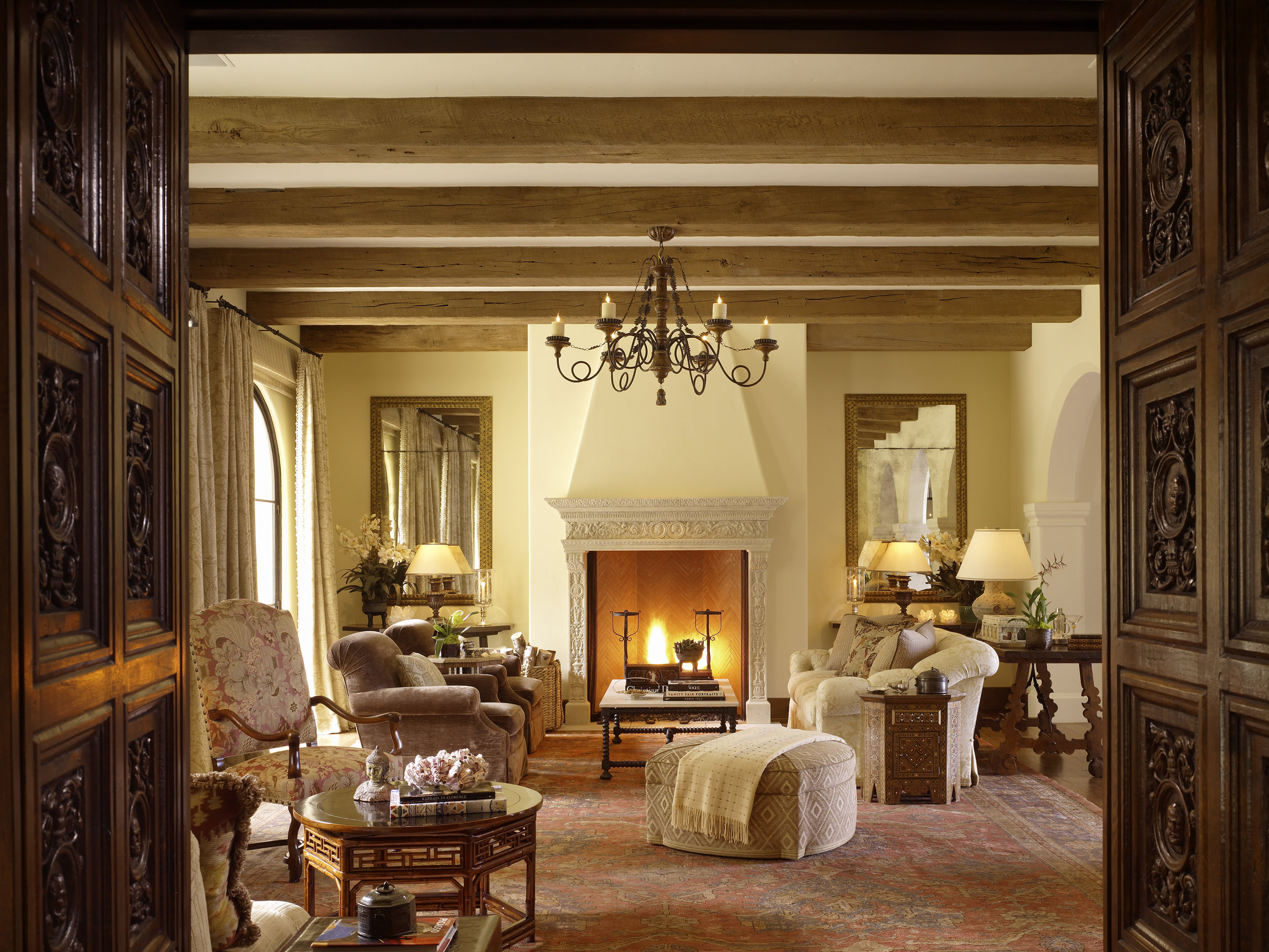
Monterey Peninsula Residence
JL: What is on the top of your bucket list?
ST: Travel is always up there and I’m forever nursing a case of wanderlust. So not necessarily in order - India for sure, Peru and Patagonia…Build my dream house one day… Perhaps my dream would be to tackle the interiors of the White House? But that could end up a total nightmare...
JL: Favorite city in Europe?
ST: London…Paris…Rome… you’re getting at that wanderlust thing with me.
JL: Favorite romantic weekend getaway?
ST: The Auberge du Soleil in the Napa Valley (Yes, I’m biased because I’ve worked on it for 30 years) … the Post Ranch in Big Sur is heavenly… and our little house in Montecito – simple perfection and muy romantico.
JL: What are you currently reading?
ST: I read multiple books at once and always have stacks by my bedside… Thrive by Arianna Huffington… Jay McInerney’s latest novel Bright Precious Days… The Collected Stories of Louis Auchincloss, because he was a good friend of my father’s and I’m missing my dad… something about the Paleovedic Diet … A Pattern Language by Christopher Alexander which isn’t new but is utterly compelling for anyone interested in architecture, designing a house, getting it right… and the just released Interior Design Master Class by Carl Dellatore, a wonderful volume of essays on various design-related subjects to which I and many of my peers have contributed. A great read and a classic in the making which should be on everyone’s shelf!
Many thanks to Suzanne Tucker and Vera Vandenbosch for working with me on this feature!
Photo credits: Matthew Millman, Peter Estersohn, and Michal Venera


